Vanessa Alcaíno & Alejandro Malo
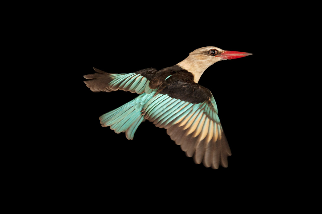
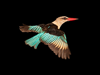
Brown Hooded Kingfisher, (Halcyon albiventris), Chitengo Camp, Gorongosa National Park, Mozambique, 2011. By Joel Sartore
When we choose to address a landscape issue and, soon after, we realized its relationship with the theme of the FotoFest 2016 Biennial: Changing Circumstances: Looking at the Future of the Planet, we thought it appropriate to echo the concerns expressed during the festival. A few contents presented in this issue offer a digital version of the same exhibitions for our audience. However, this observation would be insufficient without emphasizing some of the ideas included in the book of the same name that drives us to insist on the invitation to peer into its pages.
Conceived as a collaboration between Frederick Baldwin and Wendy Watriss, founders of FotoFest, with Steven Evans, Executive Director of the festival, it integrates a diverse and broad mosaic of artists. In his introductory text, Steven Evans highlights the need to promote the exchange of ideas between artists who use different strategies to address the issue. It also contrast the divergence of gazes with the unifying leitmotif of Thomas E. Lovejoy and Geof Rayner essays that show an intrinsic connection between all artist’s concerns. Both essays provide strong arguments on the urgent need for action on climate change; the first, from the perspective of the Earth as a living organism, and the second by demonstrating the decisive role of human beings in their environment.
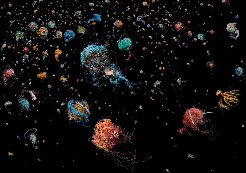
Bird’s Nest, 2011. Por Mandy Barker
Finally, Wendy Watriss gives voice to some questions that resonate with concerns we encountered during our research on the theme of landscape: "We have responsibility not only for our own well-being but that of the rest of the natural world? Can art stimulate new perspectives and new ways of seeing?” Photography has in its hands the potential to share with us realities that otherwise would be inaccessible. The images are not neutral, they feed imagination and foster reflections, being a very effective means to make any problem palpable, visible and close, to the point of being able to bring them into the political sphere and encourage agreements. We agree with Wendy’s view that art can itself stimulate and expand our world view and present innovative ways to address the issue of climate change. We should not allow ourselves to have skewed visions that only address and speak from a knowledge area or a region of the world. We must open to different cultures, include divergent views, draw new and different boundaries, create unique maps, put the world upside down, stir and divide it in various ways. That is the only way to visualize a future where rather than dominate nature, we can collaborate for its survival and ours. And this way of ‘seeing’ the world, and the new paths to our future, is what art may best express.
 Vanessa Alcaíno Pizani (Venezuela, 1980). Lives and works in Mexico. Visual artist. She graduated in Philosophy at the Central University of Venezuela and has a Master’s degree in Spanish and Latin American Thought at the Autonomous University of Madrid (UAM). Since 1994, she has worked in the field of photography at various institutions and organisations in Venezuela, Argentina and Mexico. At the moment, she is part of the editorial team of zonezero.com.
 Alejandro Malo (Mexico, 1972). Lives and works in Mexico and is the director of ZoneZero. Since 1993, he has taken part in various cultural projects and worked as an information technology consultant. He has collaborated in print and electronic publications, and given workshops and conferences on literature, creative writing, storytelling and technology. In 2009, Malo joined the team of the Fundación Pedro Meyer, where he directs the Archives and Technology departments.
Brown Hooded Kingfisher, (Halcyon albiventris), Chitengo Camp, Gorongosa National Park, Mozambique, 2011. By Joel Sartore
When we choose to address a landscape issue and, soon after, we realized its relationship with the theme of the FotoFest 2016 Biennial: Changing Circumstances: Looking at the Future of the Planet, we thought it appropriate to echo the concerns expressed during the festival. A few contents presented in this issue offer a digital version of the same exhibitions for our audience. However, this observation would be insufficient without emphasizing some of the ideas included in the book of the same name that drives us to insist on the invitation to peer into its pages.
Conceived as a collaboration between Frederick Baldwin and Wendy Watriss, founders of FotoFest, with Steven Evans, Executive Director of the festival, it integrates a diverse and broad mosaic of artists. In his introductory text, Steven Evans highlights the need to promote the exchange of ideas between artists who use different strategies to address the issue. It also contrast the divergence of gazes with the unifying leitmotif of Thomas E. Lovejoy and Geof Rayner essays that show an intrinsic connection between all artist’s concerns. Both essays provide strong arguments on the urgent need for action on climate change; the first, from the perspective of the Earth as a living organism, and the second by demonstrating the decisive role of human beings in their environment.

Bird’s Nest, 2011. Por Mandy Barker
Finally, Wendy Watriss gives voice to some questions that resonate with concerns we encountered during our research on the theme of landscape: "We have responsibility not only for our own well-being but that of the rest of the natural world? Can art stimulate new perspectives and new ways of seeing?” Photography has in its hands the potential to share with us realities that otherwise would be inaccessible. The images are not neutral, they feed imagination and foster reflections, being a very effective means to make any problem palpable, visible and close, to the point of being able to bring them into the political sphere and encourage agreements. We agree with Wendy’s view that art can itself stimulate and expand our world view and present innovative ways to address the issue of climate change. We should not allow ourselves to have skewed visions that only address and speak from a knowledge area or a region of the world. We must open to different cultures, include divergent views, draw new and different boundaries, create unique maps, put the world upside down, stir and divide it in various ways. That is the only way to visualize a future where rather than dominate nature, we can collaborate for its survival and ours. And this way of ‘seeing’ the world, and the new paths to our future, is what art may best express.
 Vanessa Alcaíno Pizani (Venezuela, 1980). Lives and works in Mexico. Visual artist. She graduated in Philosophy at the Central University of Venezuela and has a Master’s degree in Spanish and Latin American Thought at the Autonomous University of Madrid (UAM). Since 1994, she has worked in the field of photography at various institutions and organisations in Venezuela, Argentina and Mexico. At the moment, she is part of the editorial team of zonezero.com.
 Alejandro Malo (Mexico, 1972). Lives and works in Mexico and is the director of ZoneZero. Since 1993, he has taken part in various cultural projects and worked as an information technology consultant. He has collaborated in print and electronic publications, and given workshops and conferences on literature, creative writing, storytelling and technology. In 2009, Malo joined the team of the Fundación Pedro Meyer, where he directs the Archives and Technology departments.
Marcus DeSieno
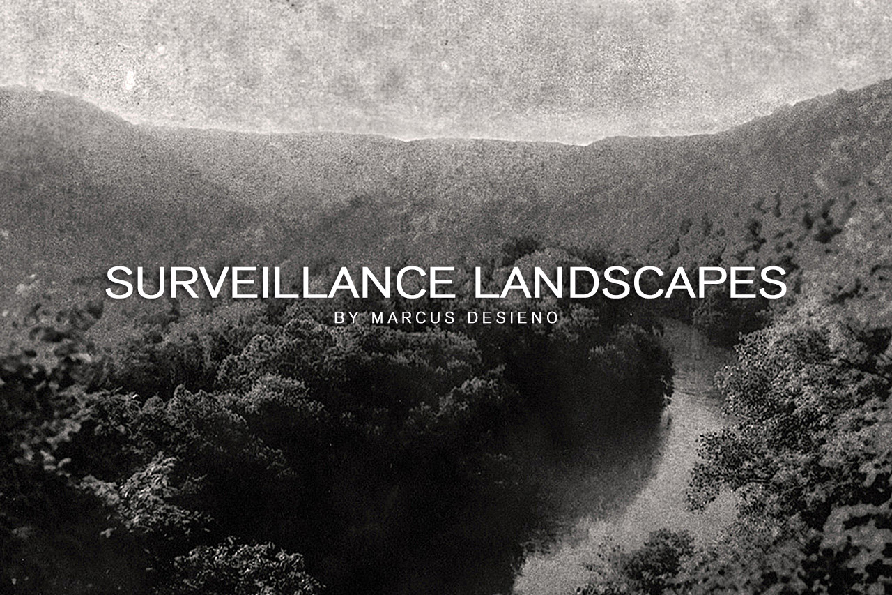
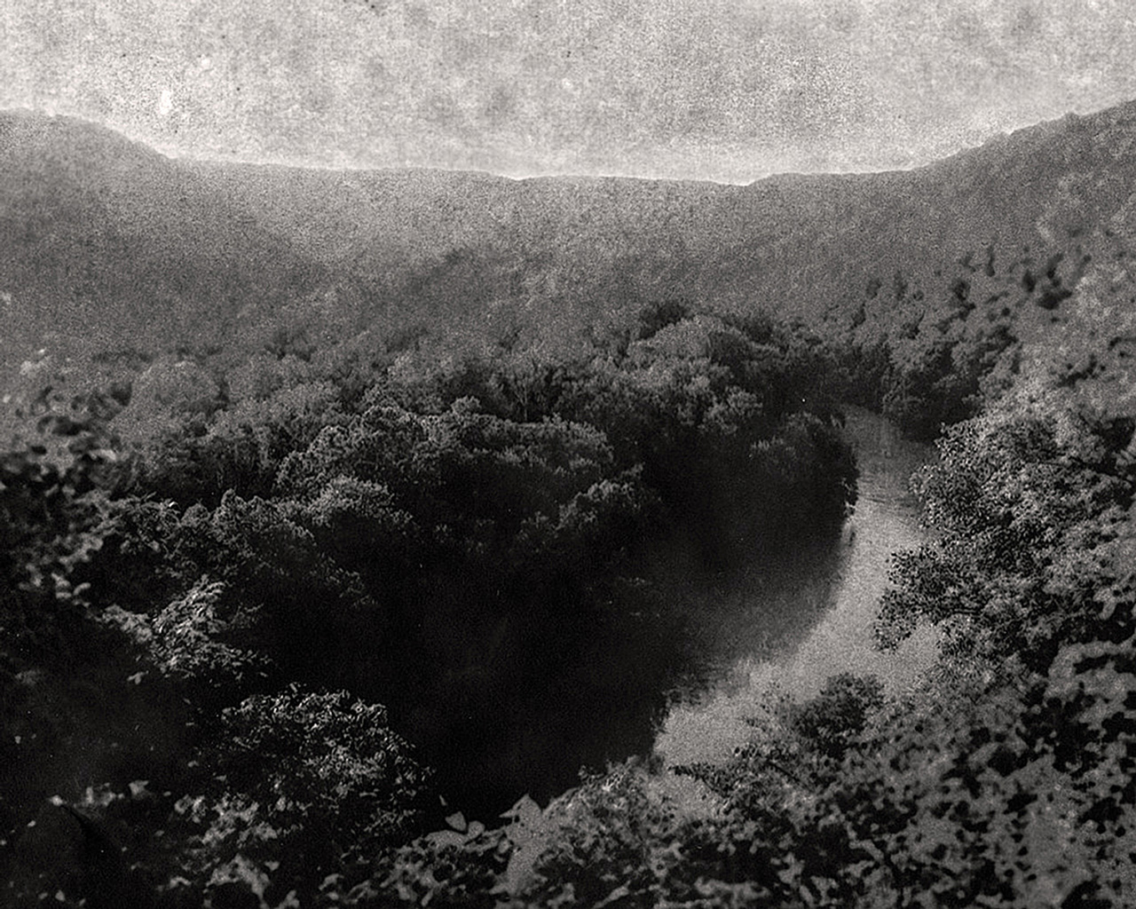
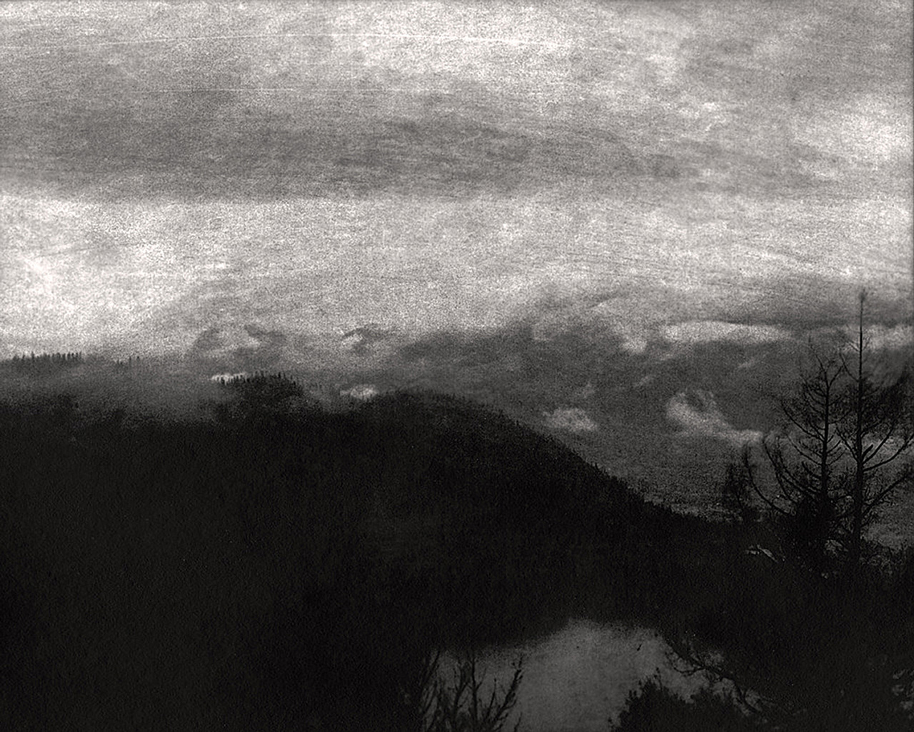
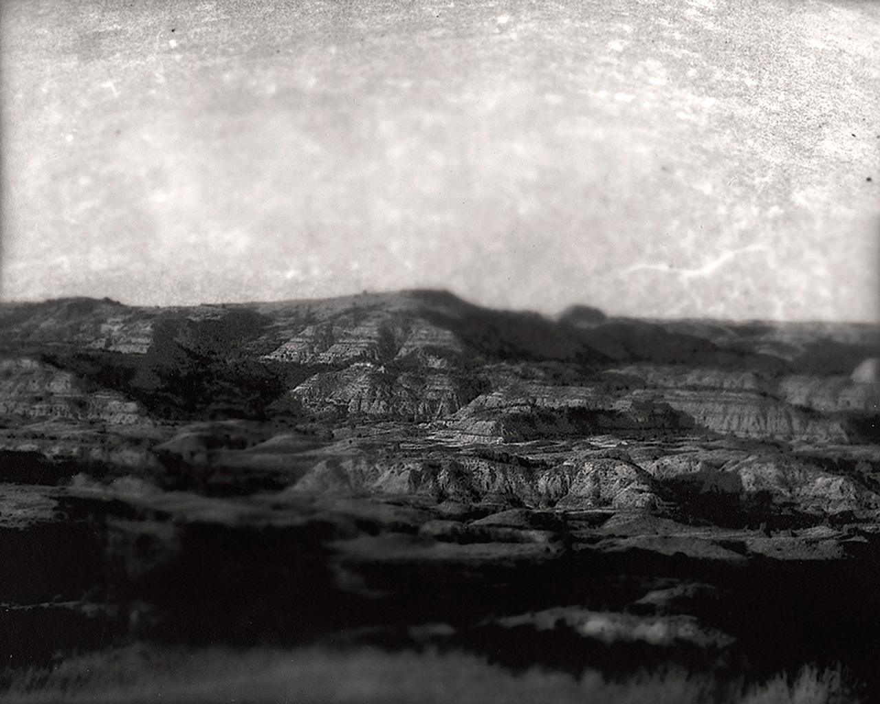
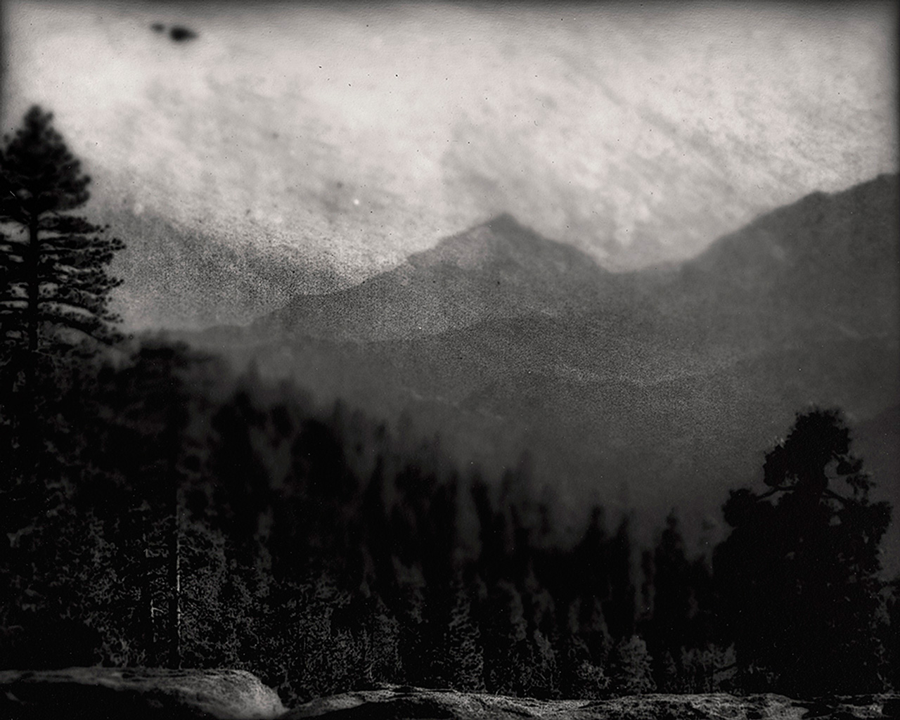
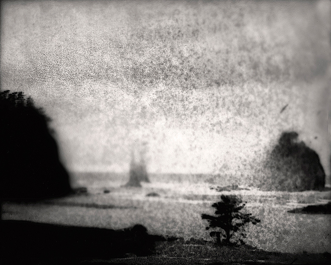
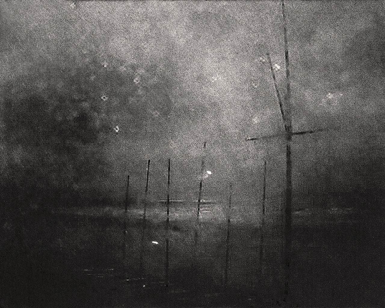
Surveillance Landscapes interrogates how surveillance technology has changed our relationship and understanding of landscape and place in our increasingly intrusive electronic culture. I hack into surveillance cameras, public webcams, and CCTV feeds in a pursuit for the classical picturesque landscape, dislocating the visual product from its automated origins while searching for a conversation between land, borders, and power. The very act of surveying a site through these photographic systems implies a dominating relationship between man and place. Ultimately, I hope to undermine these schemes of social control through the obfuscated melancholic images found while exploiting the technological mechanisms of power in our surveillance society.
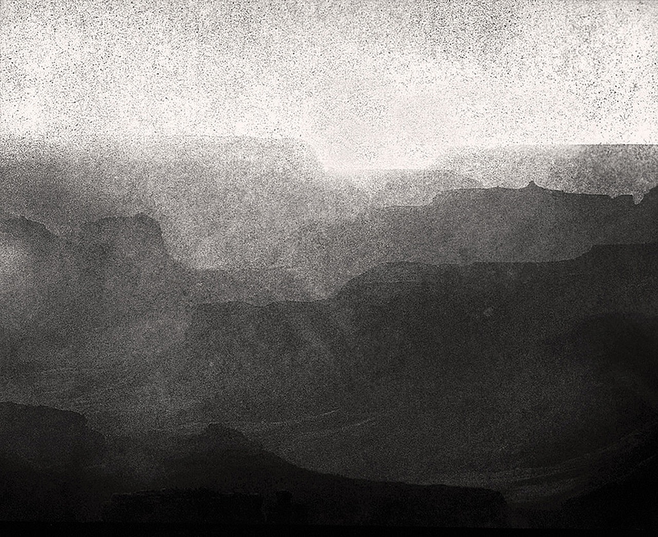
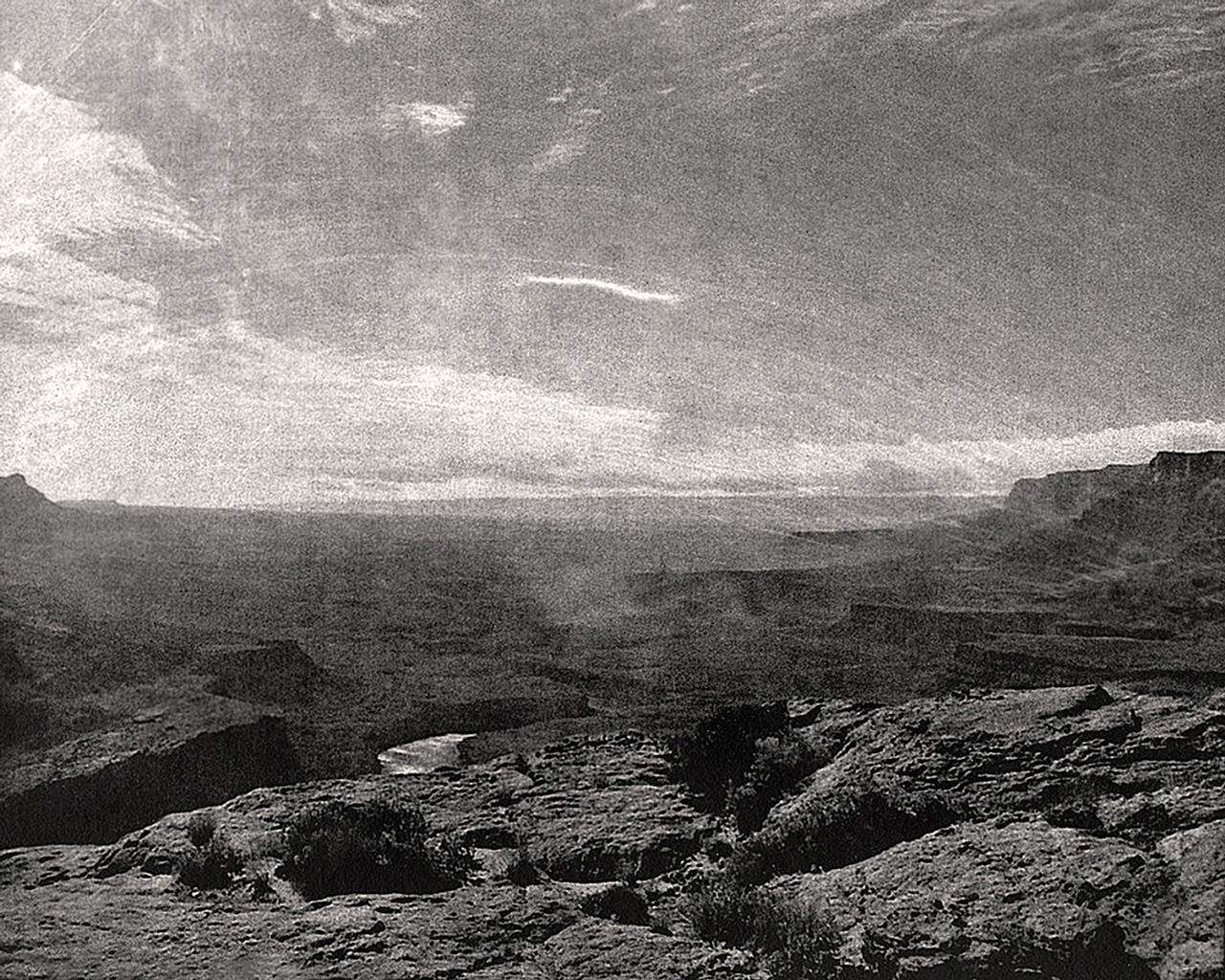
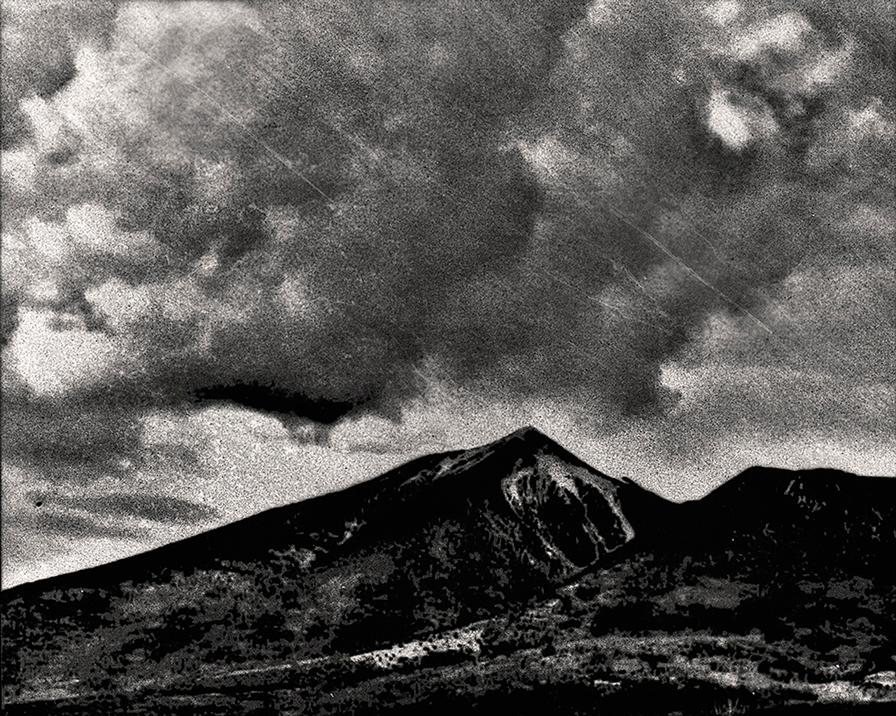
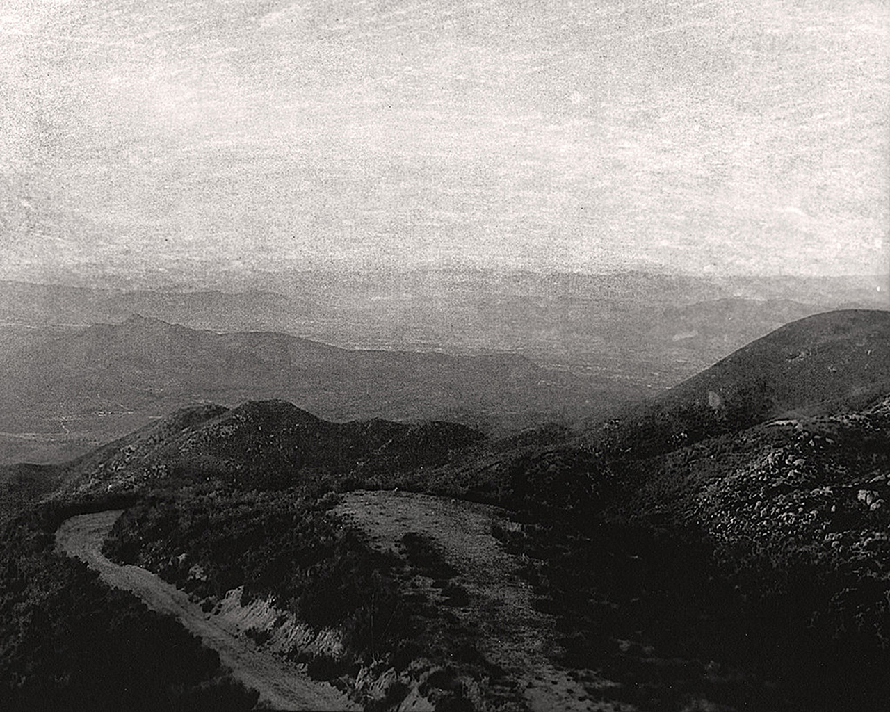
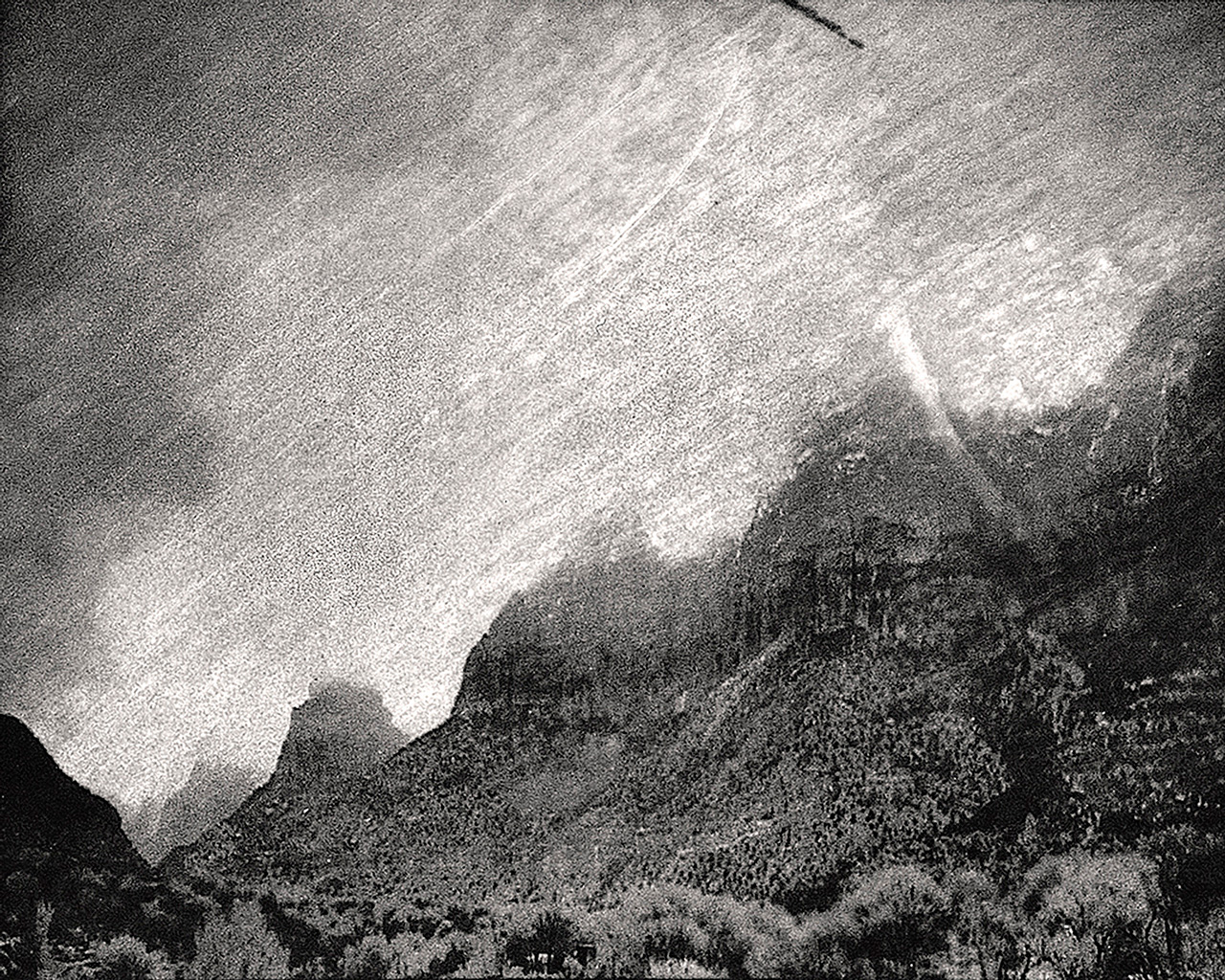
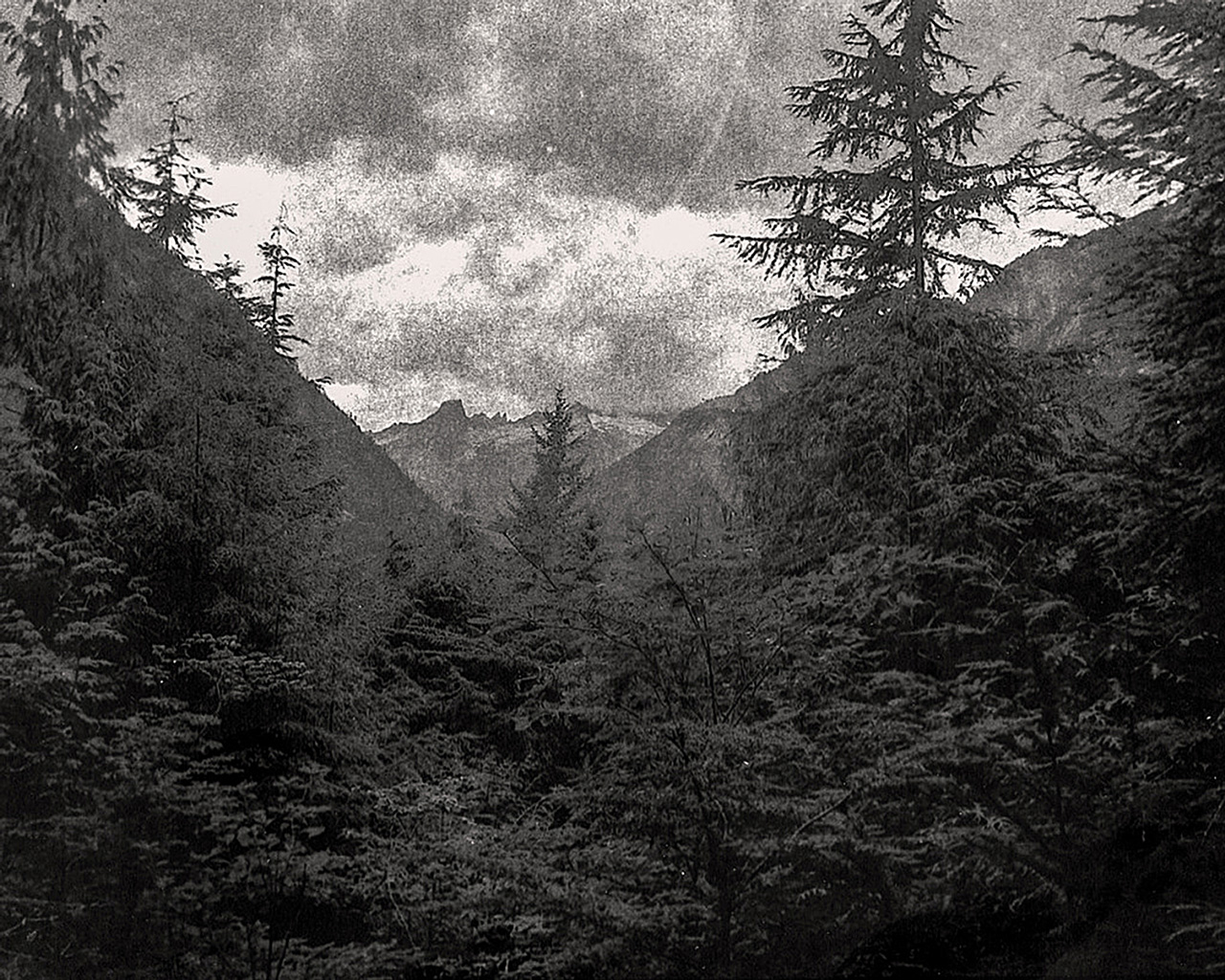
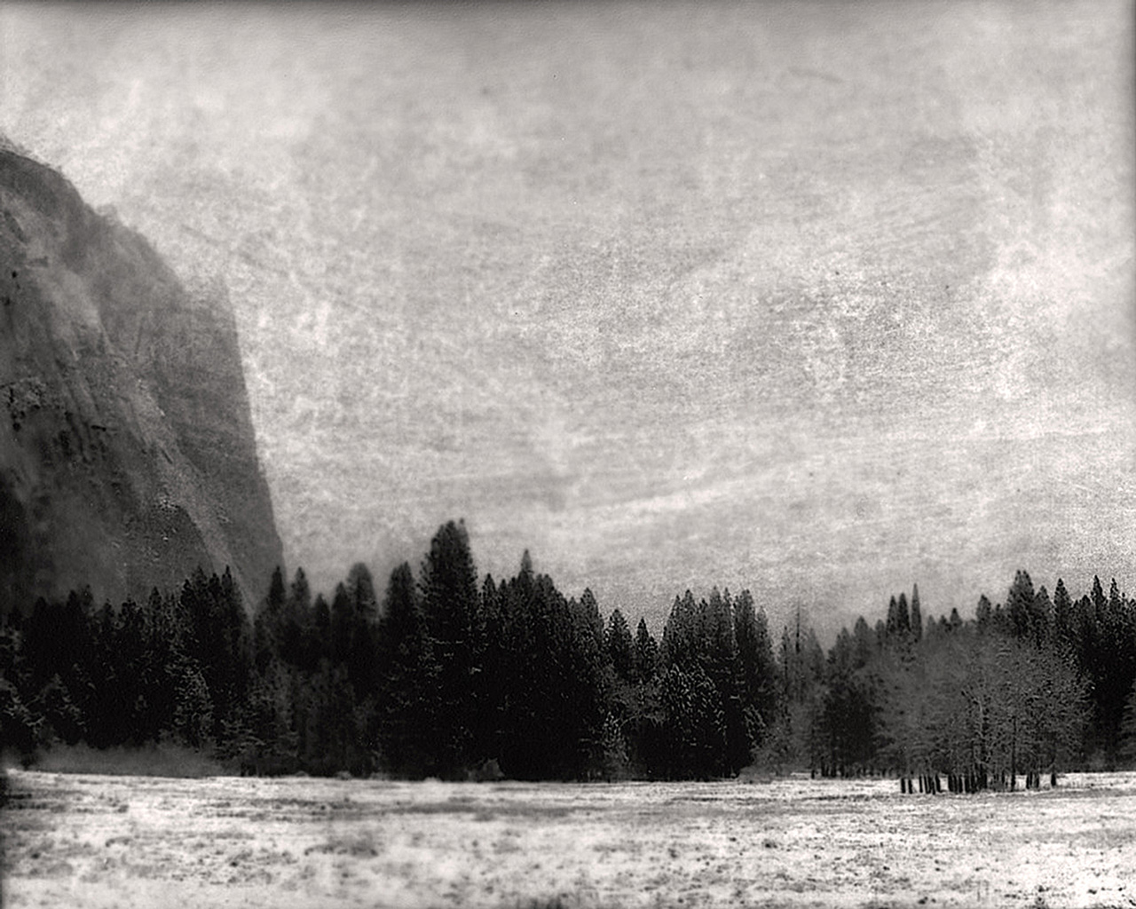
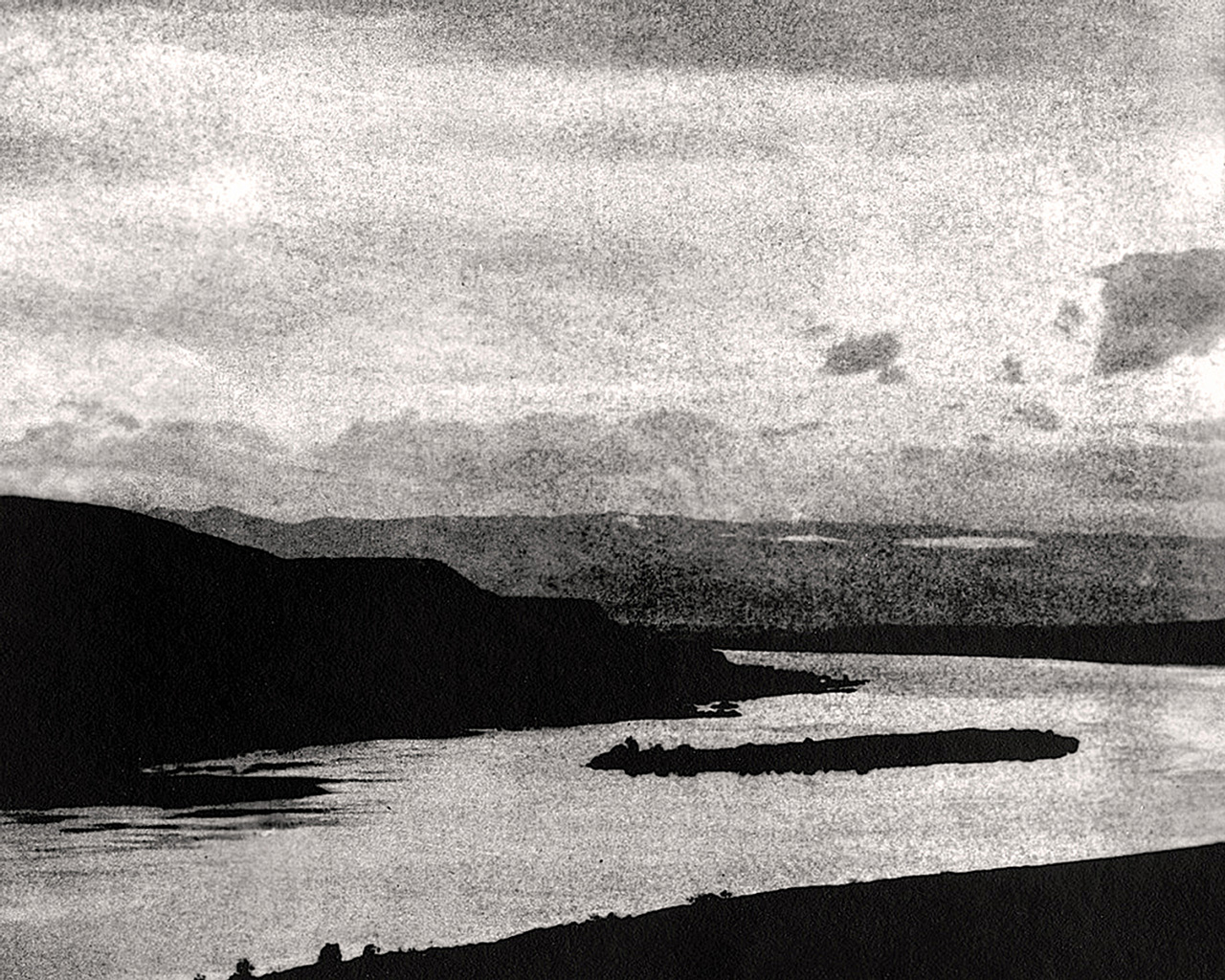
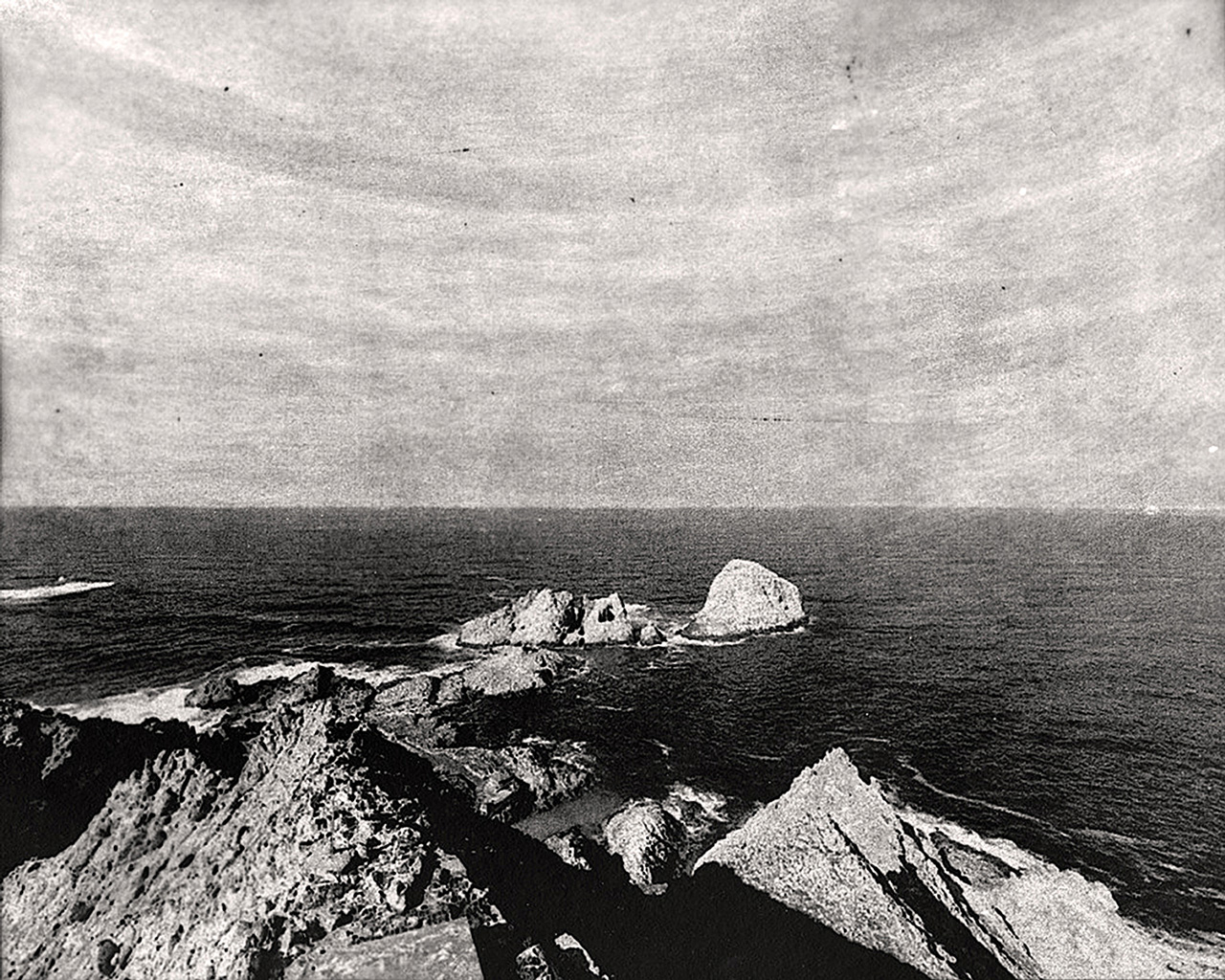
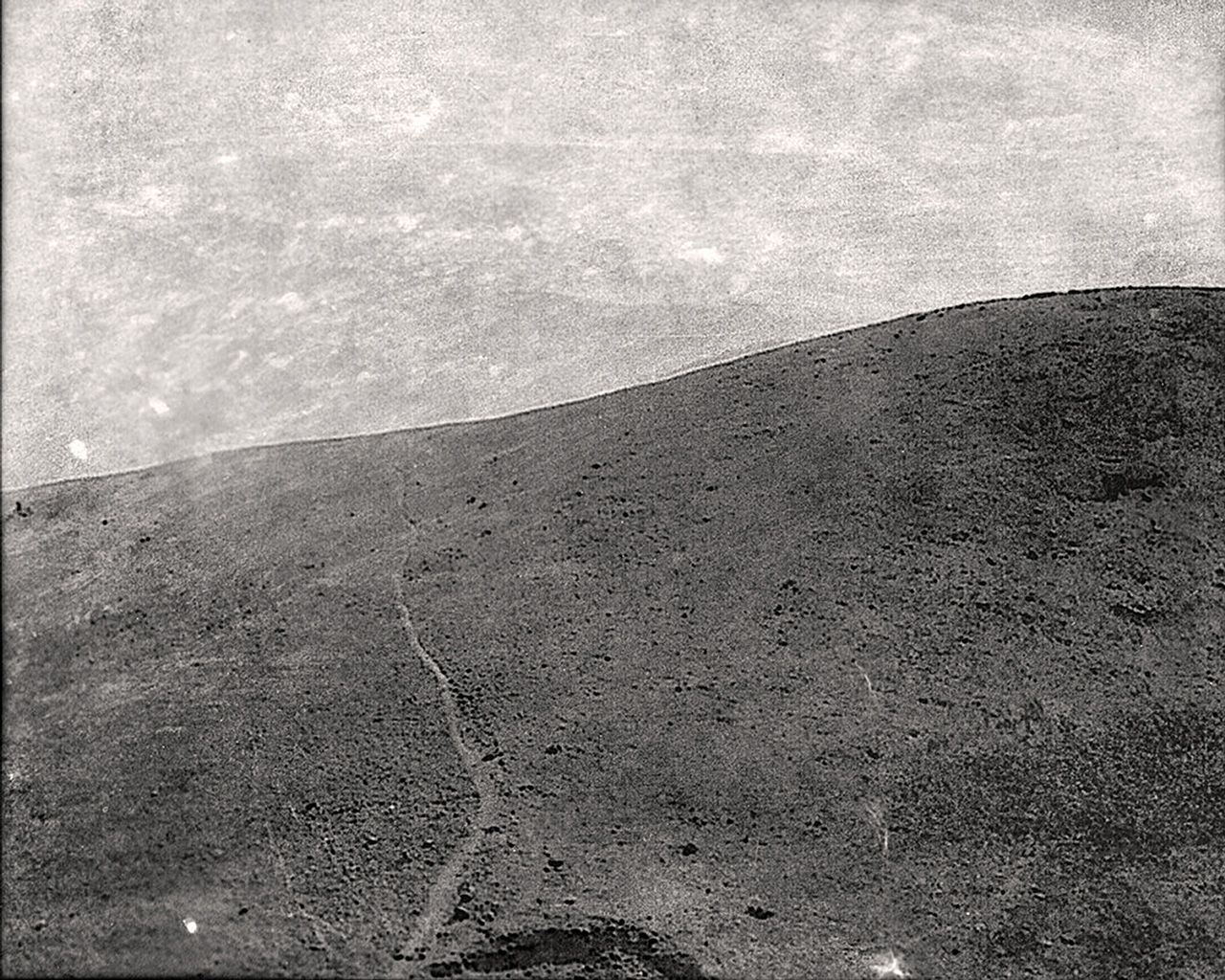
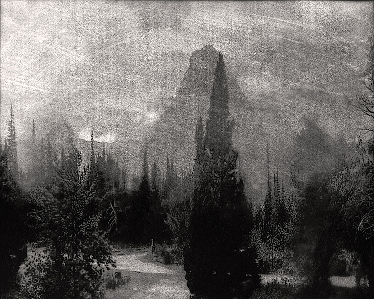
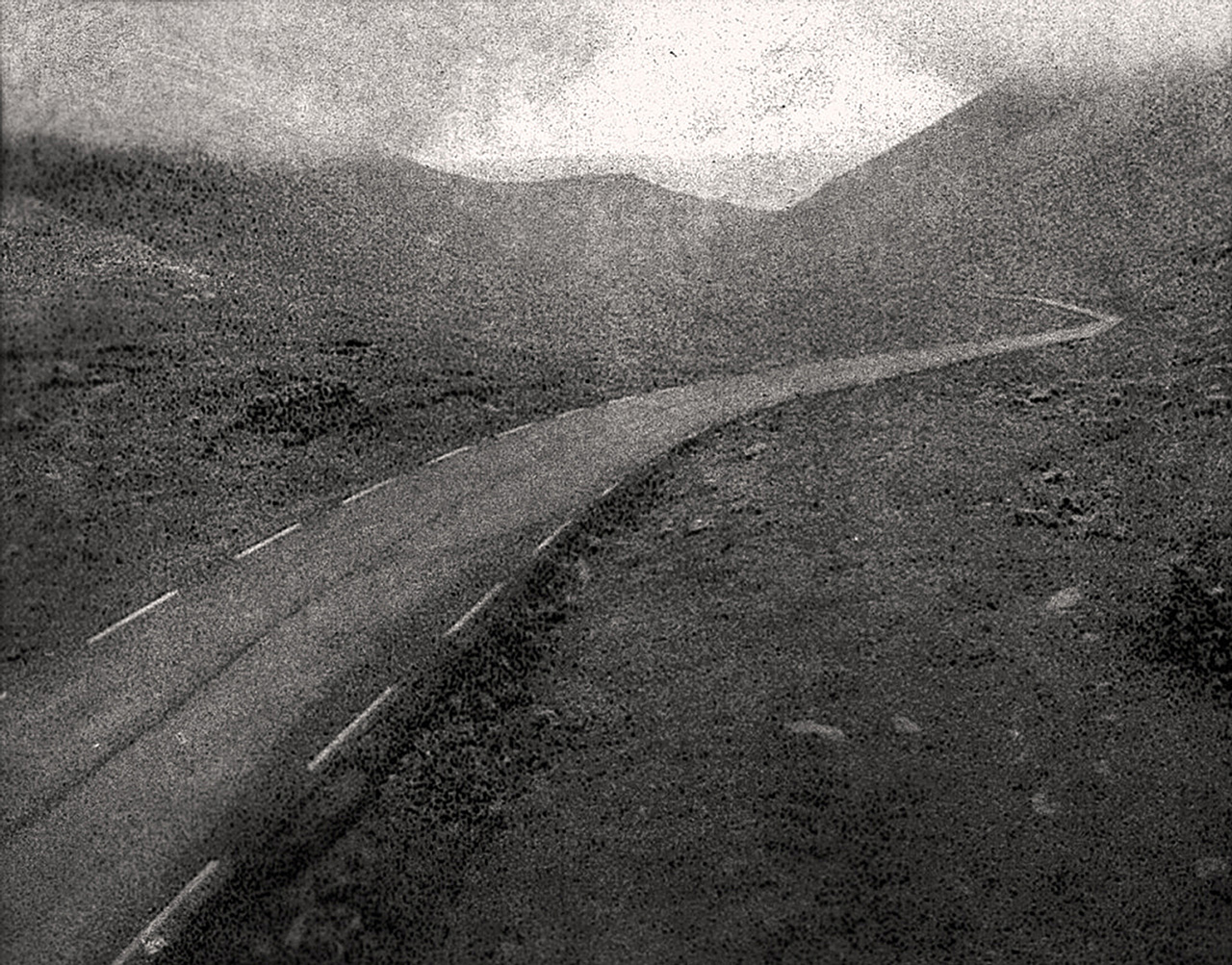
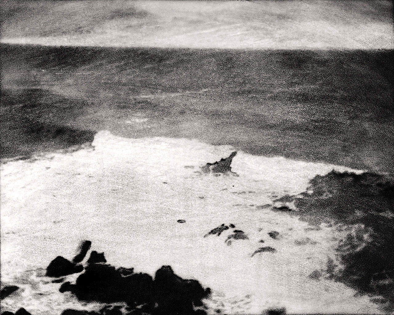
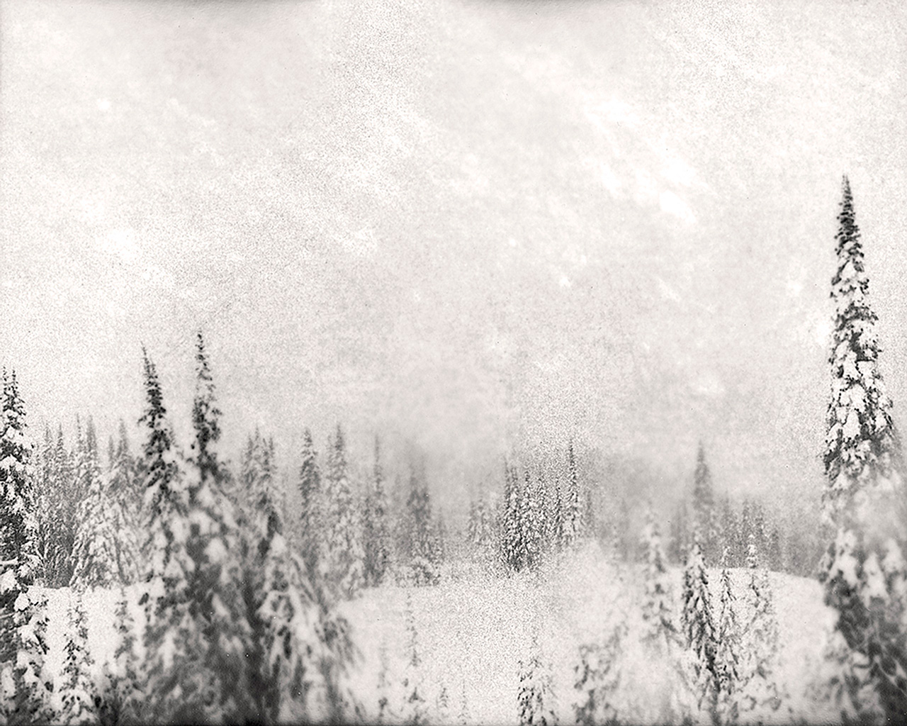
 Marcus DeSieno (USA). His work is concerned with science and exploration in relation to the history of photography. He received his MFA in Studio Art from the University of South Florida in 2015. DeSieno often assumes the role of the amateur scientist in his work in order to investigate photography's historic relationship with science in regards to the notion of the invisible. Antiquated and obsolescent photographic processes are often combined with contemporary imaging technologies to engage in a critical dialog on the evolution of photographic technology in relation to seeing.
Surveillance Landscapes interrogates how surveillance technology has changed our relationship and understanding of landscape and place in our increasingly intrusive electronic culture. I hack into surveillance cameras, public webcams, and CCTV feeds in a pursuit for the classical picturesque landscape, dislocating the visual product from its automated origins while searching for a conversation between land, borders, and power. The very act of surveying a site through these photographic systems implies a dominating relationship between man and place. Ultimately, I hope to undermine these schemes of social control through the obfuscated melancholic images found while exploiting the technological mechanisms of power in our surveillance society.


 Marcus DeSieno (USA). His work is concerned with science and exploration in relation to the history of photography. He received his MFA in Studio Art from the University of South Florida in 2015. DeSieno often assumes the role of the amateur scientist in his work in order to investigate photography's historic relationship with science in regards to the notion of the invisible. Antiquated and obsolescent photographic processes are often combined with contemporary imaging technologies to engage in a critical dialog on the evolution of photographic technology in relation to seeing.
Brad Temkin
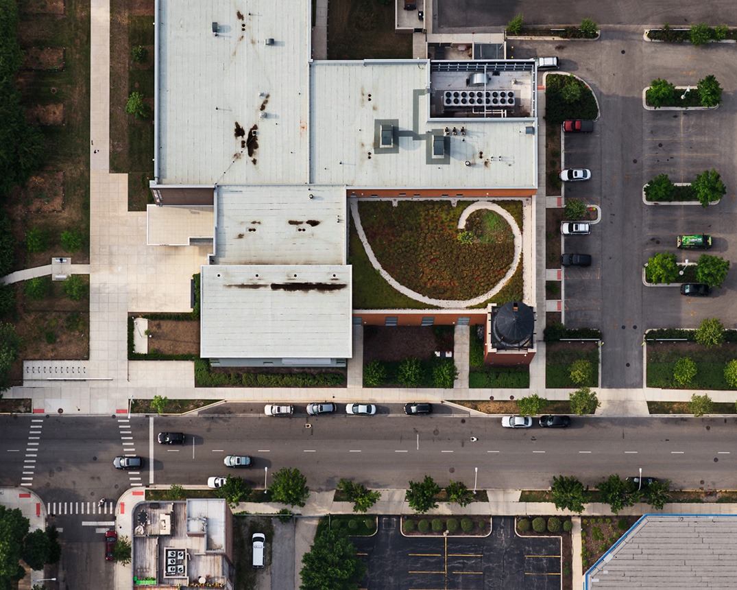
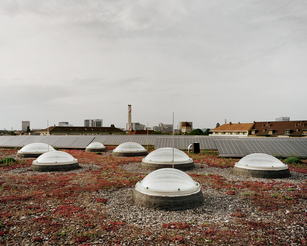
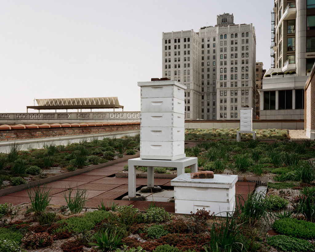
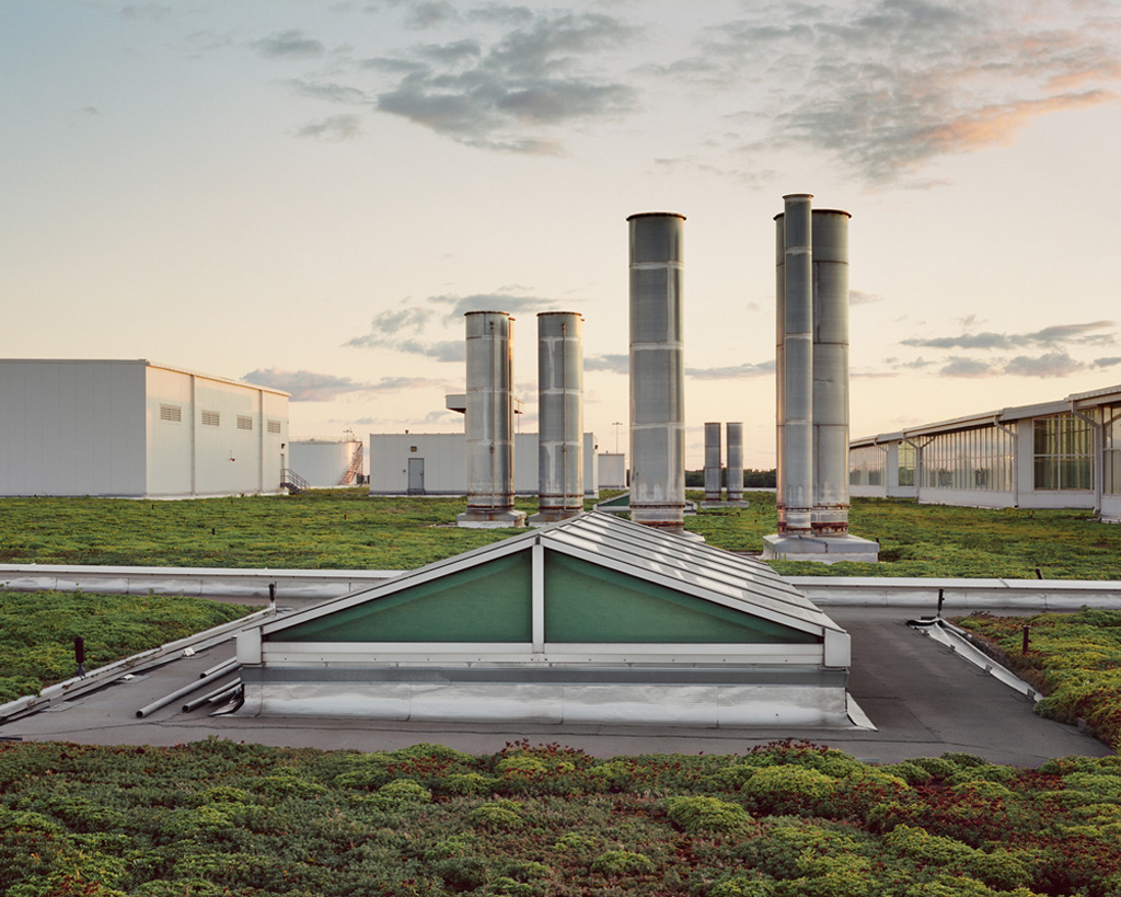
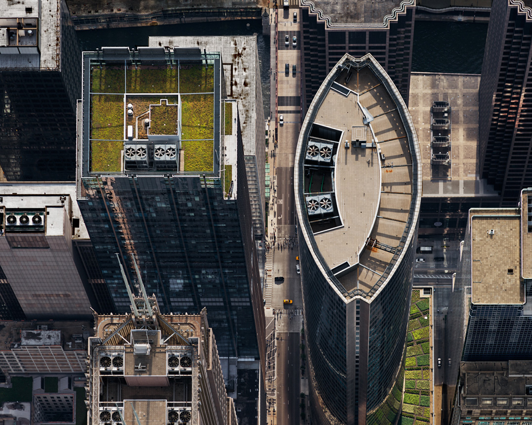
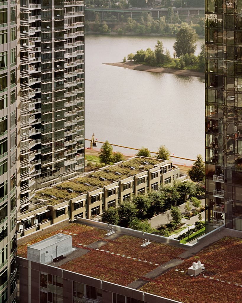
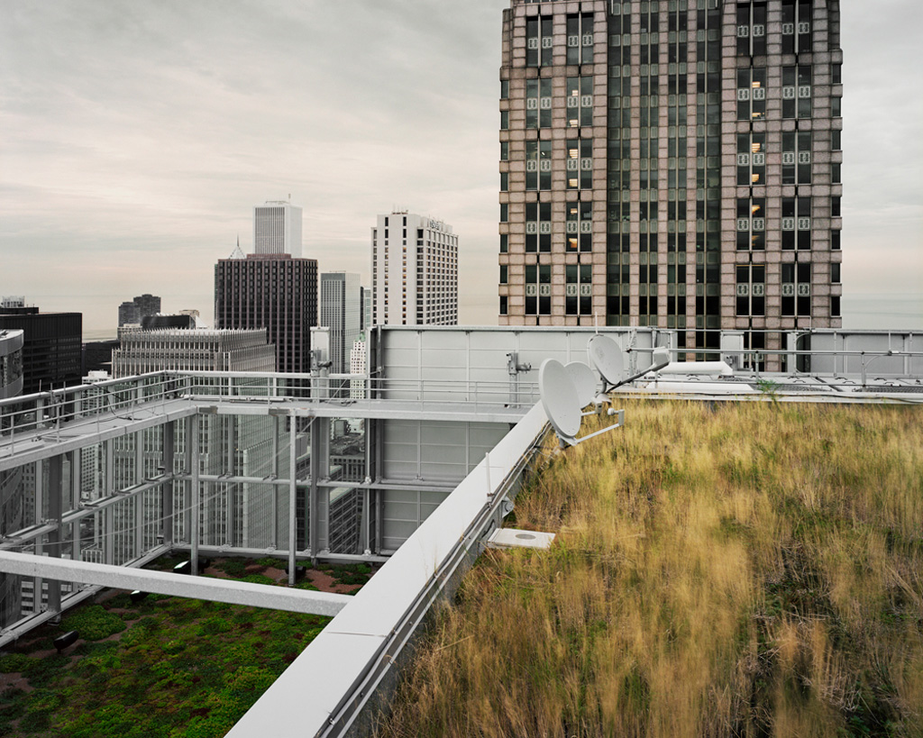
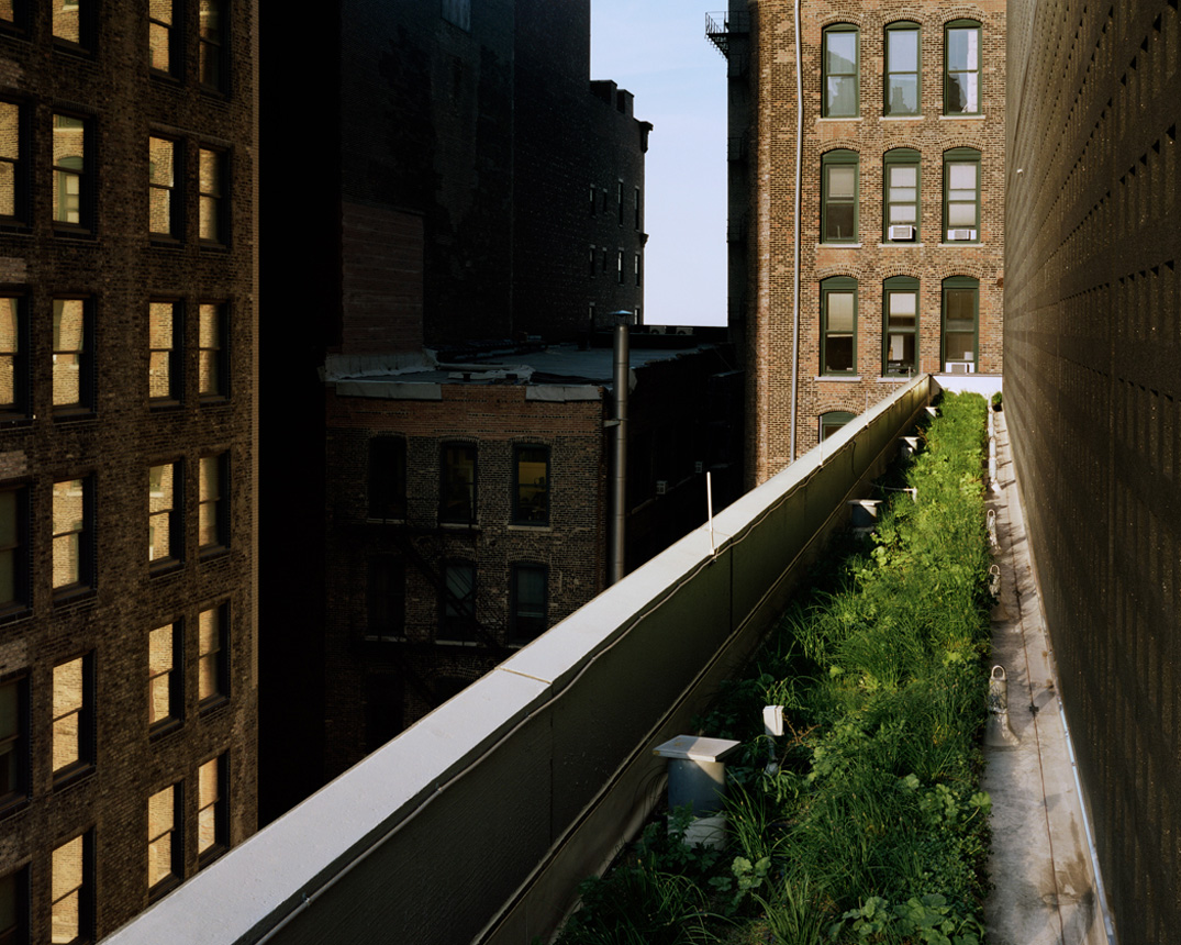
Most of my career has focused on our relationship with nature. I’m interested in how we find ways to accommodate nature, and how it accommodates us. As with most bodies of work, the pictures define my intent. But in the end, I make the pictures I do because of the conversation that occurs between the subject and myself - and this always depends on the light, the weather, how I'm feeling and what I am open to seeing at the moment. It's the moment all things come together for me.
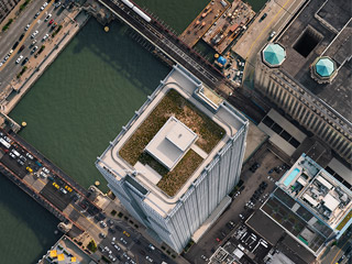
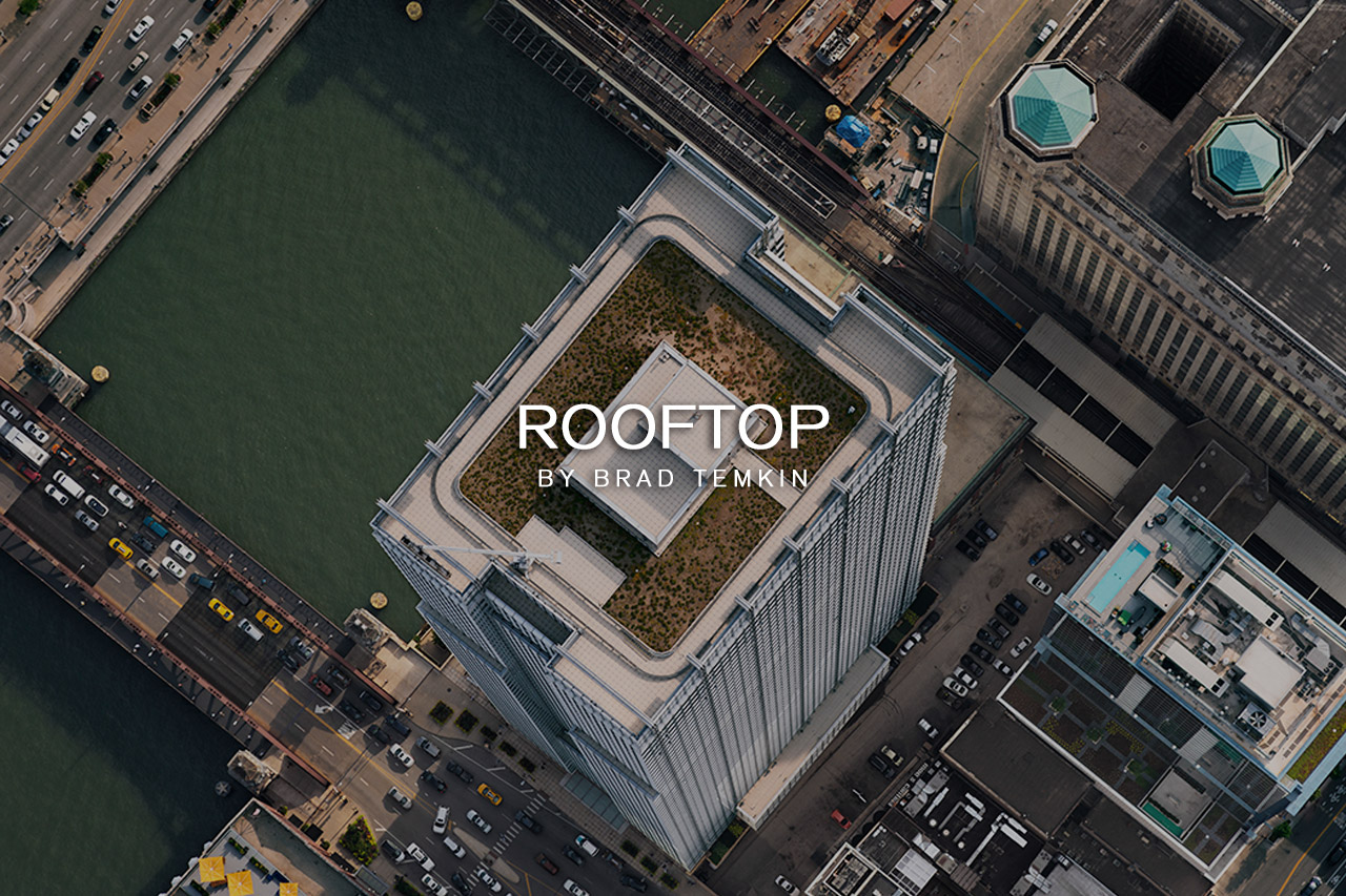
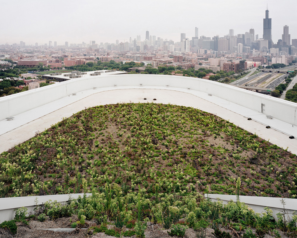
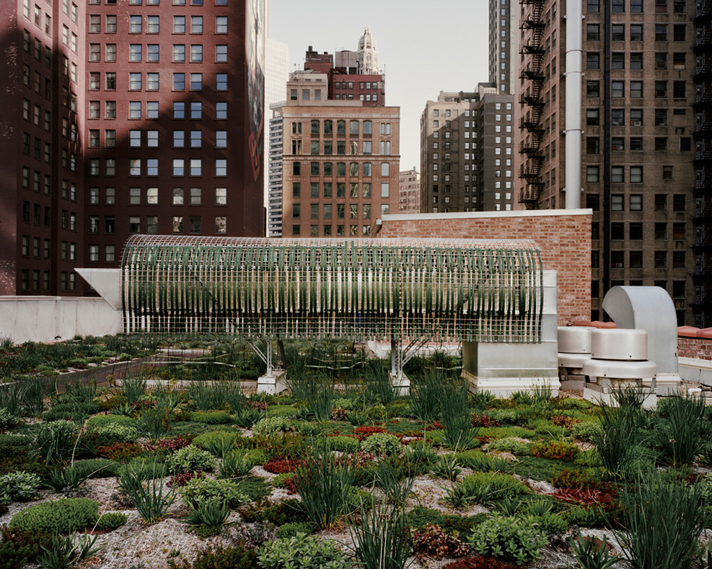
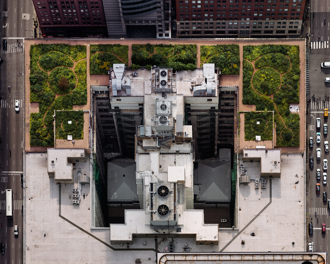
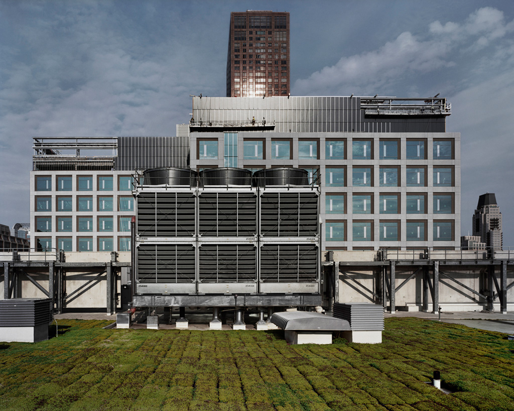
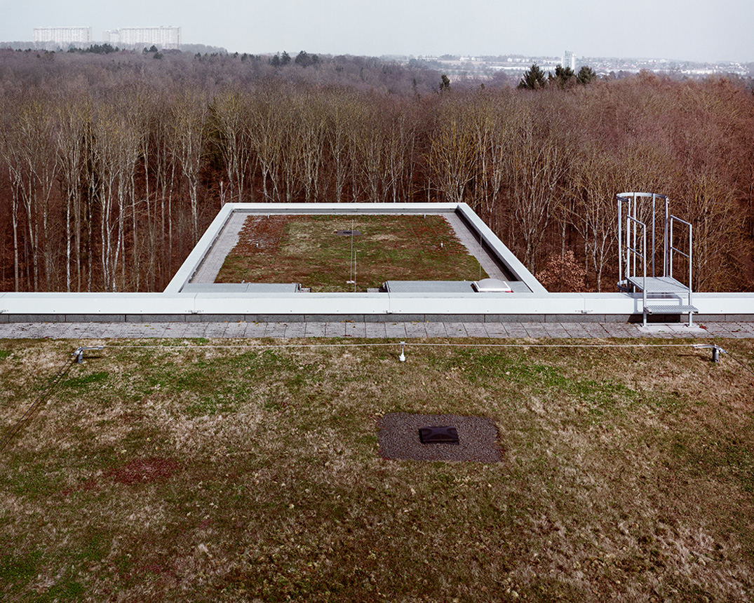
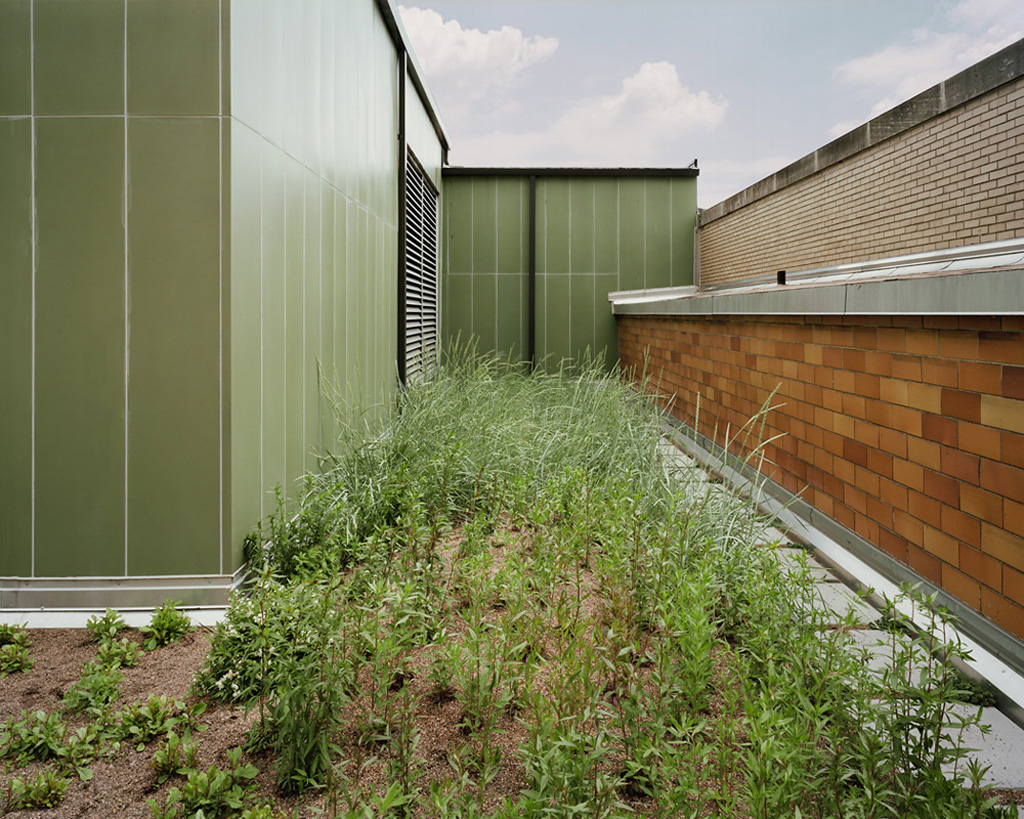
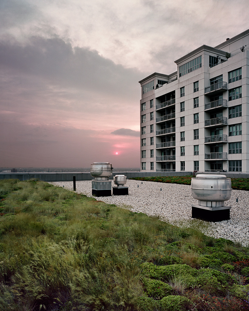
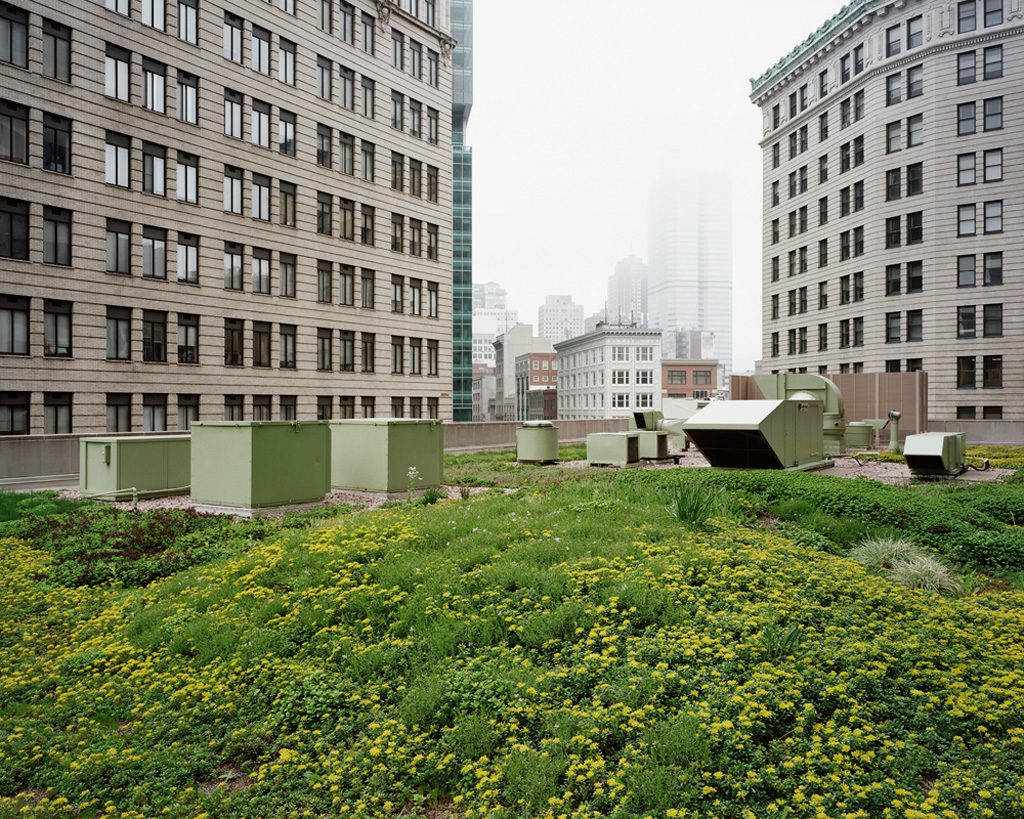
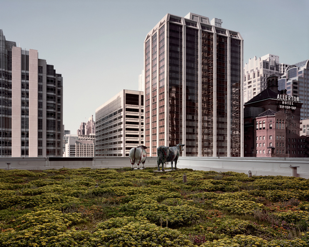
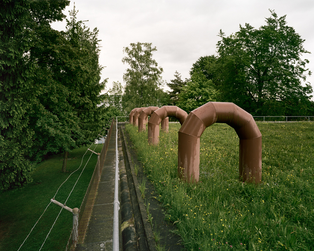
Rooftop draws poetic attention to celebrate and proliferate new ideas in design showing the inventiveness in architecture and accommodating our need for nature. Green roofs reduce our carbon footprint by countering heat island effect and improve storm water control, but they do far more. These pictures symbolize the allure of nature in the face of our continuing urban sprawl. By securely situating the gardens within the steel, stone, and glass rectangularity of urban and industrial buildings, I ask viewers to revel in the far more open patterns, colors, and connection to the sky; and how they become part of a new landscape as well as a framework for positive change. Our ingenuity and grace continues to impress me. It makes me more optimistic about humanity.
 Brad Temkin (USA, 1956). Has been documenting the human impact on the landscape. He has exhibited his photographs in museums and galleries throughout the United States and abroad. Temkin’s works are included in numerous permanent collections, including those of The Art Institute of Chicago; Milwaukee Art Museum; Corcoran Gallery of Art, Washington, D.C.; Museum of Fine Arts, Houston; Akron Art Museum, Ohio; and Museum of Contemporary Photography, Chicago, among others. His images have appeared in such publications as Aperture, Black & White Magazine, TIME Magazine and European Photography.
Most of my career has focused on our relationship with nature. I’m interested in how we find ways to accommodate nature, and how it accommodates us. As with most bodies of work, the pictures define my intent. But in the end, I make the pictures I do because of the conversation that occurs between the subject and myself - and this always depends on the light, the weather, how I'm feeling and what I am open to seeing at the moment. It's the moment all things come together for me.
Rooftop draws poetic attention to celebrate and proliferate new ideas in design showing the inventiveness in architecture and accommodating our need for nature. Green roofs reduce our carbon footprint by countering heat island effect and improve storm water control, but they do far more. These pictures symbolize the allure of nature in the face of our continuing urban sprawl. By securely situating the gardens within the steel, stone, and glass rectangularity of urban and industrial buildings, I ask viewers to revel in the far more open patterns, colors, and connection to the sky; and how they become part of a new landscape as well as a framework for positive change. Our ingenuity and grace continues to impress me. It makes me more optimistic about humanity.


 Brad Temkin (USA, 1956). Has been documenting the human impact on the landscape. He has exhibited his photographs in museums and galleries throughout the United States and abroad. Temkin’s works are included in numerous permanent collections, including those of The Art Institute of Chicago; Milwaukee Art Museum; Corcoran Gallery of Art, Washington, D.C.; Museum of Fine Arts, Houston; Akron Art Museum, Ohio; and Museum of Contemporary Photography, Chicago, among others. His images have appeared in such publications as Aperture, Black & White Magazine, TIME Magazine and European Photography.
Barbara Ciurej & Lindsay Lochman
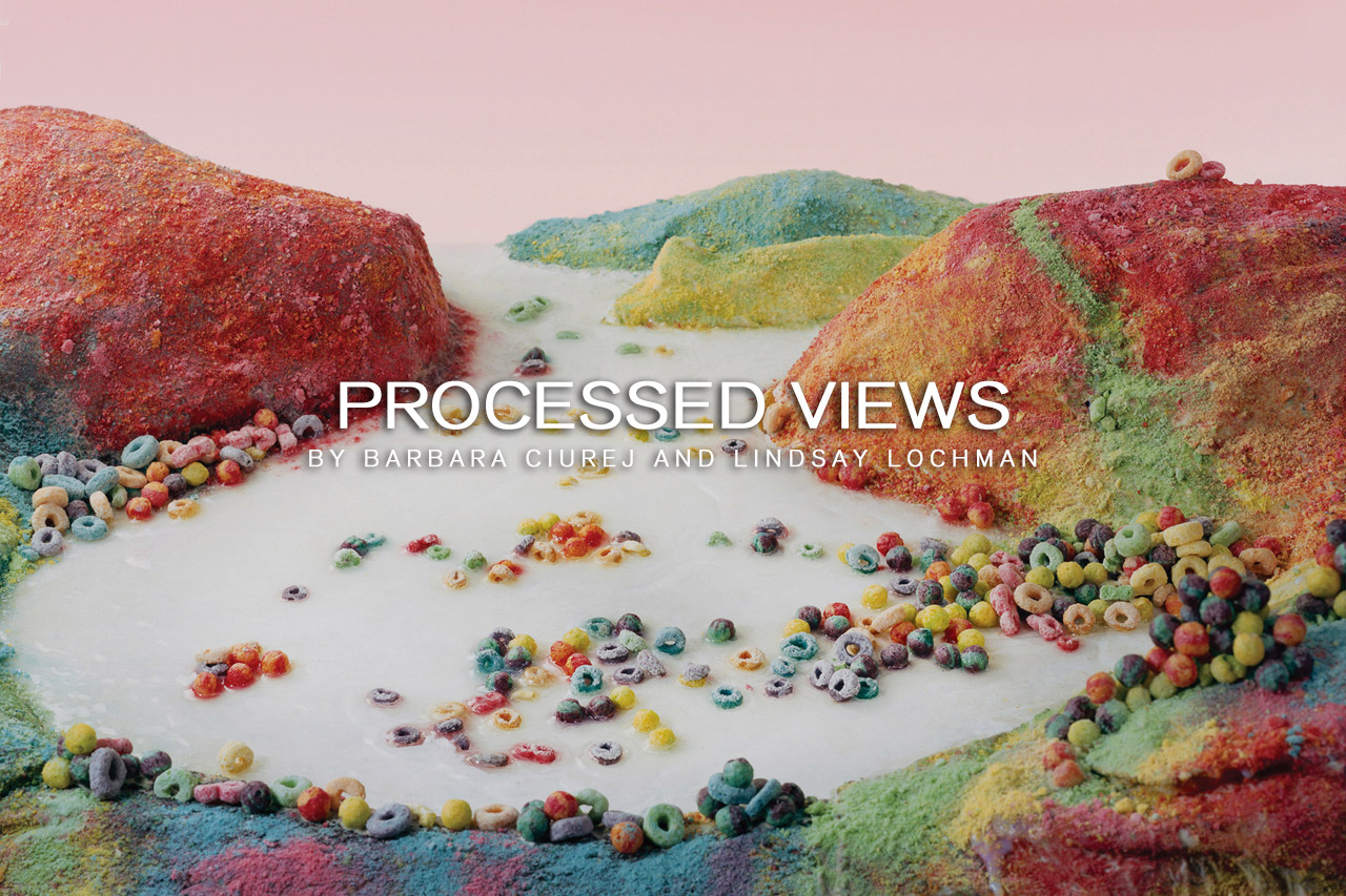
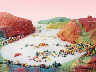
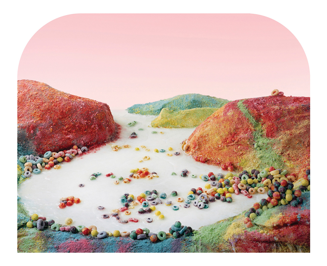
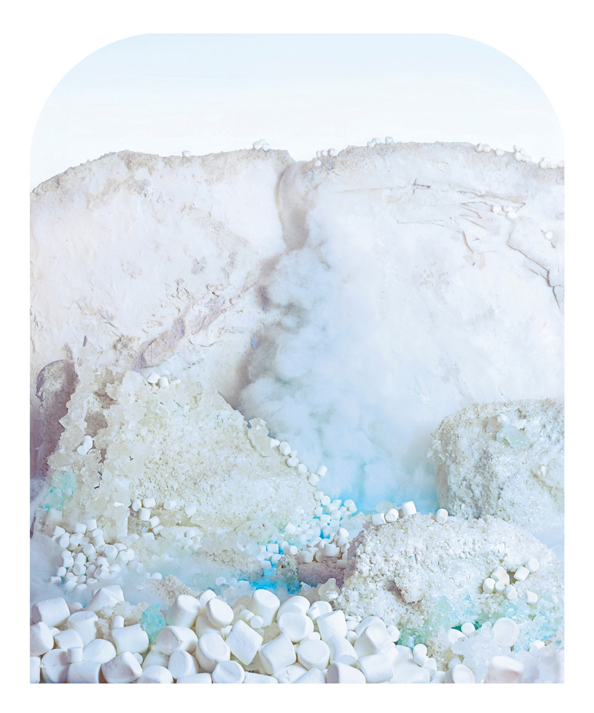
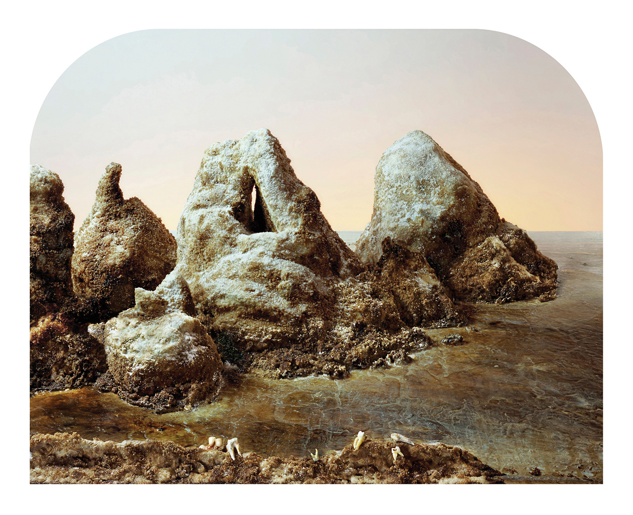
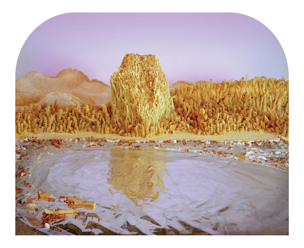
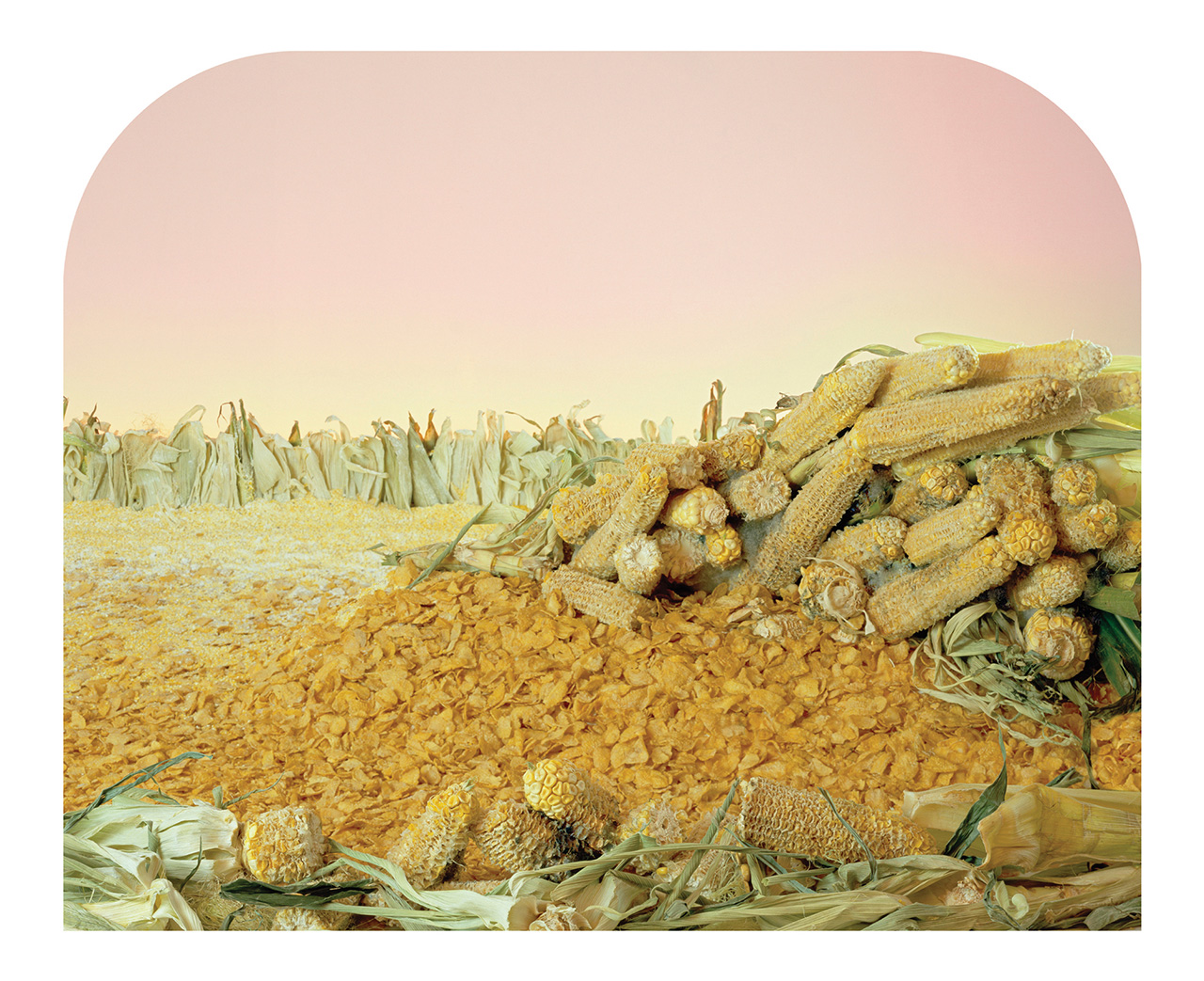
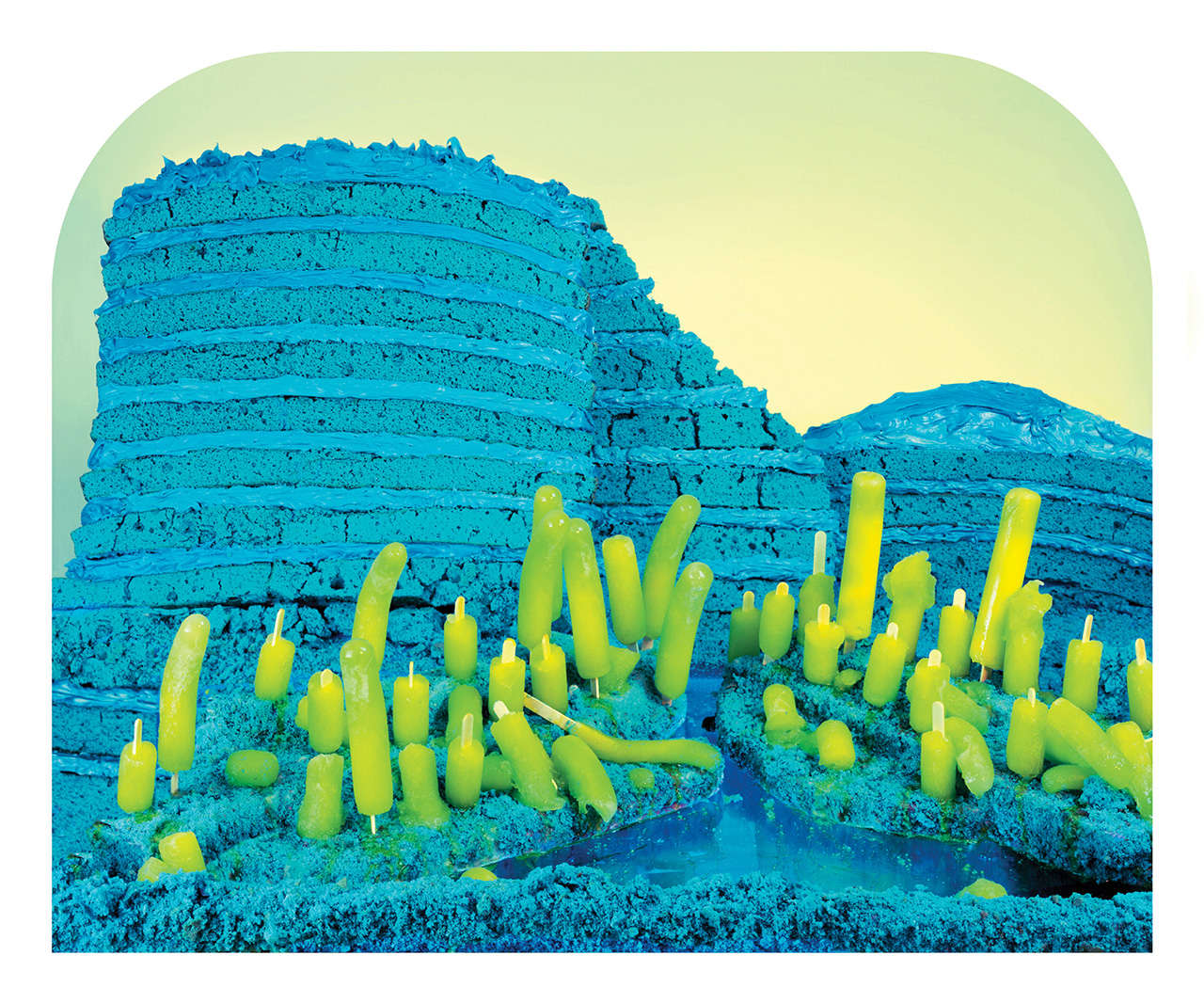
Processed Views interprets the frontier of industrial food production: the seductive and alarming intersection of nature and technology. As we move further away from the sources of our food, we head into uncharted territory replete with unintended consequences for the environment and for our health.
In our commentary on the landscape of processed foods, we reference the work of photographer, Carleton Watkins (1829-1916). His sublime views framed the American West as a land of endless possibilities and significantly influenced the creation of the first national parks. However, many of Watkins’ photographs were commissioned by the corporate interests of the day; the railroad, mining, lumber and milling companies. His commissions served as both documentation of and advertisement for the American West. Watkins’ views expessed the popular 19th century notion of Manifest Destiny – America’s bountiful land, inevitably and justifiably utilized by its citizens.
We built these views to examine consumption, progress and the changing landscape.
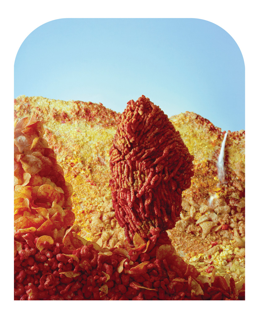
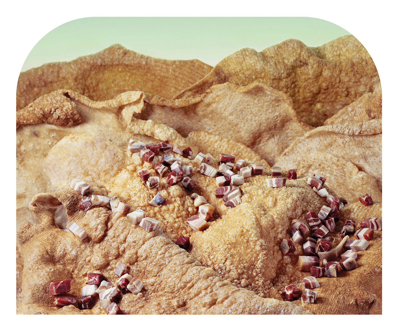
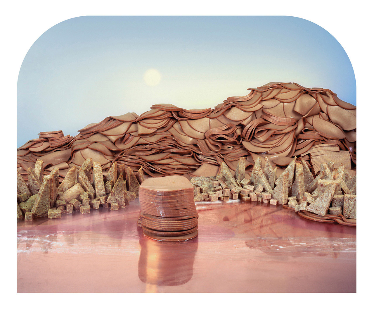
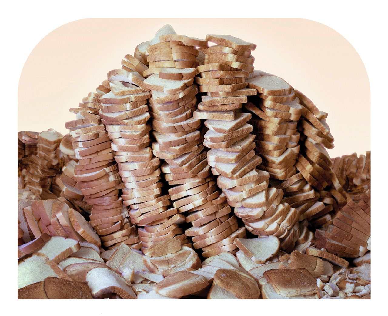
 Barbara Ciurej & Lindsay Lochman (USA). Collaborate on photographic projects that address the confluence of history, myth and popular culture. Their work has been exhibited widely and their photographs are in public and private collections including the Art Institute of Chicago, Walker Art Center, Museum of Contemporary Photography, Milwaukee Art Museum, and the Beinecke Library at Yale University. They are currently exploring the potential of constructed landscapes to describe social inequality. Processed Views is currently on view at Rick Wester Fine Art ,New York, until July 29, 2016.
Processed Views interprets the frontier of industrial food production: the seductive and alarming intersection of nature and technology. As we move further away from the sources of our food, we head into uncharted territory replete with unintended consequences for the environment and for our health.
In our commentary on the landscape of processed foods, we reference the work of photographer, Carleton Watkins (1829-1916). His sublime views framed the American West as a land of endless possibilities and significantly influenced the creation of the first national parks. However, many of Watkins’ photographs were commissioned by the corporate interests of the day; the railroad, mining, lumber and milling companies. His commissions served as both documentation of and advertisement for the American West. Watkins’ views expessed the popular 19th century notion of Manifest Destiny – America’s bountiful land, inevitably and justifiably utilized by its citizens.
We built these views to examine consumption, progress and the changing landscape.


 Barbara Ciurej & Lindsay Lochman (USA). Collaborate on photographic projects that address the confluence of history, myth and popular culture. Their work has been exhibited widely and their photographs are in public and private collections including the Art Institute of Chicago, Walker Art Center, Museum of Contemporary Photography, Milwaukee Art Museum, and the Beinecke Library at Yale University. They are currently exploring the potential of constructed landscapes to describe social inequality. Processed Views is currently on view at Rick Wester Fine Art ,New York, until July 29, 2016.
Liz Hickok
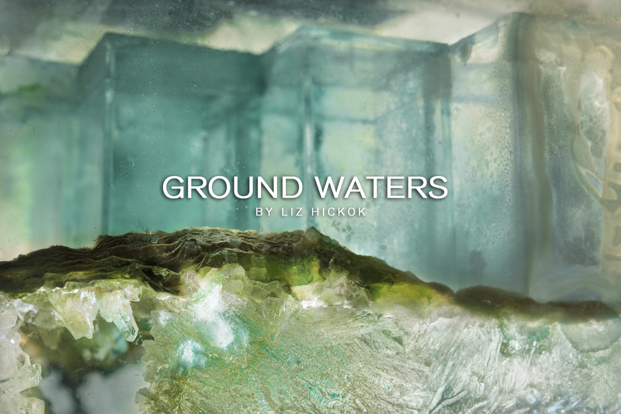
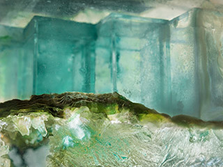
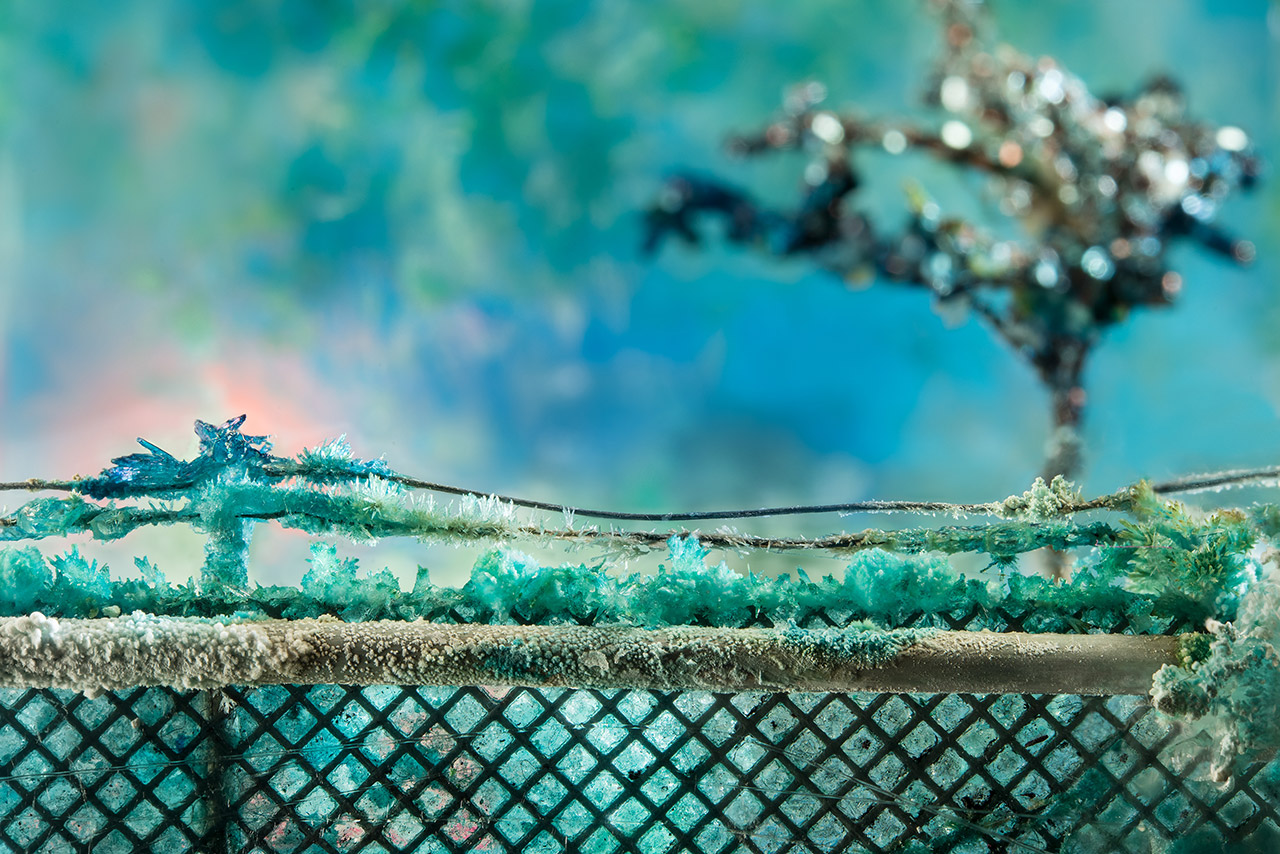
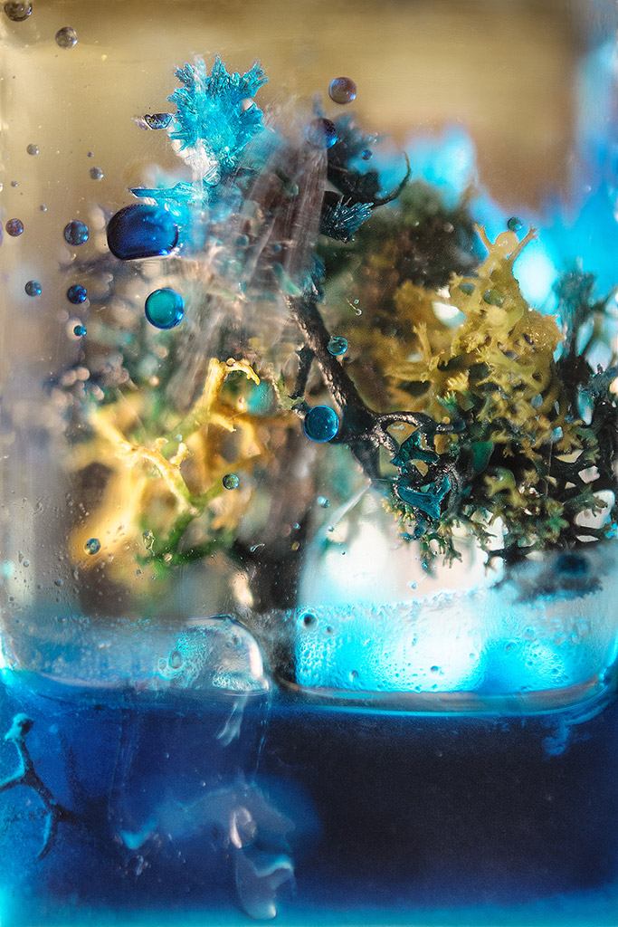
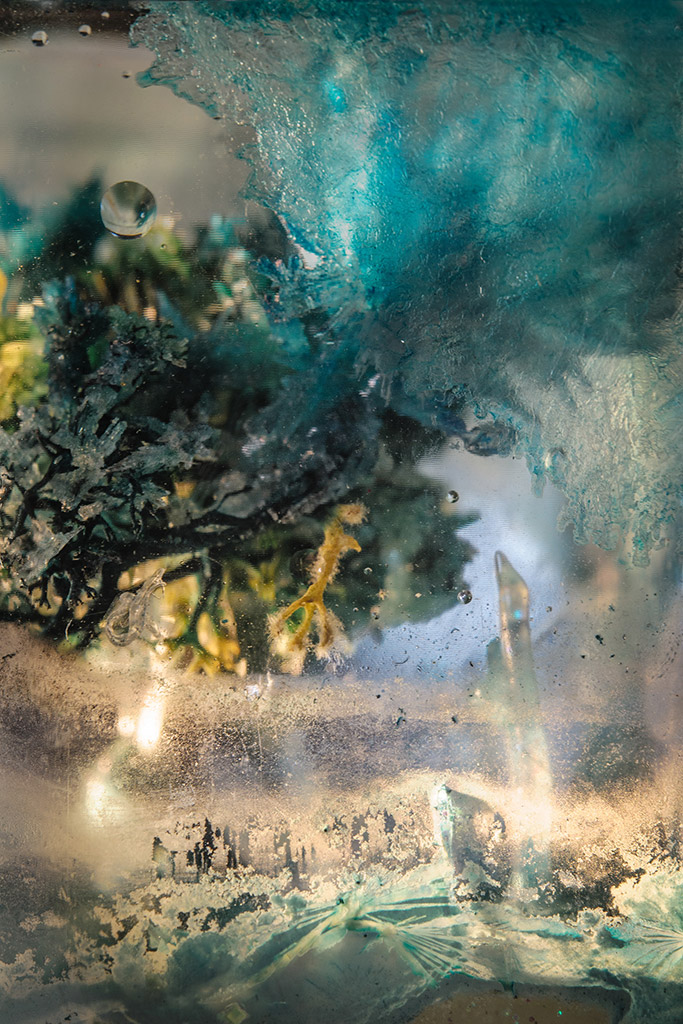
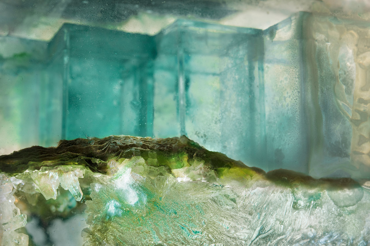
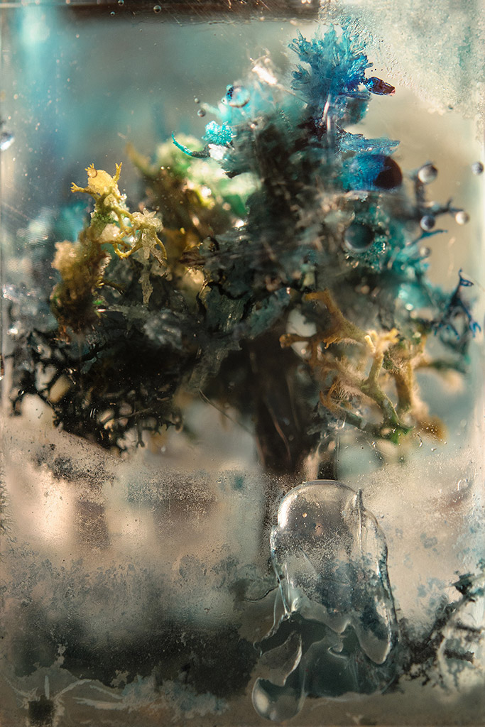
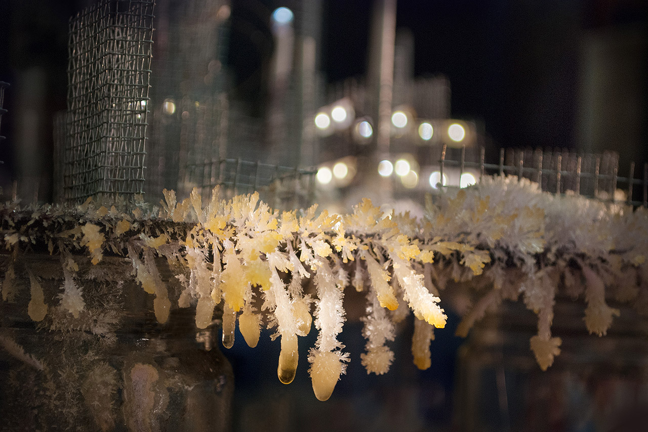
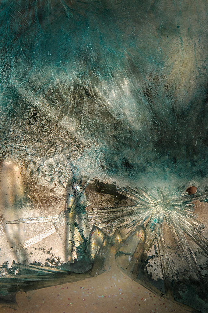
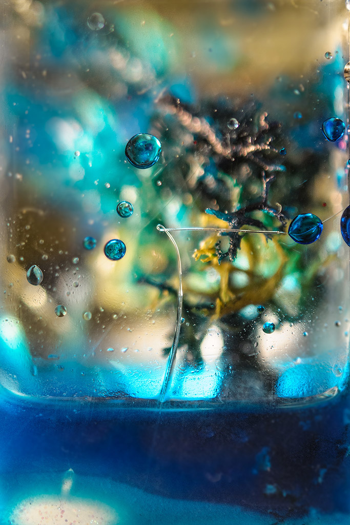
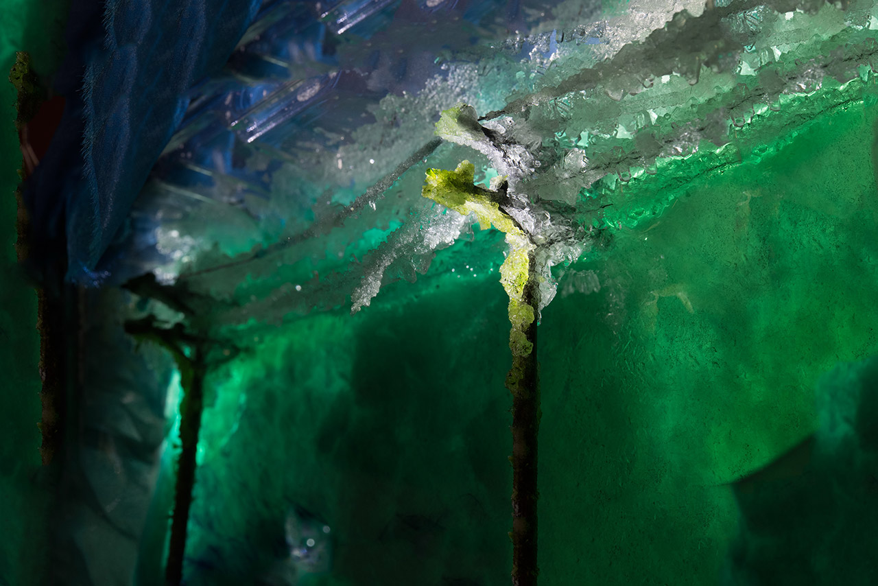
In my Ground Waters series I create miniature worlds where both natural and urban environments are overgrown by strange crystal formations. The colorful tableaux are playful in their materials, but they also allude to our environment being saturated by pollution.
I assemble and combine various elements, like a science experiment, and then I flood the scene with a liquid crystal solution. Over the course of a few hours, days, or weeks, the crystals re-form, permeating the small model. I enjoy the conflicting processes of control and lack thereof.


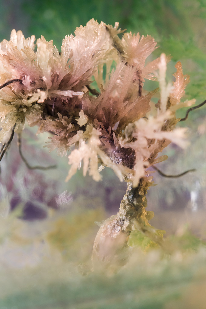
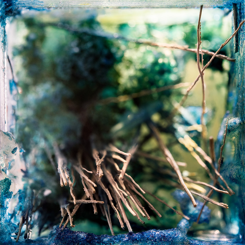
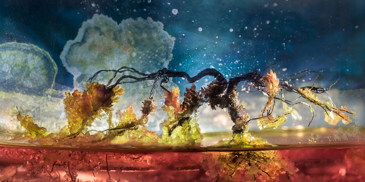

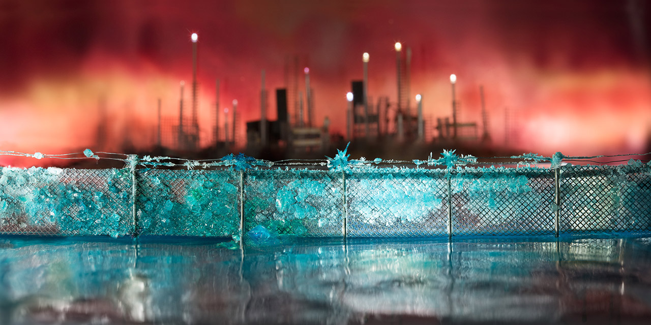




 Liz Hickok (USA). artist working in photography, video, sculpture, and installation. Hickok received her Masters in Fine Arts from Mills College in Oakland, California. She earned a BFA and BA from the School of the Museum of Fine Arts and Tufts University in Boston, Massachusetts. Hickok lived and worked in Boston for over ten years before moving to the San Francisco Bay Area.
In my Ground Waters series I create miniature worlds where both natural and urban environments are overgrown by strange crystal formations. The colorful tableaux are playful in their materials, but they also allude to our environment being saturated by pollution.
I assemble and combine various elements, like a science experiment, and then I flood the scene with a liquid crystal solution. Over the course of a few hours, days, or weeks, the crystals re-form, permeating the small model. I enjoy the conflicting processes of control and lack thereof.


 Liz Hickok (USA). artist working in photography, video, sculpture, and installation. Hickok received her Masters in Fine Arts from Mills College in Oakland, California. She earned a BFA and BA from the School of the Museum of Fine Arts and Tufts University in Boston, Massachusetts. Hickok lived and worked in Boston for over ten years before moving to the San Francisco Bay Area.
Rebecca Reeve
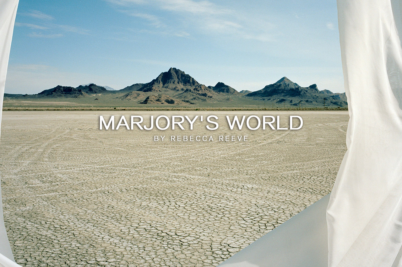
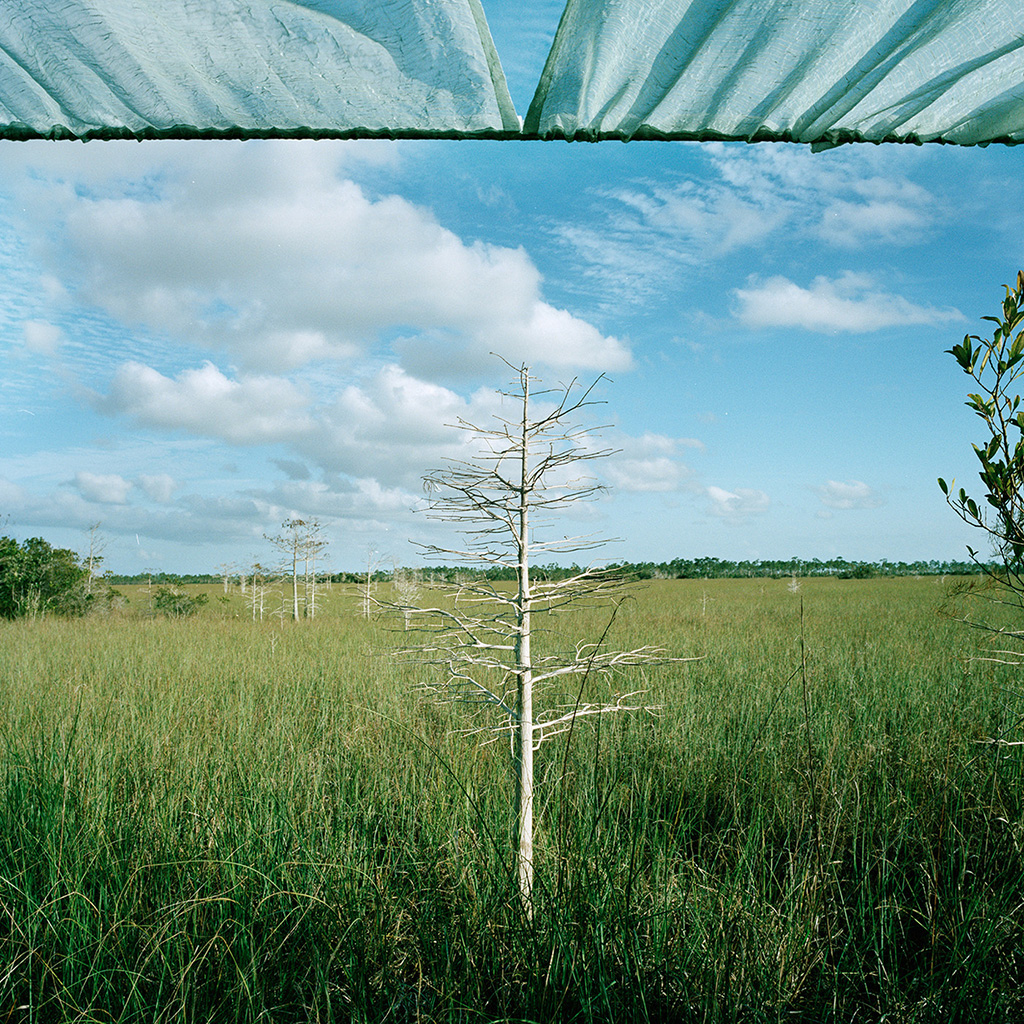
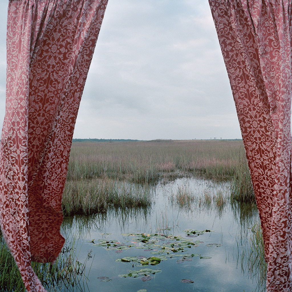
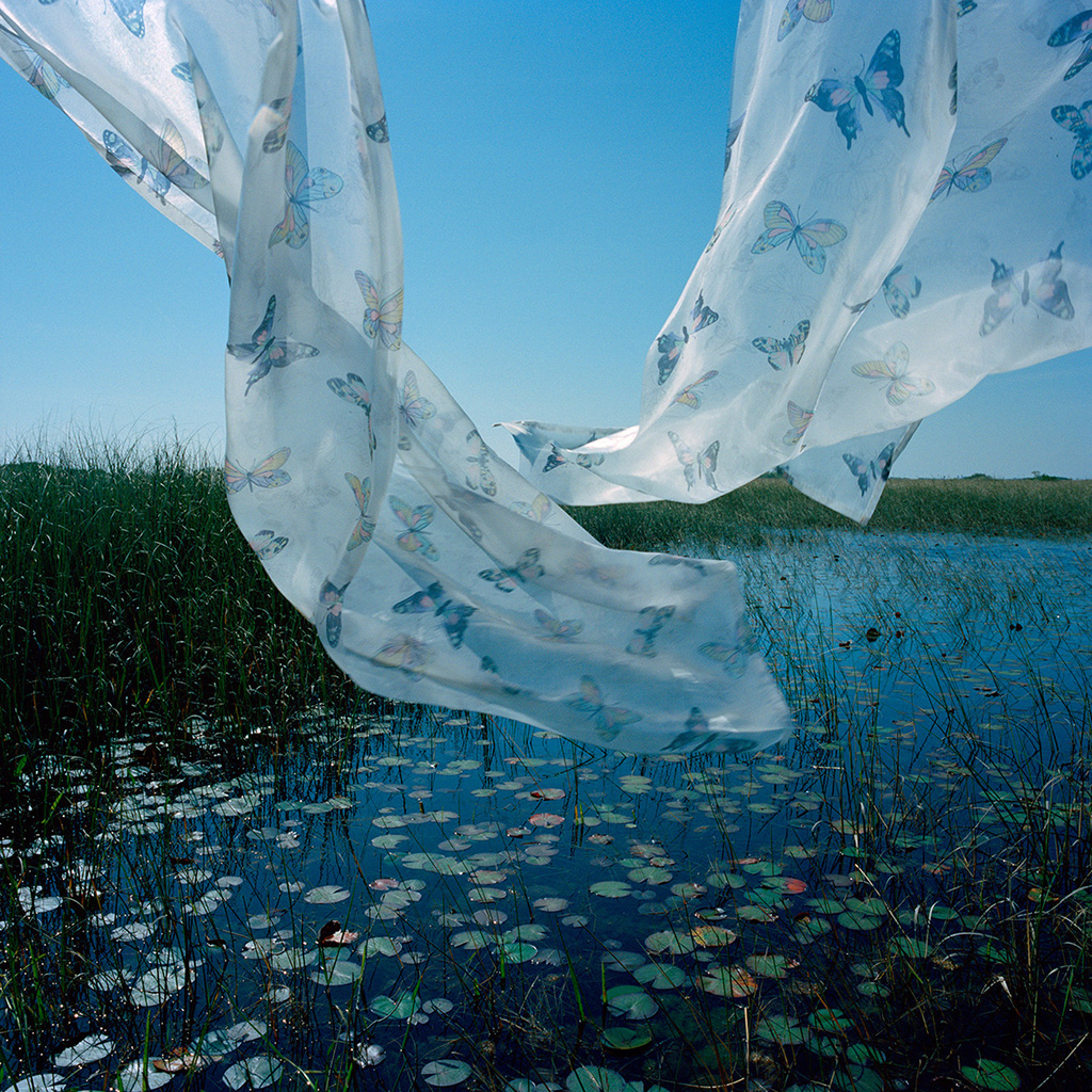
The miracle of light pours over the green and brown expanse of saw grass and of water, shining and slowly moving, the grass and the water that is the meaning and the central fact of the Everglades. It is a river of grass. —Marjory Stoneman Douglas
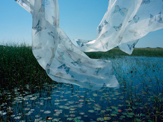
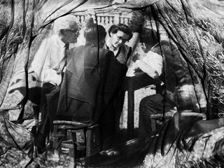
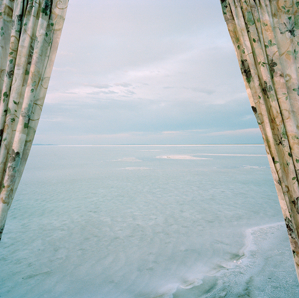
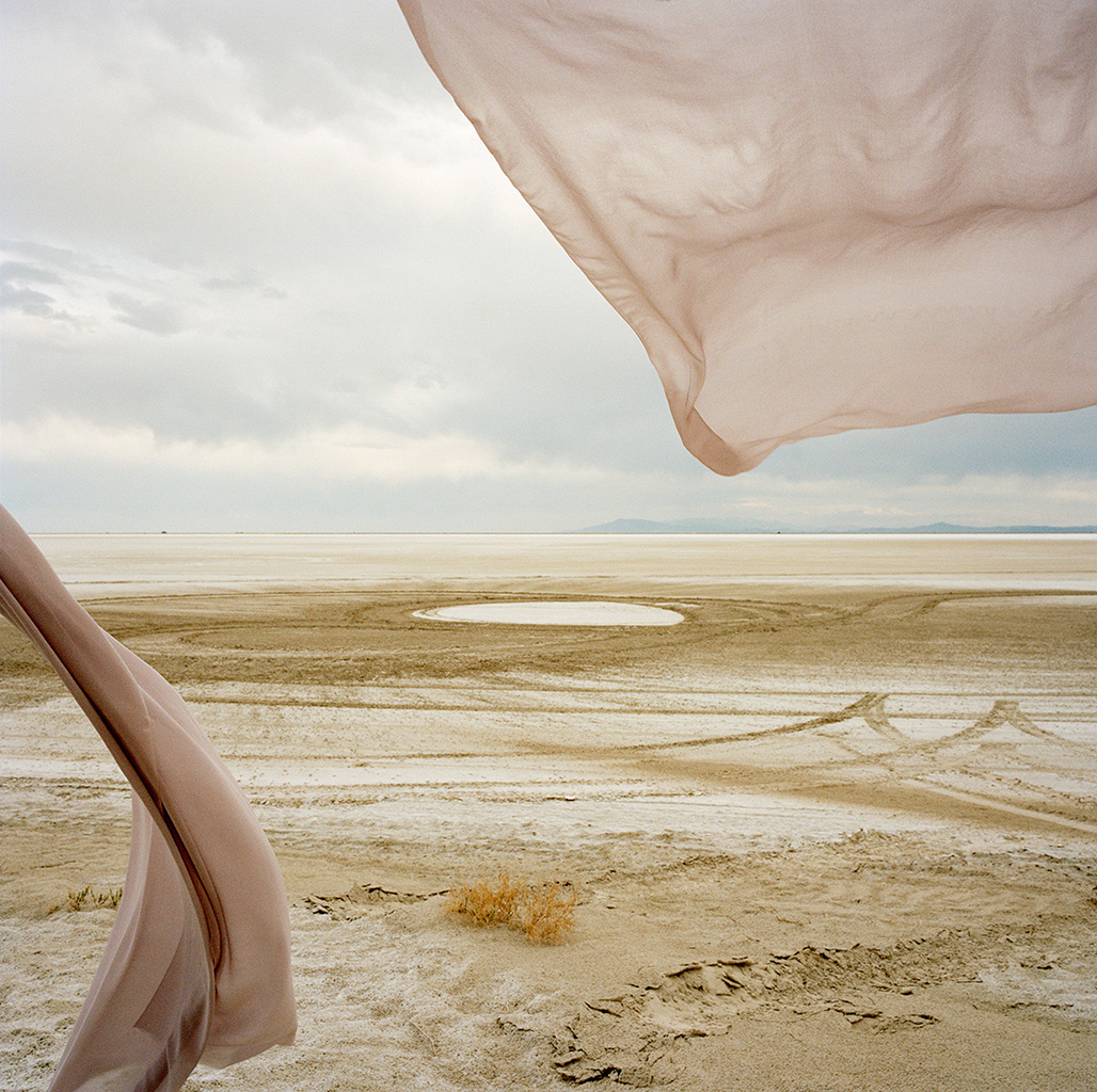
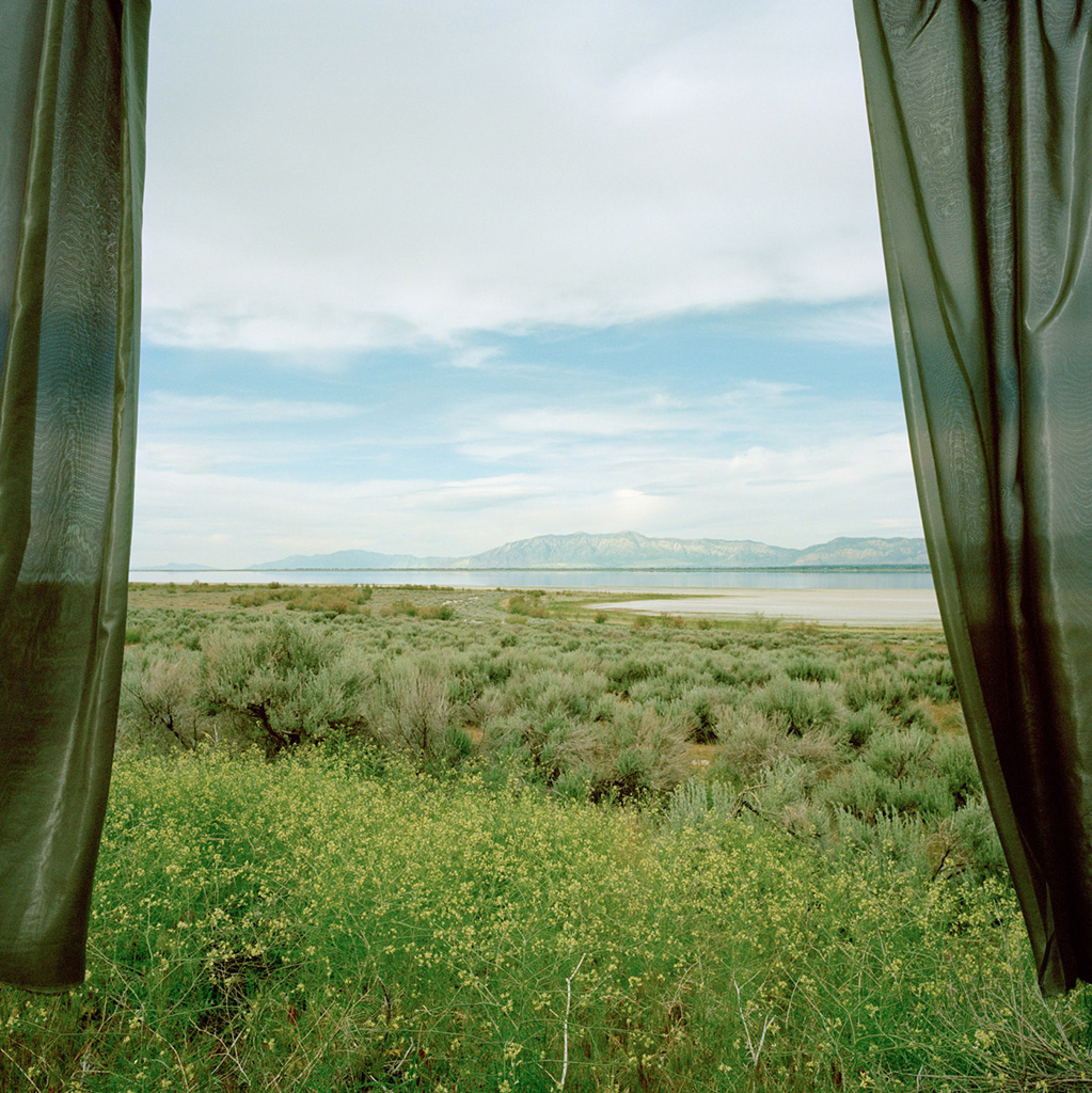
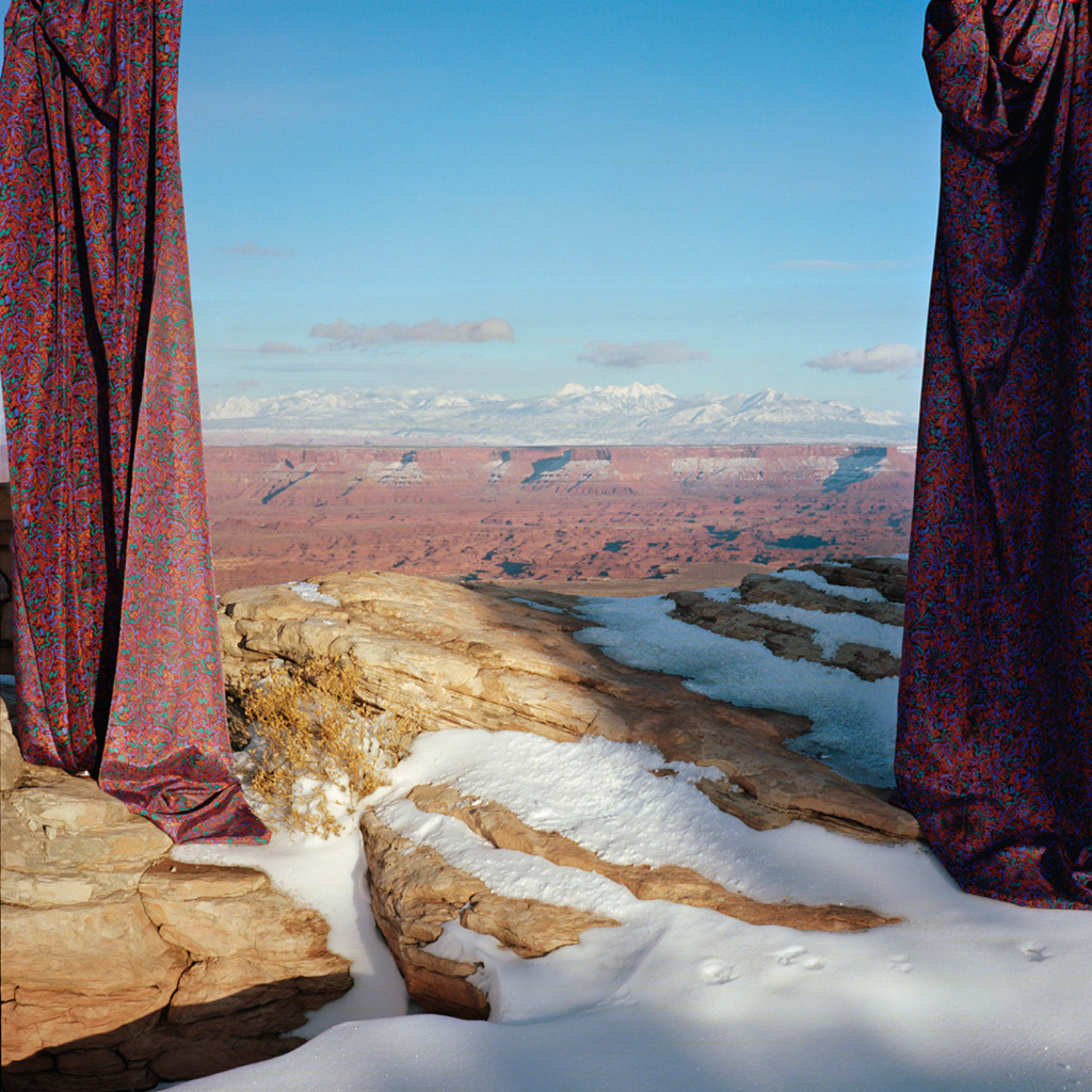
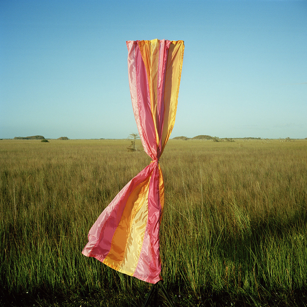
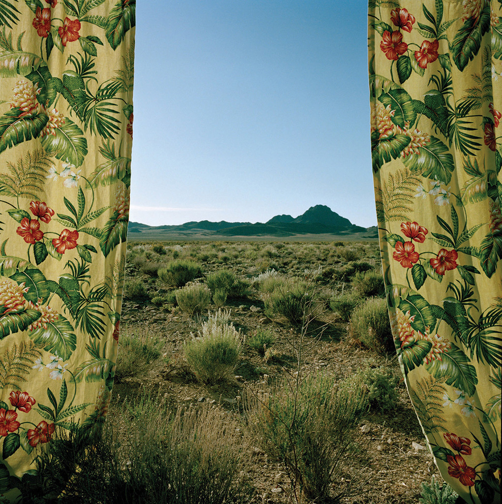
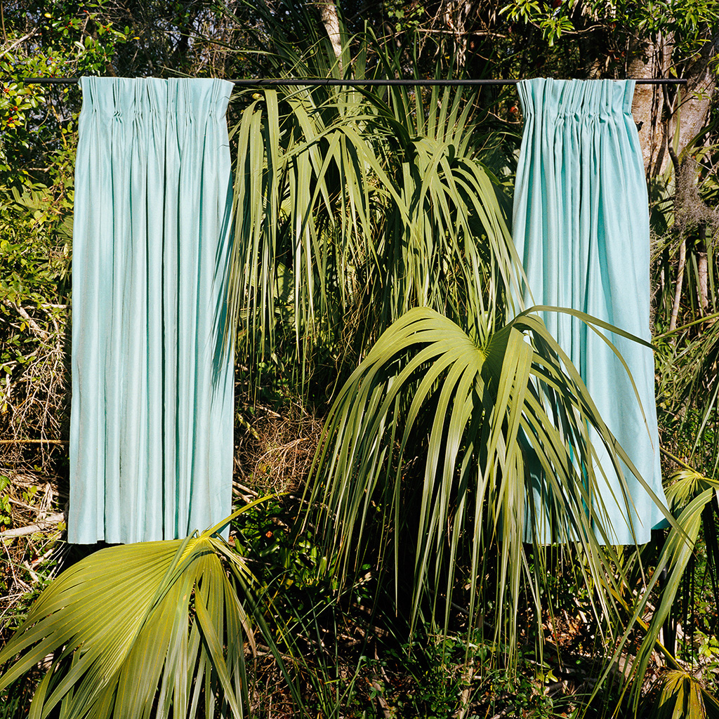
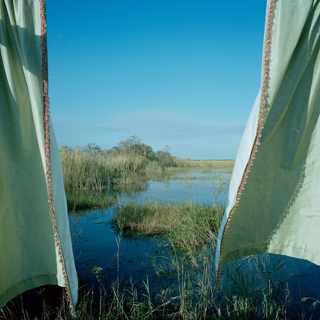
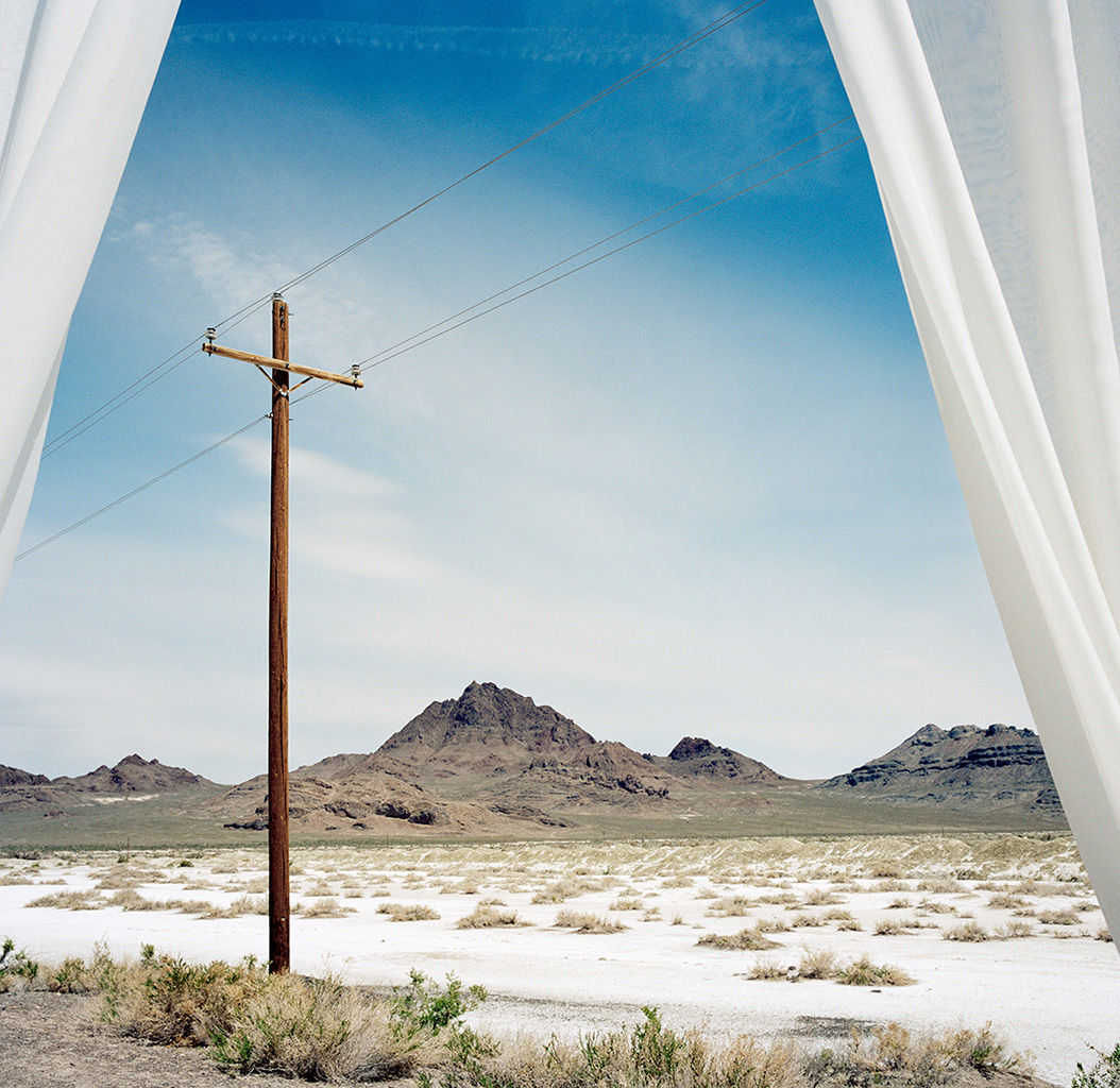
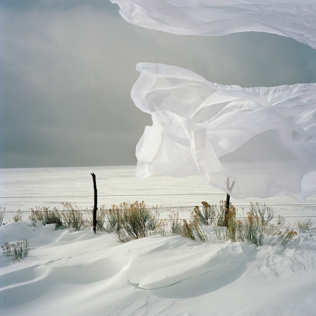
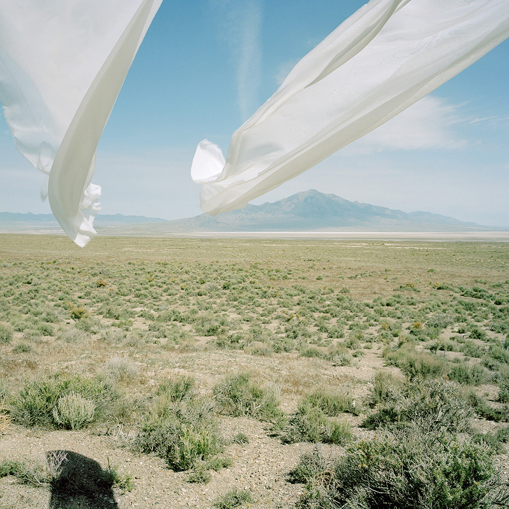
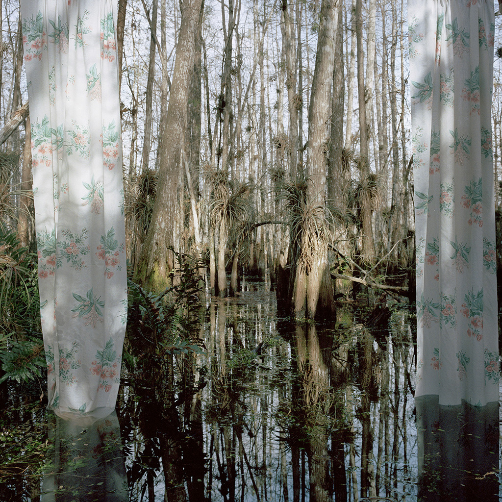
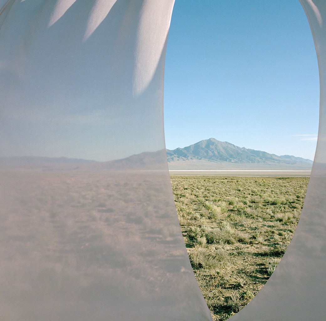
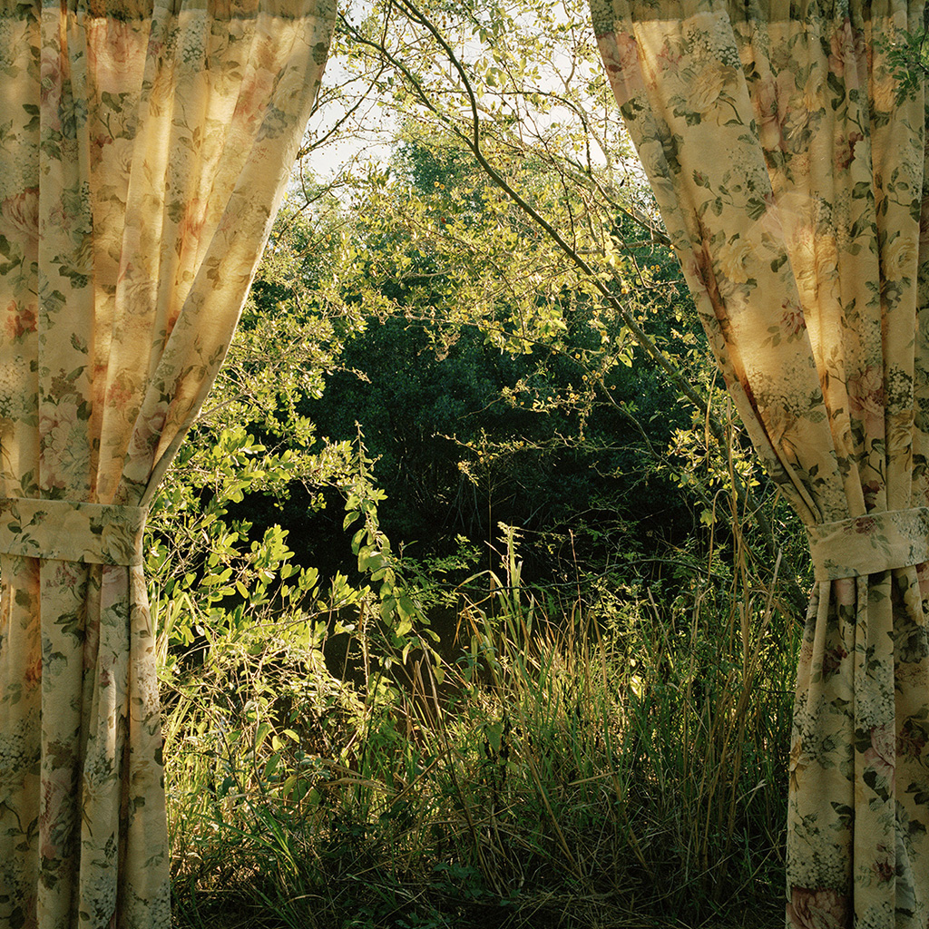
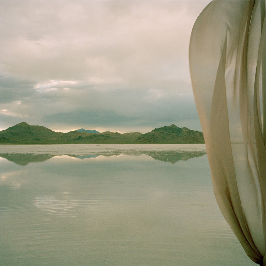
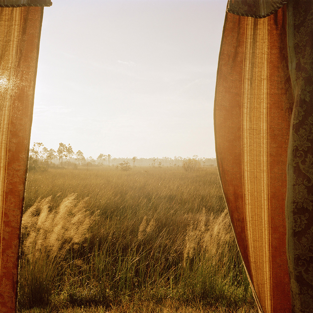
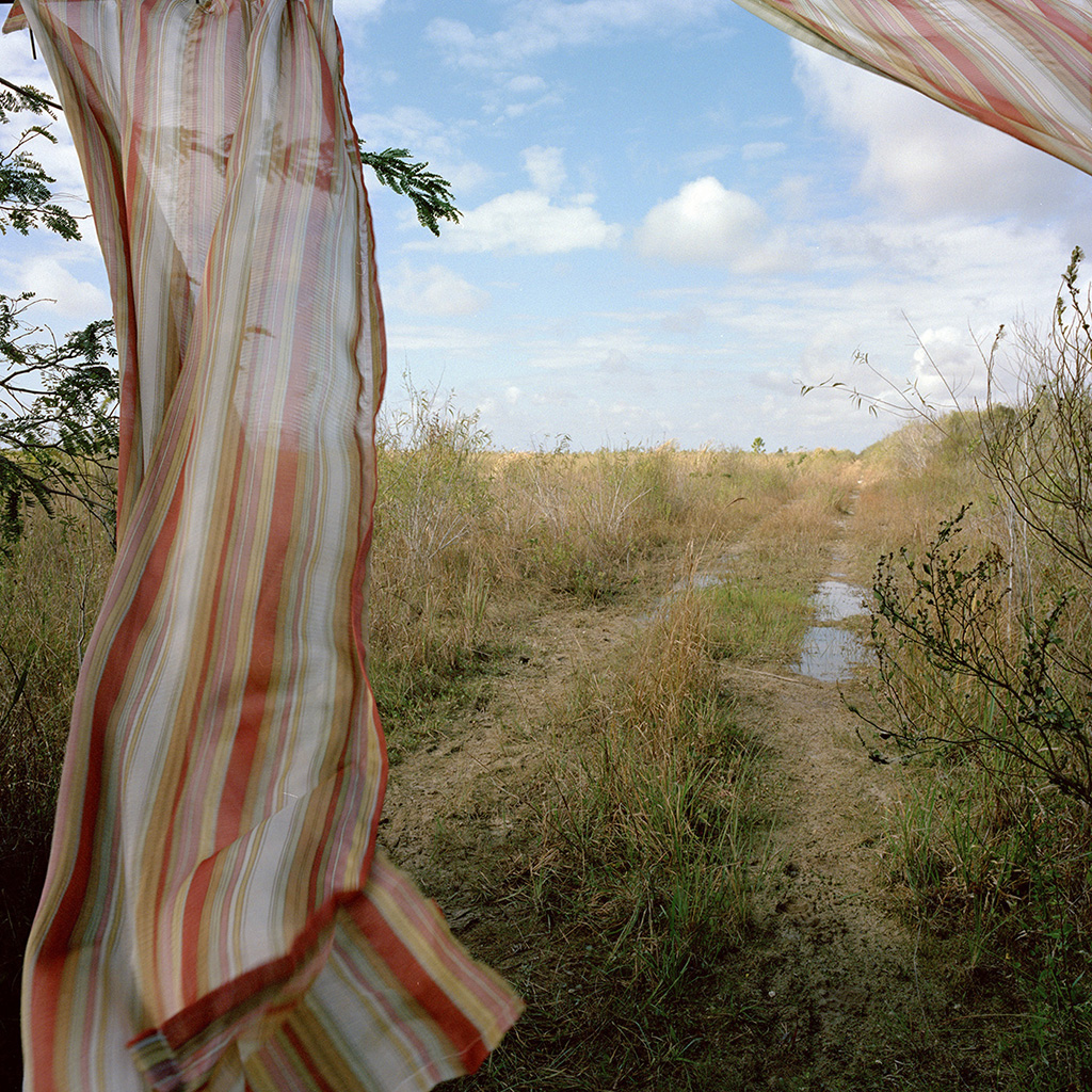
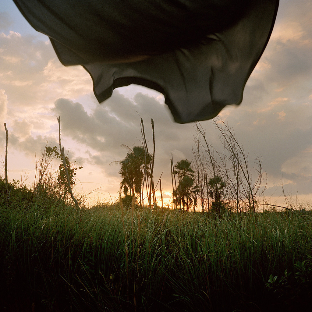
I began this series during my AIRIE residency in the Everglades in December 2012. It draws inspiration from a ritual described in The Rings of Saturn by W.G. Sebald. In Holland in the 1600s, during the wake of the deceased, it was customary to cover all mirrors, landscape paintings and portraits in the home with cloths. It was believed this would make it easier for the soul to leave the body and subdue any temptations for it to stay in this world.
The ritual seemed, by extension, to be a confirmation of the deeply moving experience that one often feels in the natural environment, and thus provided both a literal and contextual frame within which to shoot the landscape, a portal from the domestic into the wilderness. The curtains, all purchased from Goodwill and Salvation Army stores in south Florida and Utah, represent a ‘social fabric’ with a history already attached to them. In our increasingly urban existence that ever distances us from the wilderness experience, the drapes serve as visual connectors to the familiar.
Images from the Marjory's World series will be on show in the exhibition 'Mise en Scene' opening March 16th at Hazan Projects in New York City.
 Rebecca Reeve (England) She received her Bachelor of Fine Arts degree at Bath Spa University and a Masters of Visual Arts at the University of South Wales, Australia. Her photographs have been exhibited nationally and internationally including La Biennale de Montreal, (Canada), Freies Museum, Berlin, (Germany), Museum of Latin American Art, (Buenos Aires), EFA Project Space, (NYC) and the Masur Museum of Art, (Louisiana). In 2013 she was Artist in Residence at AIRIE and the recipient of the Artist in Exploration grant underwritten by Rolex. In 2016 she will be Artist in Residence at Joshua Tree National Park. She lives and works in New York City.
The miracle of light pours over the green and brown expanse of saw grass and of water, shining and slowly moving, the grass and the water that is the meaning and the central fact of the Everglades. It is a river of grass. —Marjory Stoneman Douglas
I began this series during my AIRIE residency in the Everglades in December 2012. It draws inspiration from a ritual described in The Rings of Saturn by W.G. Sebald. In Holland in the 1600s, during the wake of the deceased, it was customary to cover all mirrors, landscape paintings and portraits in the home with cloths. It was believed this would make it easier for the soul to leave the body and subdue any temptations for it to stay in this world.
The ritual seemed, by extension, to be a confirmation of the deeply moving experience that one often feels in the natural environment, and thus provided both a literal and contextual frame within which to shoot the landscape, a portal from the domestic into the wilderness. The curtains, all purchased from Goodwill and Salvation Army stores in south Florida and Utah, represent a ‘social fabric’ with a history already attached to them. In our increasingly urban existence that ever distances us from the wilderness experience, the drapes serve as visual connectors to the familiar.
Images from the Marjory's World series will be on show in the exhibition 'Mise en Scene' opening March 16th at Hazan Projects in New York City.


 Rebecca Reeve (England) She received her Bachelor of Fine Arts degree at Bath Spa University and a Masters of Visual Arts at the University of South Wales, Australia. Her photographs have been exhibited nationally and internationally including La Biennale de Montreal, (Canada), Freies Museum, Berlin, (Germany), Museum of Latin American Art, (Buenos Aires), EFA Project Space, (NYC) and the Masur Museum of Art, (Louisiana). In 2013 she was Artist in Residence at AIRIE and the recipient of the Artist in Exploration grant underwritten by Rolex. In 2016 she will be Artist in Residence at Joshua Tree National Park. She lives and works in New York City.
Jamey Stillings
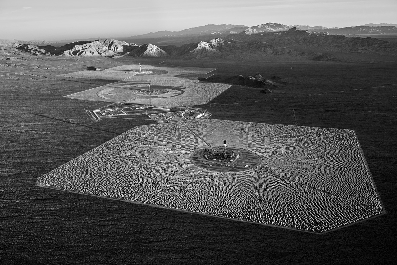
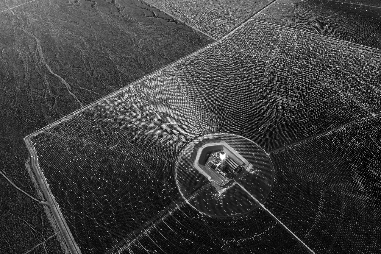
We are at a critical juncture in the evolution of our species. How we choose to live on Earth in the next few decades, with a rapidly growing human population and expanding consumption patterns, may determine not only our prospects for survival, but also the ultimate viability of Earth’s ecosystem.
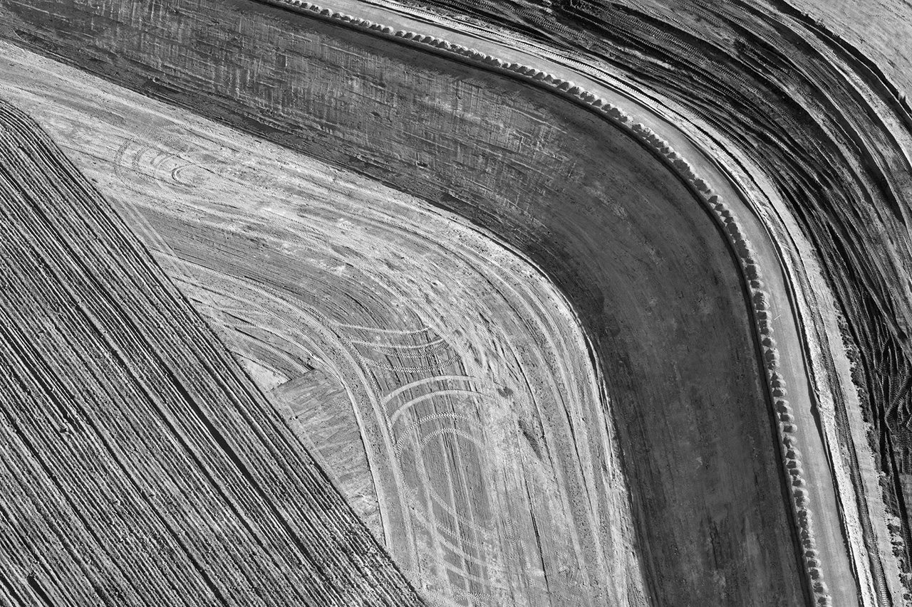
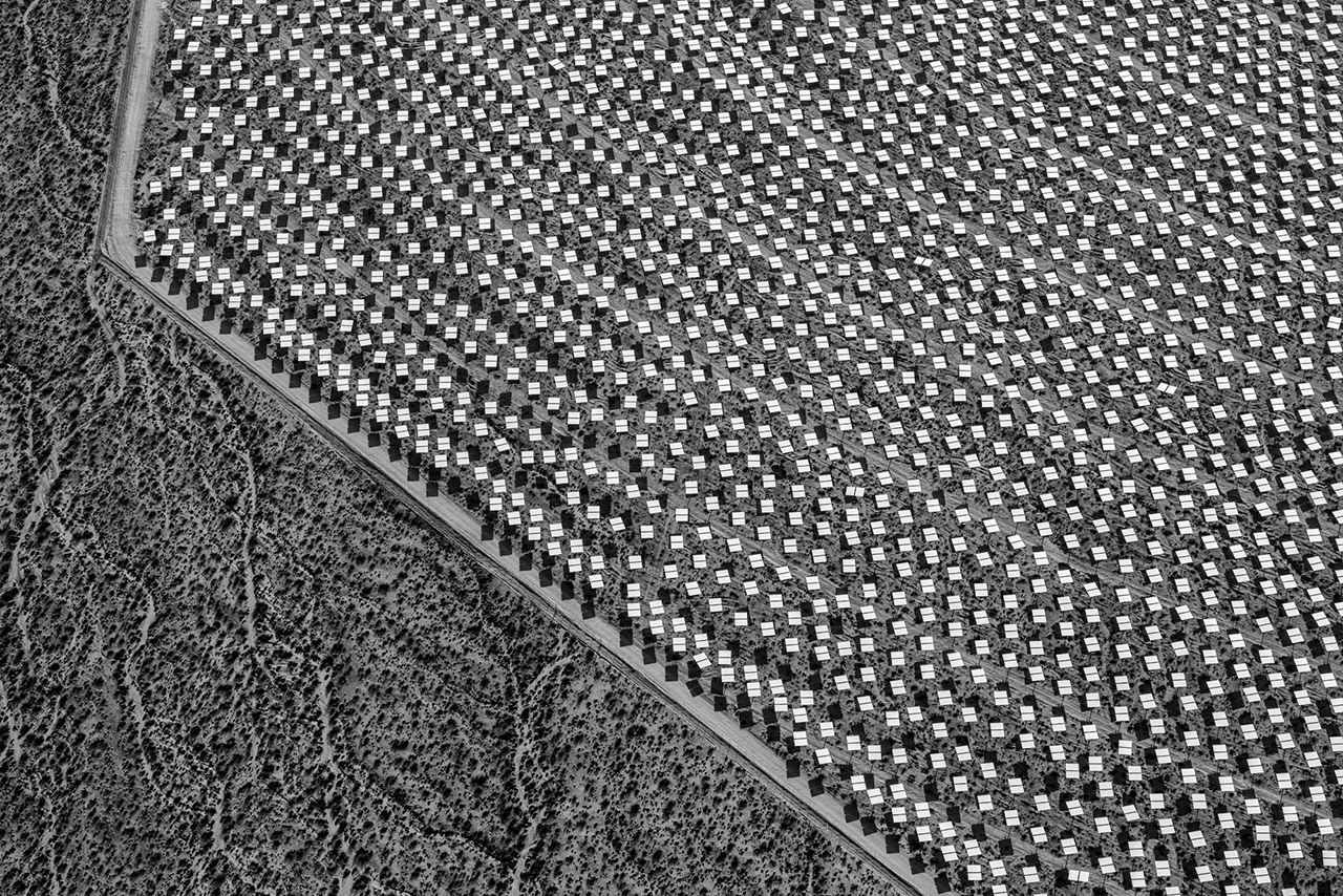
I have long been intrigued by the tension and visual energy created at the nexus of nature and human activity. Uniquely as a species, we modify and use the environment for our perceived needs or enjoyment. Sometimes we consider the future consequences of our actions. More often, we focus myopically on the short-term utility of land and resource use.
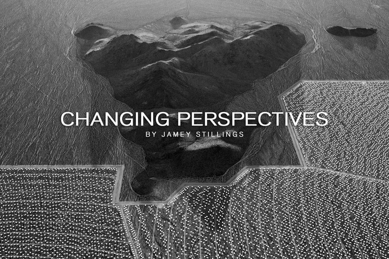
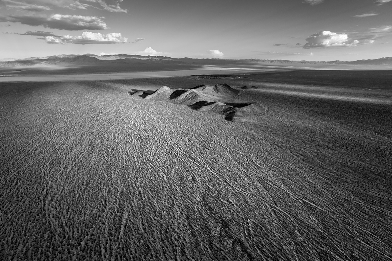
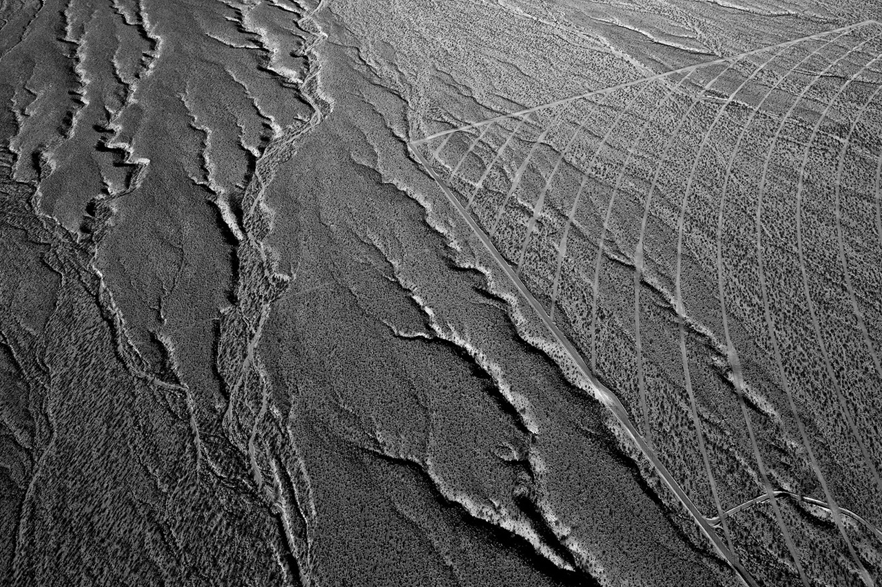
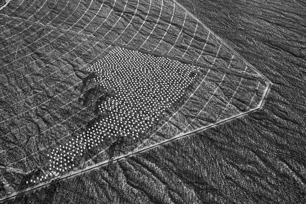
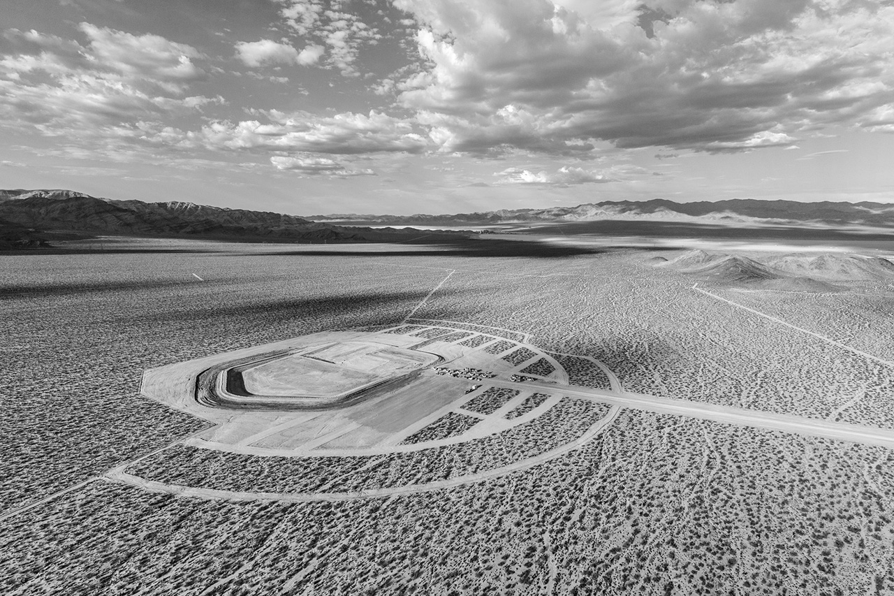
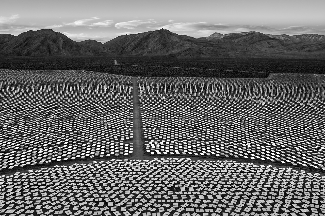
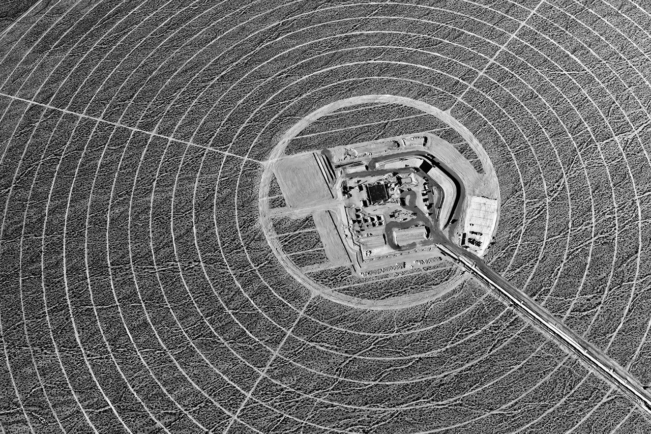
Changing Perspectives is the working title for a connected set of photography projects I will engage in over the next five years. Building upon The Evolution of Ivanpah Solar, a new project, Energy in the American West, will expand my examination of utility-scale renewable energy projects in the United States, while selectively documenting domestic coal, oil, and natural gas energy production.
My primary goal, however, is to develop Changing Perspectives into a project of global scale. New renewable energy capacity is being built around the world at a remarkable pace. Projects, in many countries, on several continents, reflect a growing international commitment to transform our cultures and economies away from a dependence on fossil fuels towards a future that taps the extraordinary sustainable energy of the sun, wind, and tides. I will research and document a select group of renewable energy projects, ones that reflect a proactive commitment to future generations, while also striving to reveal the challenges and compromises such transformations frequently entail.
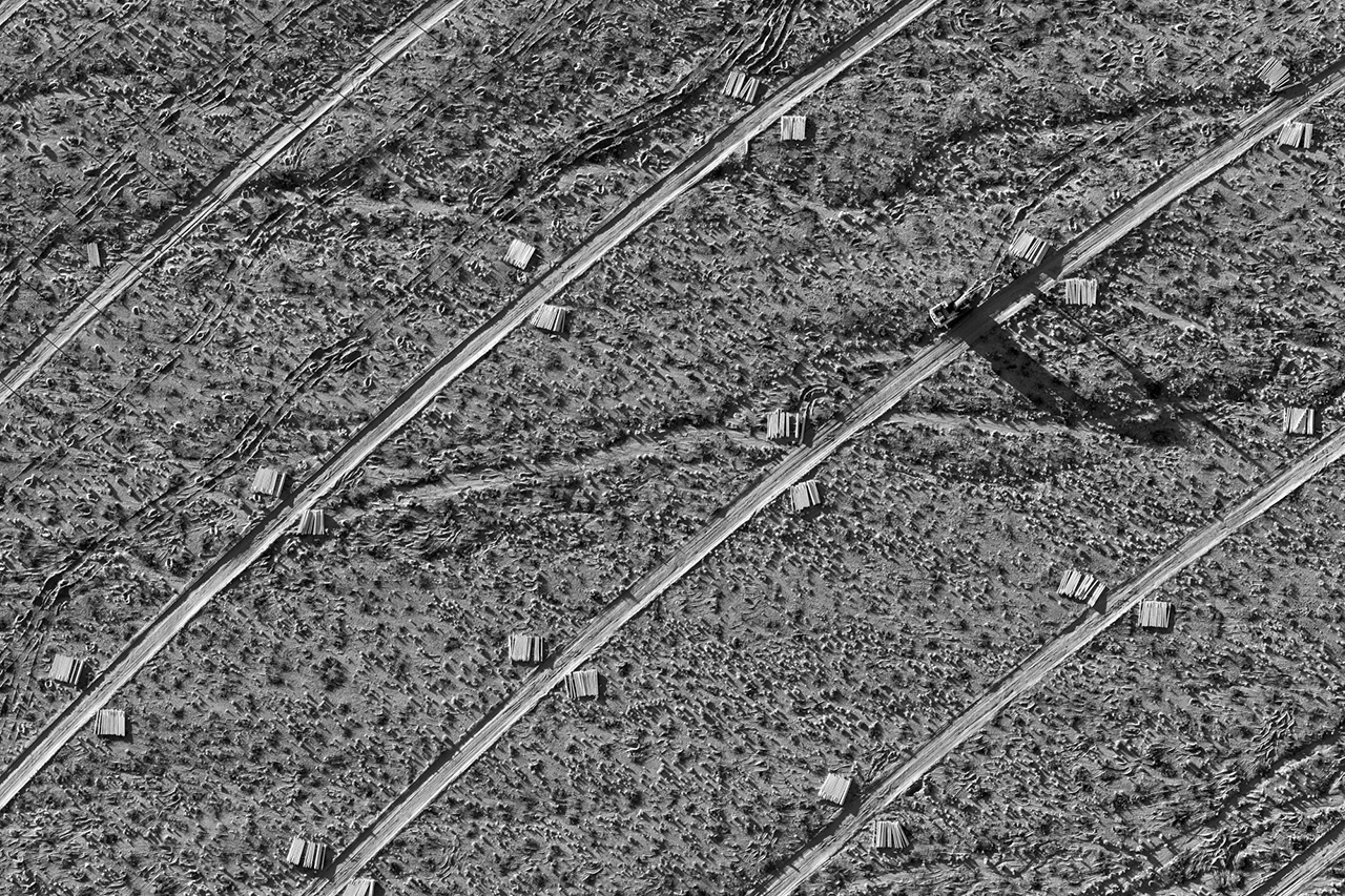
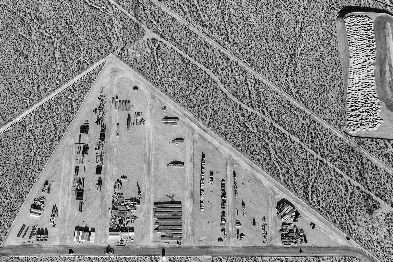
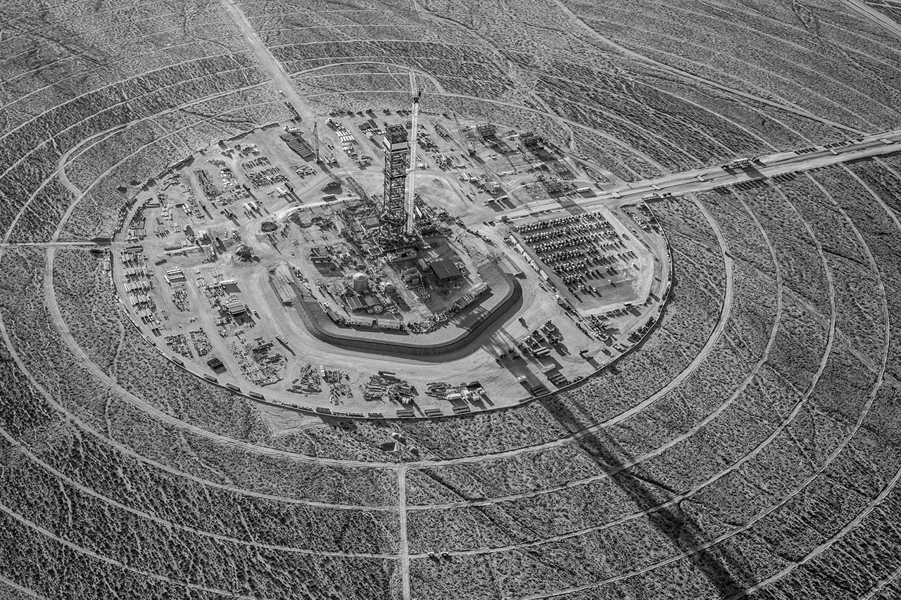
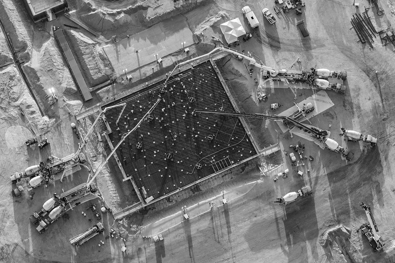
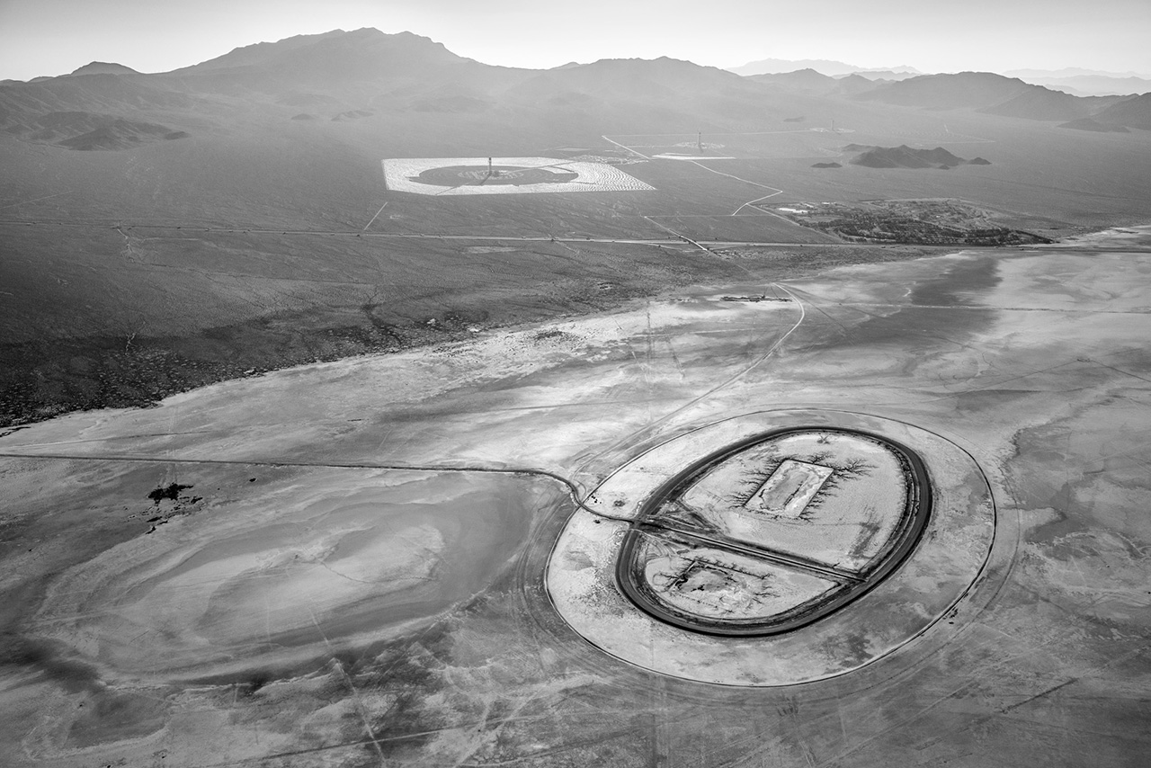
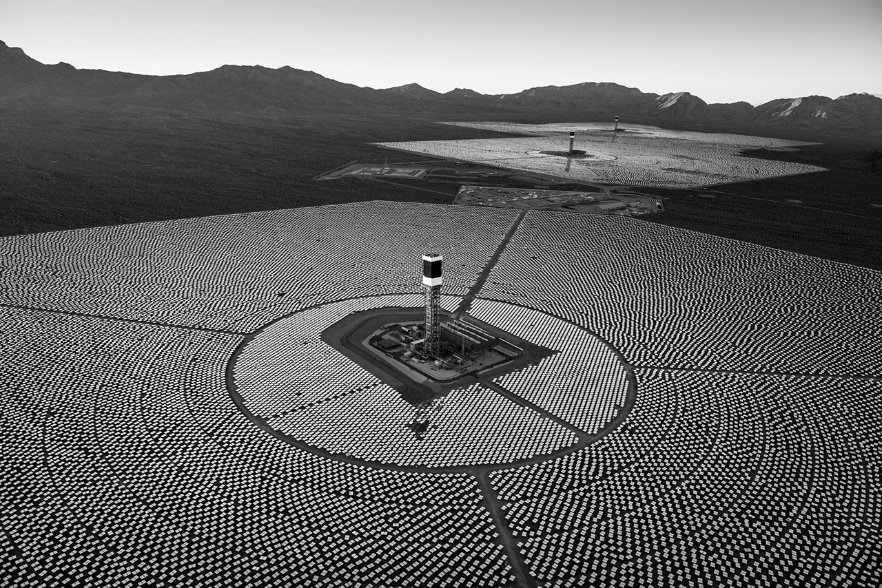
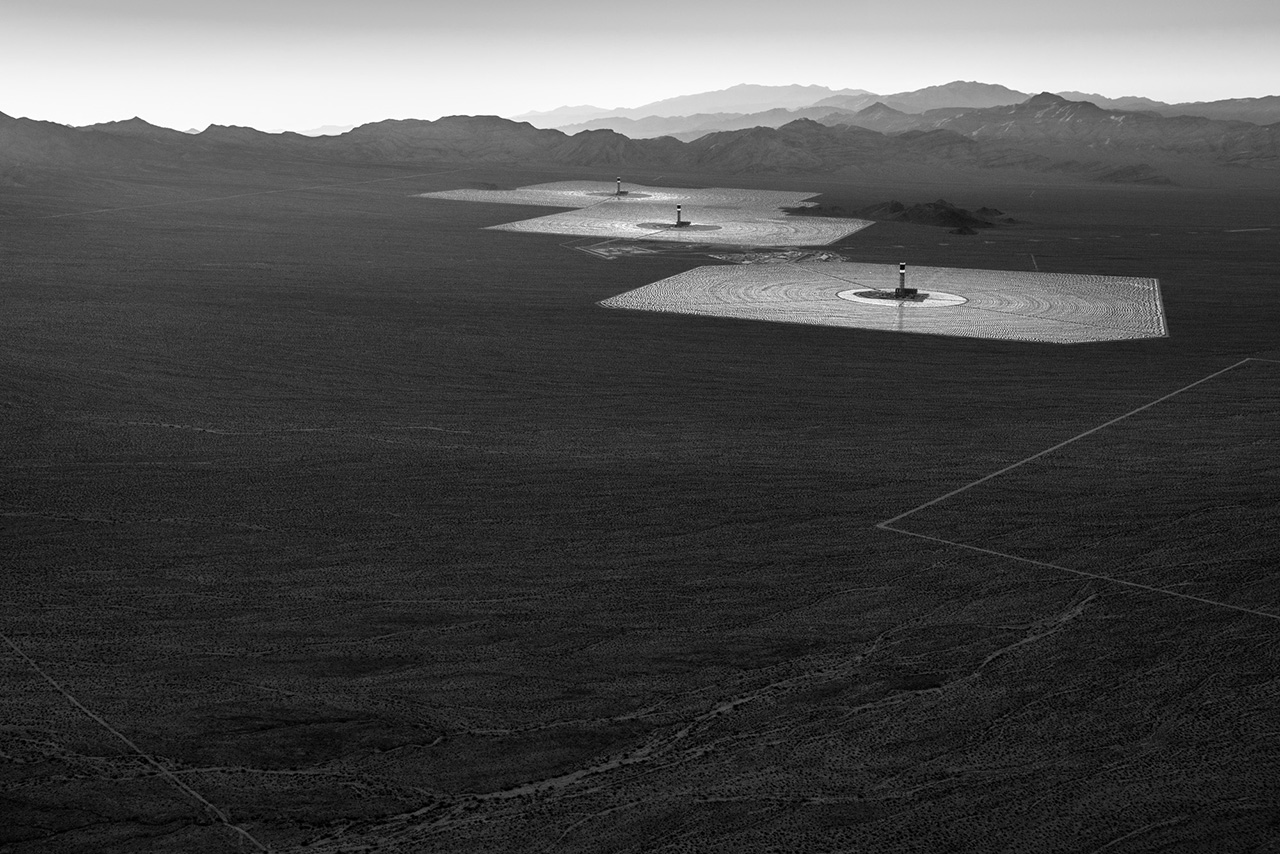
 Jamey Stillings' career spans documentary, fine art and commercial assignment projects. He earned a BA in Art from Willamette University, an MFA in Photography from Rochester Institute of Technology, and has a diverse range of national and international commission clients. Stillings' work is in the collections of the United States Library of Congress, the Museum of Fine Arts, Houston, the Los Angeles County Museum of Art, the Nevada Museum of Art, and several private collections.
We are at a critical juncture in the evolution of our species. How we choose to live on Earth in the next few decades, with a rapidly growing human population and expanding consumption patterns, may determine not only our prospects for survival, but also the ultimate viability of Earth’s ecosystem.
I have long been intrigued by the tension and visual energy created at the nexus of nature and human activity. Uniquely as a species, we modify and use the environment for our perceived needs or enjoyment. Sometimes we consider the future consequences of our actions. More often, we focus myopically on the short-term utility of land and resource use.
Changing Perspectives is the working title for a connected set of photography projects I will engage in over the next five years. Building upon The Evolution of Ivanpah Solar, a new project, Energy in the American West, will expand my examination of utility-scale renewable energy projects in the United States, while selectively documenting domestic coal, oil, and natural gas energy production.
My primary goal, however, is to develop Changing Perspectives into a project of global scale. New renewable energy capacity is being built around the world at a remarkable pace. Projects, in many countries, on several continents, reflect a growing international commitment to transform our cultures and economies away from a dependence on fossil fuels towards a future that taps the extraordinary sustainable energy of the sun, wind, and tides. I will research and document a select group of renewable energy projects, ones that reflect a proactive commitment to future generations, while also striving to reveal the challenges and compromises such transformations frequently entail.


 Jamey Stillings' career spans documentary, fine art and commercial assignment projects. He earned a BA in Art from Willamette University, an MFA in Photography from Rochester Institute of Technology, and has a diverse range of national and international commission clients. Stillings' work is in the collections of the United States Library of Congress, the Museum of Fine Arts, Houston, the Los Angeles County Museum of Art, the Nevada Museum of Art, and several private collections.
Peter Steinhauer
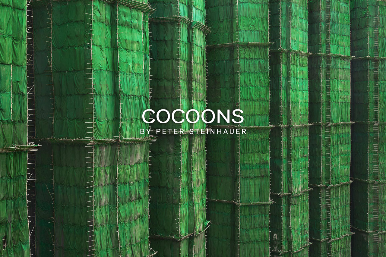
Since 1993, Peter Steinhauer has been documenting the many facets of Asian culture.
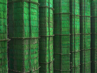
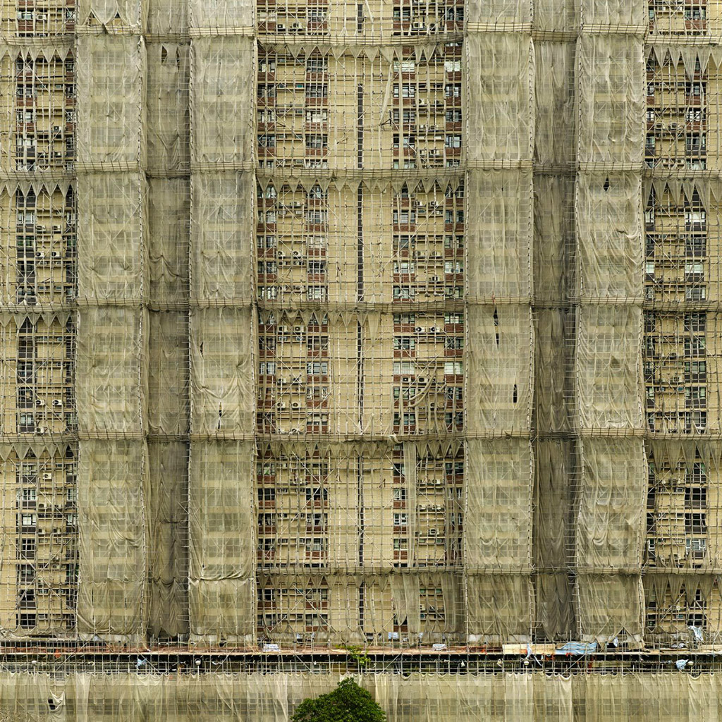
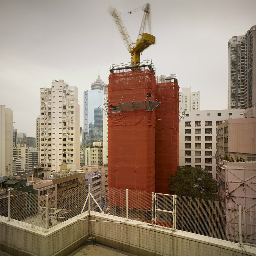
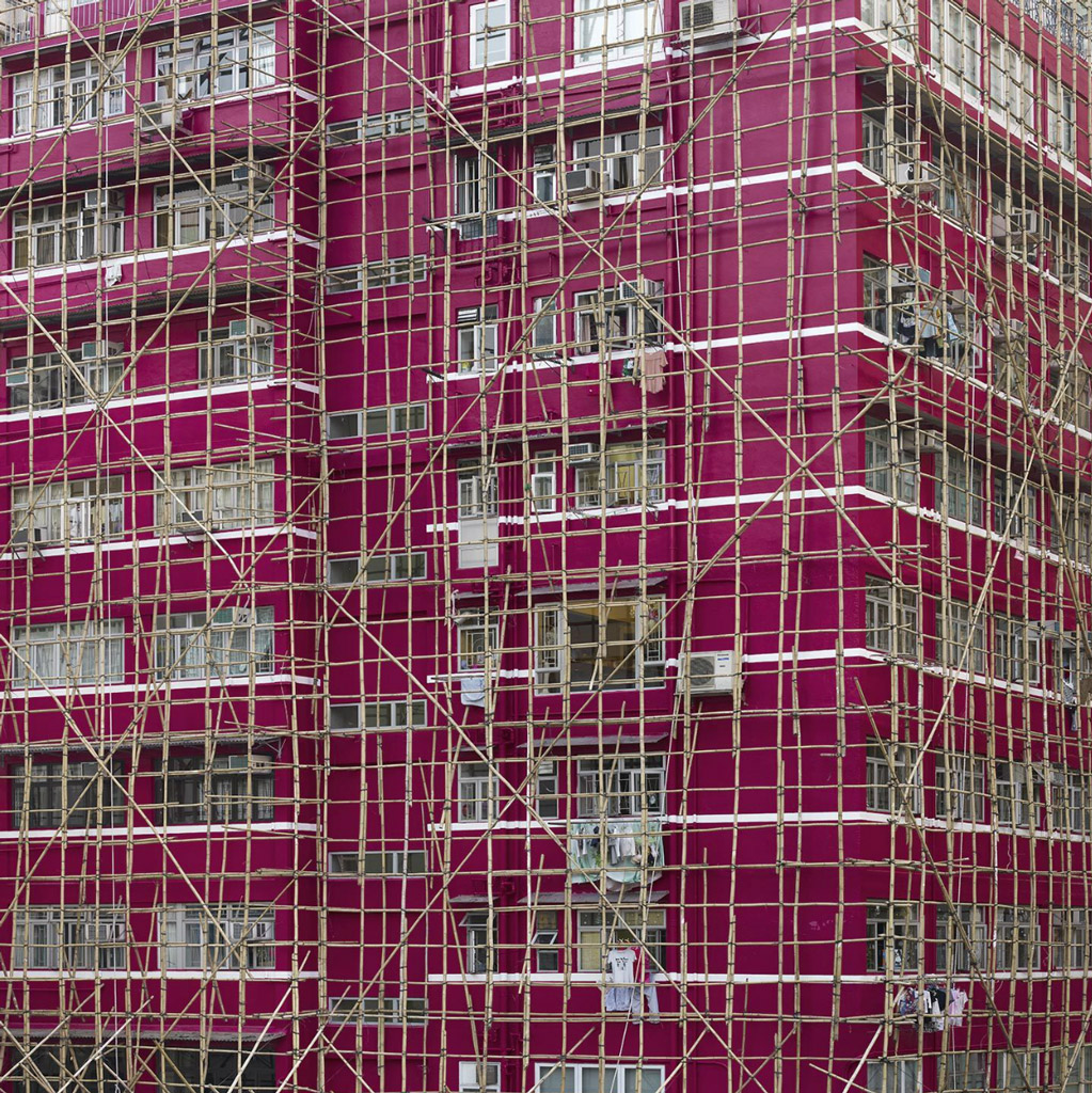
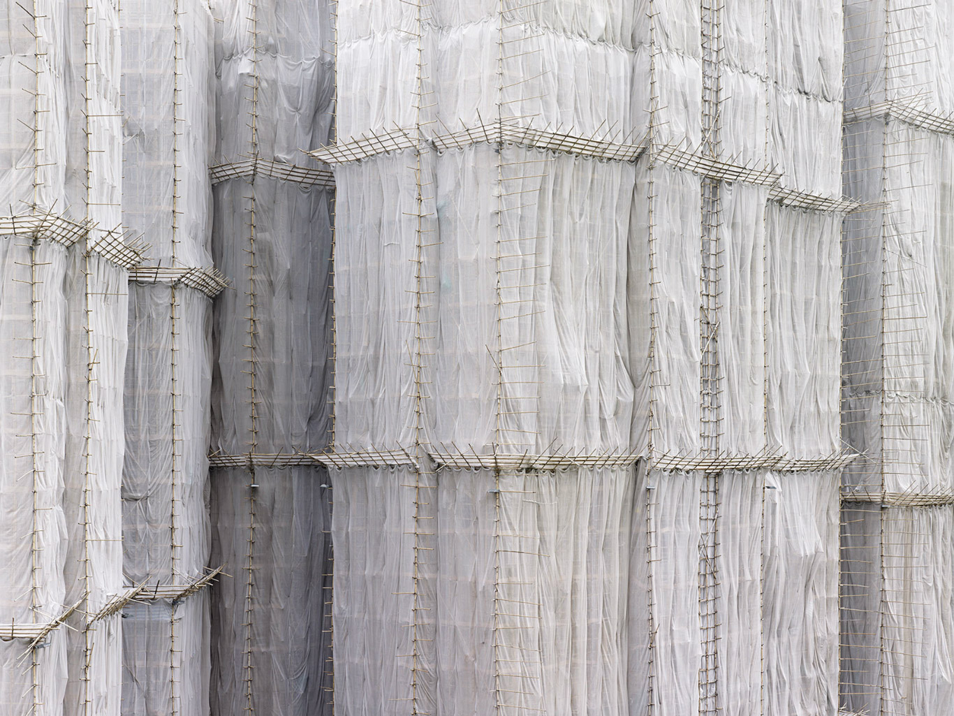
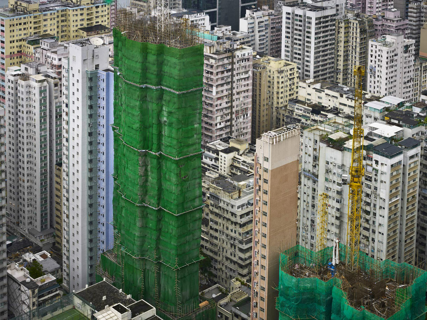
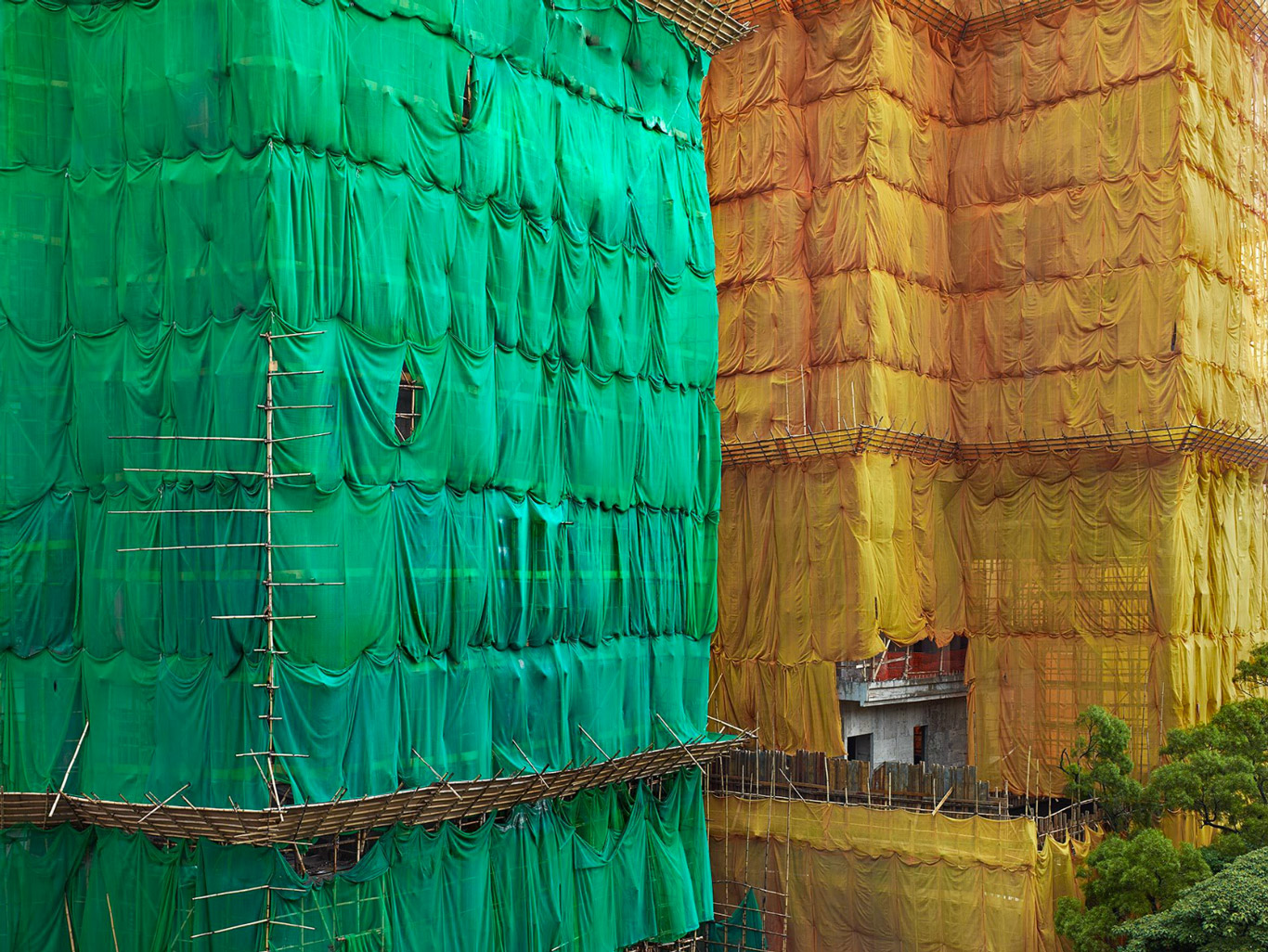
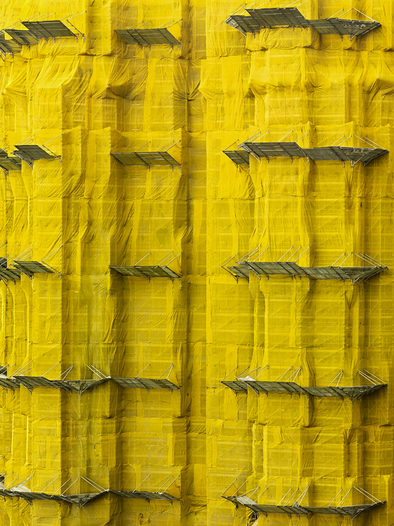
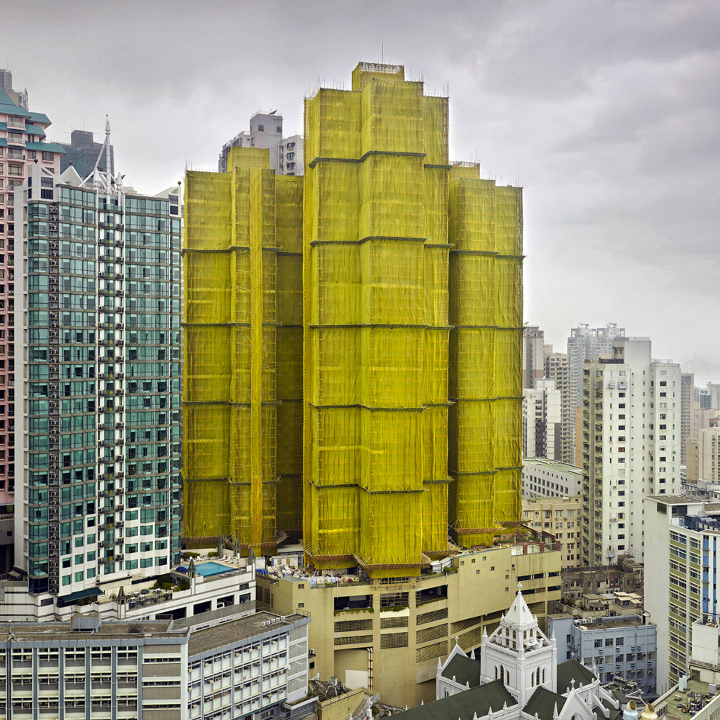
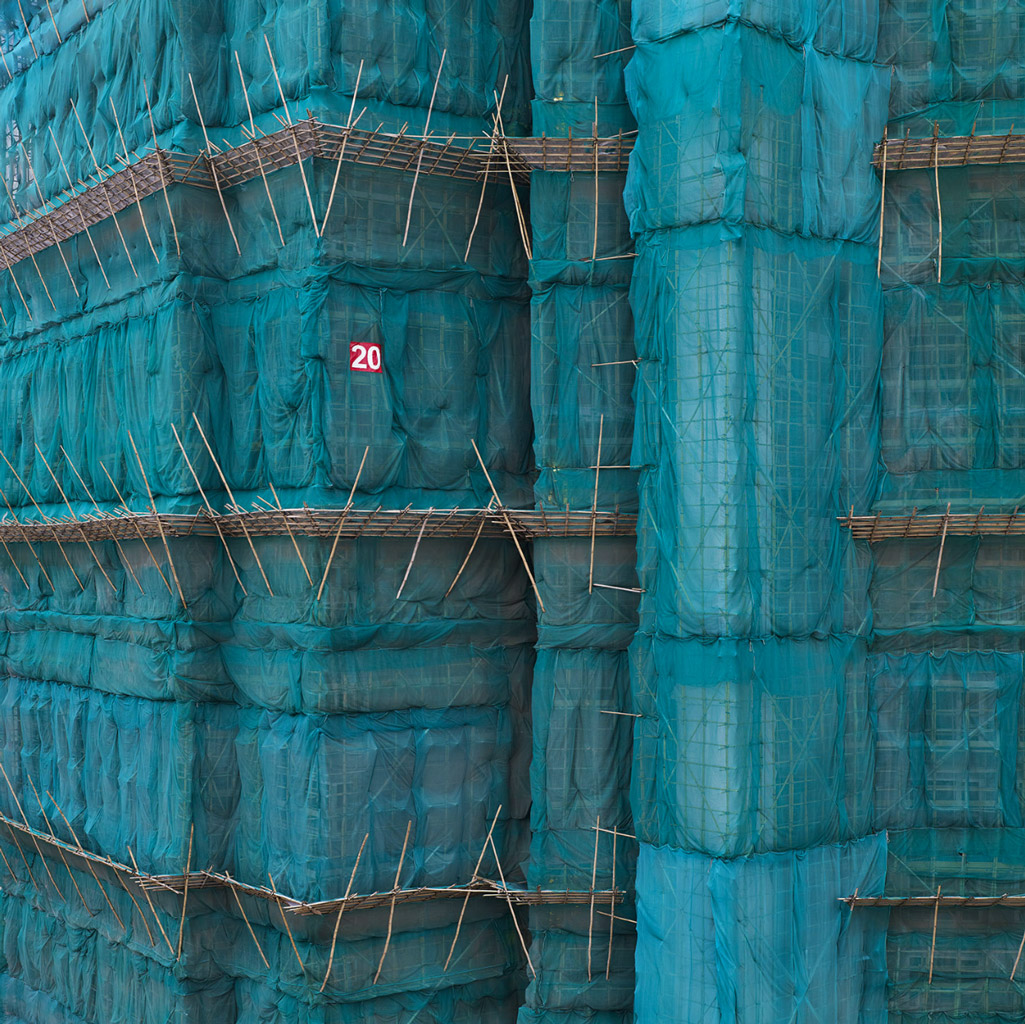
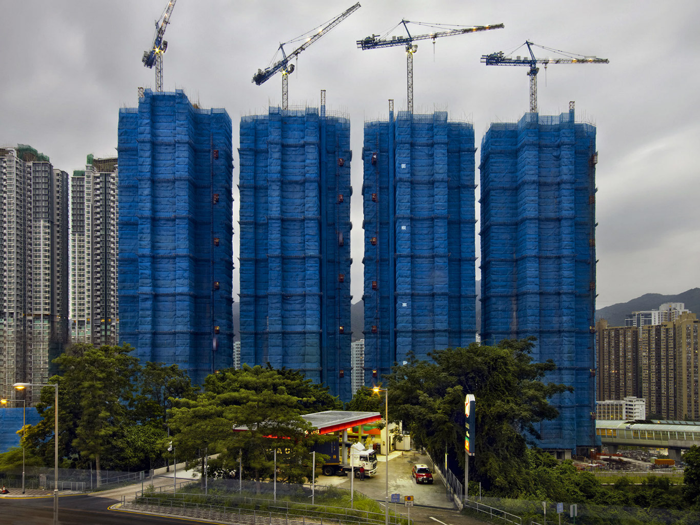
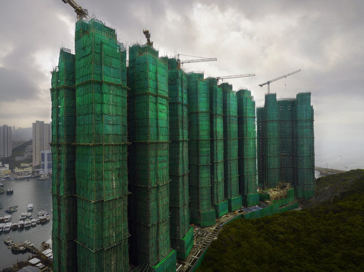
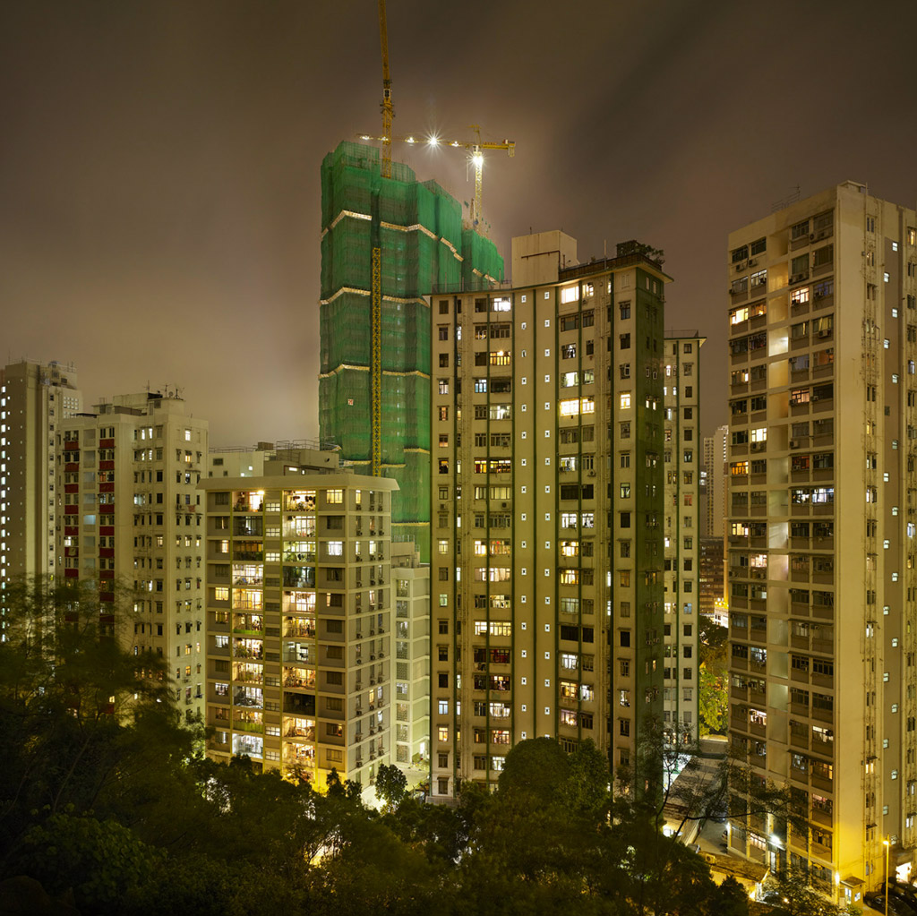
Upon his first visit to Hong Kong in January of 1994, arriving at the old Kai Tak International Airport, Steinhauer noticed a very large structure that was caged in bamboo and swathed in yellow material. He was amazed by this monumental structure, standing out beneath a canopy of clouds as it glowed against the monochromatic, urban skyline. Thus began Steinhauers fascination with these multicolored structures.
Once a practice throughout Asia, Hong Kong is the final stronghold of the bamboo scaffolders. The title Cocoon for this body of work was a natural choice. The framework; a metamorphosis; like caterpillars to butterflies. Colored material unveiled ceremoniously reveals a brand new façade, as in a cocoon revealing itself for the first time.
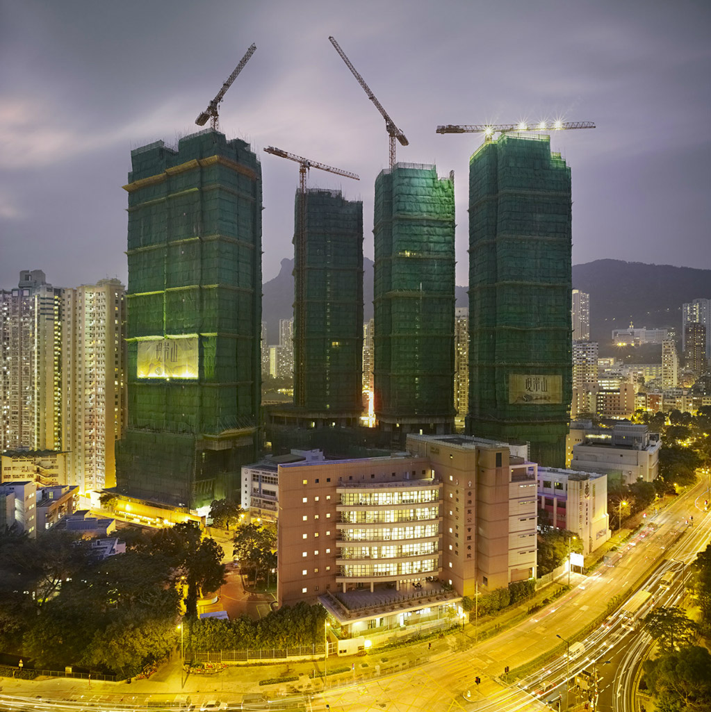
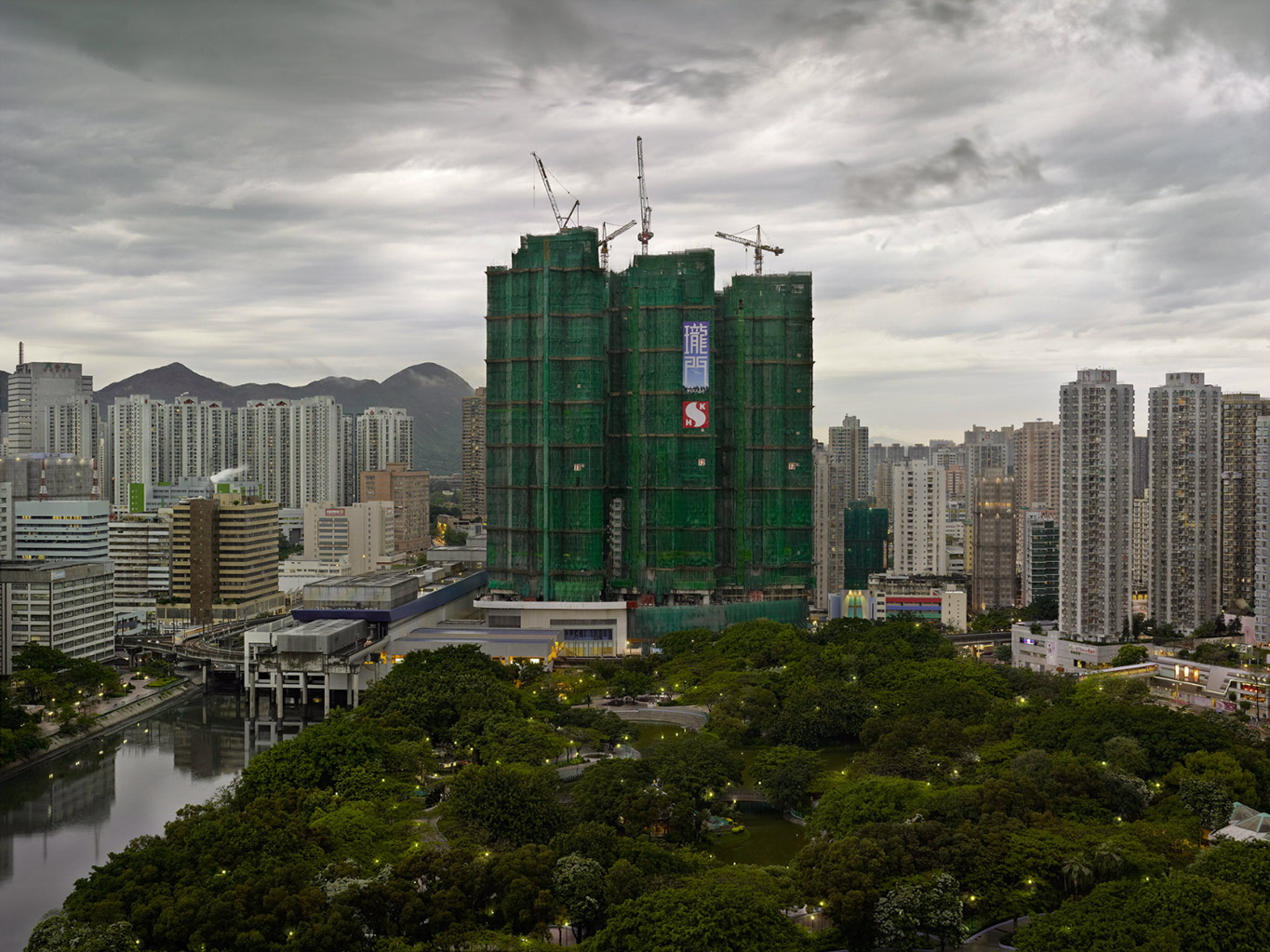
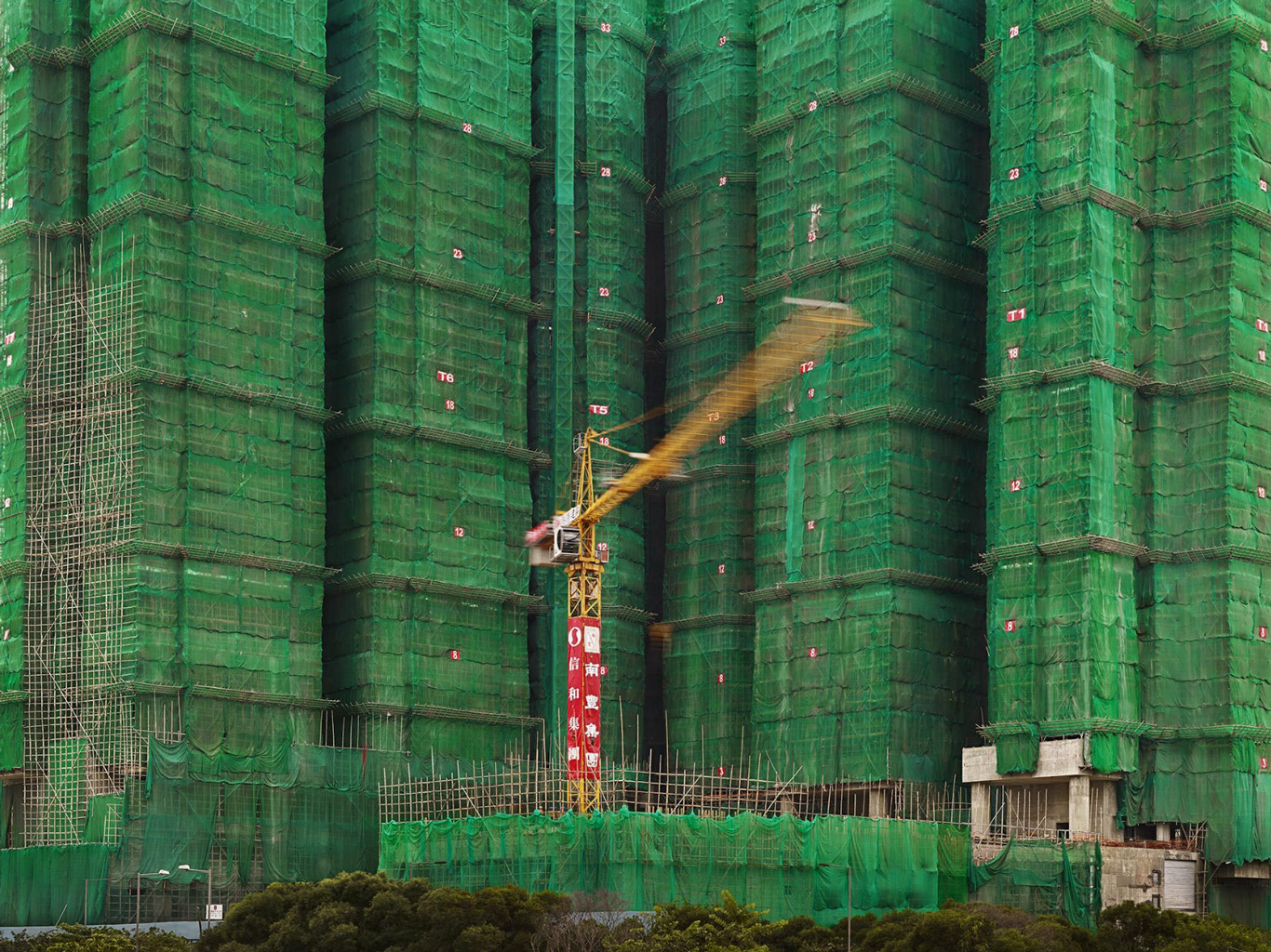
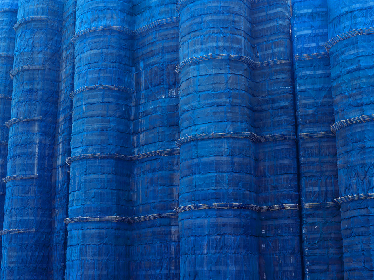
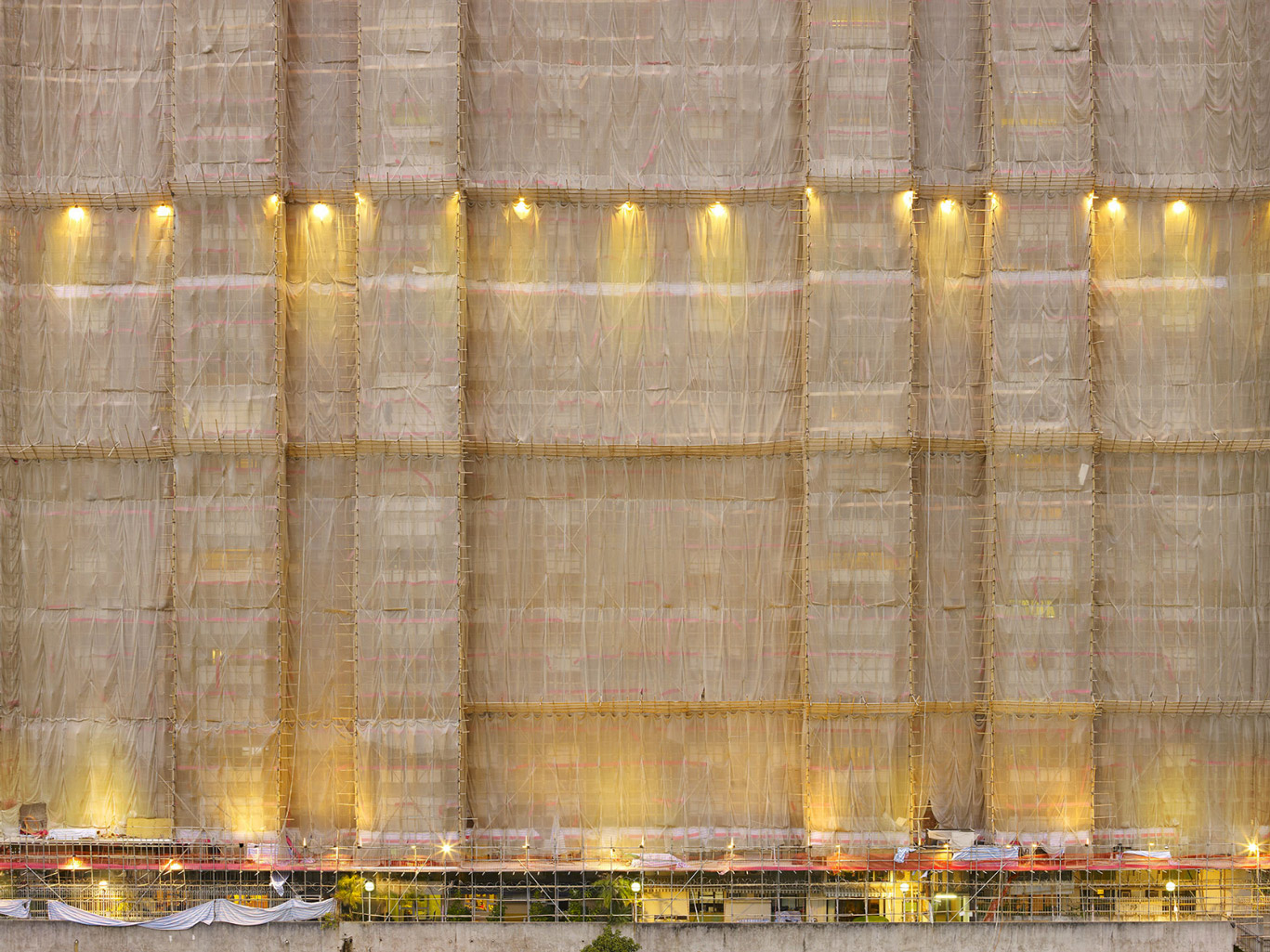
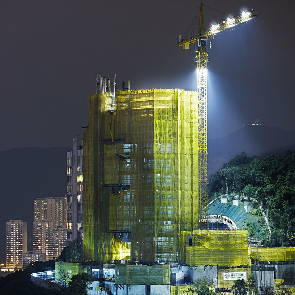
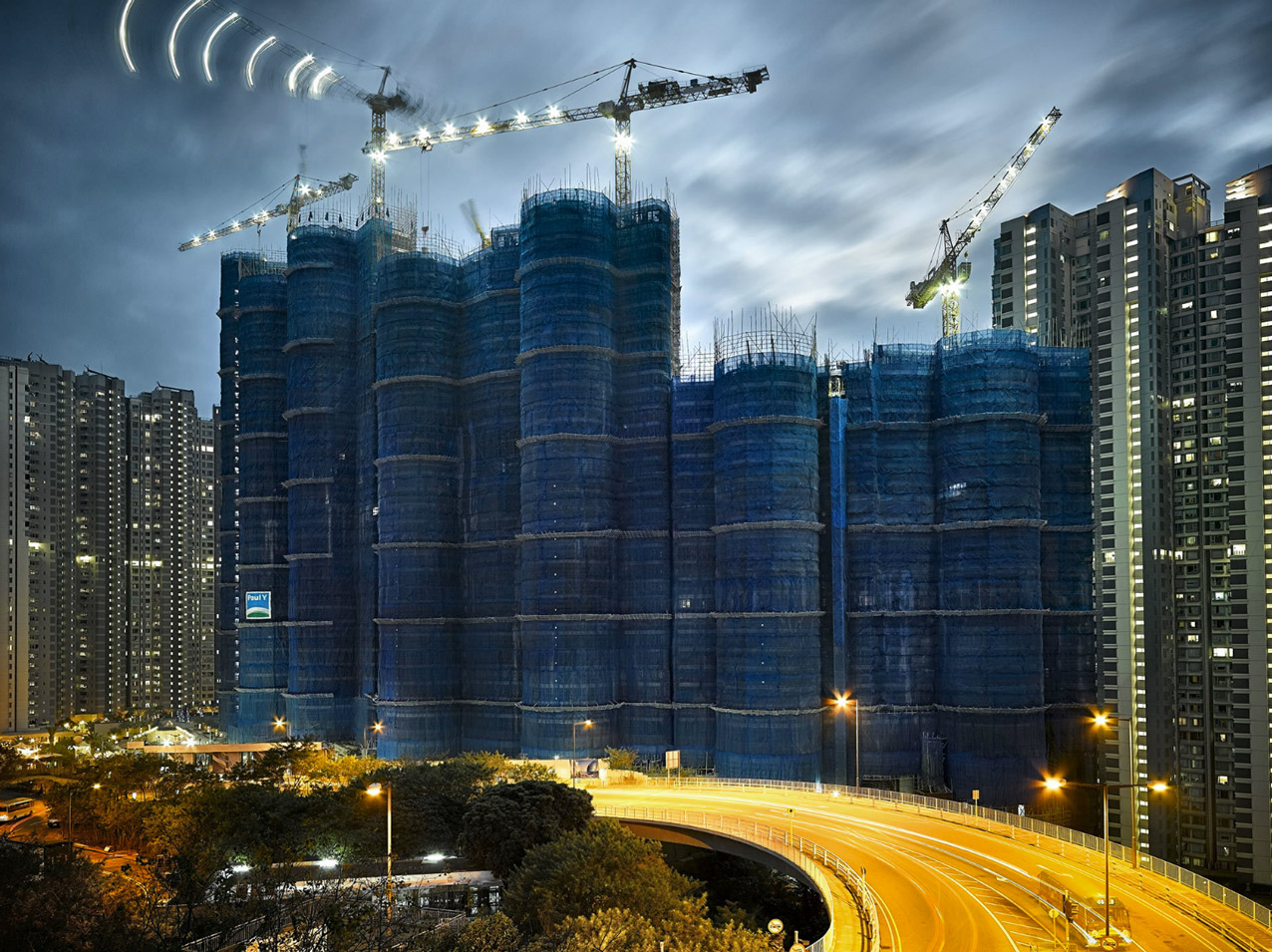
 Peter Steinhauer (United States, 1966). Artist photographer who has been living and working un Asia since 1993. His photography focuses on architecture within urban landscape, natural landscape, Asian faces and man made structure. He is a recipient of numerous international photography awards including a finalist for the 2014 Lucie Awards, Ford Foundation grant for his multi year work in Viernam, Black and White Spider Award for Architecture, IPA and PX3 Paris awards, among others. He is also a member of the elite Explorers Club in New York.
Since 1993, Peter Steinhauer has been documenting the many facets of Asian culture.
Upon his first visit to Hong Kong in January of 1994, arriving at the old Kai Tak International Airport, Steinhauer noticed a very large structure that was caged in bamboo and swathed in yellow material. He was amazed by this monumental structure, standing out beneath a canopy of clouds as it glowed against the monochromatic, urban skyline. Thus began Steinhauers fascination with these multicolored structures.
Once a practice throughout Asia, Hong Kong is the final stronghold of the bamboo scaffolders. The title Cocoon for this body of work was a natural choice. The framework; a metamorphosis; like caterpillars to butterflies. Colored material unveiled ceremoniously reveals a brand new façade, as in a cocoon revealing itself for the first time.


 Peter Steinhauer (United States, 1966). Artist photographer who has been living and working un Asia since 1993. His photography focuses on architecture within urban landscape, natural landscape, Asian faces and man made structure. He is a recipient of numerous international photography awards including a finalist for the 2014 Lucie Awards, Ford Foundation grant for his multi year work in Viernam, Black and White Spider Award for Architecture, IPA and PX3 Paris awards, among others. He is also a member of the elite Explorers Club in New York.
Kevin Weir
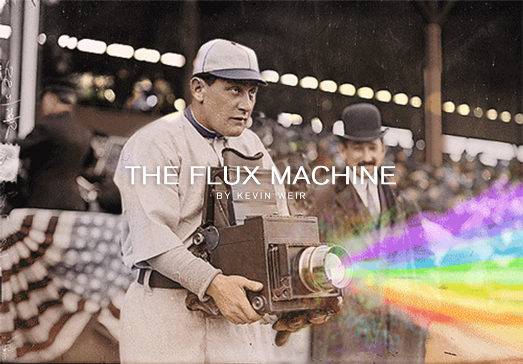
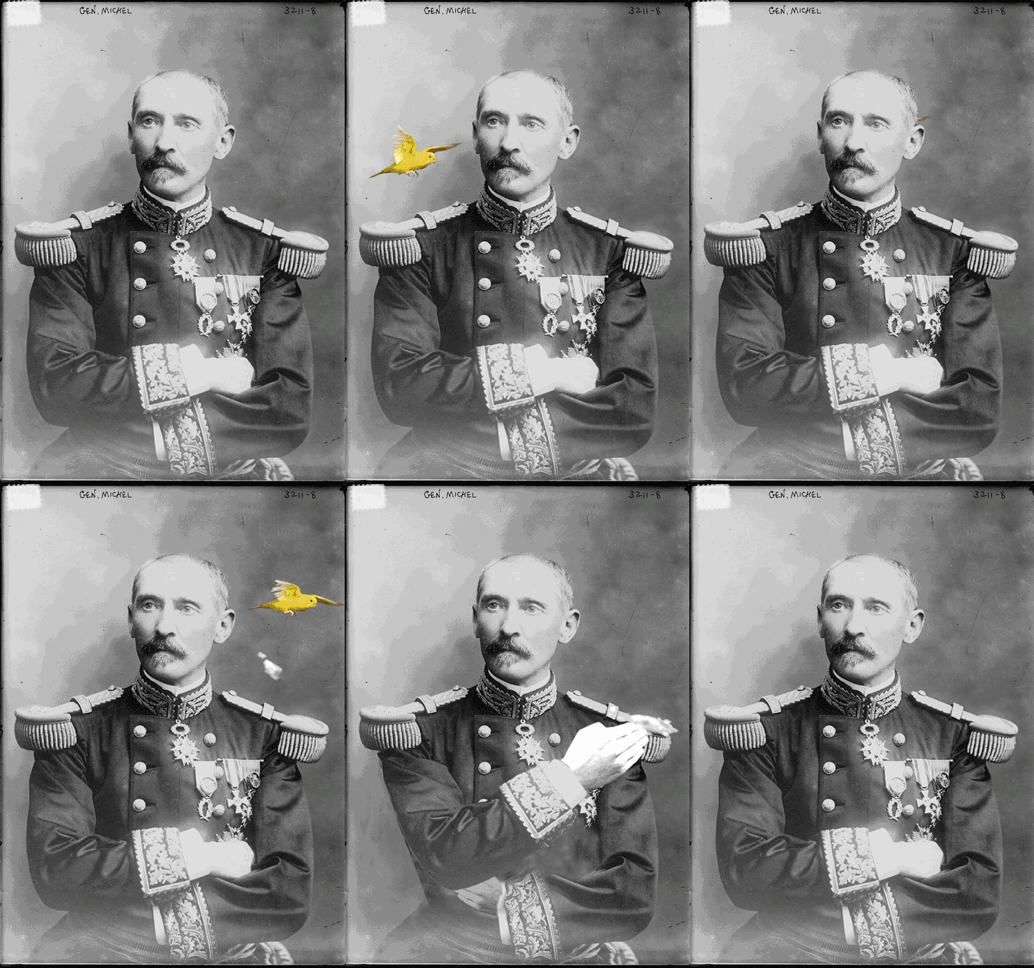
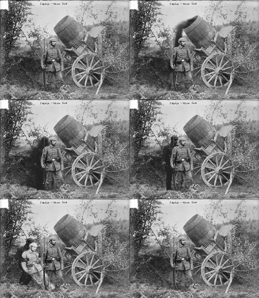
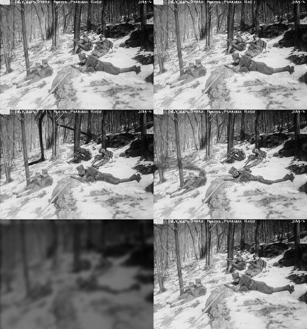
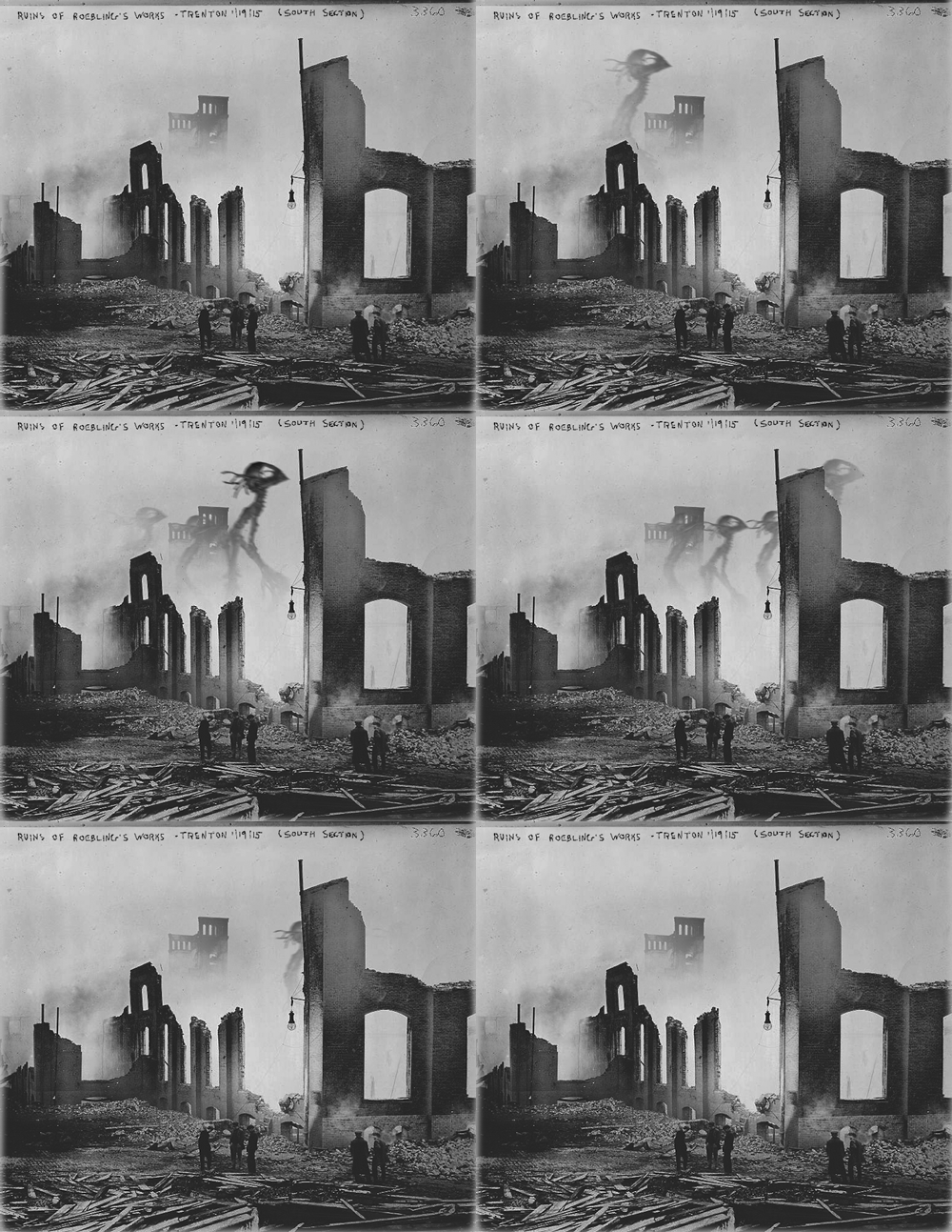
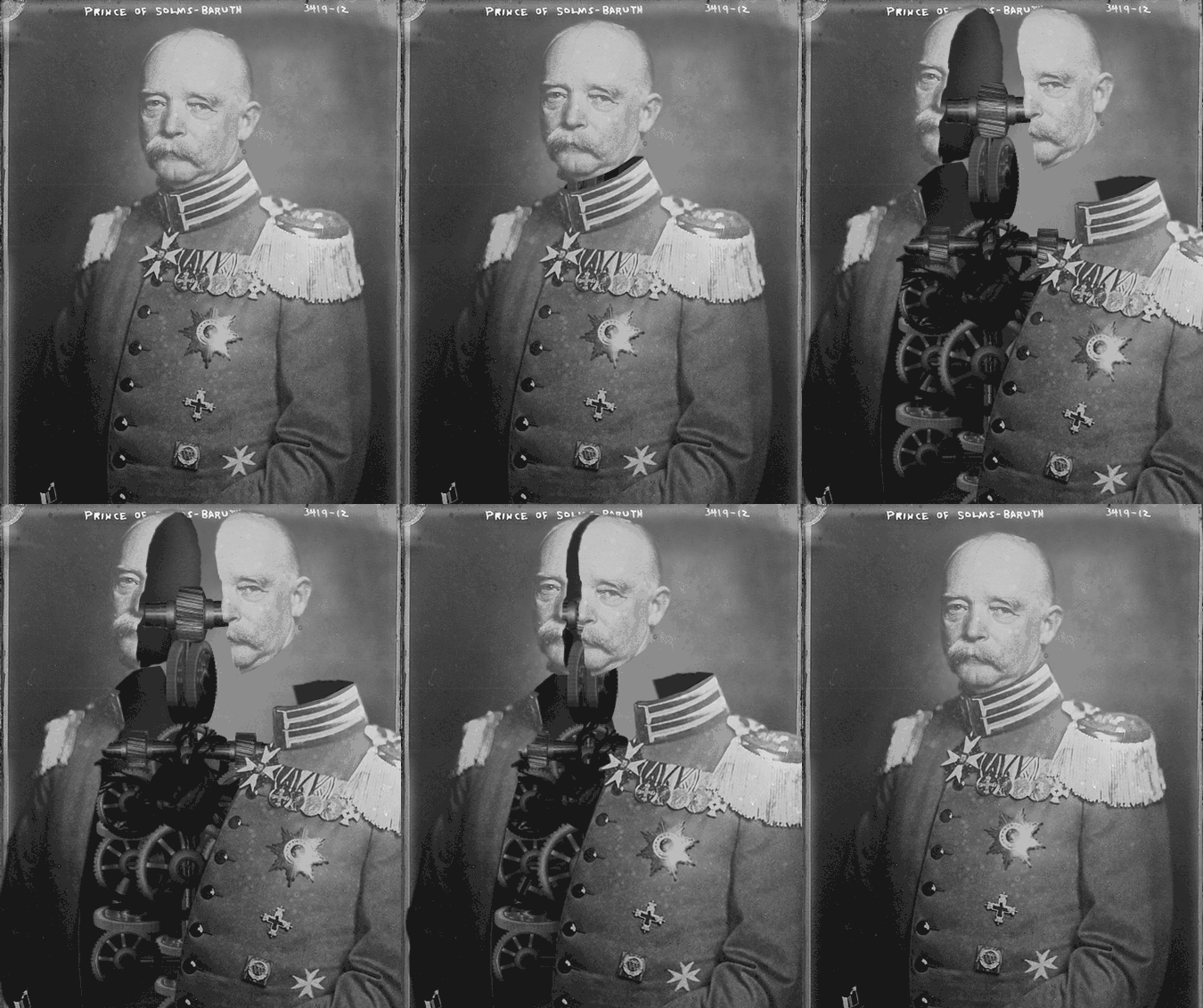
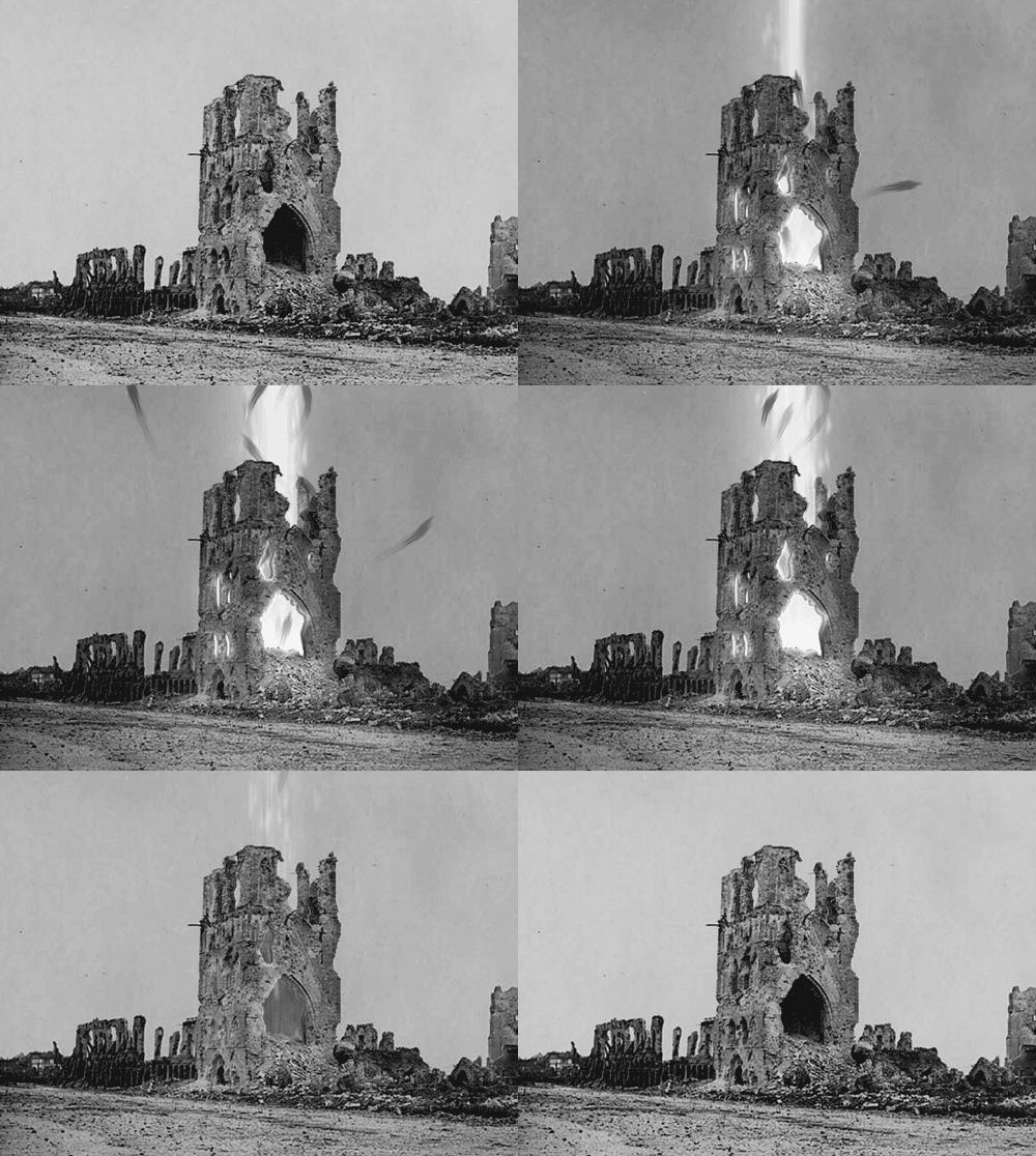
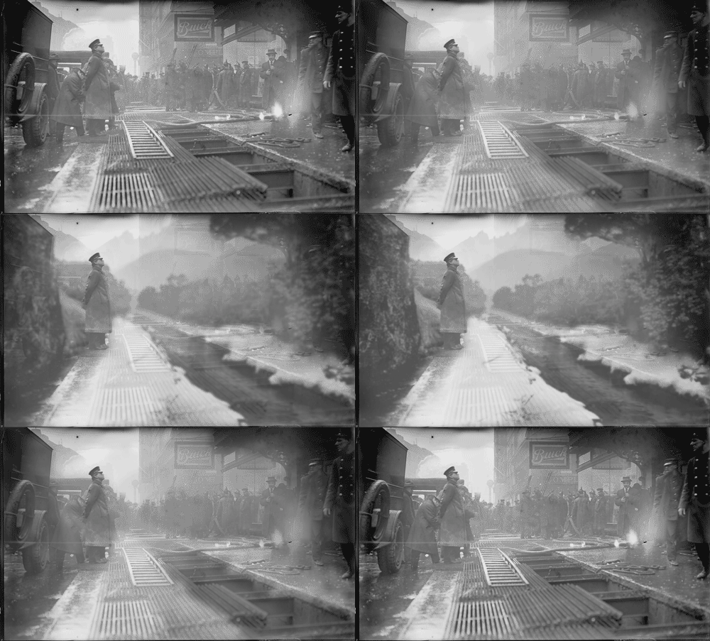
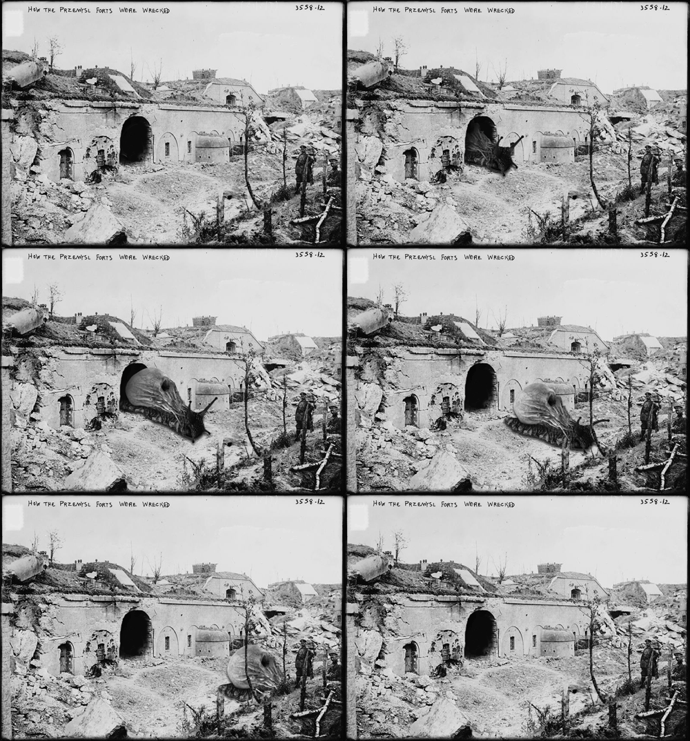
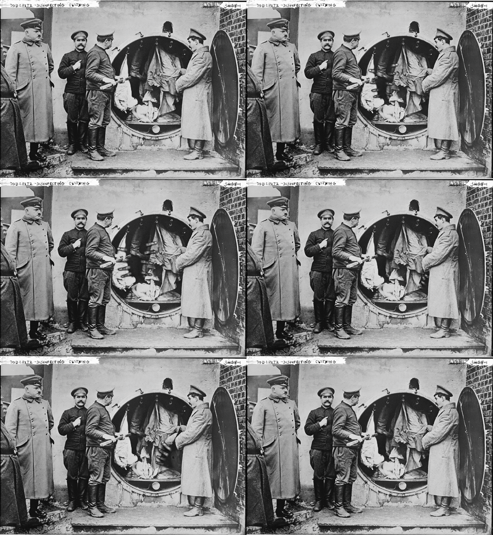
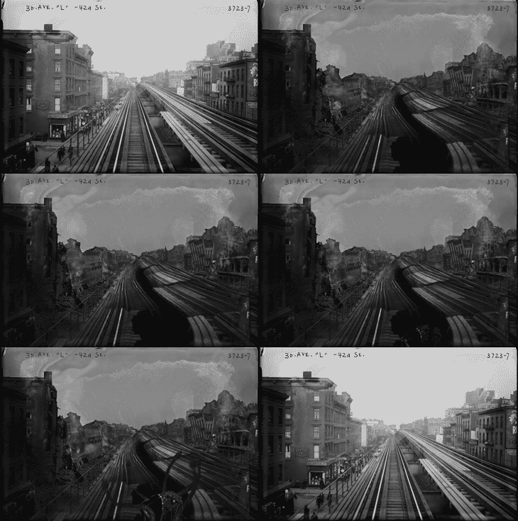
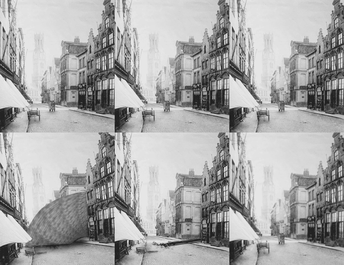
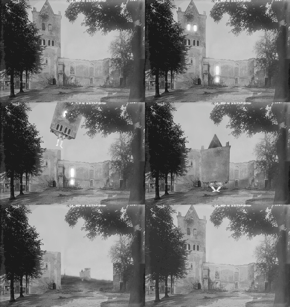
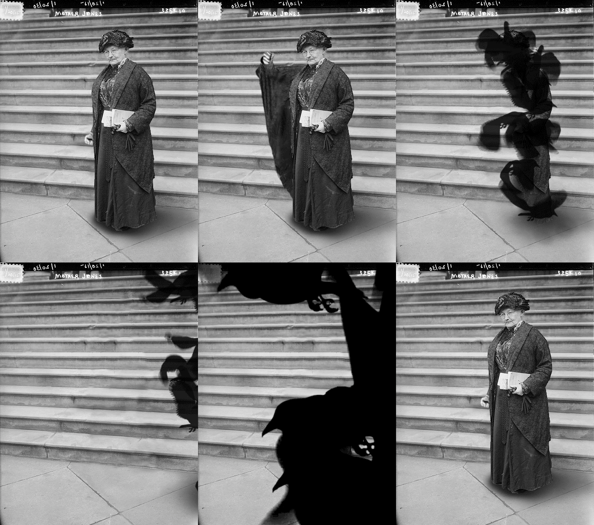
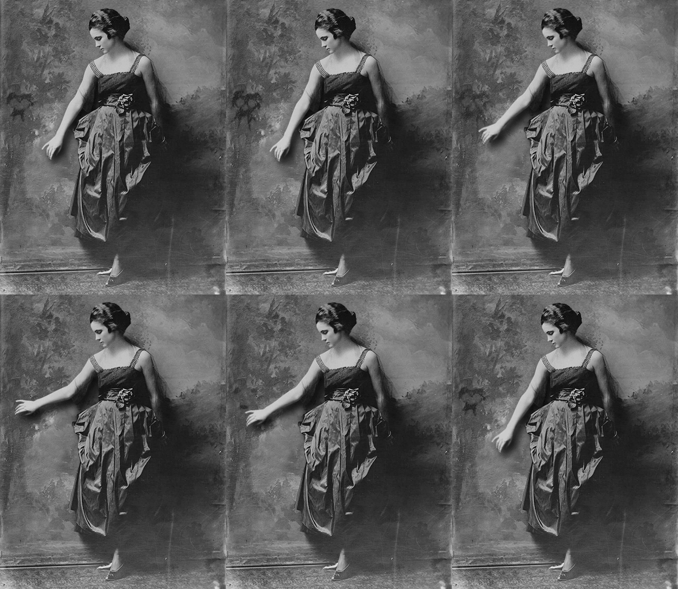
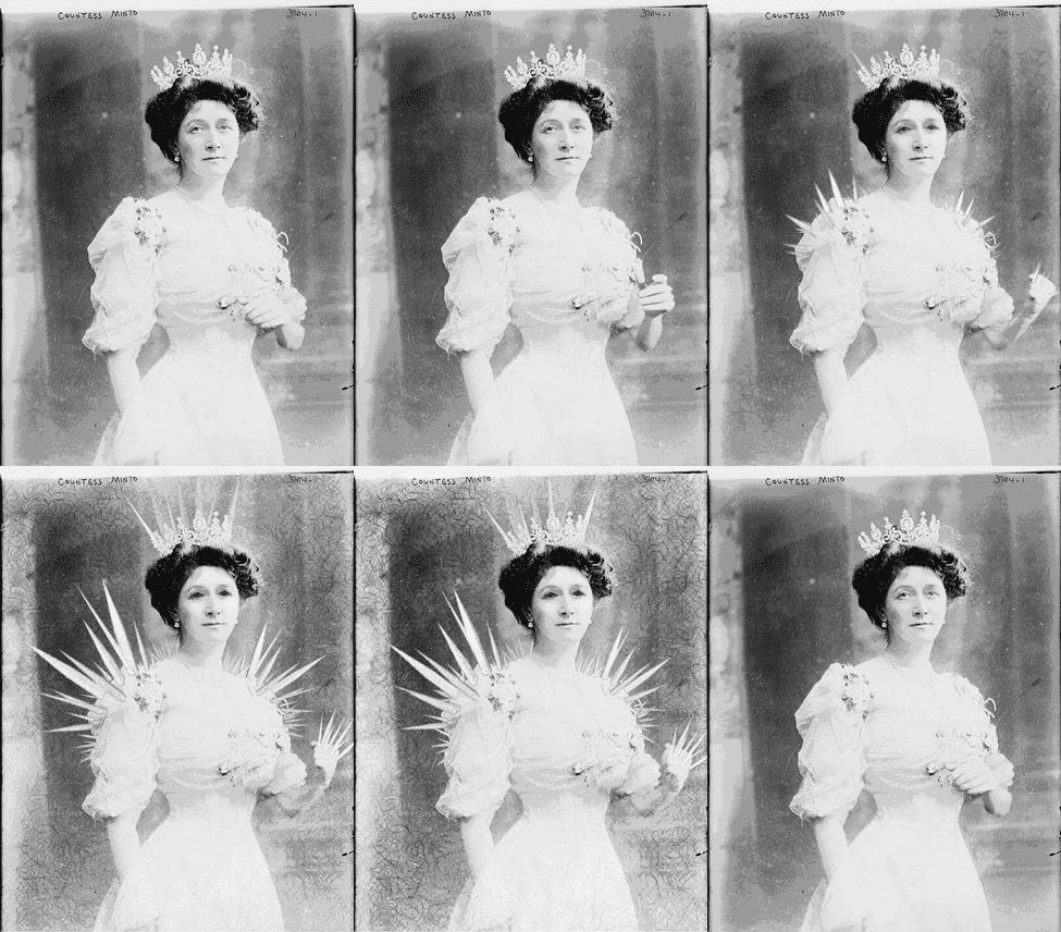
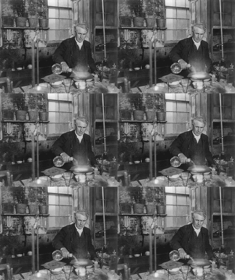
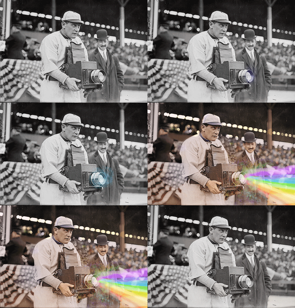
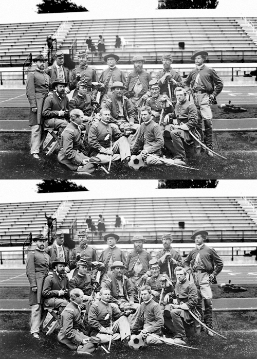
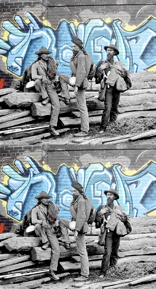
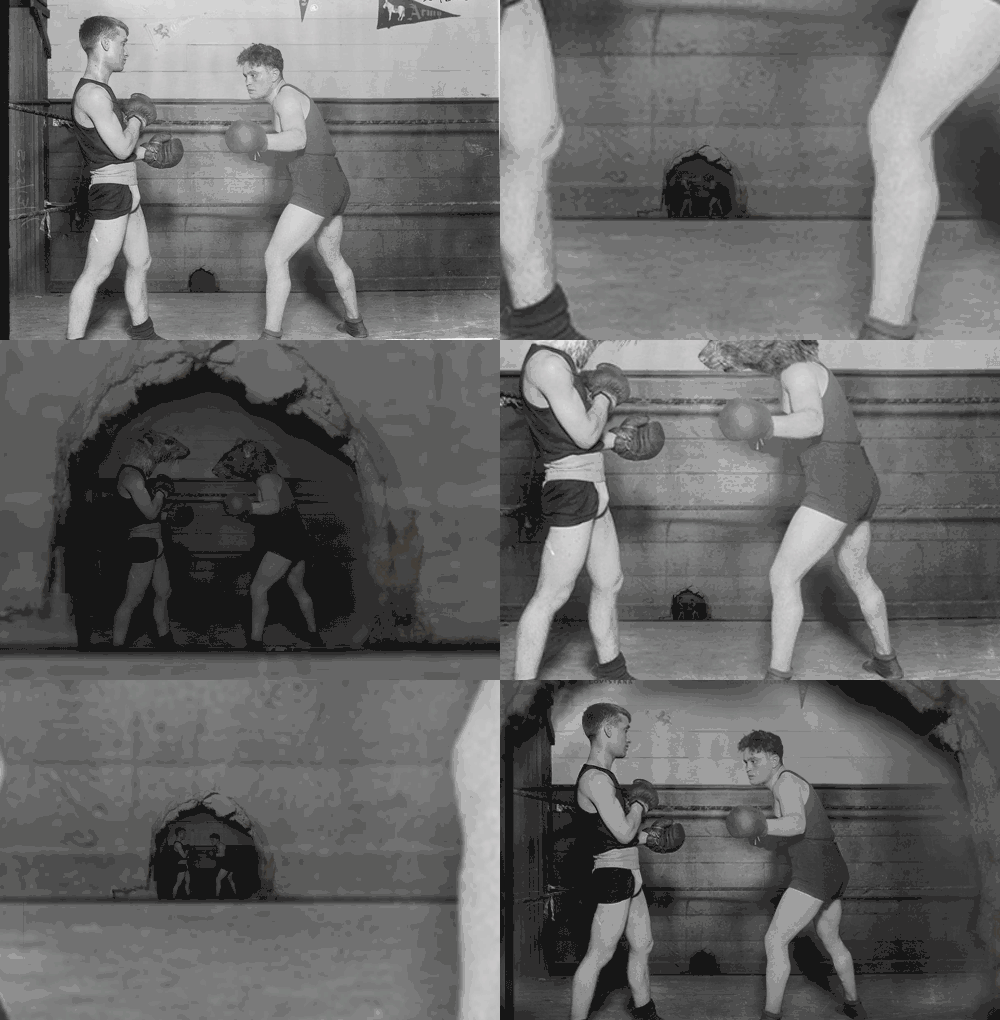
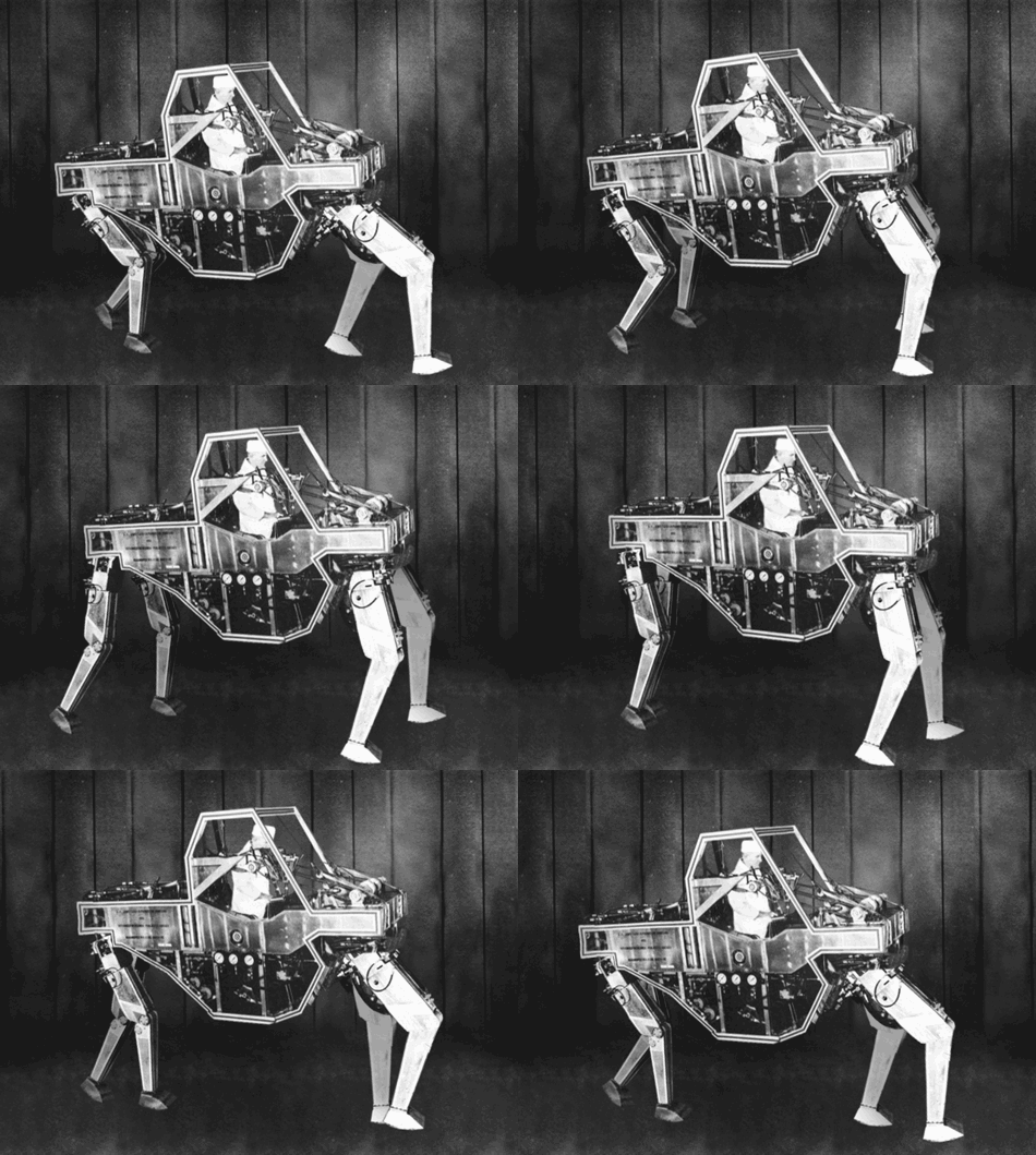
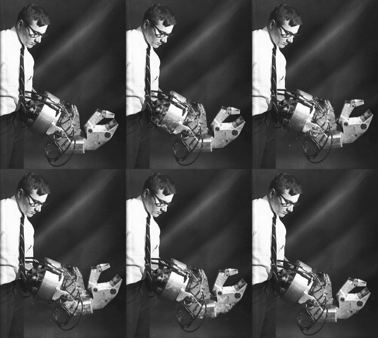
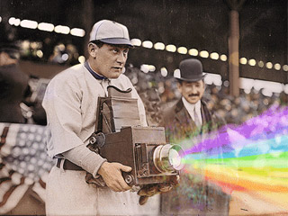
Kevin Weir’s Flux Machine swivels between two lines closely related to the theme of temporality: using the format of animated GIF, he gives static images infinite and recurrent movement, and integrating narrative elements into archival photographs he reinterprets its meaning. The resulting microfictions offer readings at different levels questioning our usual interpretation of archival materials and leading us to crossroads between the historic moment and the imagined action.
 Kevin Weir (USA) Grew up in the woods of rural upstate New York, just outside of Binghamton. He went to Penn State for his undergrad. Studied abroad in Australia. He got a masters at the VCU Brandcenter and, now, works as an art director at Droga5 in NYC. He is known worldwide for his animation project The Flux Machine, for which he uses the Bain Collection at the Library of Congress.


Kevin Weir’s Flux Machine swivels between two lines closely related to the theme of temporality: using the format of animated GIF, he gives static images infinite and recurrent movement, and integrating narrative elements into archival photographs he reinterprets its meaning. The resulting microfictions offer readings at different levels questioning our usual interpretation of archival materials and leading us to crossroads between the historic moment and the imagined action.
 Kevin Weir (USA) Grew up in the woods of rural upstate New York, just outside of Binghamton. He went to Penn State for his undergrad. Studied abroad in Australia. He got a masters at the VCU Brandcenter and, now, works as an art director at Droga5 in NYC. He is known worldwide for his animation project The Flux Machine, for which he uses the Bain Collection at the Library of Congress.
Pelle Cass
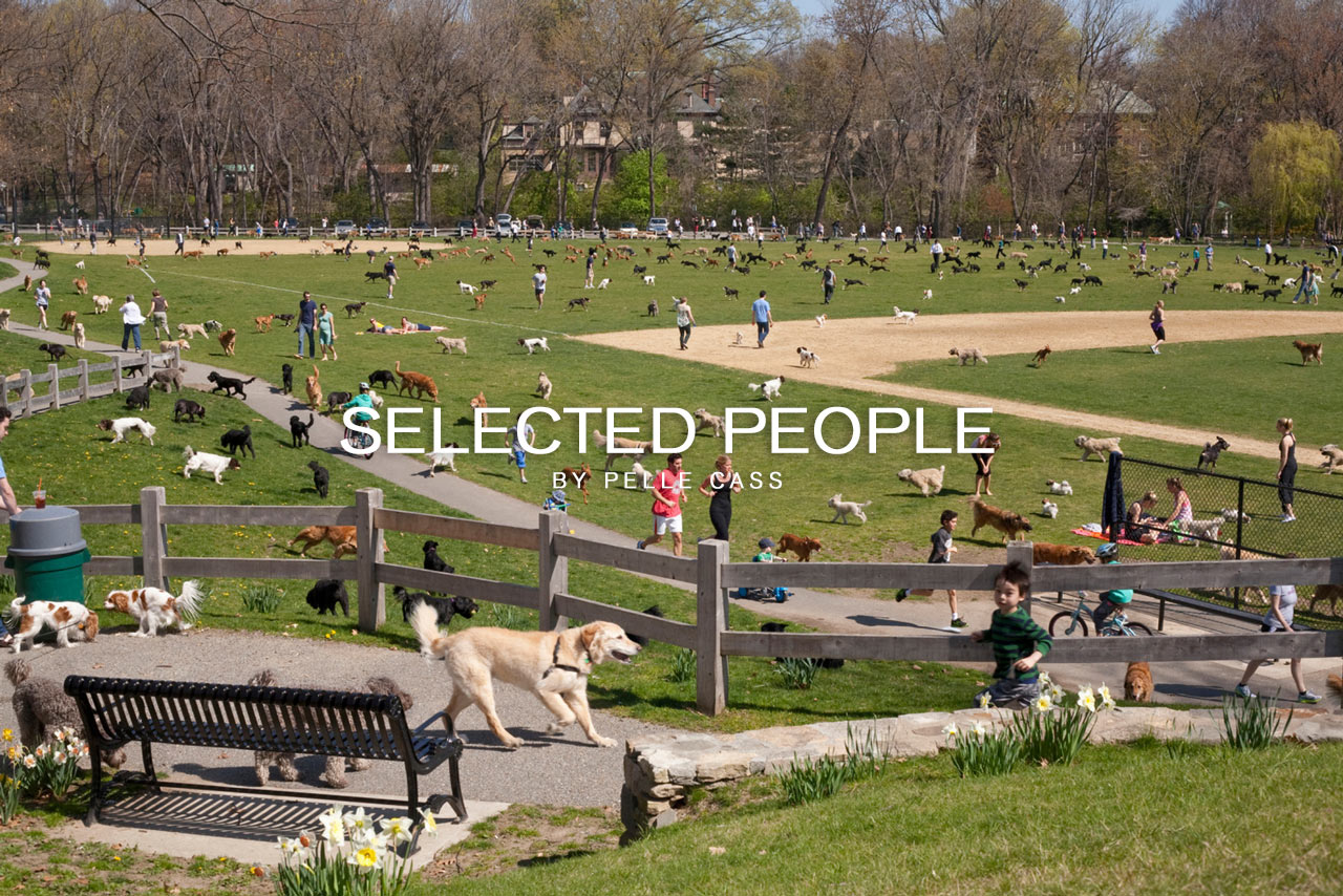
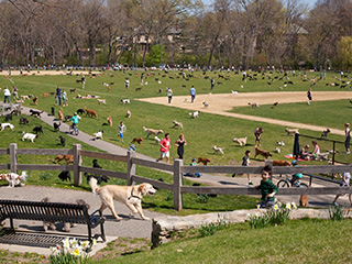
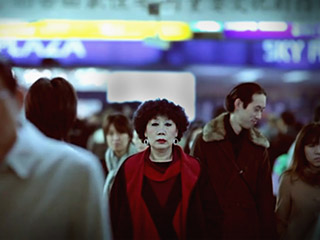
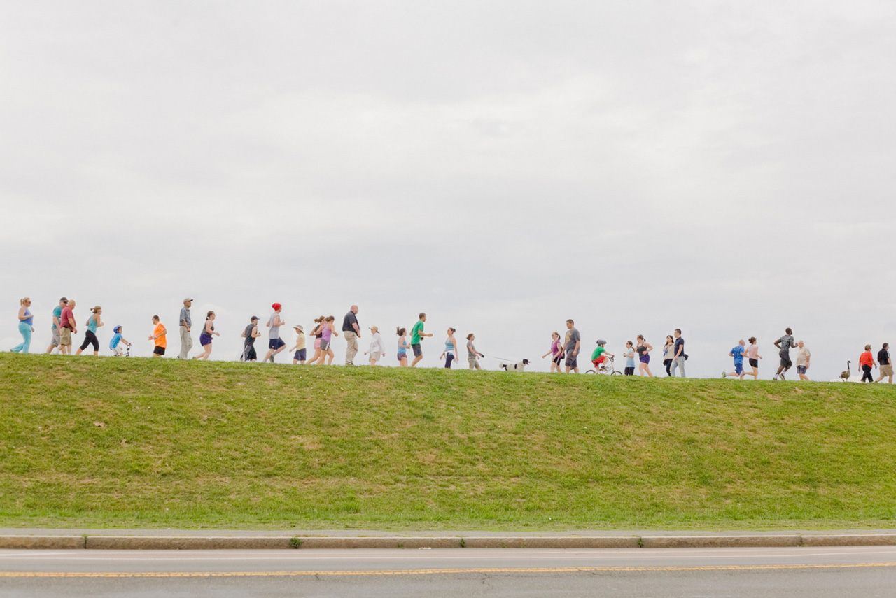
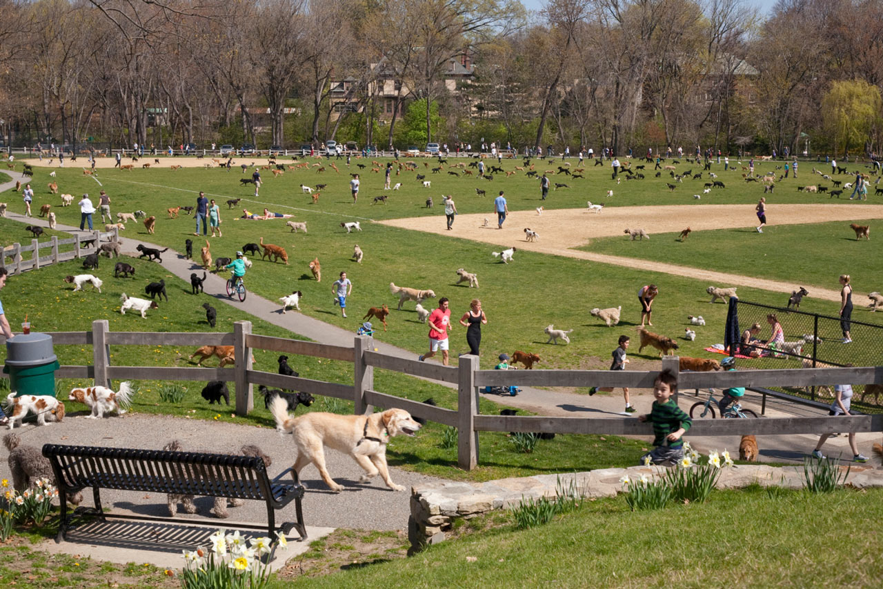
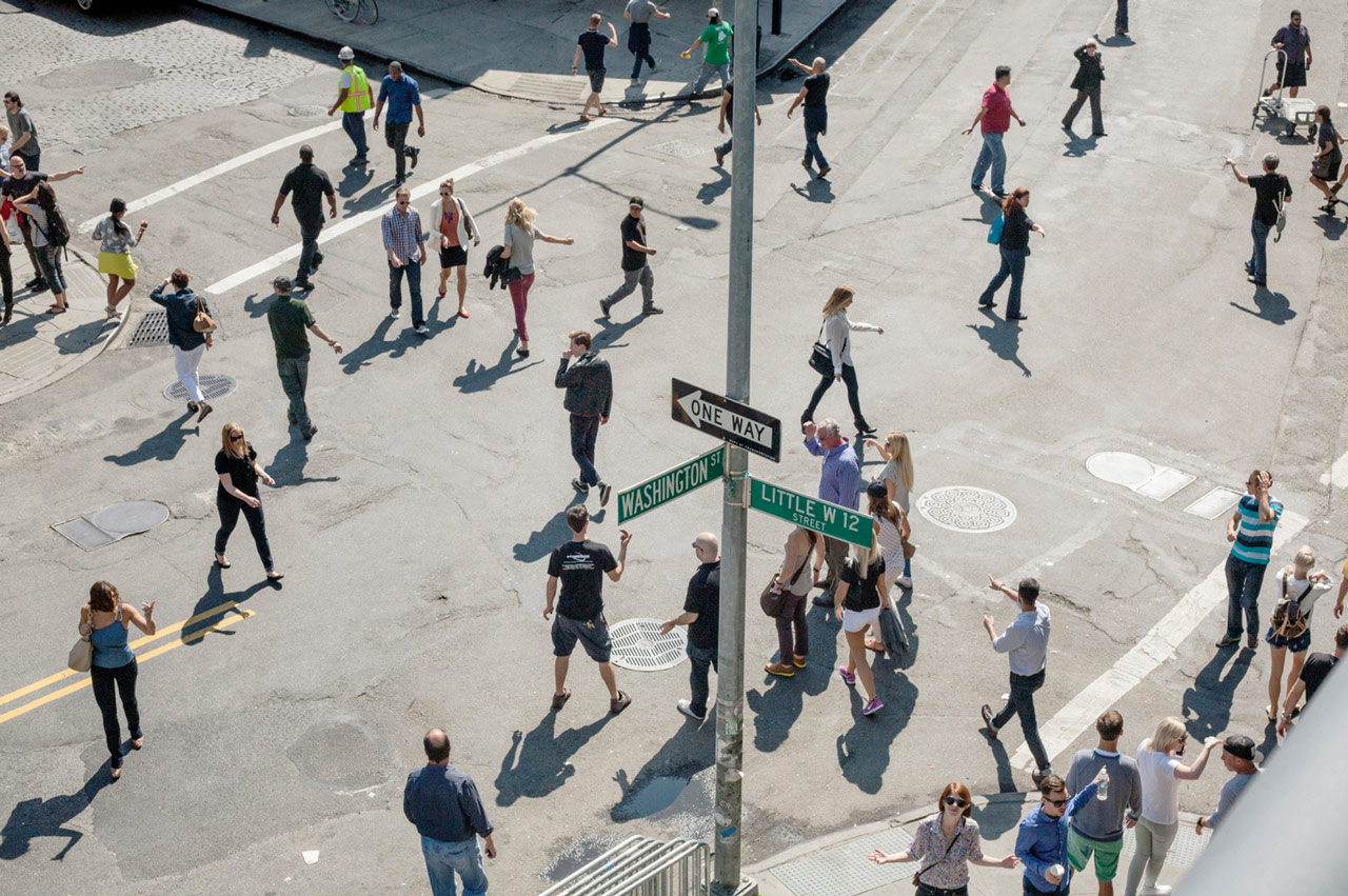
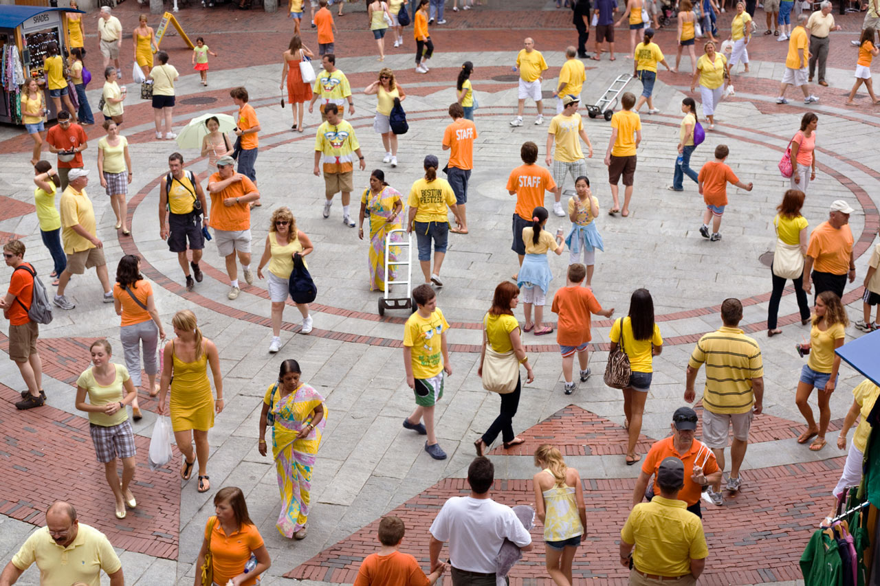
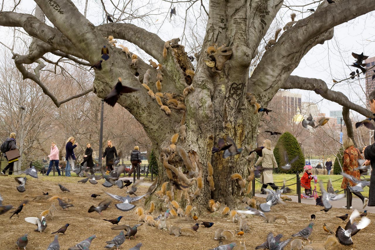
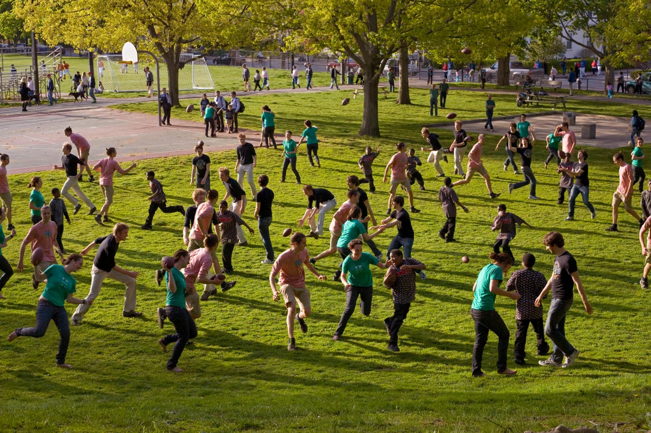
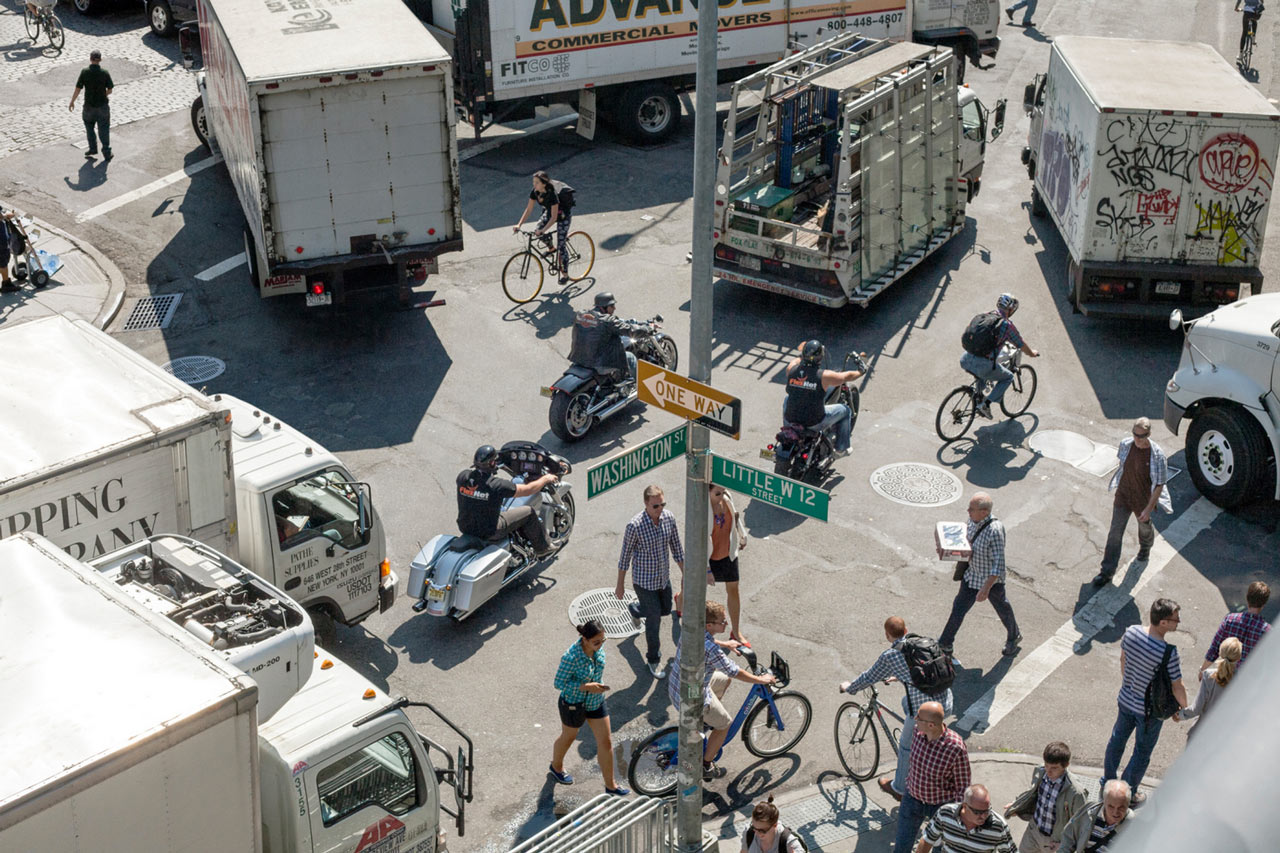
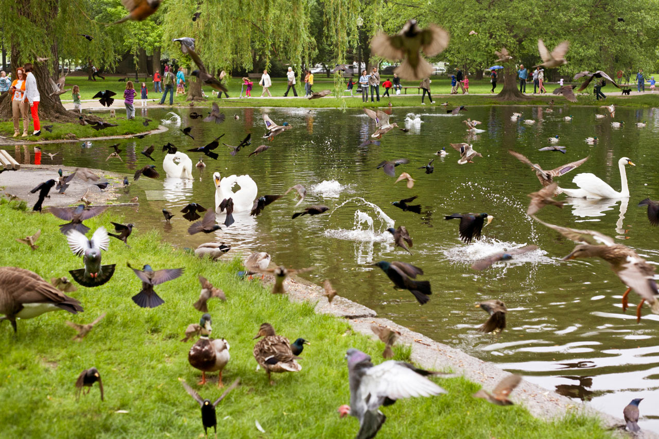
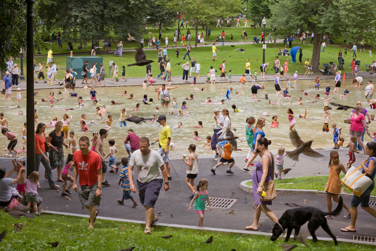
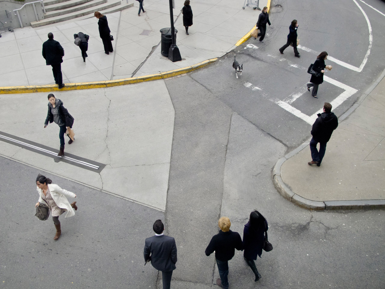
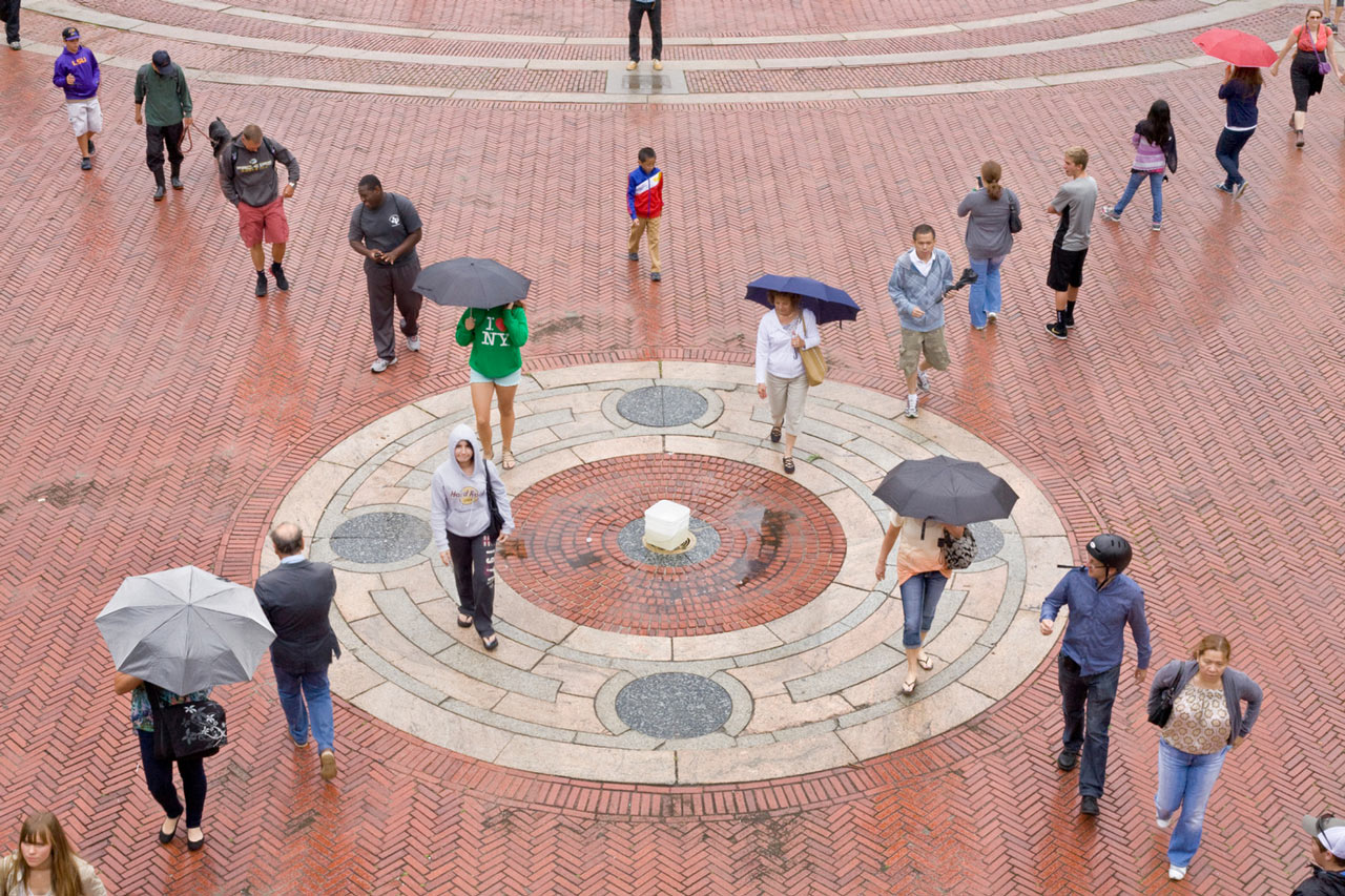
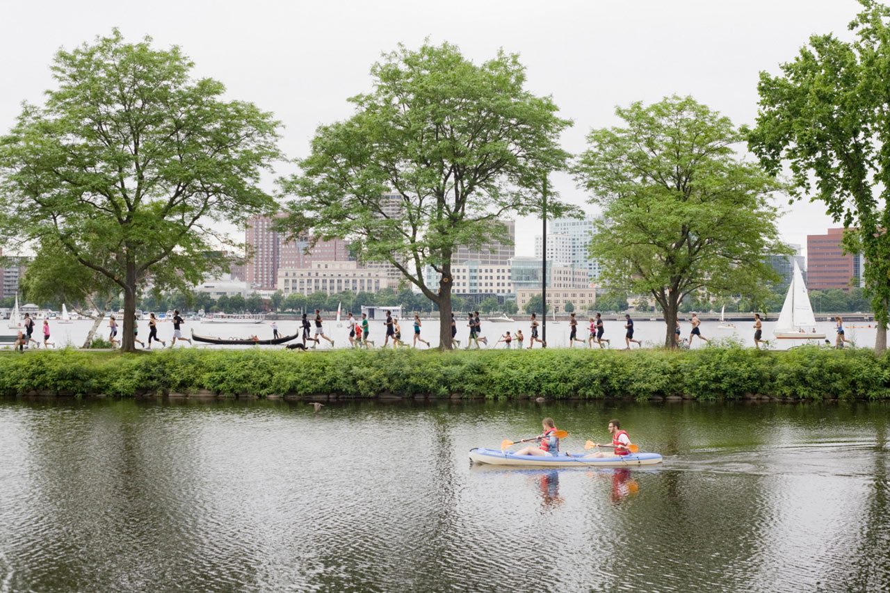
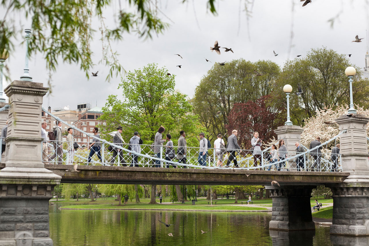
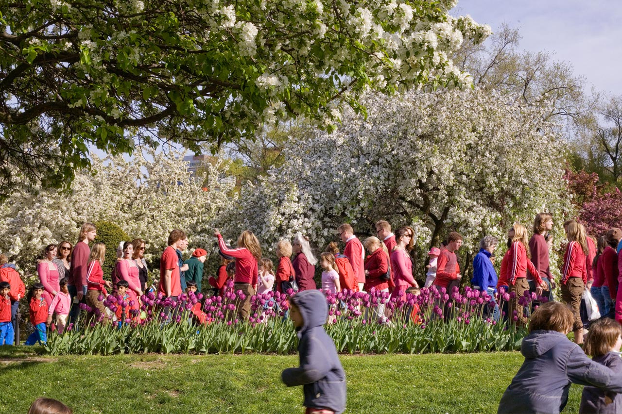
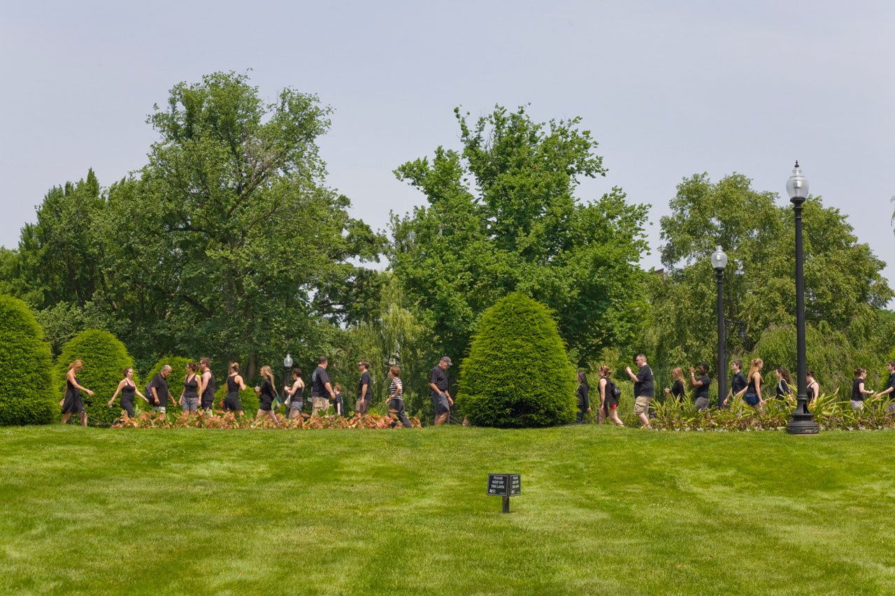
This work both orders the world and exaggerates its chaos. With the camera on a tripod, I take many photos, leave in the best ones and omit the rest. The photographs are composed but they have not been changed, only selected. My work is about the strangeness of time, about how people really look, and about the surprising world that is only visible with a camera. I want to capture more life, more people, more time, and more truth in my photographs. Photography, with its ability to record everything in front of the lens, is just the beginning of this process. Selected People is inspired by surveillance photography, Walker Evans’s hidden-camera subway portraits, and P.L. di Corcia’s Head series; works in which the camera waits for its subjects to come into view. My work also looks at city life from a fixed position, with the difference that each image contains an hour’s time and is a composition of hundreds of exposures. To do this, I put the camera on a tripod, and take hundreds of pictures as people pass by. Back in the studio, I choose what to leave in and make no further alterations. The process mirrors the way the mind focuses attention on one thing but not on another. A person thinking about photography, for example, tends to notice people with cameras over those without. This kind of selection allows me to take objective facts–the faces and bodies of people on the street–and make something new and more subjective out of them, simply by sorting them. Above all, I want to show a surprising world that is visible only with a camera.


 Pelle Cass (Brookline, MA). He has presented solo shows at the Houston Center for Photography; Gallery Kayafas, Boston; Stux Gallery, Boston; Frank Marino Gallery, NYC; the Griffin Museum of Photography; and the Fogg Art Museum’s print room. His work is in the collections of the Fogg Art Museum, the Addison Gallery of American Art, the Polaroid Collection, the DeCordova Museum, the Danforth Museum of Art, the Peabody Essex Museum, the Museum of Fine Arts, Houston, and the Lehigh University Art Galleries, among others. He was a Winner: Top 50, Critical Mass, Photolucida, Portland, OR, in 2008 and 2009, was awarded fellowships by the Corporation of Yaddo in 2010 and 2012, and won an Artist’s Resource Trust Award (Berkshire Taconic Foundation) in 2012. He lives in Brookline, Massachusetts.
This work both orders the world and exaggerates its chaos. With the camera on a tripod, I take many photos, leave in the best ones and omit the rest. The photographs are composed but they have not been changed, only selected. My work is about the strangeness of time, about how people really look, and about the surprising world that is only visible with a camera. I want to capture more life, more people, more time, and more truth in my photographs. Photography, with its ability to record everything in front of the lens, is just the beginning of this process. Selected People is inspired by surveillance photography, Walker Evans’s hidden-camera subway portraits, and P.L. di Corcia’s Head series; works in which the camera waits for its subjects to come into view. My work also looks at city life from a fixed position, with the difference that each image contains an hour’s time and is a composition of hundreds of exposures. To do this, I put the camera on a tripod, and take hundreds of pictures as people pass by. Back in the studio, I choose what to leave in and make no further alterations. The process mirrors the way the mind focuses attention on one thing but not on another. A person thinking about photography, for example, tends to notice people with cameras over those without. This kind of selection allows me to take objective facts–the faces and bodies of people on the street–and make something new and more subjective out of them, simply by sorting them. Above all, I want to show a surprising world that is visible only with a camera.


 Pelle Cass (Brookline, MA). He has presented solo shows at the Houston Center for Photography; Gallery Kayafas, Boston; Stux Gallery, Boston; Frank Marino Gallery, NYC; the Griffin Museum of Photography; and the Fogg Art Museum’s print room. His work is in the collections of the Fogg Art Museum, the Addison Gallery of American Art, the Polaroid Collection, the DeCordova Museum, the Danforth Museum of Art, the Peabody Essex Museum, the Museum of Fine Arts, Houston, and the Lehigh University Art Galleries, among others. He was a Winner: Top 50, Critical Mass, Photolucida, Portland, OR, in 2008 and 2009, was awarded fellowships by the Corporation of Yaddo in 2010 and 2012, and won an Artist’s Resource Trust Award (Berkshire Taconic Foundation) in 2012. He lives in Brookline, Massachusetts.
Eduardo Muñoz
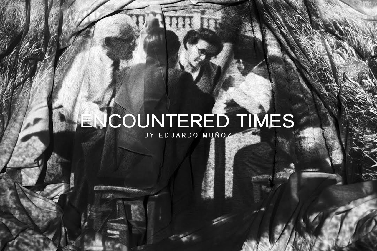
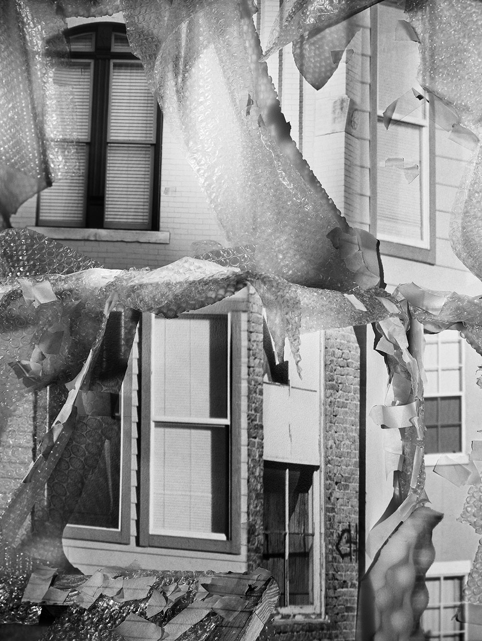
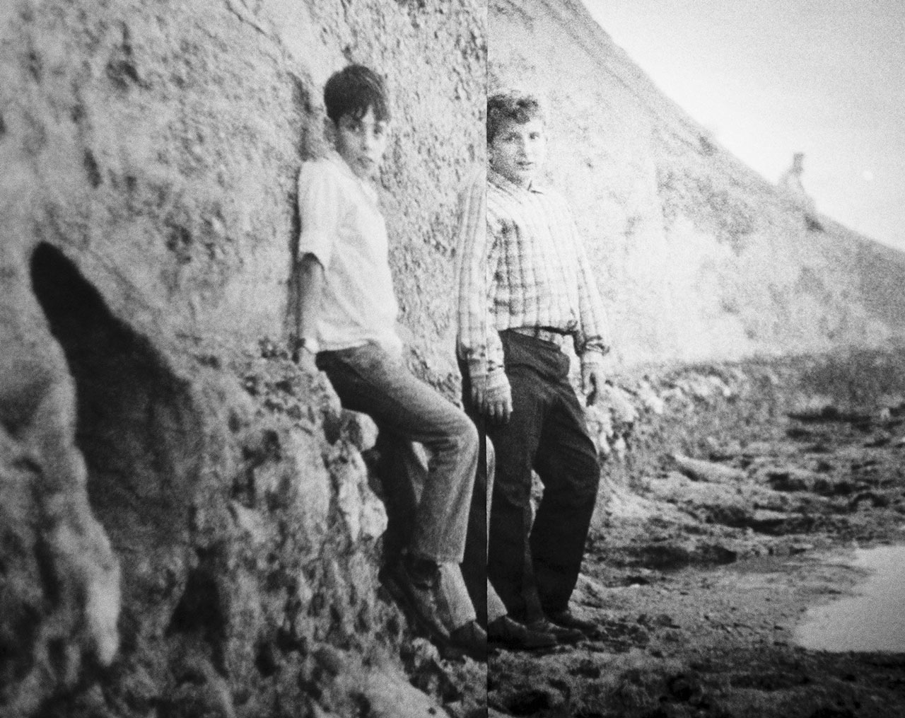
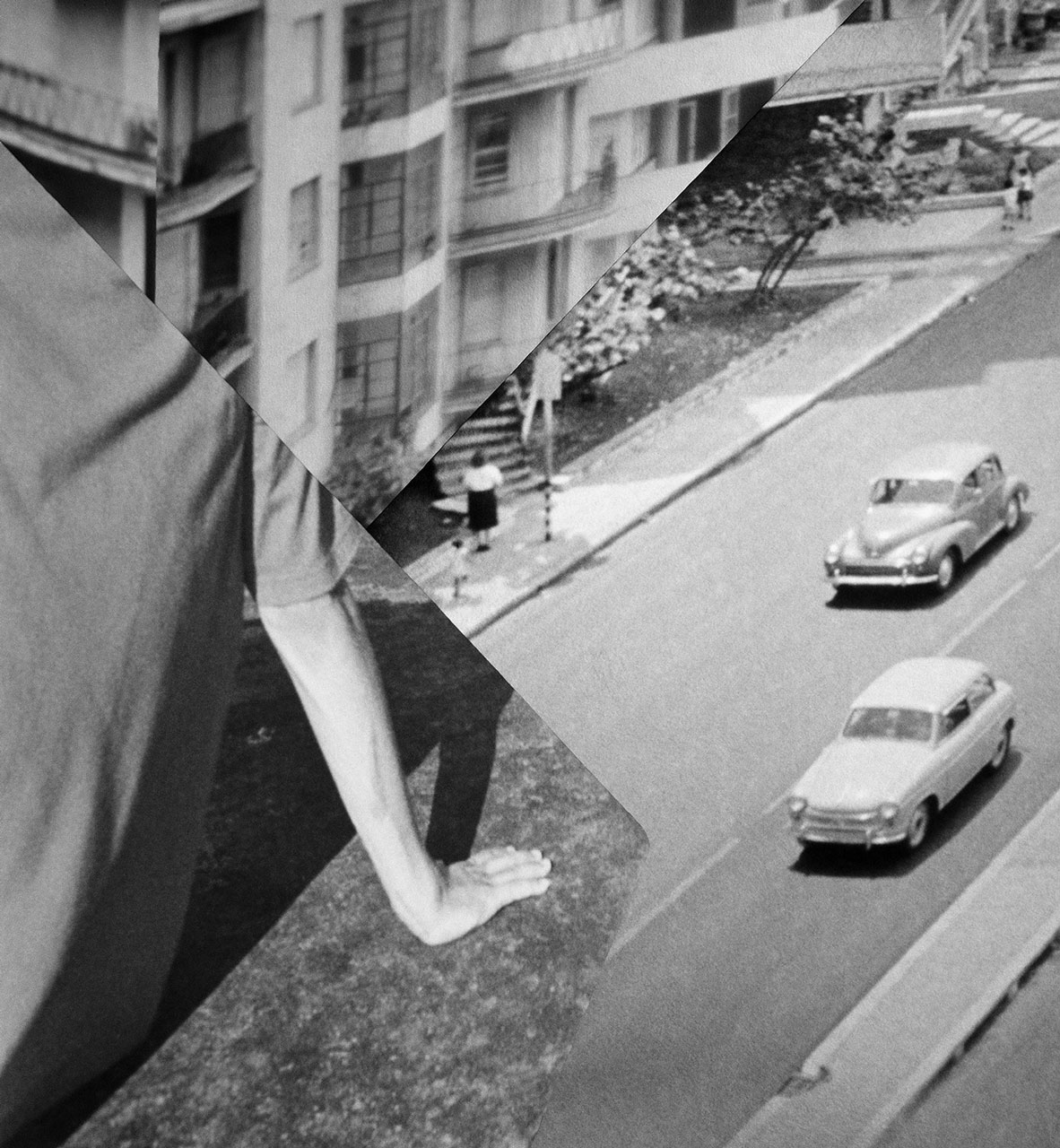
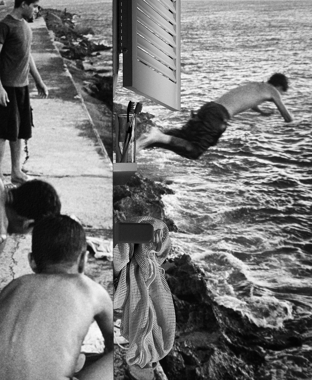
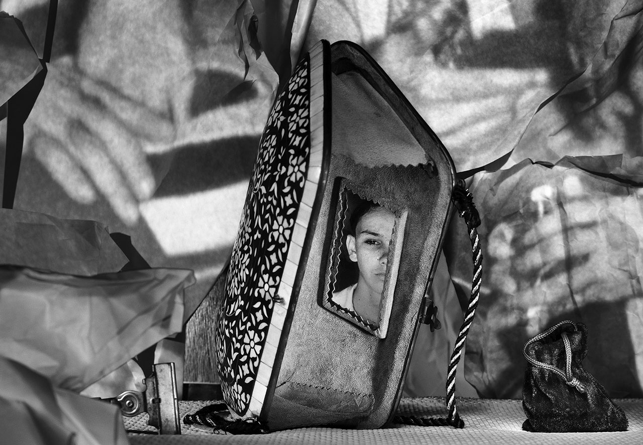
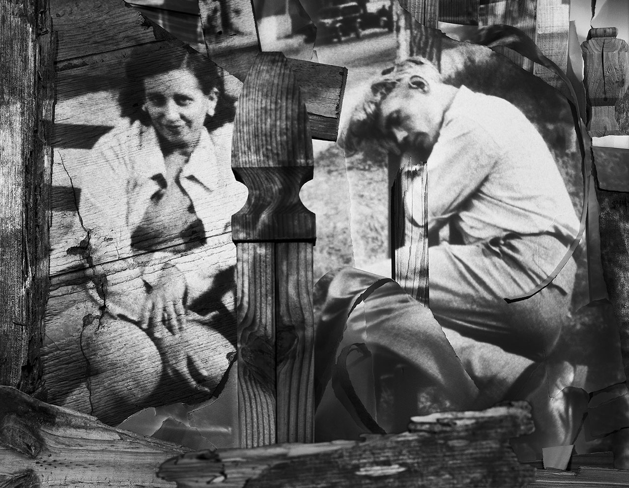
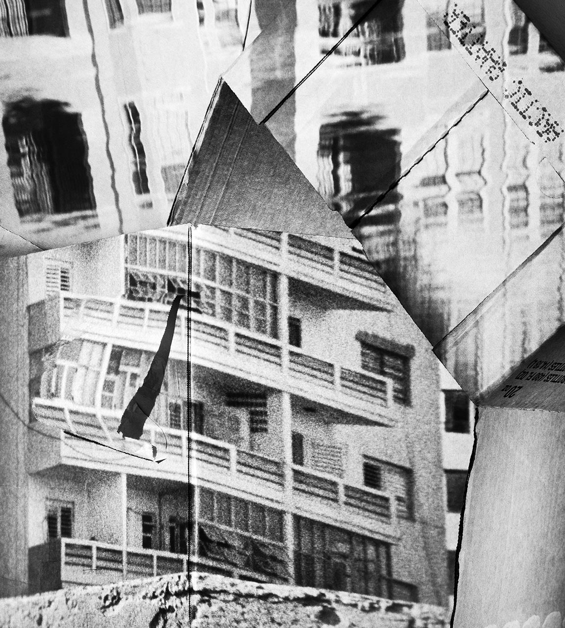
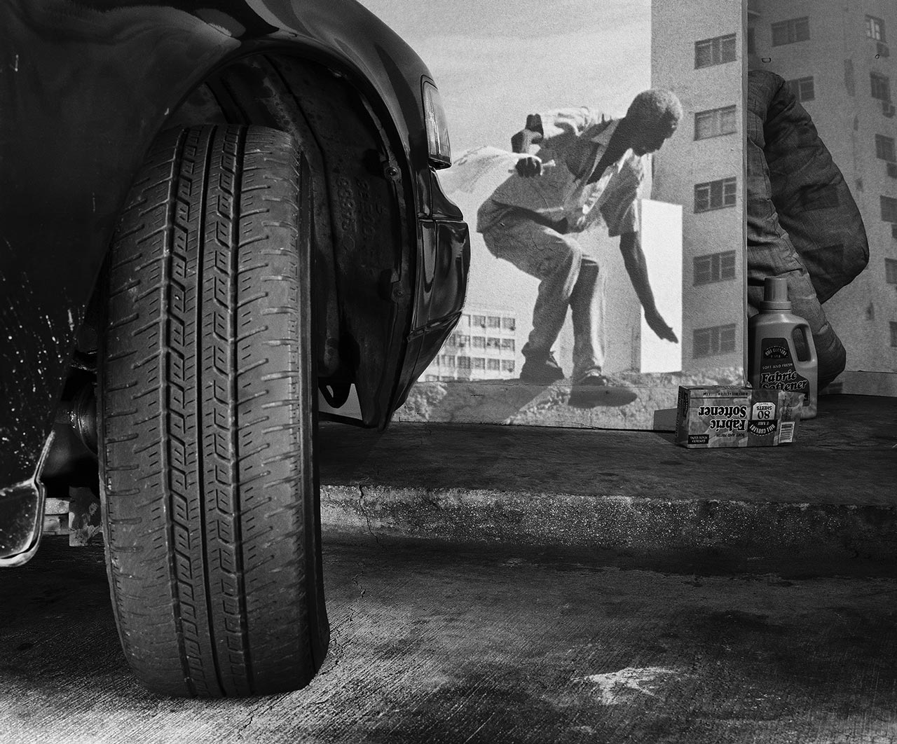
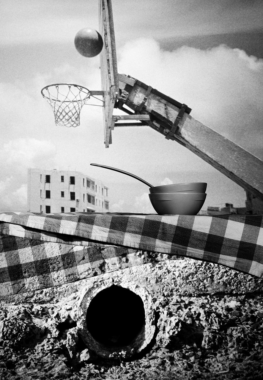
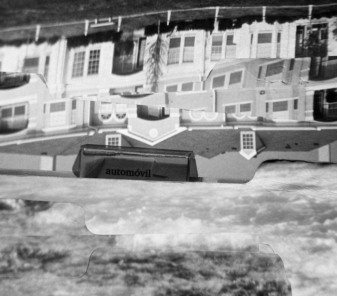
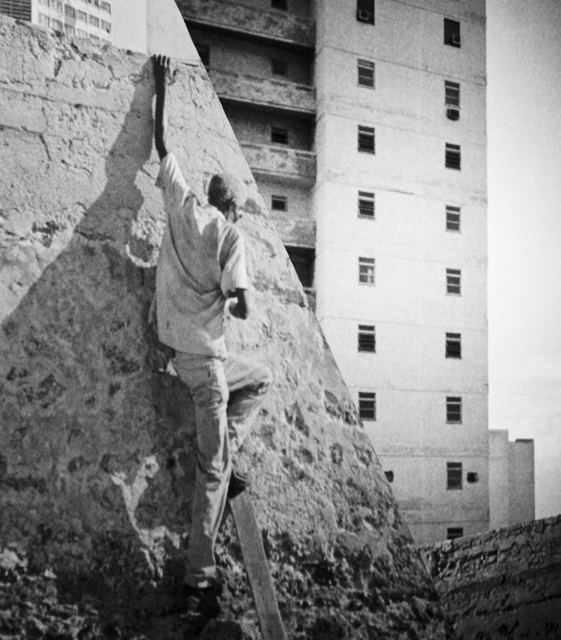
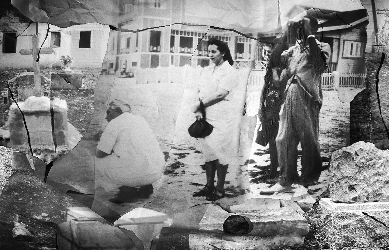
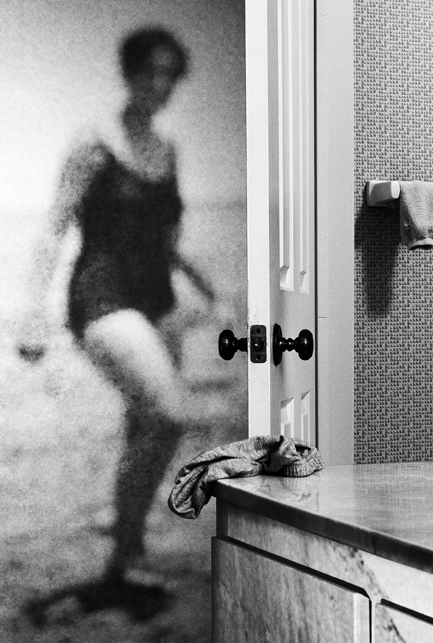
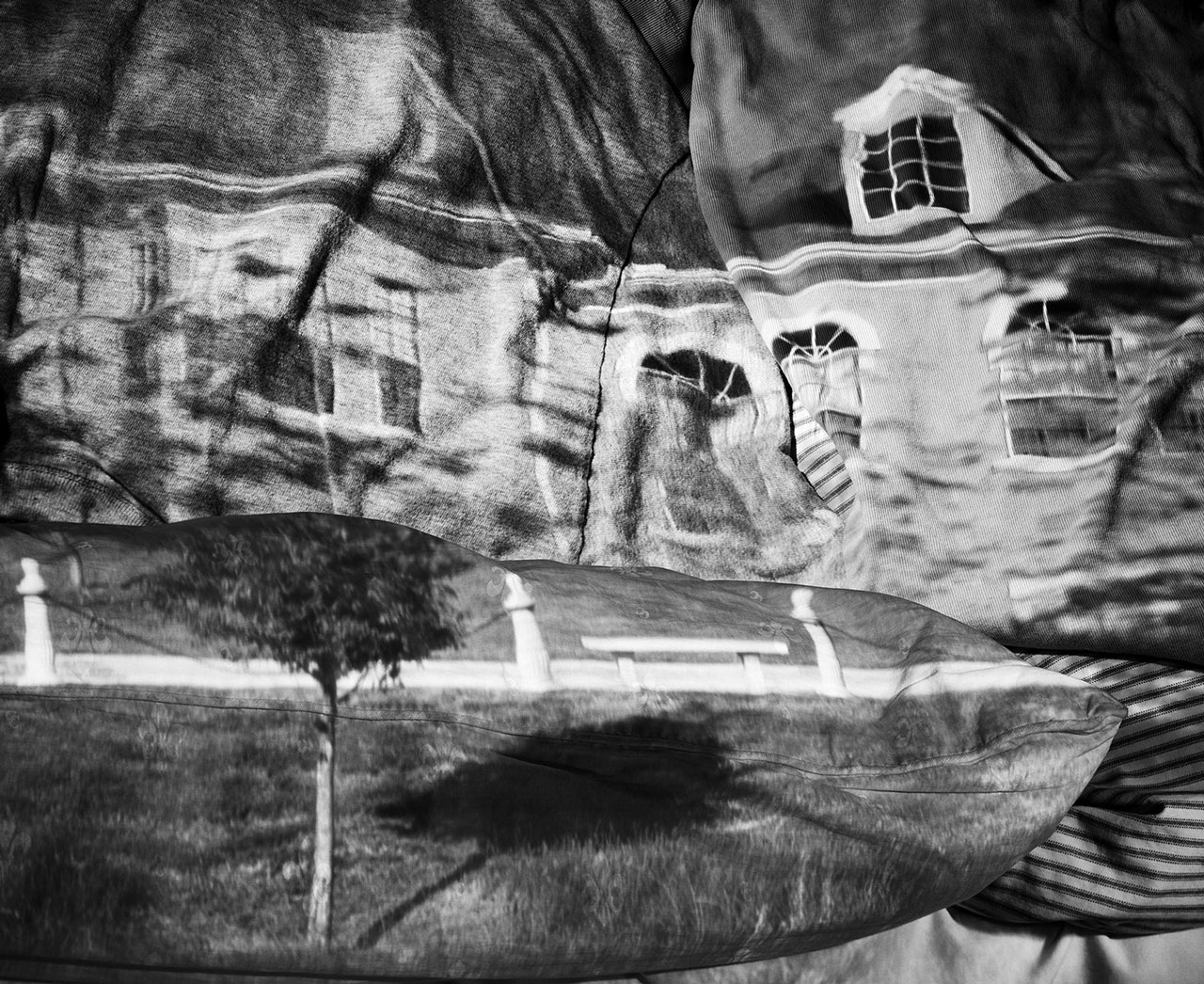
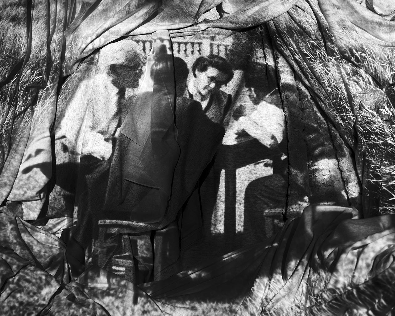
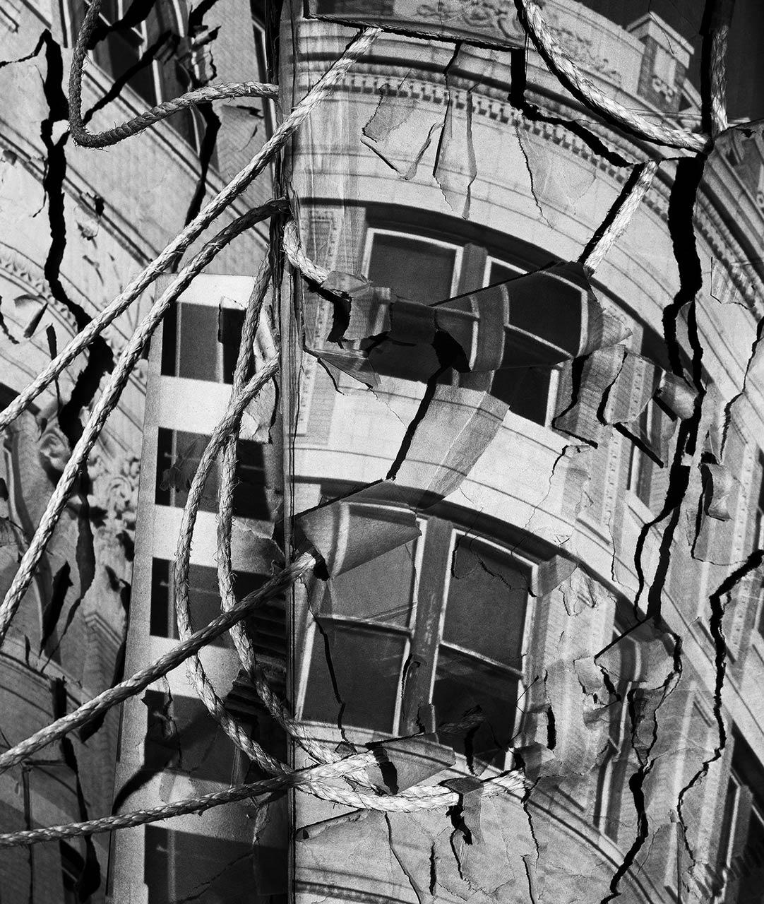
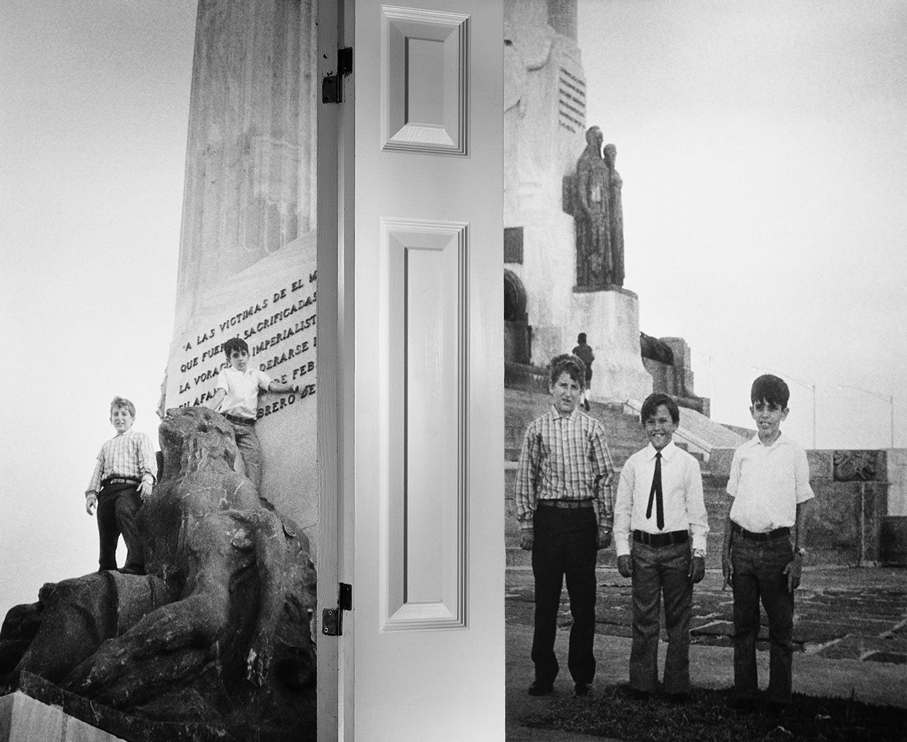
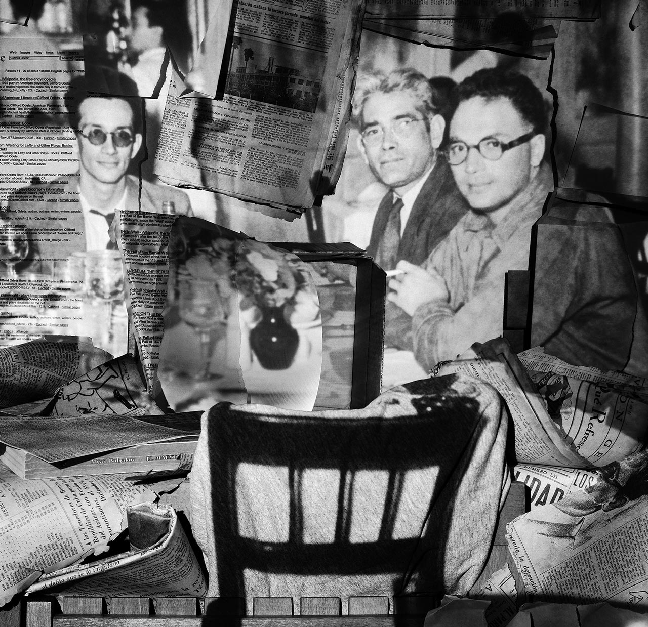
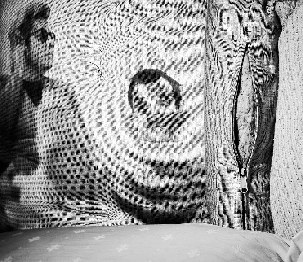
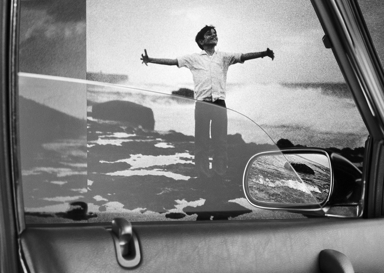
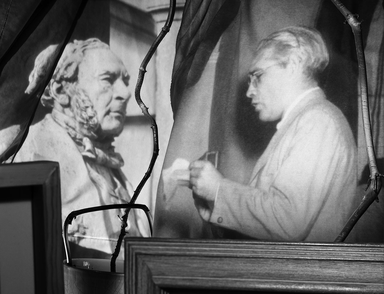
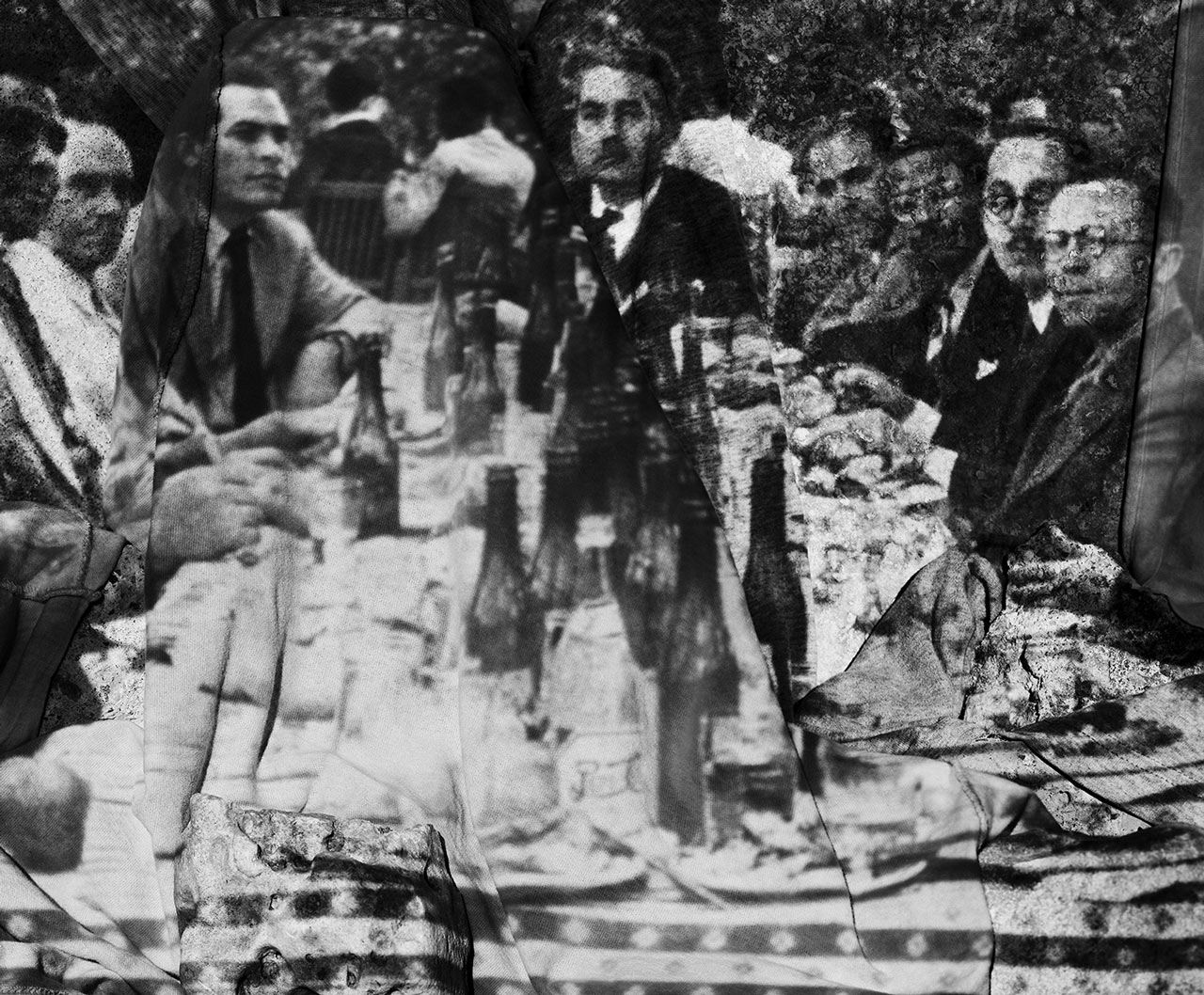
Traveling through his memories and belongings, Eduardo Muñoz Ordoqui constructs worlds and scenarios that are situated in indefinite space-times. Cautiously merging places and occasions, he composes in his series Low Tides, Portable Worlds and Without Rest photos that involve projected images, as well as objects and their reflections. He combines the tangible and the material to create a visual journey that evokes feelings of displacement, migration and uncertainty. The images tell the story of the search for meaning among places and memories.
 Eduardo Muñoz Ordoqui (Cuba, 1964). Photographer. He received a Bachelor in Fine Arts degree in History of Art from the University of Havana in 1990 and a Master in Fine Arts in Studio Art from the University of Texas at Austin in 2005. He has taught photography for more than nine years in St. Edward’s University at Austin, Texas, where he is currently a Faculty Associate at the Department of Visual Studies. Muñoz-Ordoqui’s photographic work has been exhibited in solo and group shows in Europe, Latin America, China, and United States. He received a John Simon Guggenheim Memorial Foundation Fellowship in 1997, a Cintas Foundation Fellowship in 1998 and in 2007 was chosen for the Artpace International Artist-in-Residence program in San Antonio, Texas, USA. His photographs are held in private and institutional collections in the Americas and Europe.


Traveling through his memories and belongings, Eduardo Muñoz Ordoqui constructs worlds and scenarios that are situated in indefinite space-times. Cautiously merging places and occasions, he composes in his series Low Tides, Portable Worlds and Without Rest photos that involve projected images, as well as objects and their reflections. He combines the tangible and the material to create a visual journey that evokes feelings of displacement, migration and uncertainty. The images tell the story of the search for meaning among places and memories.
 Eduardo Muñoz Ordoqui (Cuba, 1964). Photographer. He received a Bachelor in Fine Arts degree in History of Art from the University of Havana in 1990 and a Master in Fine Arts in Studio Art from the University of Texas at Austin in 2005. He has taught photography for more than nine years in St. Edward’s University at Austin, Texas, where he is currently a Faculty Associate at the Department of Visual Studies. Muñoz-Ordoqui’s photographic work has been exhibited in solo and group shows in Europe, Latin America, China, and United States. He received a John Simon Guggenheim Memorial Foundation Fellowship in 1997, a Cintas Foundation Fellowship in 1998 and in 2007 was chosen for the Artpace International Artist-in-Residence program in San Antonio, Texas, USA. His photographs are held in private and institutional collections in the Americas and Europe.
Kent Krugh
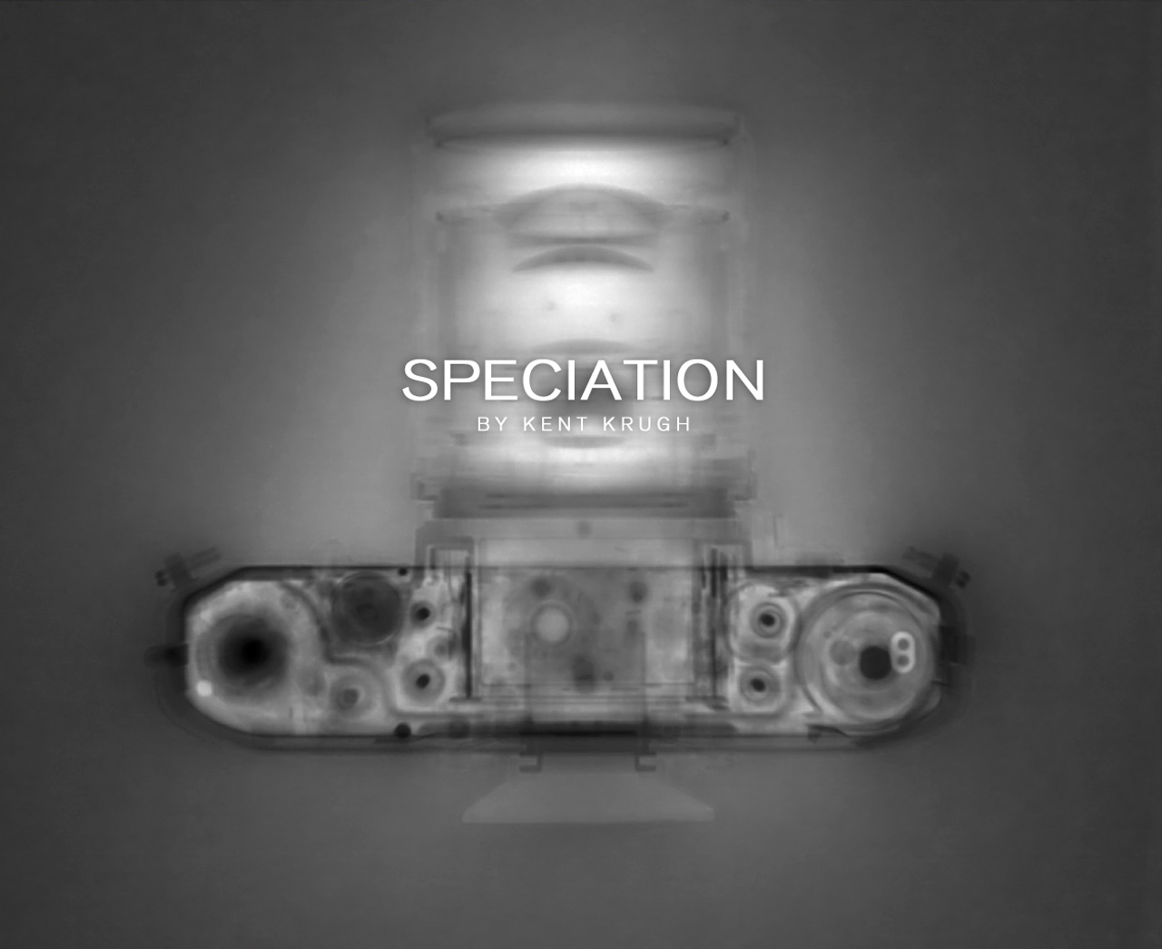
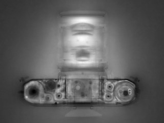
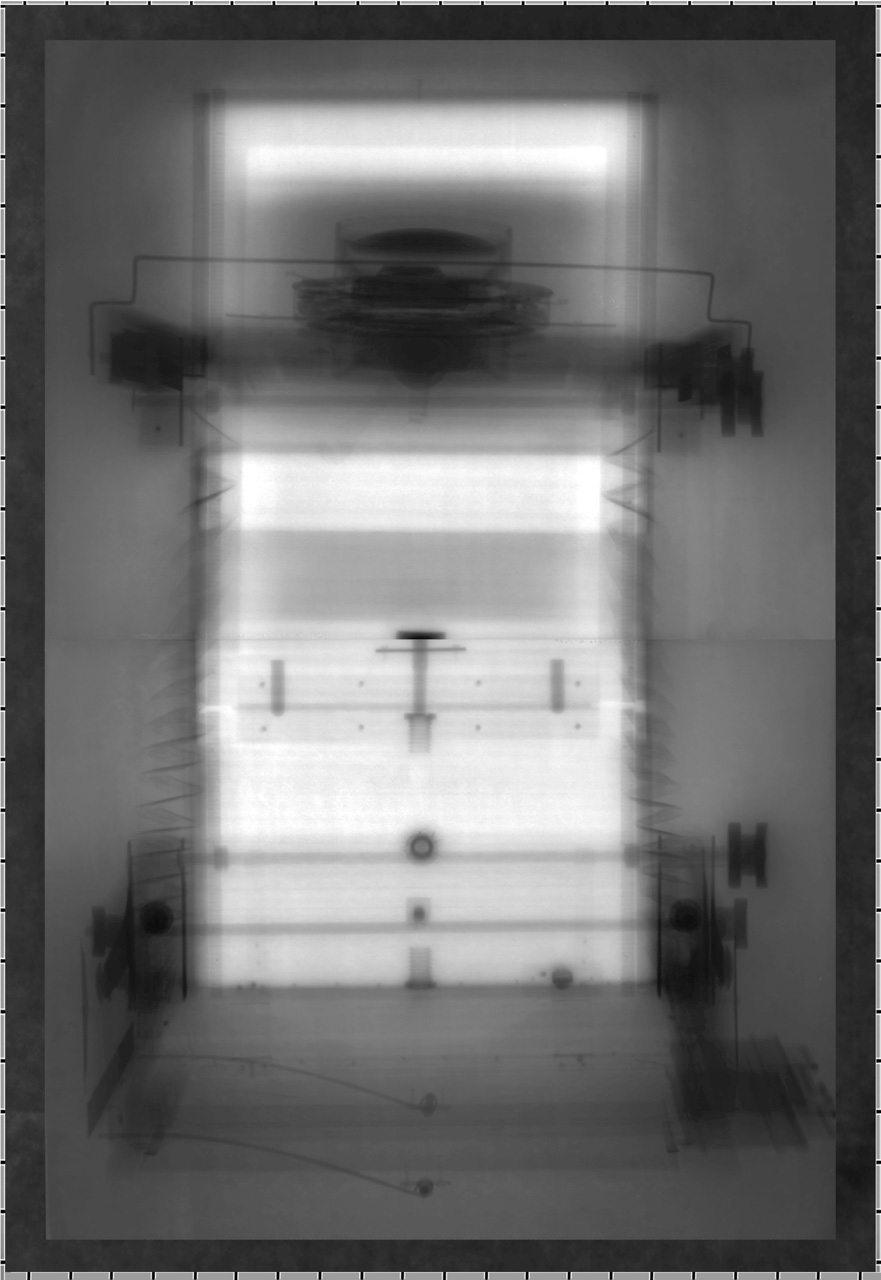
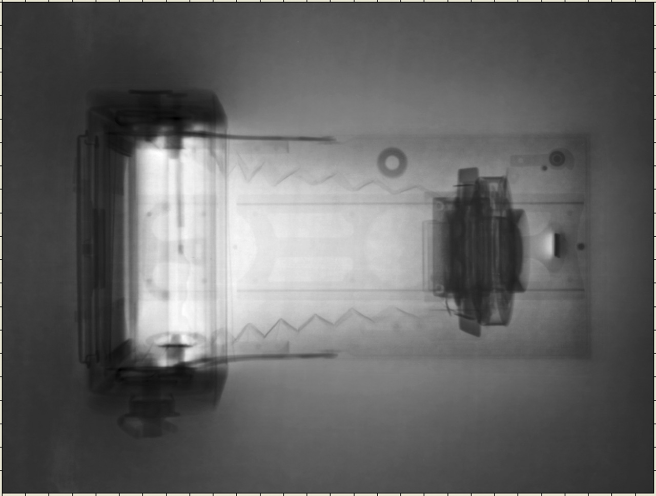
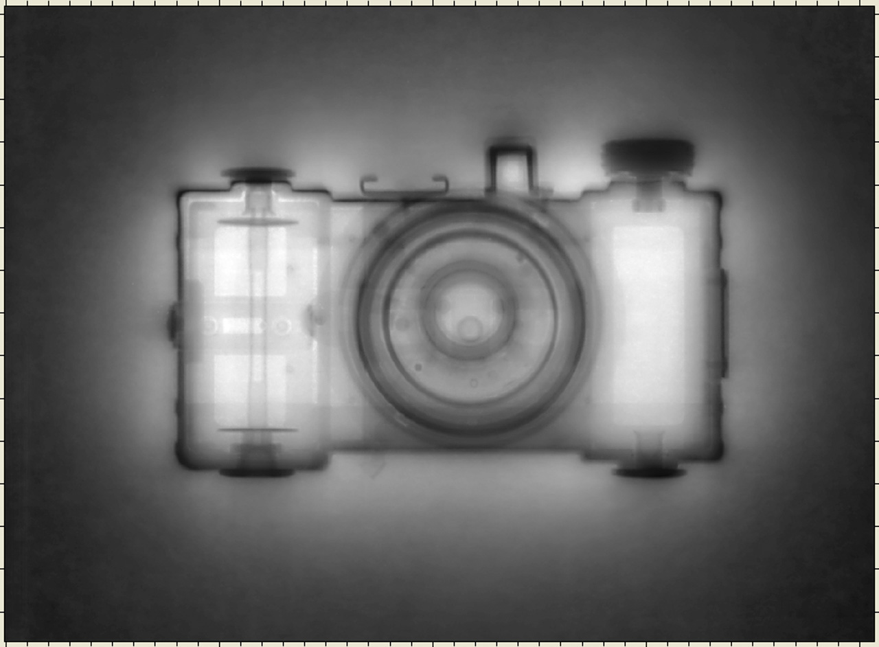
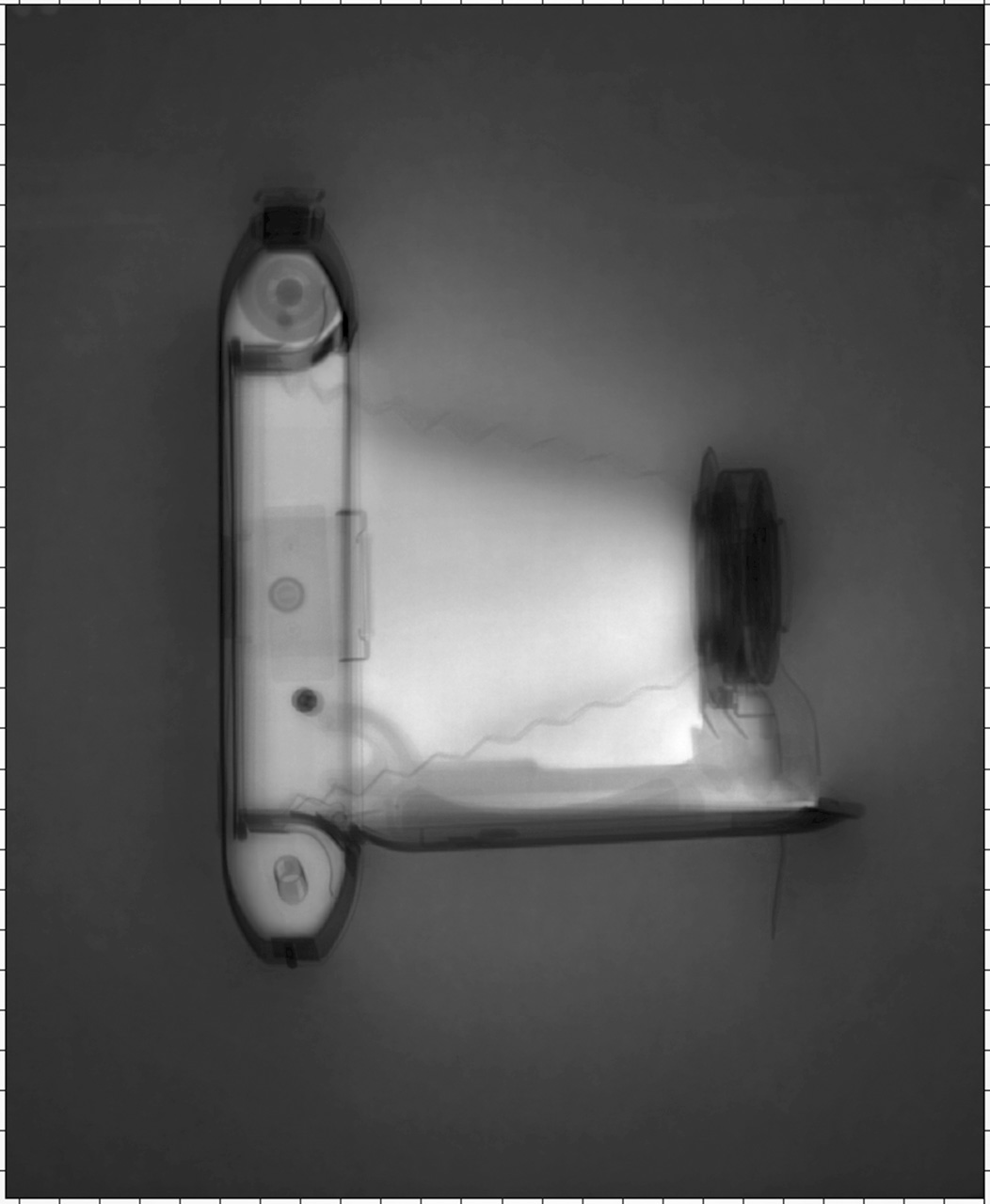
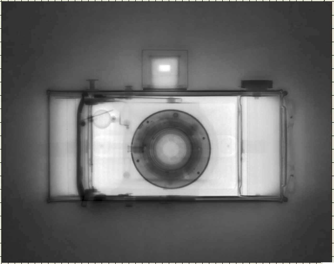
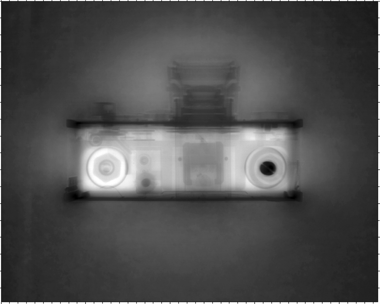
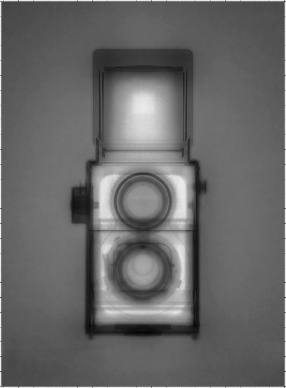
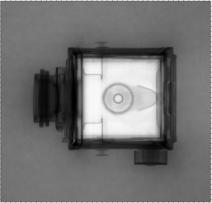
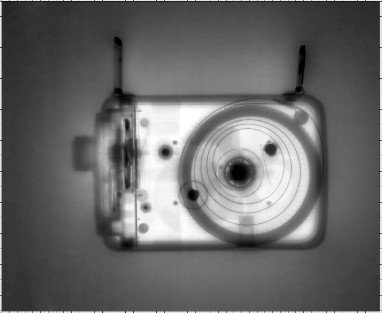
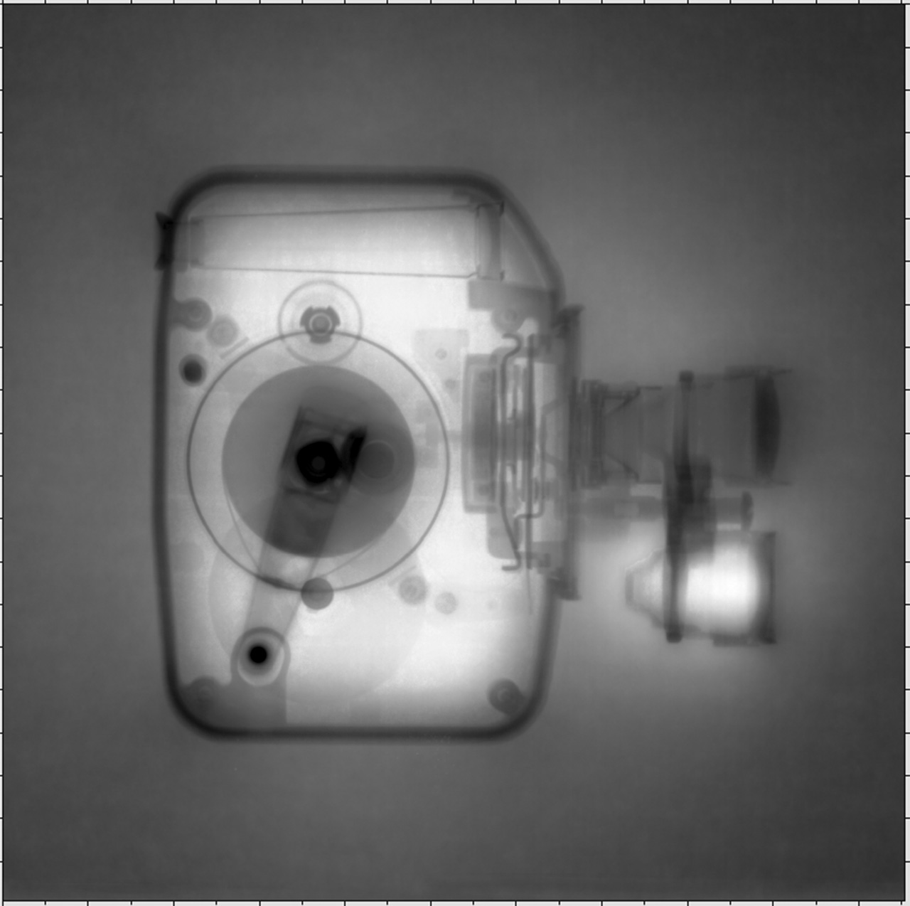
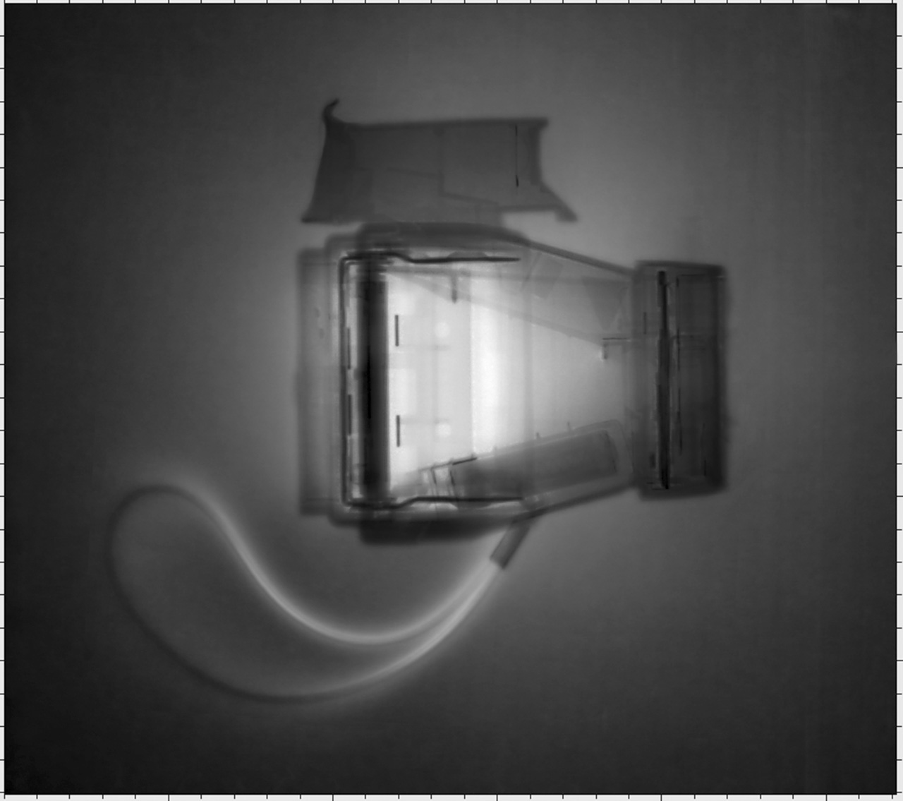
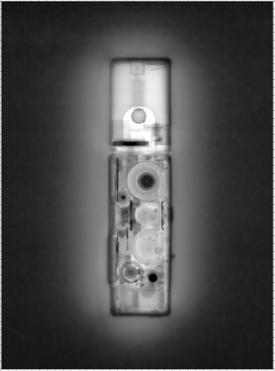
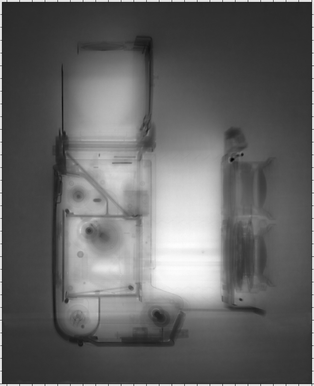
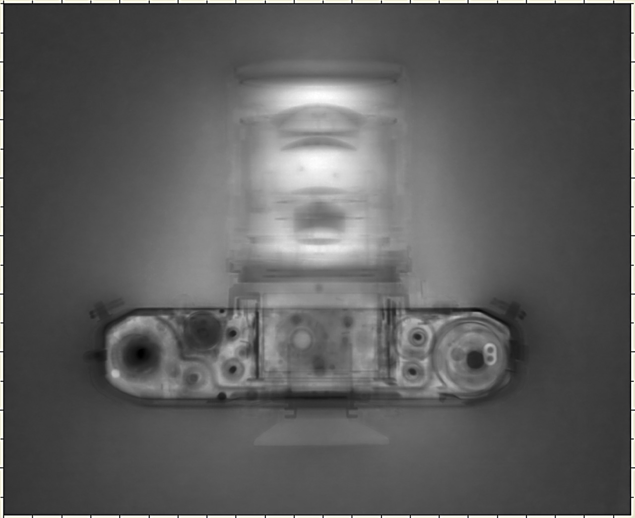
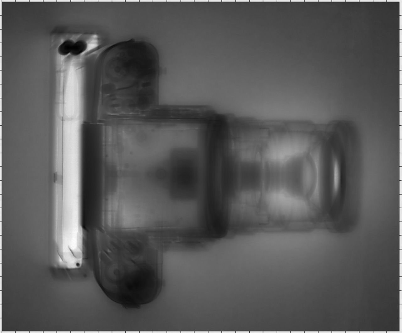
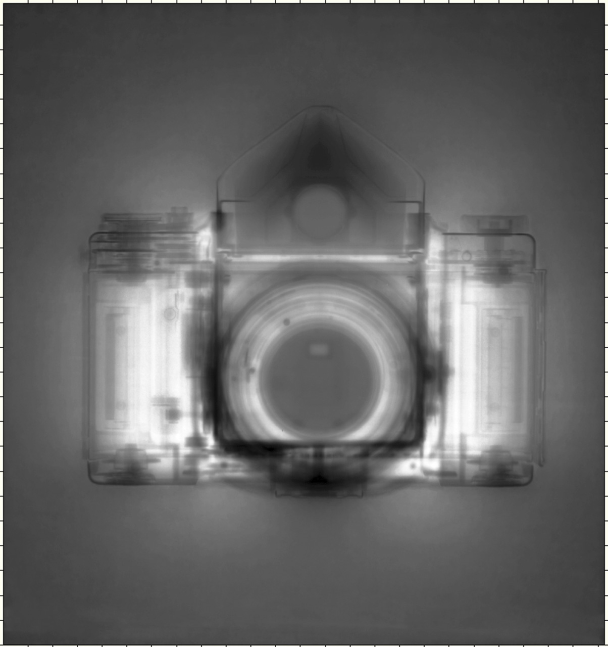
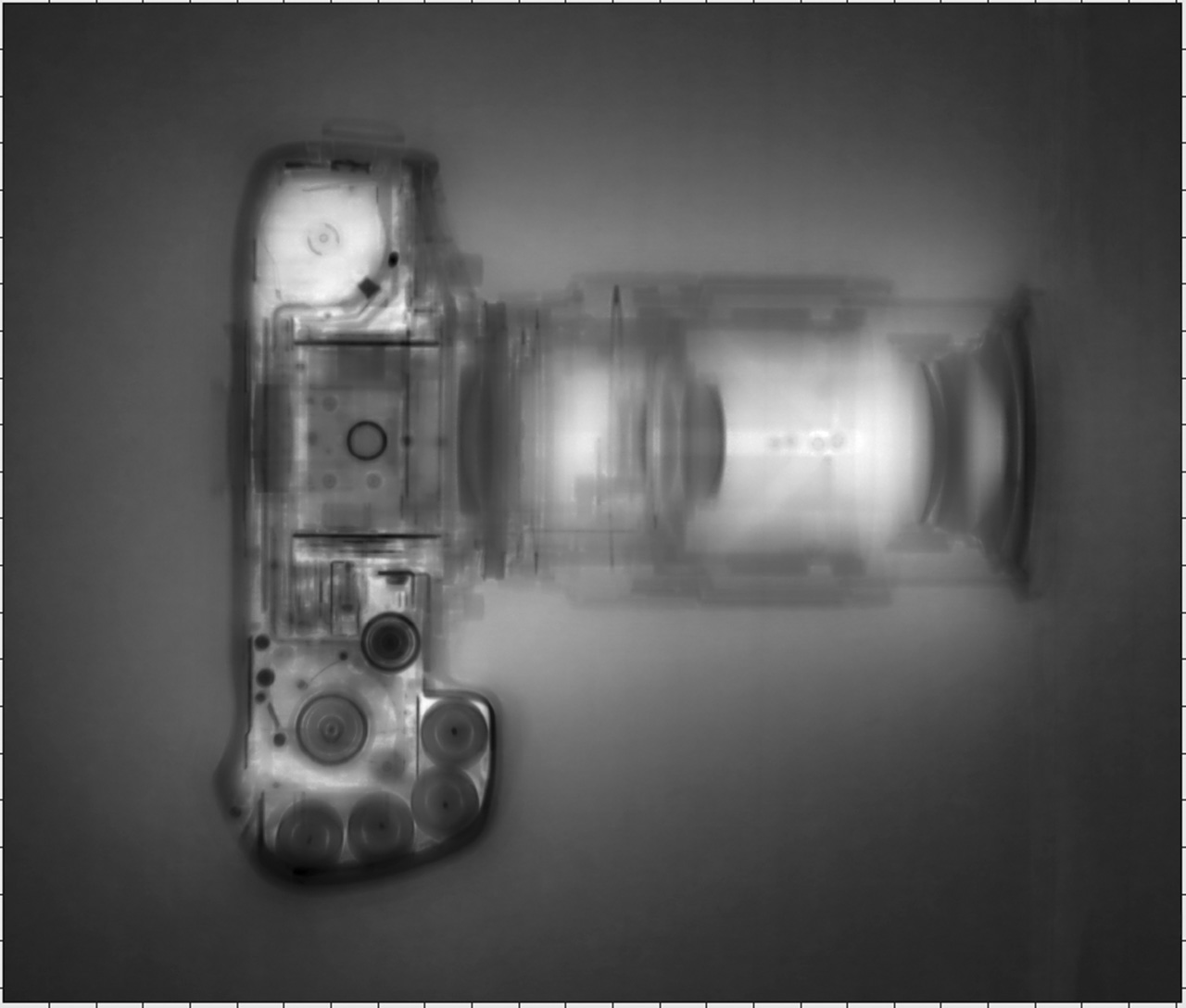
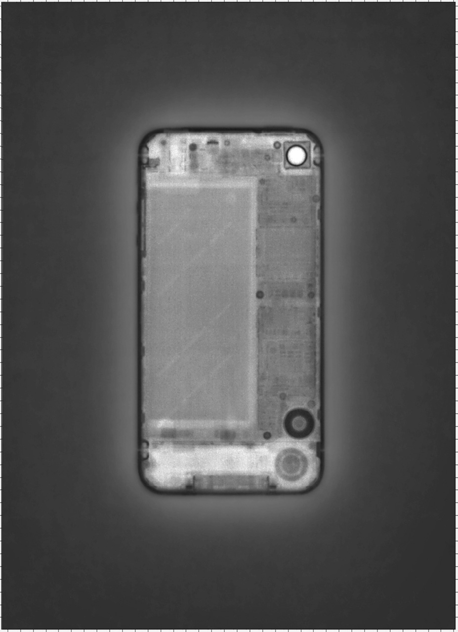
This body of work, using linear accelerator x-rays of cameras, explores the micro-evolution of cameras over time. While form and media may have changed, the camera is still a camera: a tool to create images by capturing photons of light. In a sense, it is an homage to the cameras I have used and handled. A linear accelerator produces high energy particles and x-rays and is used in physics research and health care to treat cancer patients. The resulting images align with an inner desire to probe those unseen spaces and realms I sense exist, but do not observe with my eyes.
 Kent Krugh is a fine art photographer, living and working in Greater Cincinnati, OH. Ten years ago he decided to dedicate himself to photography. He has received numerous awards in national and international competitions and was a Photolucida 2012 and 2014 Critical Mass Finalist.. His work has been exhibited in national and international group and solo venues. He also taught workshops in collaboration with Colegiatura Colombiana del Diseño, Fundación Universitaria de Bellas Artes and Centro Colombo Americano under the auspices of the Universidad de Antioquia. Krugh’s work has been exhibited at three major festivals: Fringe Festival 2010, Cincinnati, OH; FotoFest Biennial 2012, Houston, TX; and FotoFocus Biennial 2012, Cincinnati, OH. Krugh's work can be found in numerous private collections and museums including the Portland Art Museum and the Cleveland Museum of Art.
[core_state] => 1 [core_access] => 1 [core_metadata] => {"robots":"","author":"Kent Krugh","rights":"","xreference":""} [core_created_user_id] => 838 [core_created_by_alias] => [core_created_time] => 2015-02-10 21:22:20 [core_images] => {"image_intro":"images\/categories\/open-content\/krugh.jpg","float_intro":"","image_intro_alt":"","image_intro_caption":"","image_fulltext":"images\/categories\/open-content\/krugh.jpg","float_fulltext":"","image_fulltext_alt":"","image_fulltext_caption":""} [core_modified_time] => 2016-06-22 18:25:45 [core_language] => en-GB [core_catid] => 37 [core_publish_up] => 2015-02-10 21:22:20 [core_publish_down] => 0000-00-00 00:00:00 [content_type_title] => Article [router] => ContentHelperRoute::getArticleRoute [author] => Elisa Rugo [author_email] => elisa@zonezero.com [link] => index.php?option=com_content&view=article&id=248:speciation&catid=37&lang=en-GB [displayDate] => 2015-02-10 21:22:20 [event] => stdClass Object ( [afterDisplayTitle] => [beforeDisplayContent] => [afterDisplayContent] => ) [text] =>

This body of work, using linear accelerator x-rays of cameras, explores the micro-evolution of cameras over time. While form and media may have changed, the camera is still a camera: a tool to create images by capturing photons of light. In a sense, it is an homage to the cameras I have used and handled. A linear accelerator produces high energy particles and x-rays and is used in physics research and health care to treat cancer patients. The resulting images align with an inner desire to probe those unseen spaces and realms I sense exist, but do not observe with my eyes.


 Kent Krugh is a fine art photographer, living and working in Greater Cincinnati, OH. Ten years ago he decided to dedicate himself to photography. He has received numerous awards in national and international competitions and was a Photolucida 2012 and 2014 Critical Mass Finalist.. His work has been exhibited in national and international group and solo venues. He also taught workshops in collaboration with Colegiatura Colombiana del Diseño, Fundación Universitaria de Bellas Artes and Centro Colombo Americano under the auspices of the Universidad de Antioquia. Krugh’s work has been exhibited at three major festivals: Fringe Festival 2010, Cincinnati, OH; FotoFest Biennial 2012, Houston, TX; and FotoFocus Biennial 2012, Cincinnati, OH. Krugh's work can be found in numerous private collections and museums including the Portland Art Museum and the Cleveland Museum of Art.
[id] => 248 [language] => en-GB [catid] => 37 [jcfields] => Array ( ) ) 1
Matthew Hashiguchi
 Good Luck Soup
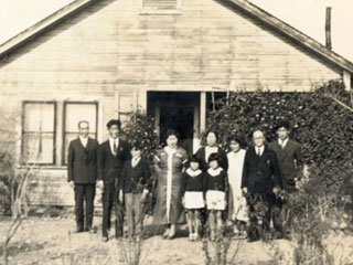
Is a transmedia storytelling project documenting and sharing stories of the Japanese American and Japanese Canadian experience after they left the internment camps. The project consists of a feature-length documentary film, titled Good Luck Soup and an interactive, participatory website, Good Luck Soup Interactive. On this website stories will be told through uploaded text and photographs from internment camp victims, or their families, and will be shared through an interactive website and map.
 People Aren't All Bad
ZZ. What has been the reaction of the public to your invitation to participate in your transmedia storytelling project?
MH. We've had a consistently positive response from the Japanese American/Canadian community. Initially, I think many have been nervous about sharing their own stories and experiences, but once we sit down with them and talk about their life, they tend to open up. It's been a form of catharsis, I think, because many people have never discussed their issues or experiences of being Japanese American/Canadian... and some of these things are very difficult topics or thoughts that have been bottled up. So, it's a very emotional experience to share these thoughts and feelings. We haven't yet opened it up to the general public, but again, everyone has been consistently positive, and I have no reason to think the reaction will be any different once its available to all Japanese Americans and Japanese Canadians.
ZZ. What means of publicity are you using or are you planning to use for the diffusion of the project?
MH. Social media will be a huge tool for publicity and marketing. We've already reached and met so many people through Twitter and Facebook, and we'll certainly continue to utilize those outlets. We've been in communication with many Asian American and Asian Canadian organizations that have offered their support once the project is complete, and the opportunity to collaborate with entities such as the Japanese American Citizens League, the Japanese American National Museum and the Nikkei National Museum would be priceless. We're certainly inspired by their mission and view our project as a continuation of what they offer the public.
In addition to the interactive documentary, this project also includes a feature length film. Film festivals will be another great opportunity to screen the film and present the interactive project to an audience.
ZZ. Can you share with us how you have experienced the realisation, dissemination and the reach of the project thus far?
MH. It's been a very gradual and collaborative process, and luckily I have an incredible team of colleagues and friends that have made the realization of this project possible, and without their help, I would not have been able to get this project made. The work load is split up fairly well. Right now, our web-designer/coder (Russell Goldenberg) is building the site. He's the one sitting alone typing away at his computer. Every few weeks, we'll all have a meeting where we discuss the direction of the project... and then Russell goes and brings it to life. Billy Wirasnik, Emily Ferrier and myself and have been in charge of content aggregation. So we're narrowing the aim of the stories and in many cases, going out and finding those stories and individuals. It's a solid collaboration made up of various creative visions, rather than one. And, as the Project Creator, I really enjoy a hands-off approach that allows individuals to run off with an idea and make it their own.
 Matthew Hashiguchi (1984). Based in Boston, Massachusetts. After graduating from The Ohio State University in 2007 with a BA in Photojournalism, Matthew went on to work and intern as a multimedia journalist for The Findlay Courier, The Lima News and The Washington Post. In 2008, he returned to school and graduated from Emerson College with an MFA in Visual and Media Art and has since been working as an independent documentary filmmaker and educator, whose work focuses on the diverse cultural, social and ethnic stories of American society. For his film The Lower 9 he has received various awards.
 Good Luck Soup
Is a transmedia storytelling project documenting and sharing stories of the Japanese American and Japanese Canadian experience after they left the internment camps. The project consists of a feature-length documentary film, titled Good Luck Soup and an interactive, participatory website, Good Luck Soup Interactive. On this website stories will be told through uploaded text and photographs from internment camp victims, or their families, and will be shared through an interactive website and map.
 People Aren't All Bad
ZZ. What has been the reaction of the public to your invitation to participate in your transmedia storytelling project?
MH. We've had a consistently positive response from the Japanese American/Canadian community. Initially, I think many have been nervous about sharing their own stories and experiences, but once we sit down with them and talk about their life, they tend to open up. It's been a form of catharsis, I think, because many people have never discussed their issues or experiences of being Japanese American/Canadian... and some of these things are very difficult topics or thoughts that have been bottled up. So, it's a very emotional experience to share these thoughts and feelings. We haven't yet opened it up to the general public, but again, everyone has been consistently positive, and I have no reason to think the reaction will be any different once its available to all Japanese Americans and Japanese Canadians.
ZZ. What means of publicity are you using or are you planning to use for the diffusion of the project?
MH. Social media will be a huge tool for publicity and marketing. We've already reached and met so many people through Twitter and Facebook, and we'll certainly continue to utilize those outlets. We've been in communication with many Asian American and Asian Canadian organizations that have offered their support once the project is complete, and the opportunity to collaborate with entities such as the Japanese American Citizens League, the Japanese American National Museum and the Nikkei National Museum would be priceless. We're certainly inspired by their mission and view our project as a continuation of what they offer the public.
In addition to the interactive documentary, this project also includes a feature length film. Film festivals will be another great opportunity to screen the film and present the interactive project to an audience.
ZZ. Can you share with us how you have experienced the realisation, dissemination and the reach of the project thus far?
MH. It's been a very gradual and collaborative process, and luckily I have an incredible team of colleagues and friends that have made the realization of this project possible, and without their help, I would not have been able to get this project made. The work load is split up fairly well. Right now, our web-designer/coder (Russell Goldenberg) is building the site. He's the one sitting alone typing away at his computer. Every few weeks, we'll all have a meeting where we discuss the direction of the project... and then Russell goes and brings it to life. Billy Wirasnik, Emily Ferrier and myself and have been in charge of content aggregation. So we're narrowing the aim of the stories and in many cases, going out and finding those stories and individuals. It's a solid collaboration made up of various creative visions, rather than one. And, as the Project Creator, I really enjoy a hands-off approach that allows individuals to run off with an idea and make it their own.
 Matthew Hashiguchi (1984). Based in Boston, Massachusetts. After graduating from The Ohio State University in 2007 with a BA in Photojournalism, Matthew went on to work and intern as a multimedia journalist for The Findlay Courier, The Lima News and The Washington Post. In 2008, he returned to school and graduated from Emerson College with an MFA in Visual and Media Art and has since been working as an independent documentary filmmaker and educator, whose work focuses on the diverse cultural, social and ethnic stories of American society. For his film The Lower 9 he has received various awards.
Josef Wladyka
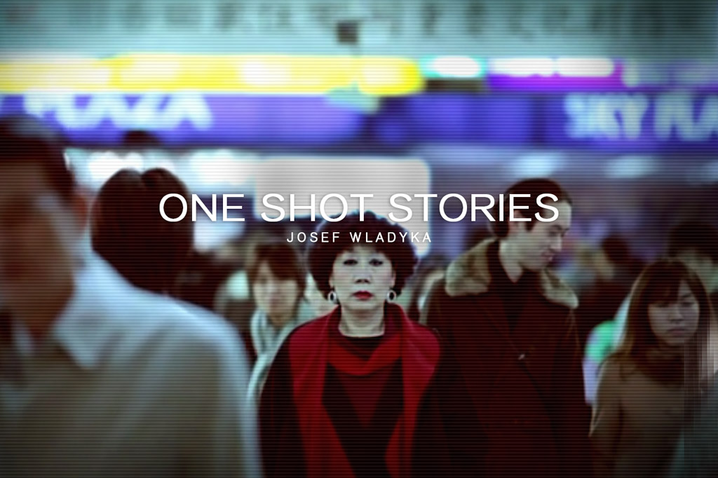
My mother left Japan more than thirty years ago and didn't return until November 2010. This is her story.
Location: Tokyo, Japan.
Cinematography: Stan Wladyka.
Music: Tyler Parkinson.
Okaasan お母さん
Beginning as a child performer in Odessa, Russia, Albert Makhtsier has been acting for over half a century. Despite being diagnosed with Parkinson's disease, Albert remains one of New York City's finest actors. This is his story.
Location: Times Square, New York City.
Cinematography: Alan Blanco.
Music: Tyler Cash.
Albert Makhtsier
Curai is a small, tight knit fishing village on the Southern Pacific Coast of Colombia. It's a place where almost everyone shares the same last name. Jacobo is a community leader there and this is one of his stories.
Location: Curai, Colombia.
Cinematography by Leonardo D'Antoni.
Music by Tyler Cash.
Jacobo Castillo Salazar
These are a collection of peoples' personal stories told through a single shot. Each story is an exploration of the universal essence of the human condition and our connection to one another that extends beyond any boundaries.
 Josef Wladyka. Lives in New York. Influenced by his parents, Josef developed a fascination for movies from a very young age. He began experimenting with filmmaking in high school and has since created several (short) films and commercials that have been screened at festivals around the world. He holds a MFA from NYU Tisch Graduate Film where he won a Spike Lee Fellowship. His debut feature film, Manos Sucias (2014), has won various awards.
My mother left Japan more than thirty years ago and didn't return until November 2010. This is her story.
Location: Tokyo, Japan.
Cinematography: Stan Wladyka.
Music: Tyler Parkinson.
Okaasan お母さん
Beginning as a child performer in Odessa, Russia, Albert Makhtsier has been acting for over half a century. Despite being diagnosed with Parkinson's disease, Albert remains one of New York City's finest actors. This is his story.
Location: Times Square, New York City.
Cinematography: Alan Blanco.
Music: Tyler Cash.
Albert Makhtsier
Curai is a small, tight knit fishing village on the Southern Pacific Coast of Colombia. It's a place where almost everyone shares the same last name. Jacobo is a community leader there and this is one of his stories.
Location: Curai, Colombia.
Cinematography by Leonardo D'Antoni.
Music by Tyler Cash.
Jacobo Castillo Salazar
These are a collection of peoples' personal stories told through a single shot. Each story is an exploration of the universal essence of the human condition and our connection to one another that extends beyond any boundaries.
 Josef Wladyka. Lives in New York. Influenced by his parents, Josef developed a fascination for movies from a very young age. He began experimenting with filmmaking in high school and has since created several (short) films and commercials that have been screened at festivals around the world. He holds a MFA from NYU Tisch Graduate Film where he won a Spike Lee Fellowship. His debut feature film, Manos Sucias (2014), has won various awards.
Rania Matar
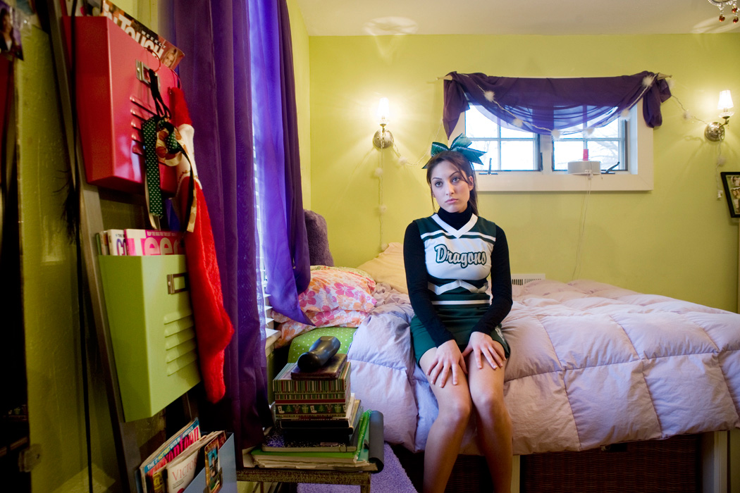
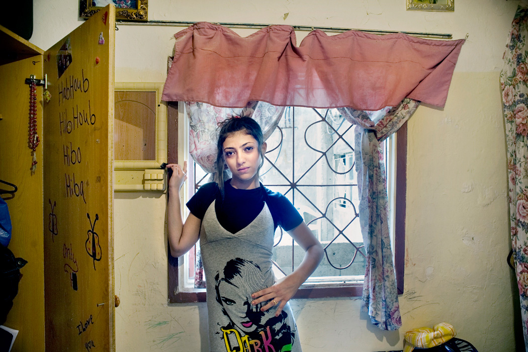
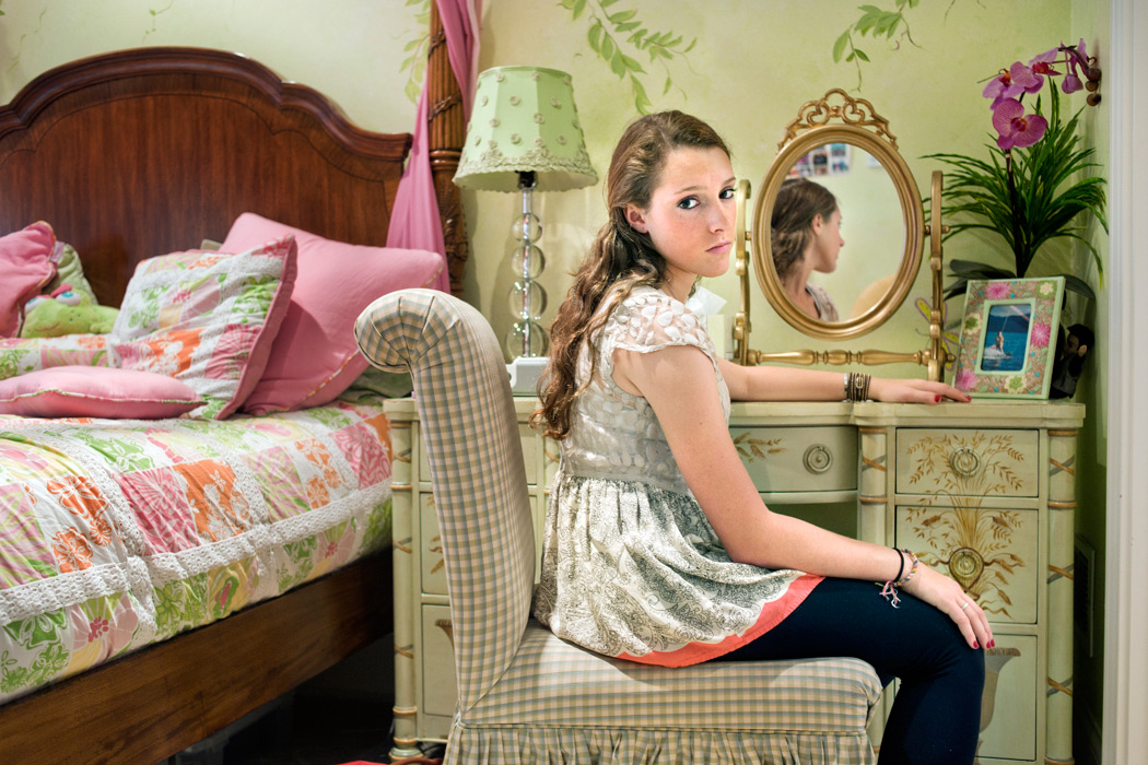
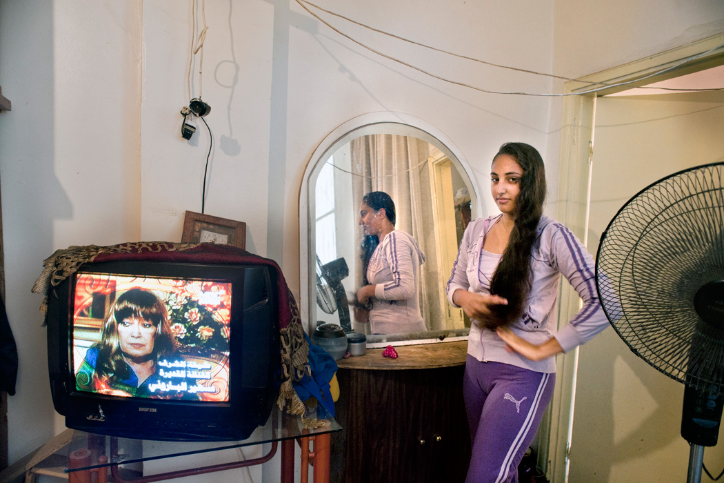
A girl and her room
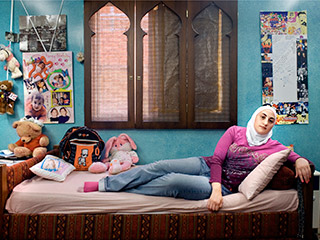
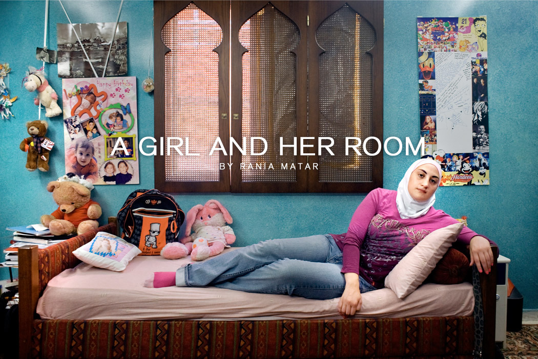
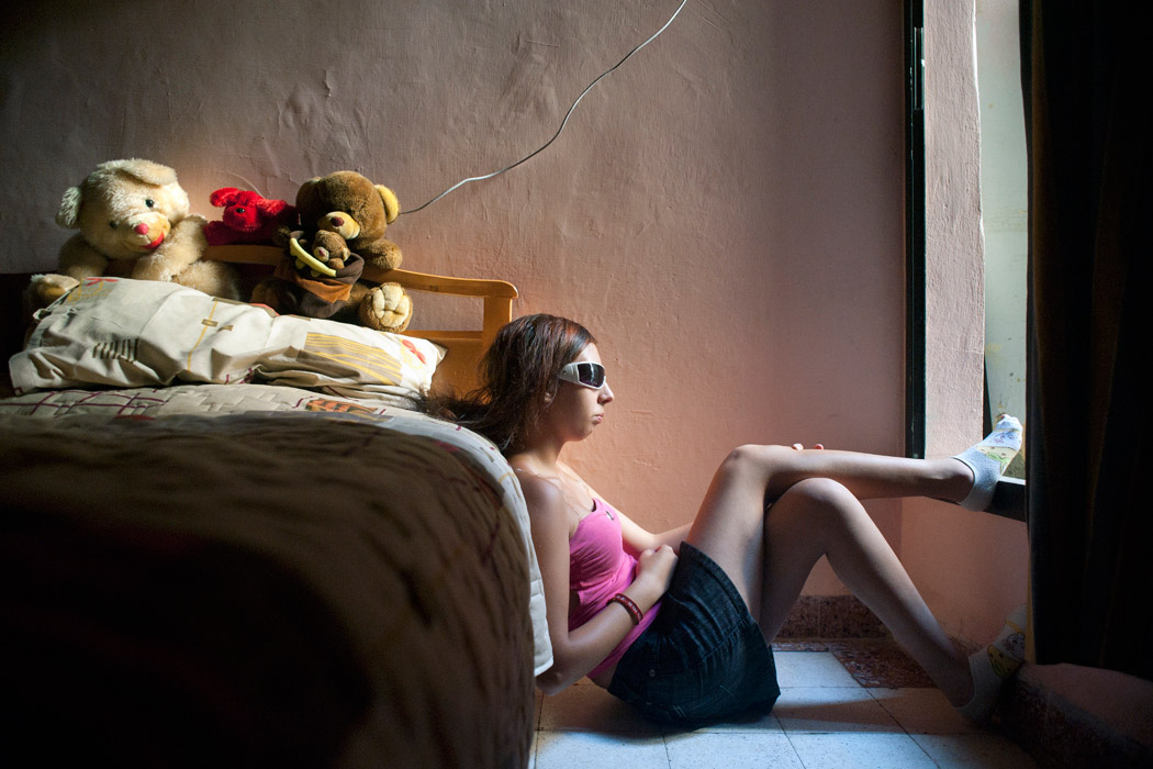
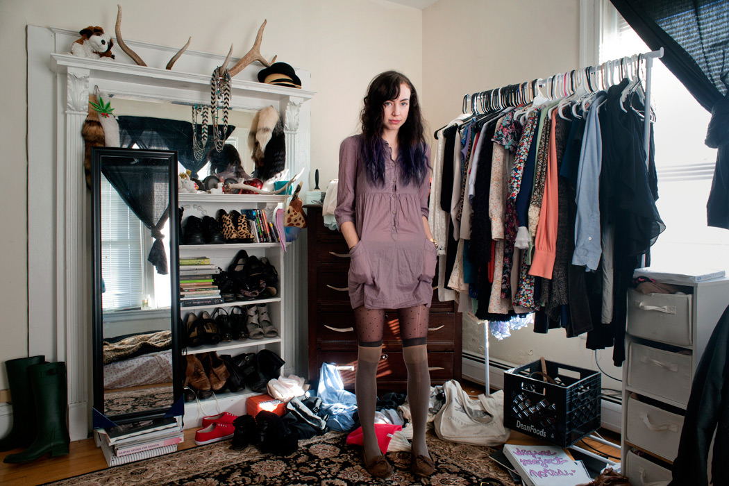
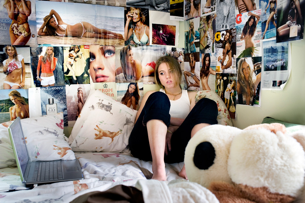
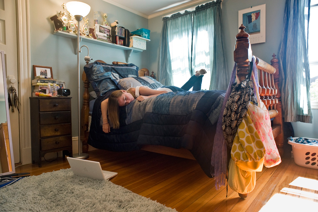
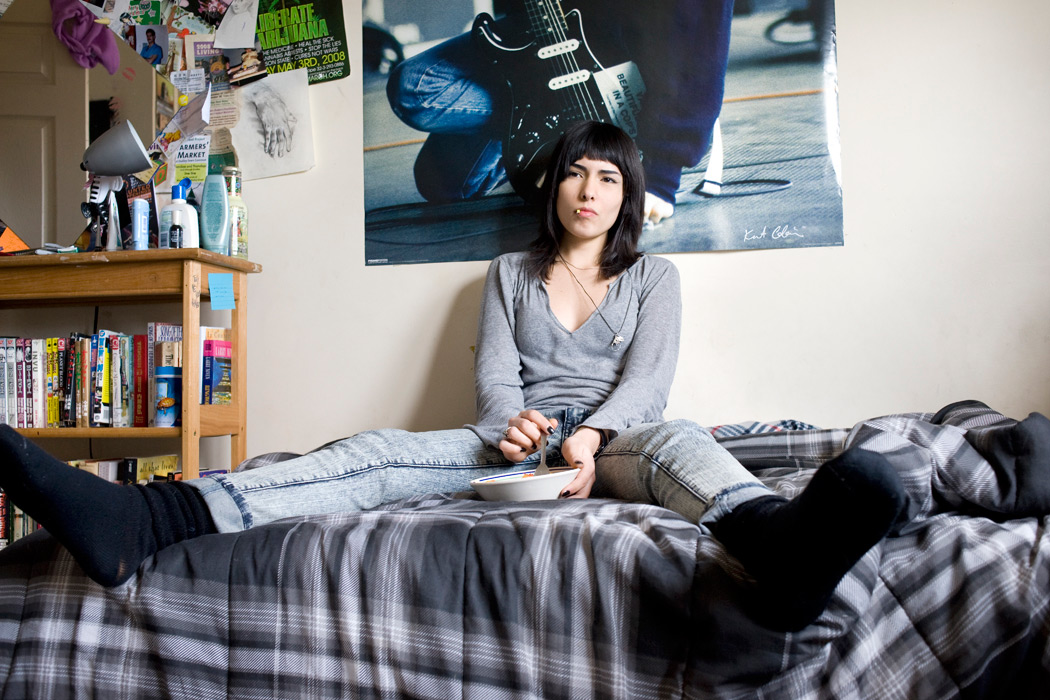
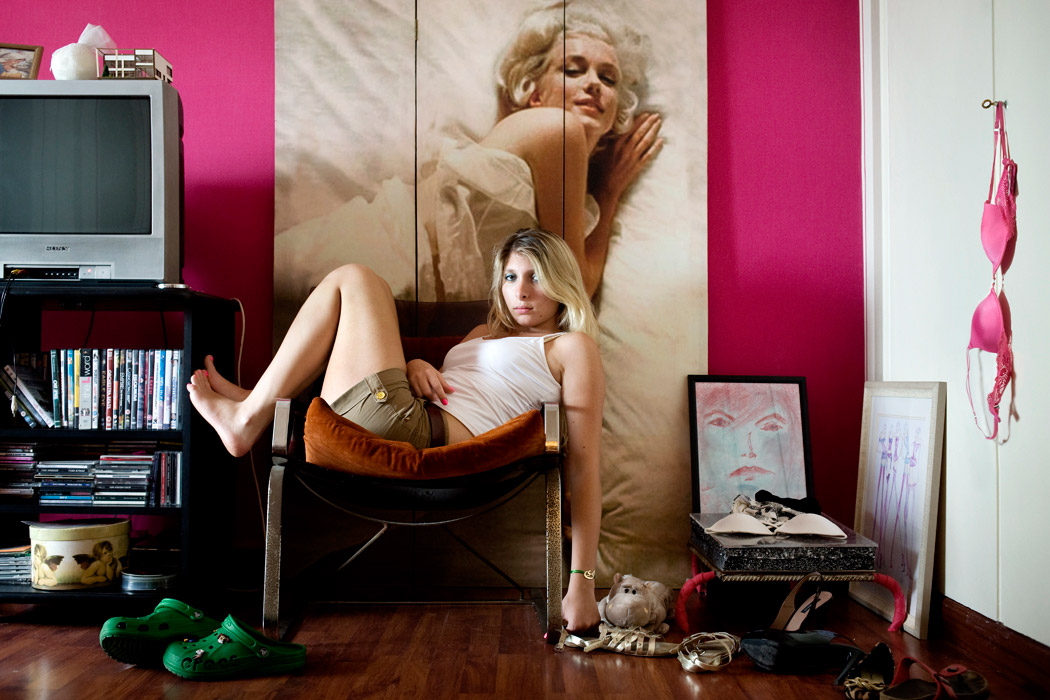
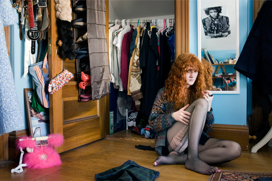
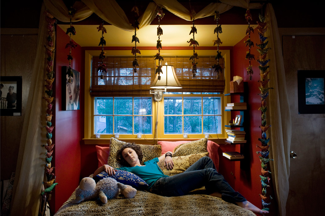
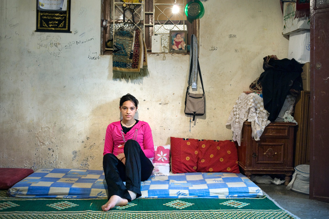
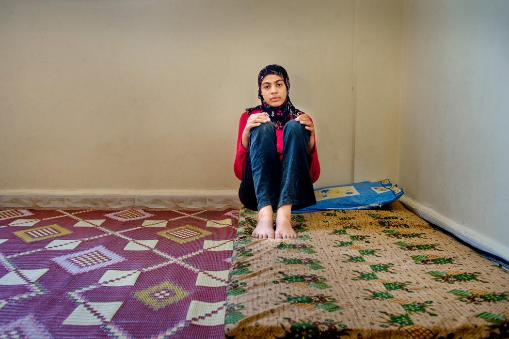
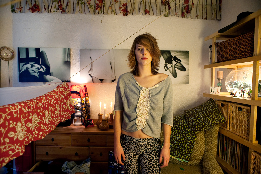
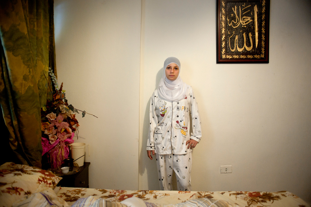
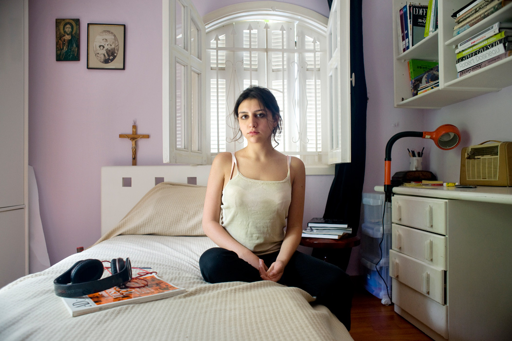
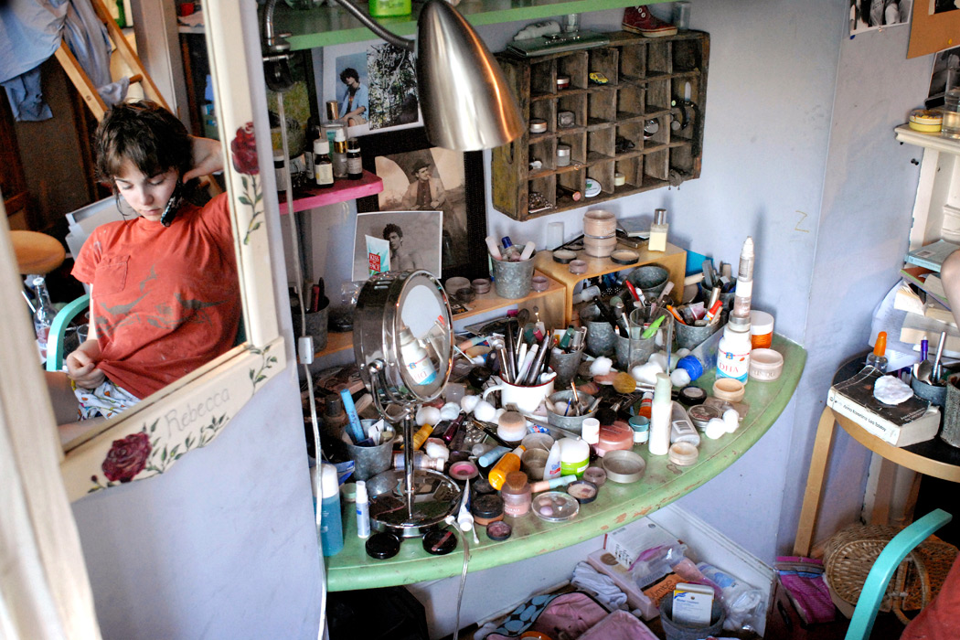
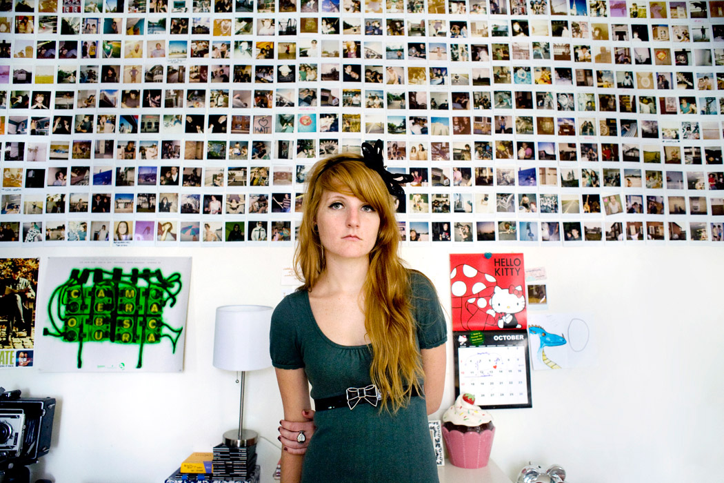
A Girl and Her Room was inspired by my oldest daughter, then 15, who was no longer a carefree child. She was shifting into adulthood incrementally before my eyes. After photographing her with her girlfriends, I realized I wanted to capture each young woman by herself in her own environment: her bedroom. The room was a metaphor, an extension of the girl, but also the girl seemed to be part of the room, to fit in just like everything else in the material and emotional space she created.
While I initially focused on teenage girls in the United States, I eventually expanded the project to include girls from the other world I experienced myself as a young woman: the Middle East. This is how this project became personal to me. The beauty, dreams, vulnerability and strength of these young women, regardless of place, background and religion, were beautifully universal and deeply moving.
Being with those young women in the privacy of their world gave me a unique peek into their private lives and their inner selves. They sensed that I was not judging them and became an active part of the project. Their frankness and generosity in sharing access was a privilege that they have extended to me but also to all the viewers of this work.


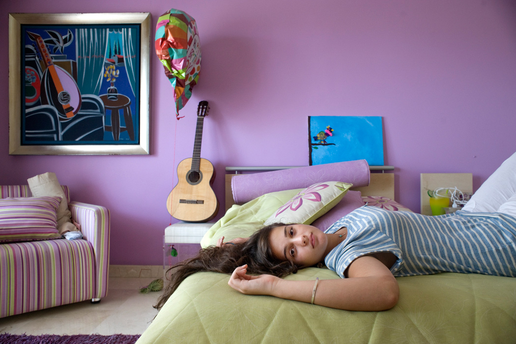
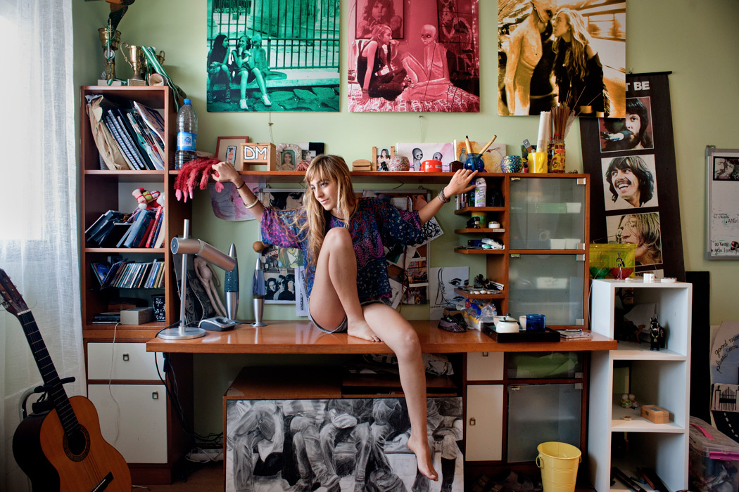
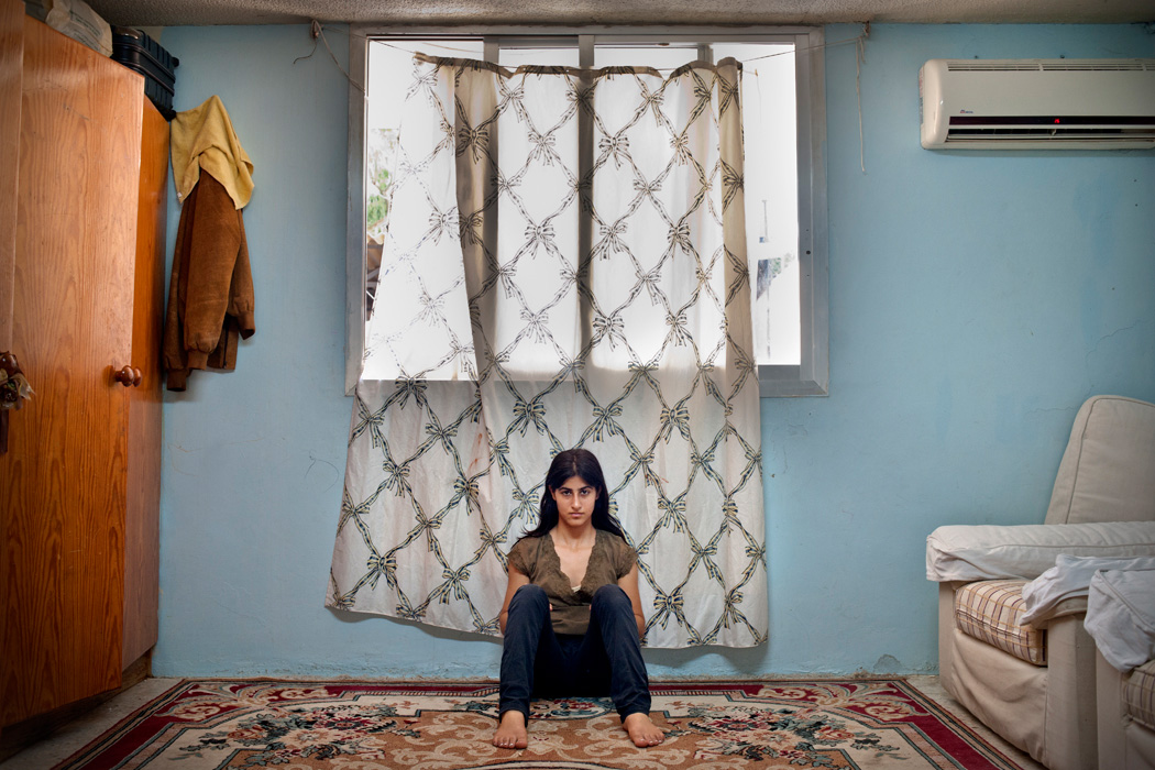
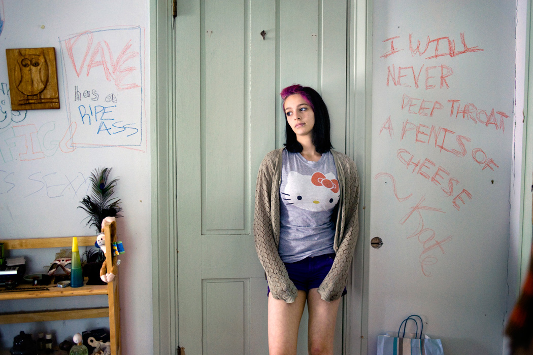

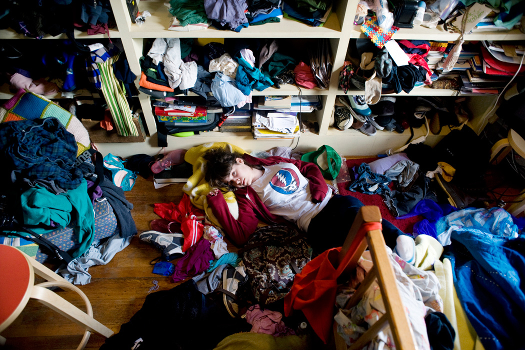
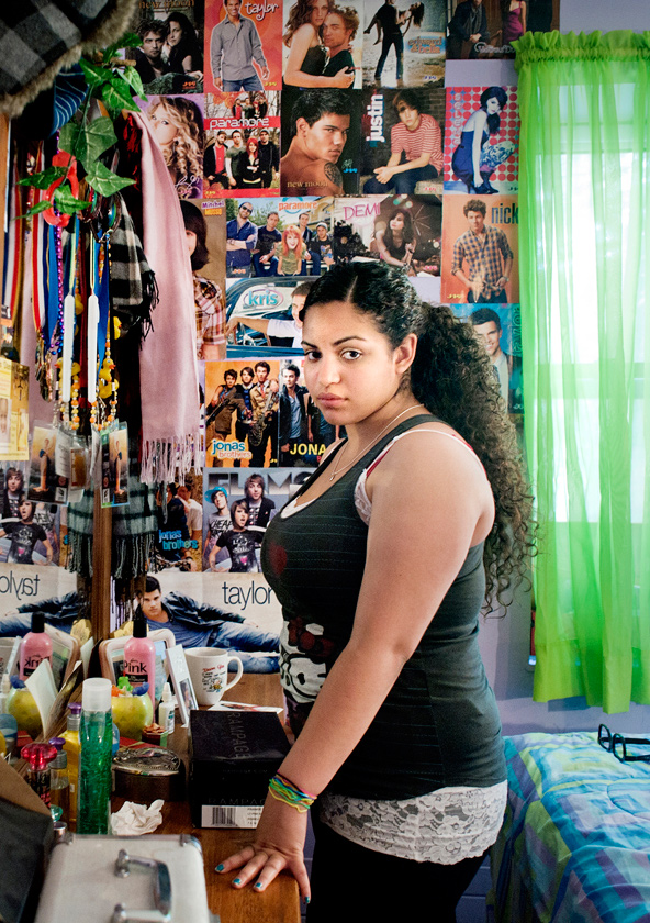
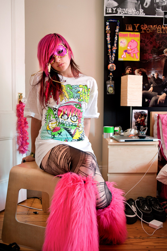

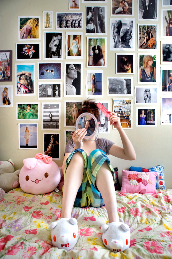




 Rania Matar (Lebanon, 1964). Originally trained as an architect at the American University of Beirut and at Cornell University, she studied photography at the New England School of Photography and the Maine Photographic Workshops. Her work focuses on girls and women. She documents her life through the lives of those around her, focusing on the personal and the mundane in an attempt to portray the universal within the personal. Her work has won several awards, is part of several museum and private collections, has been featured in numerous publications, and exhibited widely in the U.S. and internationally. Visit her website: raniamatar.com
A girl and her room
A Girl and Her Room was inspired by my oldest daughter, then 15, who was no longer a carefree child. She was shifting into adulthood incrementally before my eyes. After photographing her with her girlfriends, I realized I wanted to capture each young woman by herself in her own environment: her bedroom. The room was a metaphor, an extension of the girl, but also the girl seemed to be part of the room, to fit in just like everything else in the material and emotional space she created.
While I initially focused on teenage girls in the United States, I eventually expanded the project to include girls from the other world I experienced myself as a young woman: the Middle East. This is how this project became personal to me. The beauty, dreams, vulnerability and strength of these young women, regardless of place, background and religion, were beautifully universal and deeply moving.
Being with those young women in the privacy of their world gave me a unique peek into their private lives and their inner selves. They sensed that I was not judging them and became an active part of the project. Their frankness and generosity in sharing access was a privilege that they have extended to me but also to all the viewers of this work.


 Rania Matar (Lebanon, 1964). Originally trained as an architect at the American University of Beirut and at Cornell University, she studied photography at the New England School of Photography and the Maine Photographic Workshops. Her work focuses on girls and women. She documents her life through the lives of those around her, focusing on the personal and the mundane in an attempt to portray the universal within the personal. Her work has won several awards, is part of several museum and private collections, has been featured in numerous publications, and exhibited widely in the U.S. and internationally. Visit her website: raniamatar.com
Noah Kalina
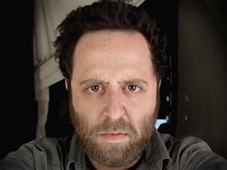
Noah Kalina has been taking a photograph of himself every day since January 2000. Originally it was meant to be a photo project, but in 2006 he was inspired by a project by Ahree Lee, a graphic designer from California who had put a time-lapse video of herself on YouTube. Noah decided to do the same with his self-portraits and, within three weeks, it became an international internet sensation.
 Noah Kalina (US, 1980) is a photographer based in Brooklyn and Lumberland, New York. He graduated from the School of Visual Arts with a BFA in photography. His project ‘Everyday’ was a worldwide hit. His work has been exhibited all over the world: in the U.S., Switzerland, Italy, Belgium, France, Australia, England, Canada, Germany and the Netherlands. He also has given lectures in various countries. To see more of his work go to: noahkalina.com
Noah Kalina has been taking a photograph of himself every day since January 2000. Originally it was meant to be a photo project, but in 2006 he was inspired by a project by Ahree Lee, a graphic designer from California who had put a time-lapse video of herself on YouTube. Noah decided to do the same with his self-portraits and, within three weeks, it became an international internet sensation.
 Noah Kalina (US, 1980) is a photographer based in Brooklyn and Lumberland, New York. He graduated from the School of Visual Arts with a BFA in photography. His project ‘Everyday’ was a worldwide hit. His work has been exhibited all over the world: in the U.S., Switzerland, Italy, Belgium, France, Australia, England, Canada, Germany and the Netherlands. He also has given lectures in various countries. To see more of his work go to: noahkalina.com
Natan Dvir

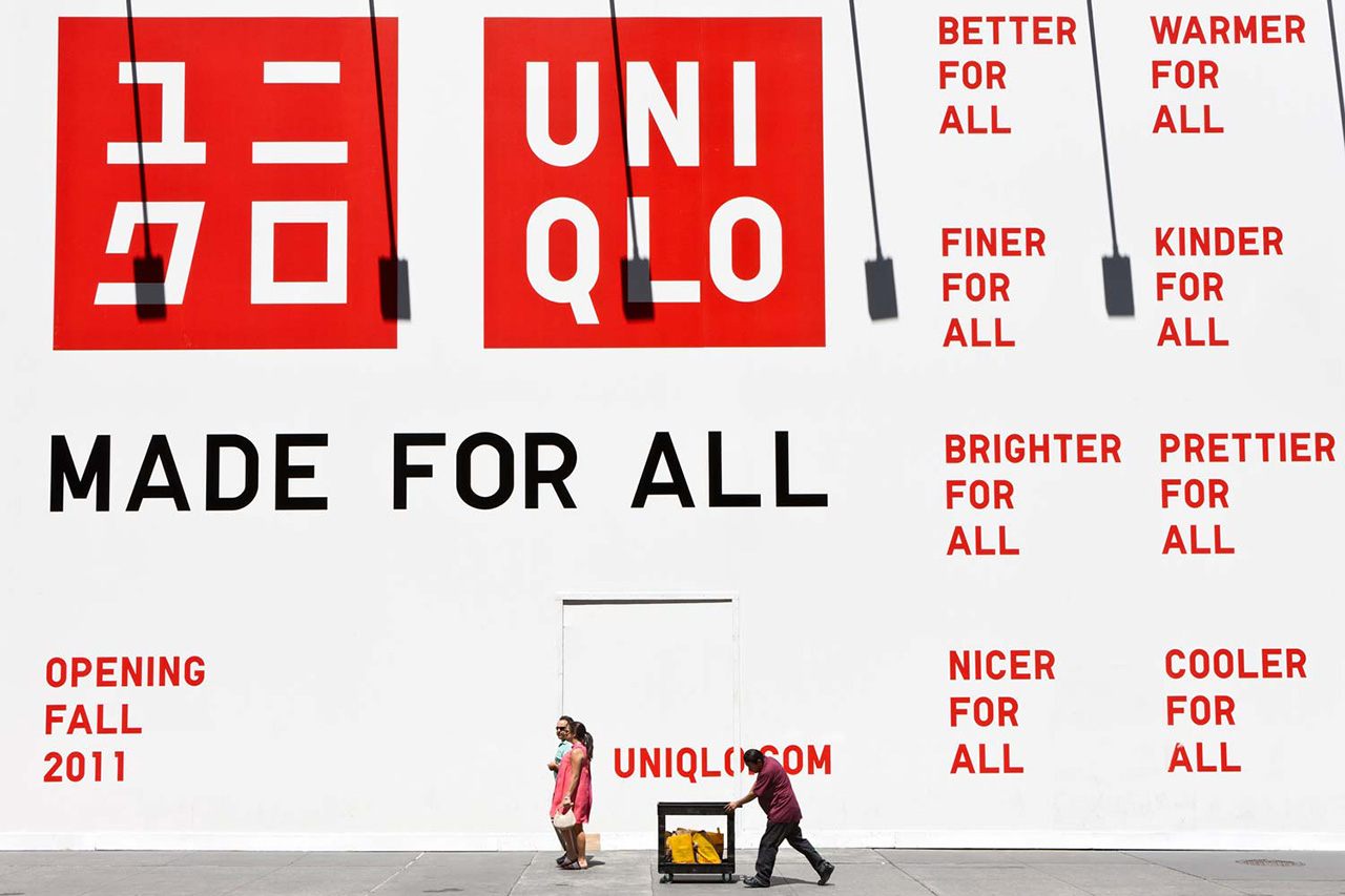
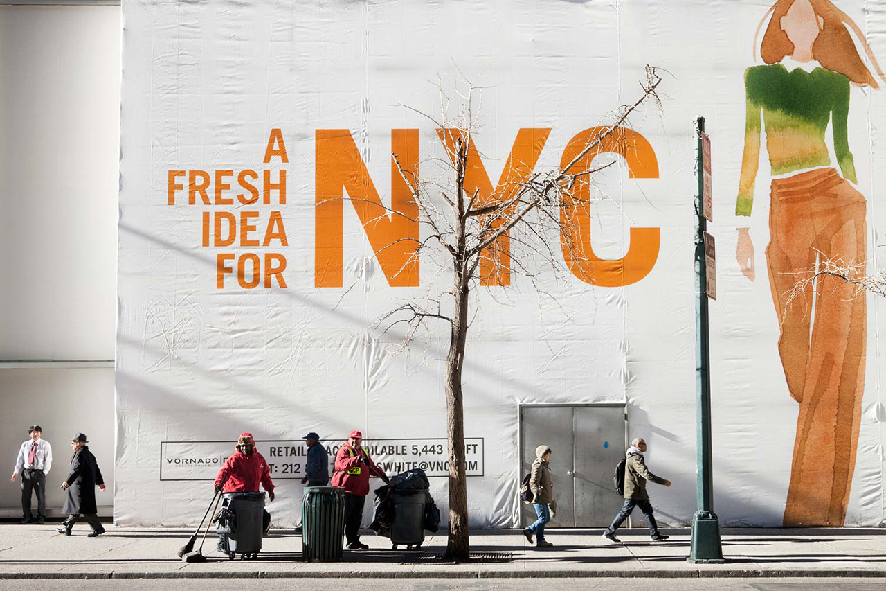
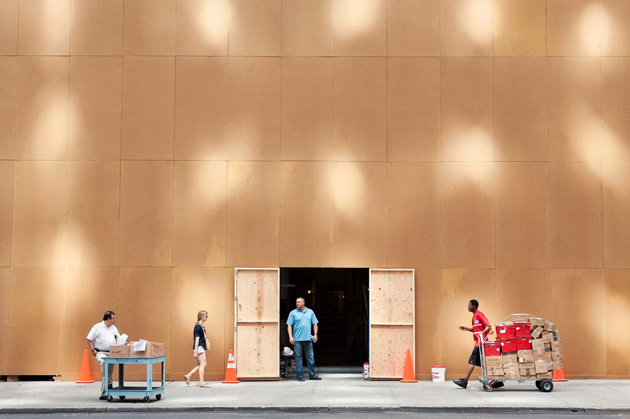
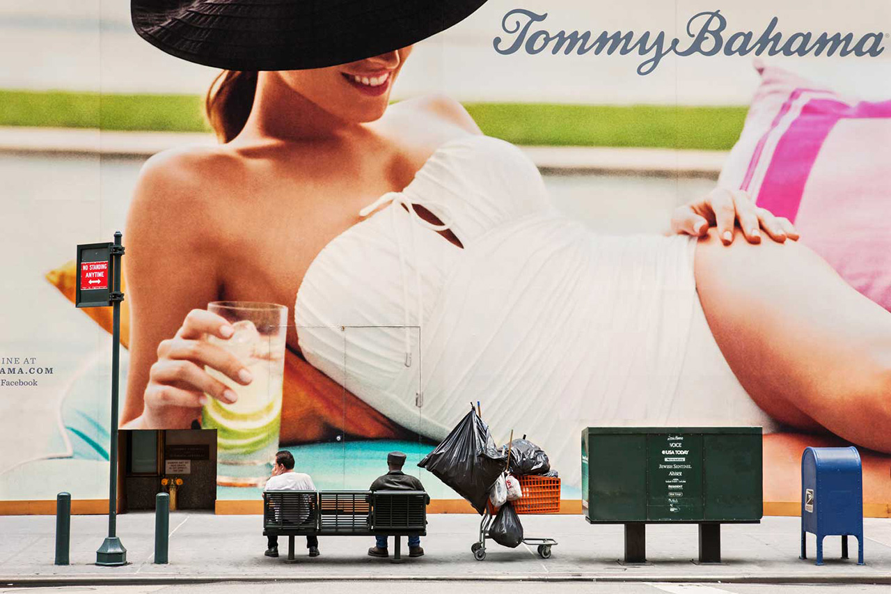
Coming Soon
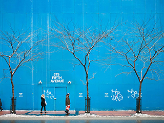
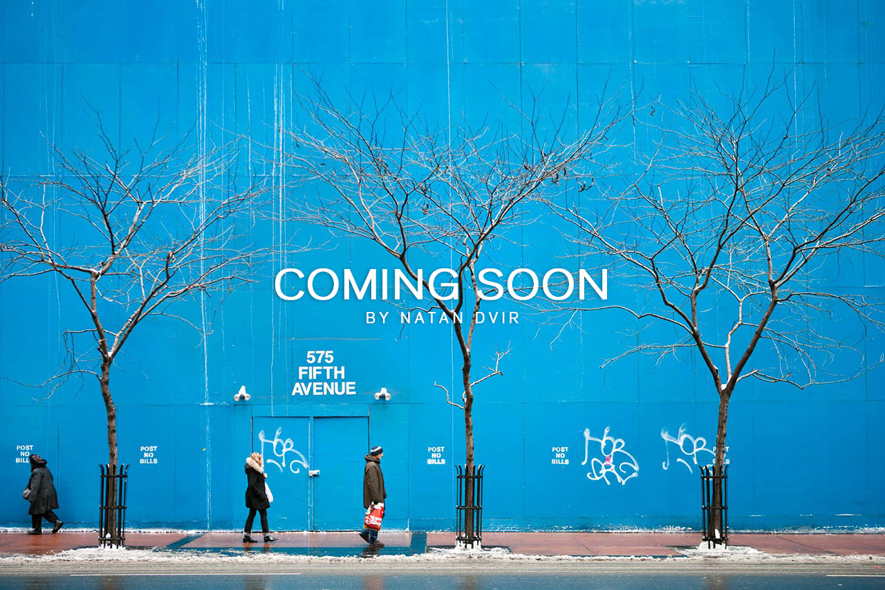
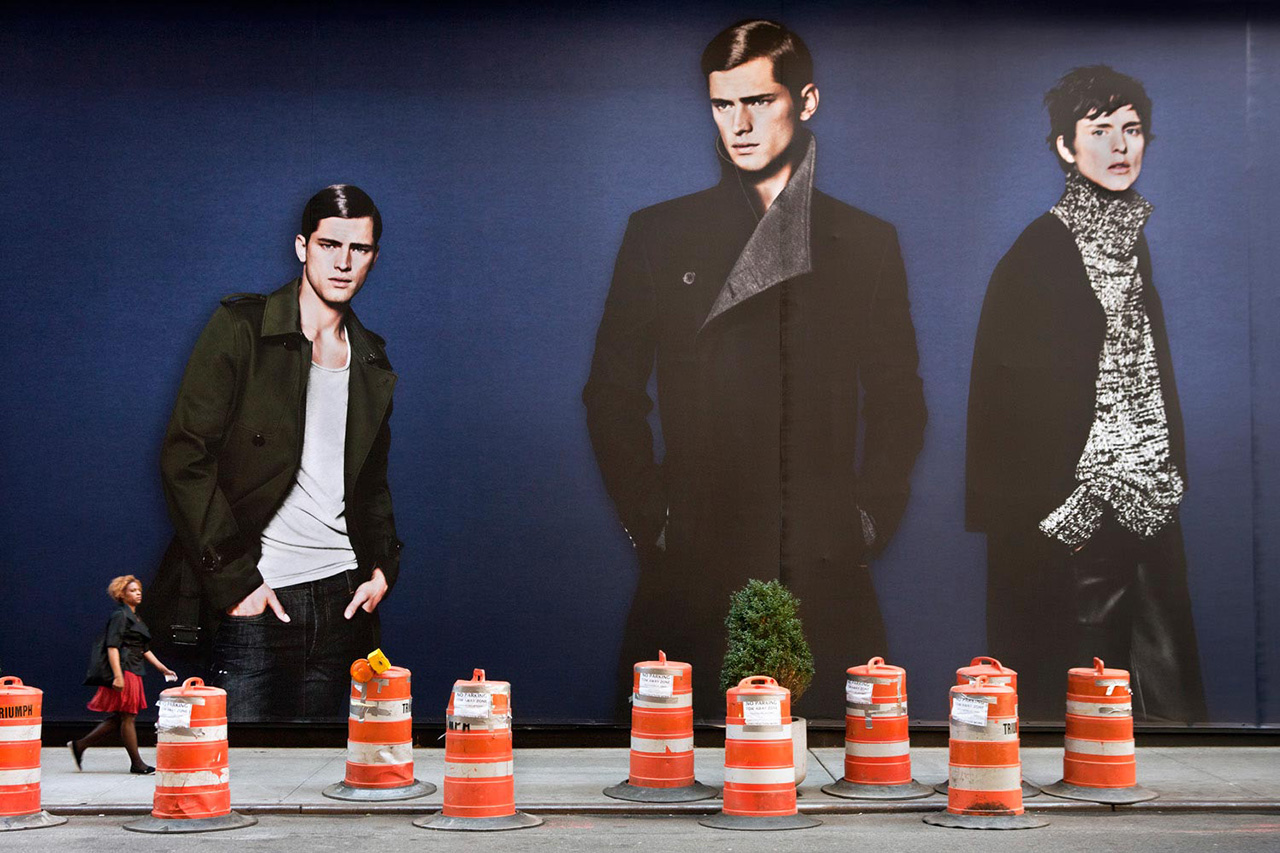
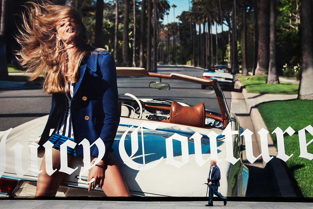
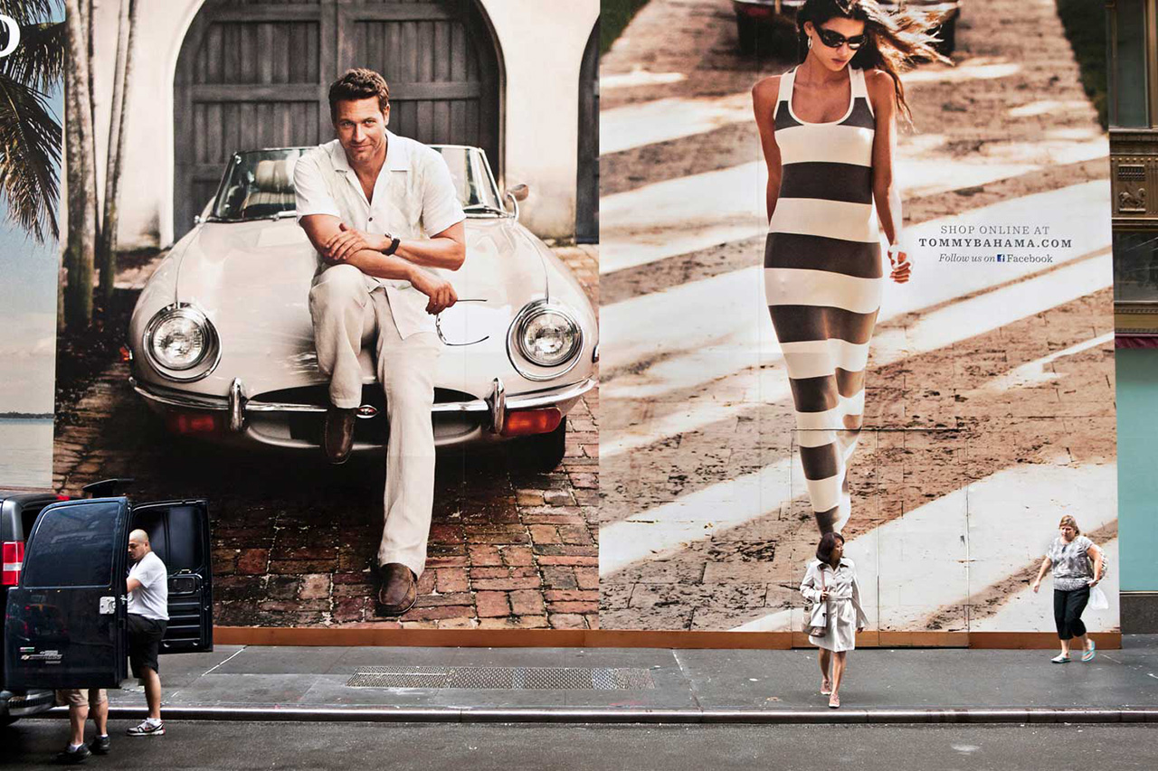
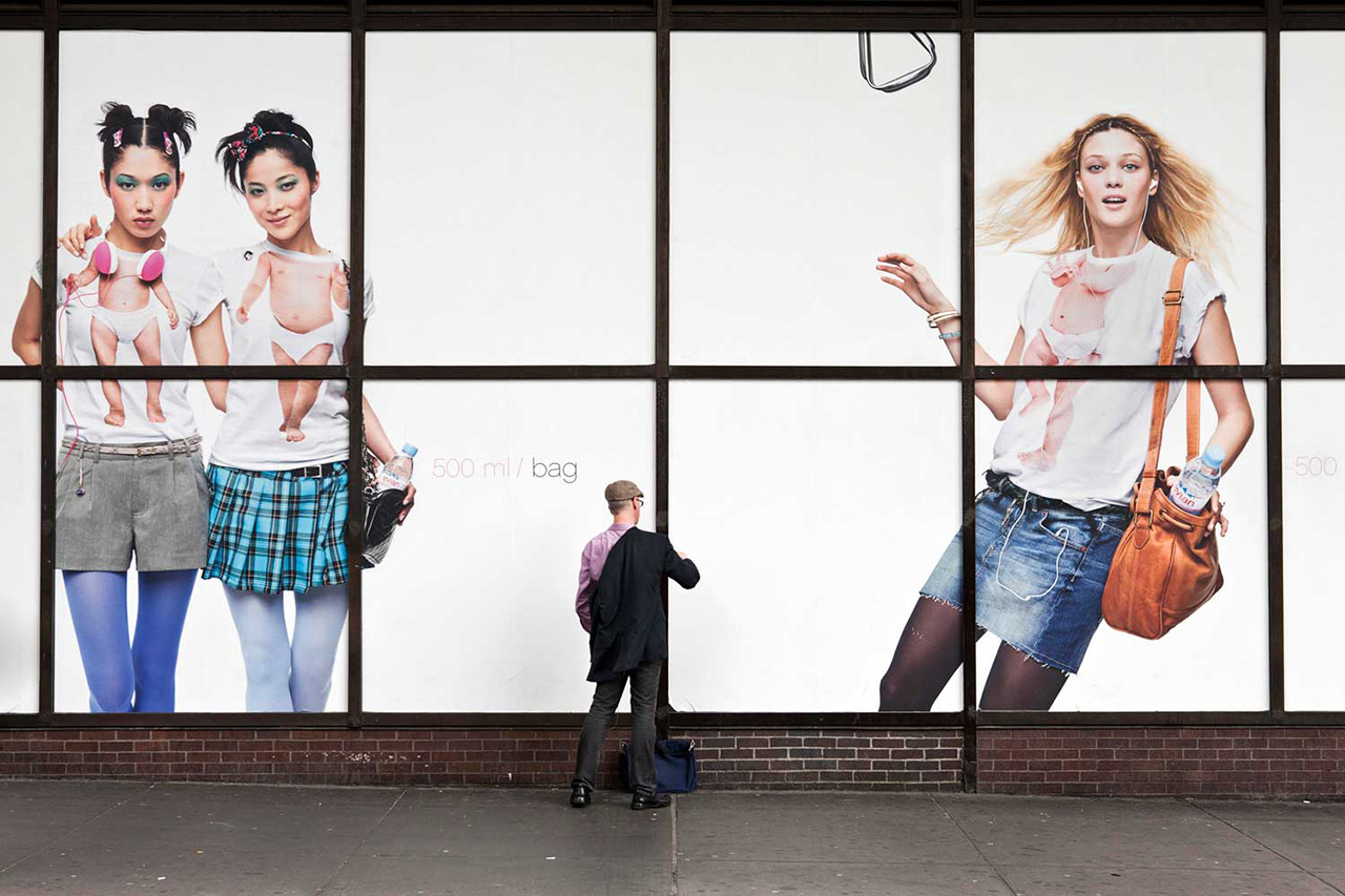
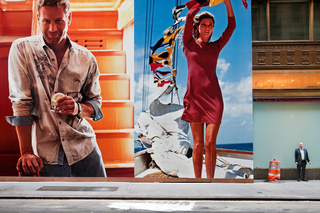
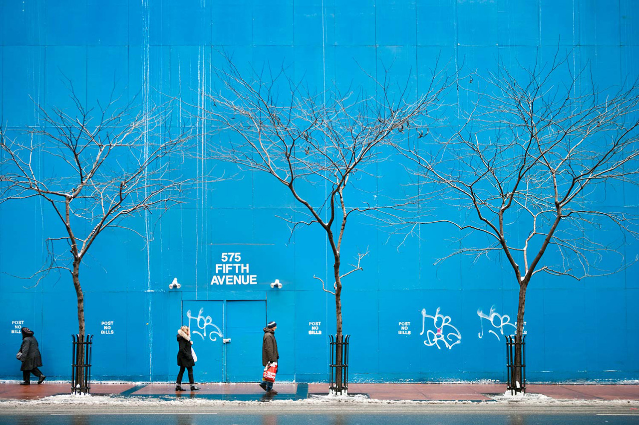
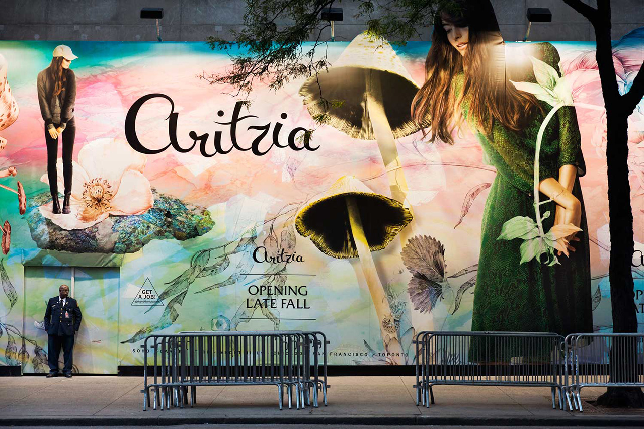
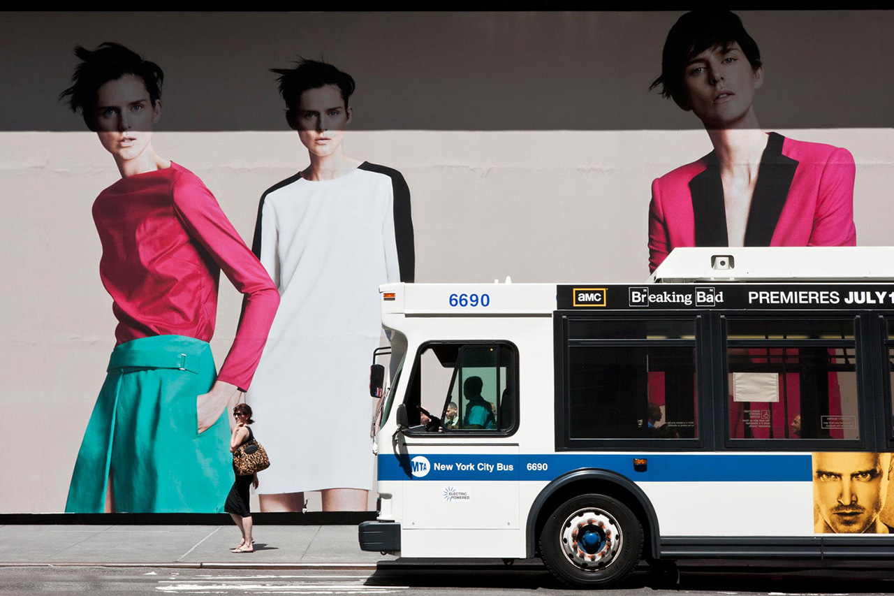
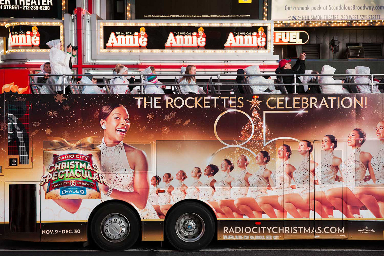
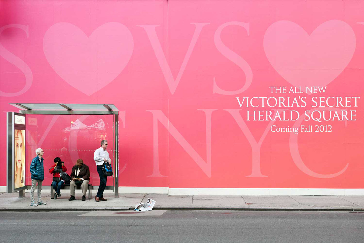
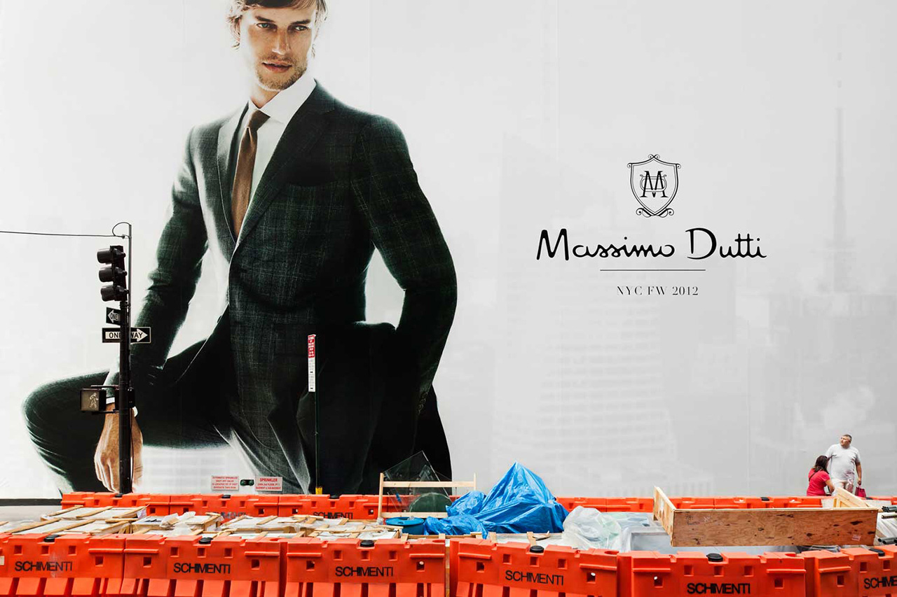
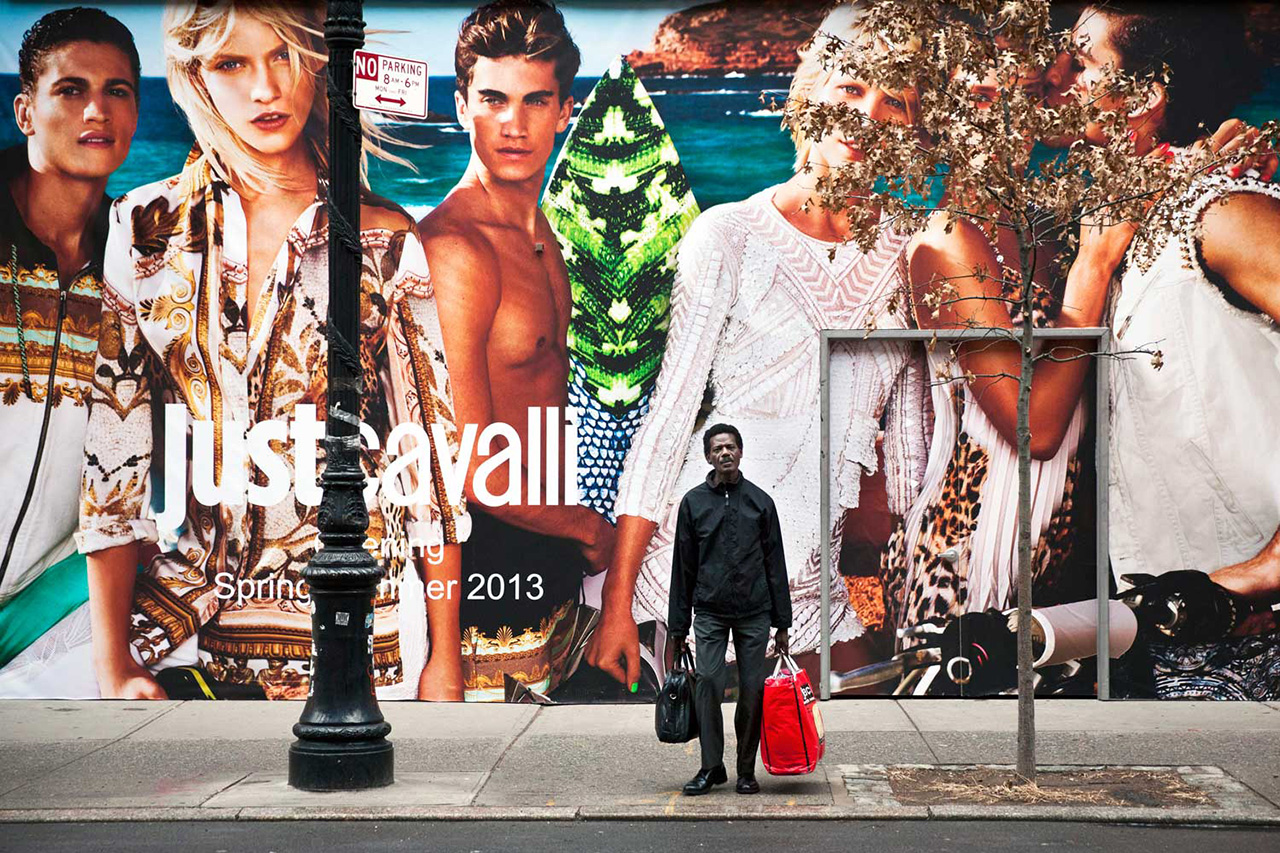
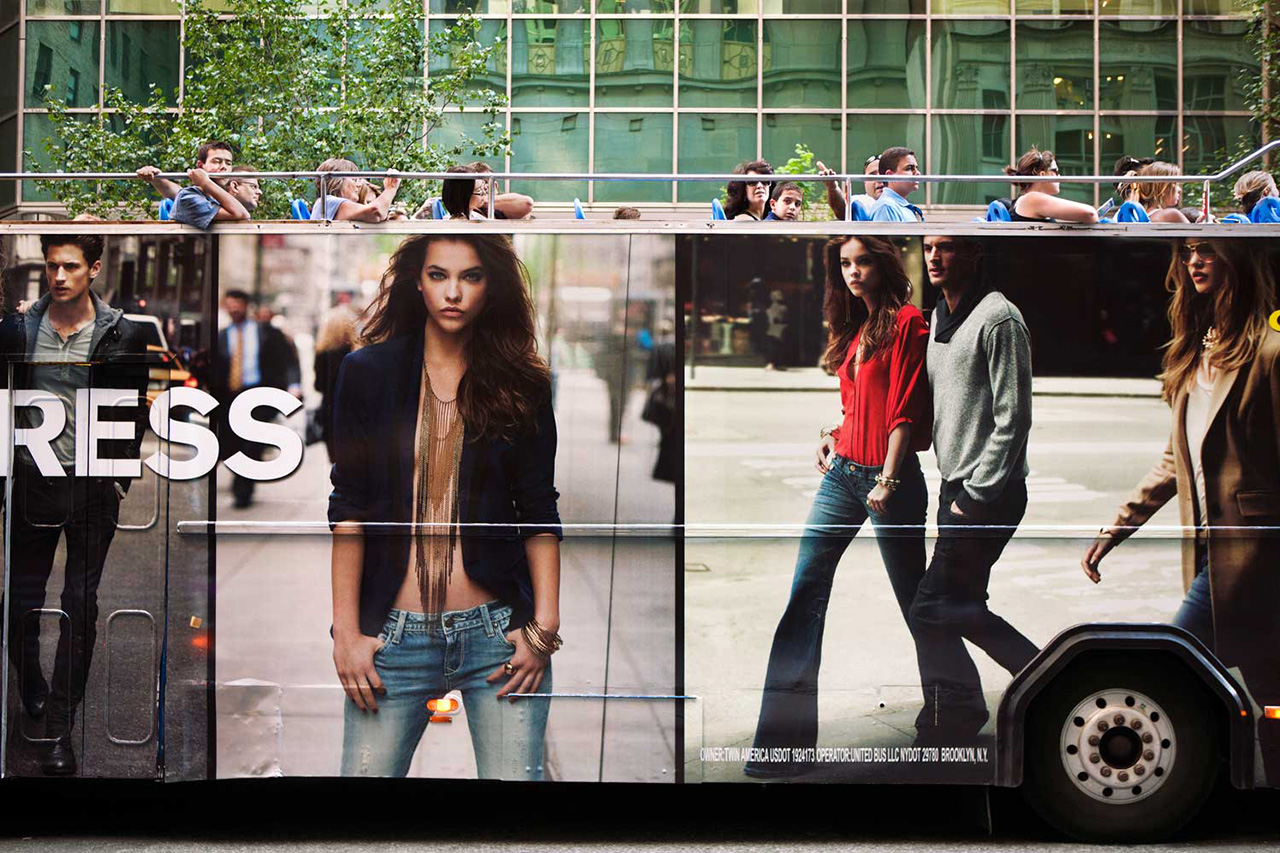
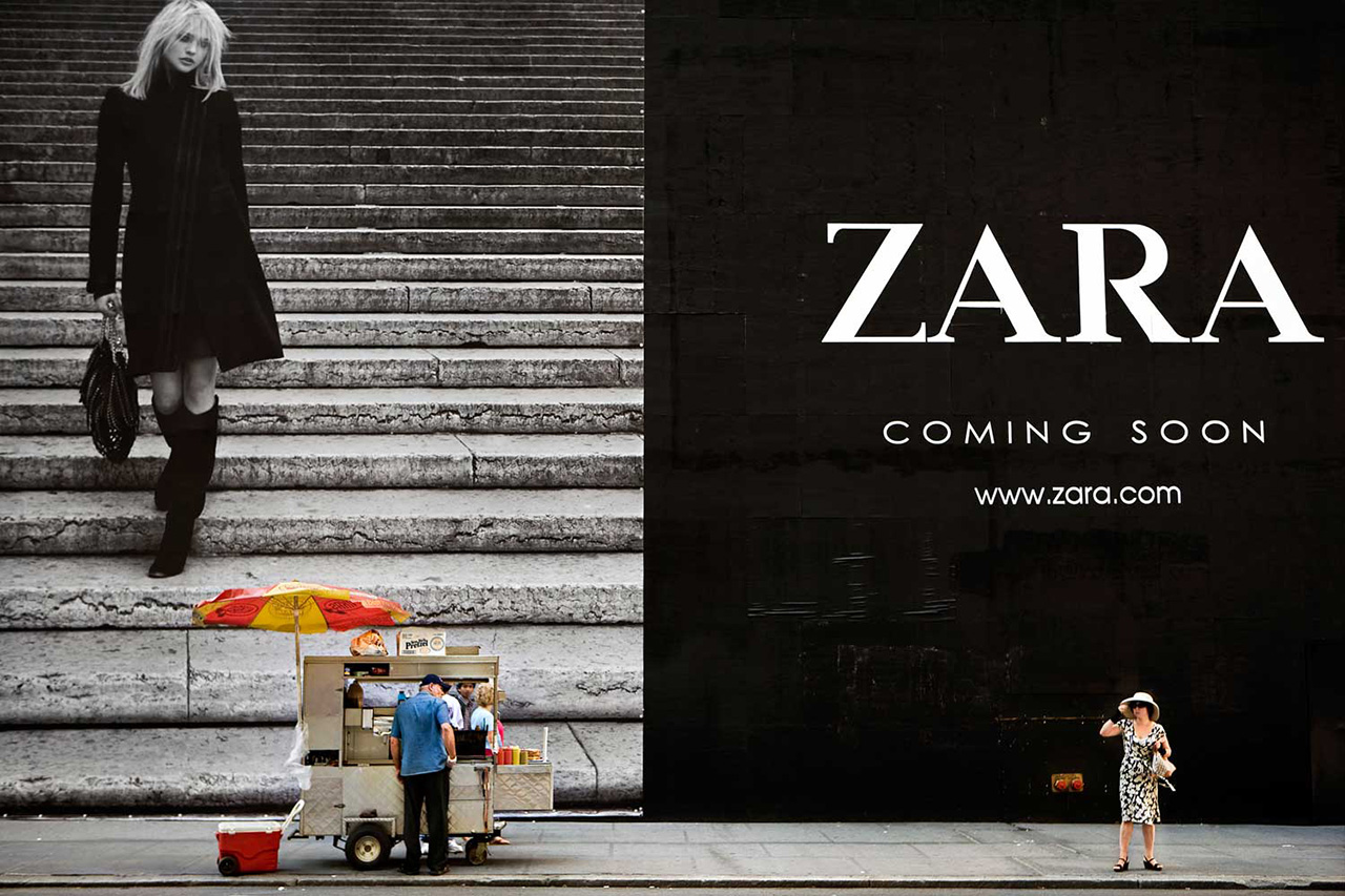
In recent years, a kaleidoscopic net of huge billboards has enveloped the commercial hubs of New York City. The branding of the cityscape has become so ubiquitous, that the colorful, monumental advertisements, looming over the narrow streets, seem to be virtually unnoticed by the passersby. Giant billboards both dominate the urban landscape and blend into the background. Always in the peripheral vision, these ads turn the people moving through the space into passive spectators. The grasp is democratic and compulsory –the outdoor advertisements cannot be turned off and are able to reach a diverse public whose movements through the city momentarily overlap.
The effectiveness of outdoor billboards is juxtaposed with their impermanence; most are replaced after several weeks. The ephemeral nature, massive size and saturated colors of the ads create a fluid cinematic experience for the observer. People inhabiting the space underneath are pulled, unaware, into a staged set, the reality of the street merging with the commercial fantasy of the advertisements. Coming Soon is an exploration of our visual relationship with the branded city centers and the commercial environment we live in.


 Natan Dvir (Nahariya, 1972). Lives in New York and works all around the world. He received a master’s degree in Business Administration from Tel Aviv University and a master´s degree in Photography from the School of Visual Arts, NY, after which he became a faculty member at the International Center for Photography (ICP). As a photographer he focuses on the human aspects of political, social and cultural issues. His work has been exhibited all over the world in solo and group exhibitions and has been published by leading international magazines.
 [core_state] => 1 [core_access] => 1 [core_metadata] => {"robots":"","author":"Natan Dvir","rights":"","xreference":""} [core_created_user_id] => 841 [core_created_by_alias] => [core_created_time] => 2014-09-23 21:54:34 [core_images] => {"image_intro":"images\/categories\/open-content\/comingsoon.jpg","float_intro":"","image_intro_alt":"","image_intro_caption":"","image_fulltext":"images\/categories\/open-content\/comingsoon.jpg","float_fulltext":"","image_fulltext_alt":"","image_fulltext_caption":""} [core_modified_time] => 2016-06-22 18:25:52 [core_language] => en-GB [core_catid] => 37 [core_publish_up] => 2014-09-23 21:52:42 [core_publish_down] => 0000-00-00 00:00:00 [content_type_title] => Article [router] => ContentHelperRoute::getArticleRoute [author] => [author_email] => [link] => index.php?option=com_content&view=article&id=196:coming-soon&catid=37&lang=en-GB [displayDate] => 2014-09-23 21:52:42 [event] => stdClass Object ( [afterDisplayTitle] => [beforeDisplayContent] => [afterDisplayContent] => ) [text] =>


Coming Soon
In recent years, a kaleidoscopic net of huge billboards has enveloped the commercial hubs of New York City. The branding of the cityscape has become so ubiquitous, that the colorful, monumental advertisements, looming over the narrow streets, seem to be virtually unnoticed by the passersby. Giant billboards both dominate the urban landscape and blend into the background. Always in the peripheral vision, these ads turn the people moving through the space into passive spectators. The grasp is democratic and compulsory –the outdoor advertisements cannot be turned off and are able to reach a diverse public whose movements through the city momentarily overlap.
The effectiveness of outdoor billboards is juxtaposed with their impermanence; most are replaced after several weeks. The ephemeral nature, massive size and saturated colors of the ads create a fluid cinematic experience for the observer. People inhabiting the space underneath are pulled, unaware, into a staged set, the reality of the street merging with the commercial fantasy of the advertisements. Coming Soon is an exploration of our visual relationship with the branded city centers and the commercial environment we live in.


 Natan Dvir (Nahariya, 1972). Lives in New York and works all around the world. He received a master’s degree in Business Administration from Tel Aviv University and a master´s degree in Photography from the School of Visual Arts, NY, after which he became a faculty member at the International Center for Photography (ICP). As a photographer he focuses on the human aspects of political, social and cultural issues. His work has been exhibited all over the world in solo and group exhibitions and has been published by leading international magazines.
 [id] => 196 [language] => en-GB [catid] => 37 [jcfields] => Array ( ) ) 1
Eric Kim
Eric Kim, "Debunking the “Myth of the Decisive Moment”", Eric Kim Street Photography Blog , May 23, 2014
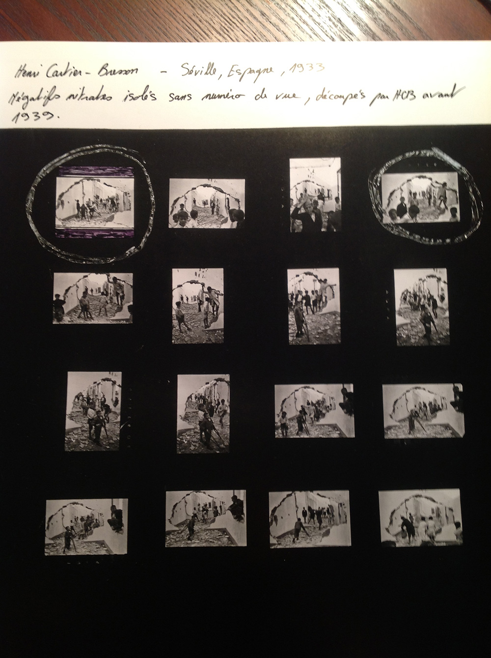
Contact sheet from Henri Cartier-Bresson in Seville, Spain, 1933. © Henri Cartier-Bresson / Magnum Photos
When I started off in street photography, I believed in the “myth of the decisive moment”. What do I mean by that?
Well, when I first heard of “The Decisive Moment” by Henri Cartier Bresson, I had the wrong impression that he only took one photo of a scene. I imagined Henri Cartier Bresson waltzing into a street scene, carefully aiming his Leica, and taking only one shot and creating masterpieces. I thought he was a demigod– a photographer who somehow had this magic behind his lens.
However if we look at his contact sheets, it is a different story. He (and almost all great photographers) never only take one photo of a great potential scene. Out of Henri Cartier Bresson’s contact sheets, you can see that almost all of his great images required him “working the scene”– taking multiple photos of the same scene at different angles, moments, and perspectives. He hustled hard to get the shots he wanted– and would spend considerable time with his contact sheets, determining which photos he decided were his “best”.
Close-ups of the contact sheet from Seville, by Henri Cartier-Bresson:
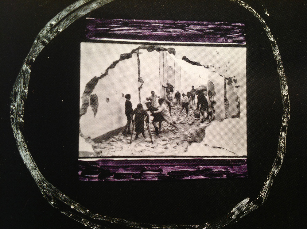
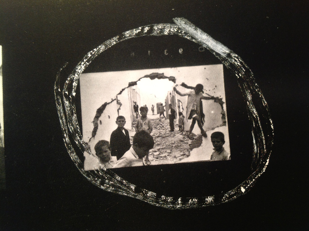
One mistake that I see a lot of beginner street photographers is that they only take one photo per scene. I think this is because they too believe in the “myth of the decisive moment” and partly because of the fear that they will be caught taking photographs.
The importance of studying contact sheets
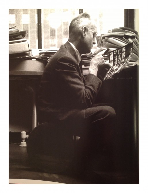
Henri Cartier-Bresson looking at contacts at the New York Magnum Office. 1959. © Rene Burri / Magnum Photos
I have written about contact sheets several times before. For those of you who aren’t familiar with what a contact sheet is it is pretty much a sheet of paper which shows all the photographs a photographer shot on a roll of film. And with this sheet of paper, a photographer can use a loupe (small magnifying glass for the eye) and edit (choose) their favorite images. This was done in the days of the darkroom, and when digital didn’t exist.
Now of course, we have “Lightroom” where we can identify all of our photos of a scene digitally. Instead of having to look at tiny thumbnails, we can now see all of our “almost” photos in full resolution.
Contact sheets are the best learning tools for a photographer. You can learn from contact sheets from other photographers, and also from your own contact sheets.
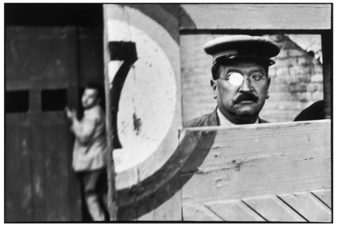
Henri Cartier-Bresson. SPAIN. 1933. Valencia. Note the two versions of the photo he was considering from. This was the best.
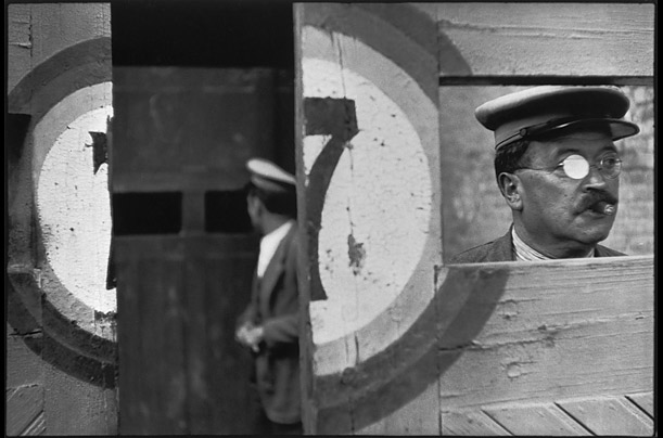
Henri Cartier-Bresson. SPAIN. 1933. Valencia. This image wasn’t as strong as the prior.
Analyzing contact sheets from the masters who came before us is the closest thing we have to reading their minds. We can see how they “worked the scene”– and how they took photos from different perspectives, decided when to hit the shutter, and how many photos they decided to take. Some photographers are able to “nail” their photos in just 5-6 shots, while other photographers will shoot a full roll of 36 photos in just one scene.
Realize that all these master photographers were shooting on film, where it actually cost something to photograph. Now that most of us shoot digitally, there is no excuse for us to not “work the scene” and take many different photos of the same scene.
To learn more about contact sheets, check out my article: “10 Things Street Photographers Can Learn From Magnum Contact Sheets” and also pick up a copy of “Magnum Contact Sheets” on Amazon. It will be the best $100 you will ever spend for your photographic education.
How to “work the scene”
Okay, so we’ve talked about the importance of “working the scene”– and how important it is to take multiple photos of a scene (not just one photo). So how do you exactly “work the scene”?
A few things to clarify:
1. Don’t only just take one photo
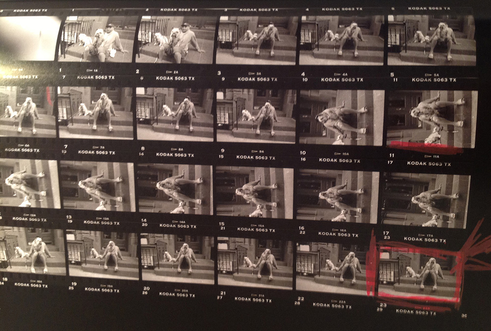
Contact sheet of Elliott Erwitt, “Bulldogs”, New York, 2000. © Elliott Erwitt / Magnum Photos
Once again, it is very tempting to only the one photograph when you see a good scene. When I started off in street photography, I would be deathly afraid of offending people or being “caught in the act” of photographing strangers.
However realize that to make a great photograph, you need to work the scene. You will never know when the “best” decisive moment will occur. In a scene, there are many different great potential “decisive moments”. You generally only know which is the best “decisive moment” afterwards in the editing phase.
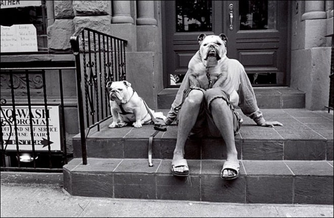
“Bulldogs”, New York, 2000. © Elliott Erwitt / Magnum Photos
Even Henri Cartier Bresson once said: “Sometimes you have to milk the cow a lot to get a little bit of cheese.”
2. Don’t chimp
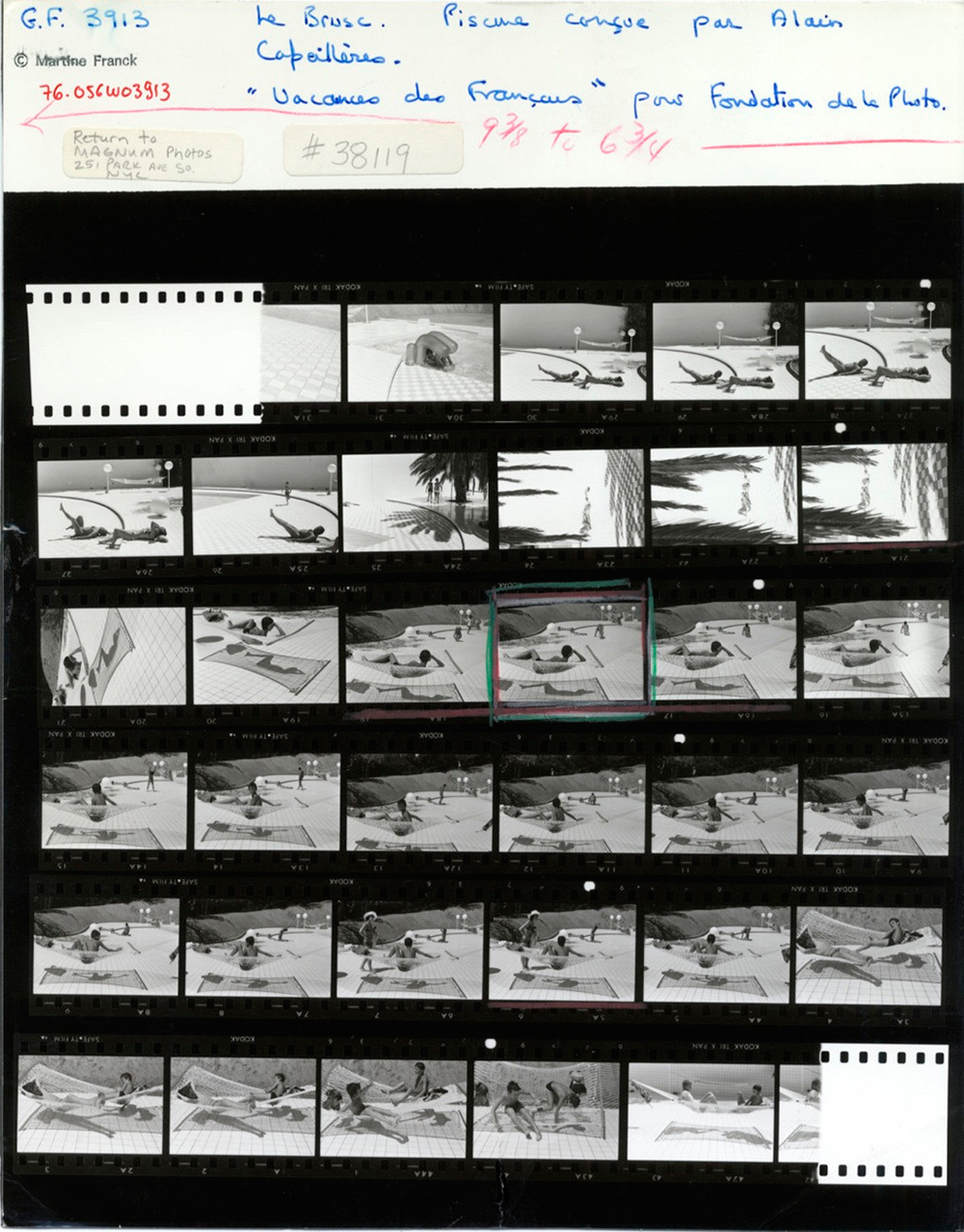
Alain Capeilleres, 1976. © Martine Franck / Magnum Photos.
Another practical tip to better “work the scene” is to not “chimp”. What is chimping you ask? Well, it is when you look at your LCD screen after you take a photograph. Why do they call that “chimping”? Well, apparently film photographers used to make fun of digital photographers by saying they looked like a bunch of “chimps” (or monkeys) when they would crowd around their LCD screens and show off the photos they just took.
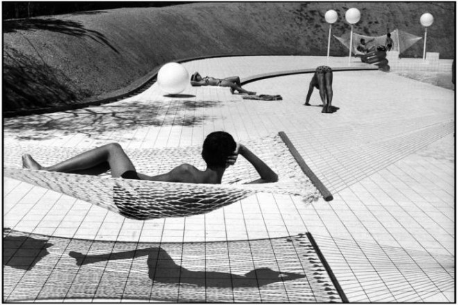
Photo by Martine Franck, Provence-Alpes-Côte d’Azur region. Town of Le Brusc. Pool designed by Alain Capeilleres, 1976. © Martine Franck / Magnum Photos
So what is so bad about “chimping” anyways? I’ve written an article on why street photographers shouldn’t chimp– but to sum up, chimping kills your flow when you’re out shooting on the streets. Rather than checking your LCD screen several times while working a scene to check for exposure, framing, and what you captured– it is better to just take a lot of photos at different angles and moments and choose the best photos later.
3. Linger
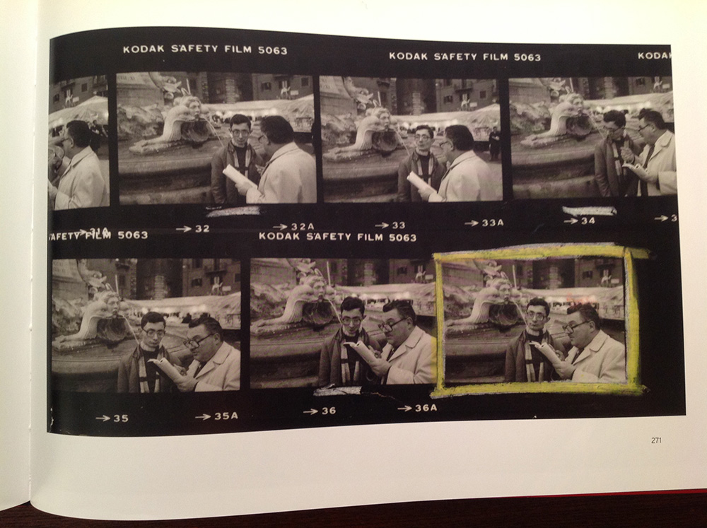
Contact sheet of Richard Kalvar, “Piazza Della Rotonda”. Rome, Italy, 1980. © Richard Kalvar / Magnum Photos
“Lingering” is one of the most difficult things about “working the scene”. Lingering is to “overstay your welcome”. It is generally rude to “linger”. Lingering is like “loitering”– you hang around longer than you should, and people look down on it.
One of the most frequently asked questions I get in my workshops is, “How long should I ‘work a scene’ and linger before I know it’s time to leave, or I got the shot?”
Well, that is the big problem. We have no idea when we either “got the shot” or we’ve hung around “long enough”.
Personally, my philosophy is to be the houseguest that overstays his or her welcome. Did you ever have a friend who asked to stay at your place for a week but ends up staying a few months? Be that guy.
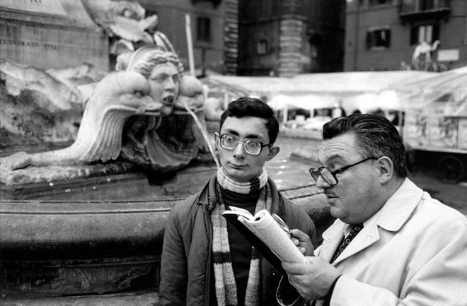
“Piazza Della Rotonda”. Rome, Italy, 1980. © Richard Kalvar / Magnum Photos
The reason I advocate for “overstaying your welcome” is because it is better to linger for a longer period of time because often your best shot will be the last shot. Looking at a lot of contact sheets, especially this image by Richard Kalvar, you see that his best image was at the very end (on his 37th frame, quite lucky). If he didn’t linger around and work the scene, he would’ve never gotten his iconic shot.
Furthermore in street photography, you will only see a great potential scene once in your life. You might see similar scenes, but you will never see the same exact scene with the same exact people, with that background, that light, and that configuration.
So don’t live with regrets, linger around longer than you should– and “overshoot” a scene.
A technique I learned from my friend Charlie Kirk is if you see a great potential scene, hang around and wait a bit longer before you go in and start taking photos. For example, if you see a cool looking guy smoking– linger around him and wait for him to take a puff– then jump in and take a few shots of him inhaling his cigarette.
Lingering is quite painful to do. It is awkward, makes you feel uncomfortable, and might make your subject feel uncomfortable.
One way I get over the awkwardness of lingering and “working the scene” is by pretending I am photographing something behind them and avoiding eye contact. Because I shoot with a 35mm lens, I don’t have to point my camera directly at my subject to get them in the frame.
Another technique is to smile and interact with my subject while photographing them. For example, if I see a good scene, I might start off by shooting candidly– then if my subject makes eye contact with me, I will also make eye contact, smile, keep shooting, and even start chatting with them (hey, you’re looking good!)
4. Look for gestures
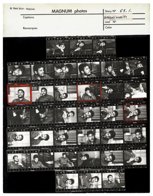
Che contact sheet. © Rene Burri / Magnum Photos
When you are “working the scene”– don’t just put your camera to rapid fire mode and start shooting aimlessly. Rather, be very conscious about when you decide to click the shutter.
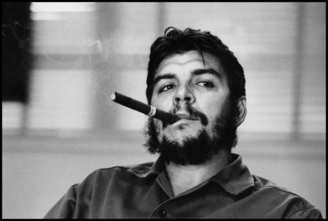
Che Guevara. © Rene Burri / Magnum Photos
Generally I make the decision to click the shutter when I see hand gestures. It can be a gesture of someone covering their face, holding their hands by their sides, or pointing in a certain direction.
Another great tip is to wait for eye contact. Try experimenting taking photos without eye contact, and some photos with eye contact. You never know which photograph will be better. But there is a saying: “eyes are the windows to the soul”– which means if you get eye contact in your street photographs, they can be more intimate and emotional.
5. Keep your feet moving
If you ever watch a boxer, they rarely keep their feet still. The most important thing as a boxer is to never put your heels on the ground. The moment you stop moving is the moment you become a sitting duck– and will be a prime target to be knocked out by your opponent.
Take the same mindset as a street photographer. When working the scene, don’t just keep your feet planted on the ground. Keep your feet moving. Take photos from the left, right, take a step forward, a step backwards. Crouch down. Get different angles and perspectives.
6. Shoot both landscape and portrait photos

Contac sheet, VJ Day. Photo by Alfred Eisenstaedt
Also when working the scene, try experimenting taking your photos in both landscape (horizontal) and portrait (vertical) modes. When you are in the heat of the moment and see a great street photography scene, it is often difficult to know which is the “better” orientation of your camera for the scene.
So if you have time, try to work out both orientations of your camera– depending on what kind of image you want to create.
7. Be calm and patient
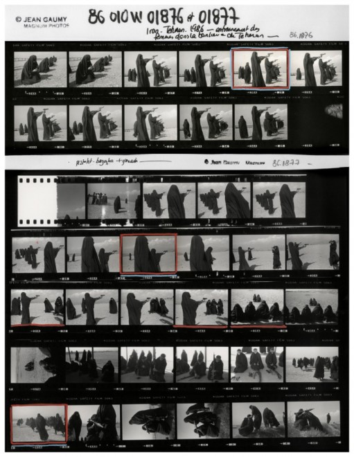
Jean Gaumy, Iran, 1986.
When you are working a scene, remember to try to stay calm and patient. We can sometimes get into a frenzy when working the scene, and trying to get “the shot”. However be calm and patient while you’re shooting– by analyzing when you need to hit the shutter, how close you need to be to your subject to frame them properly, and distracting elements in the background.
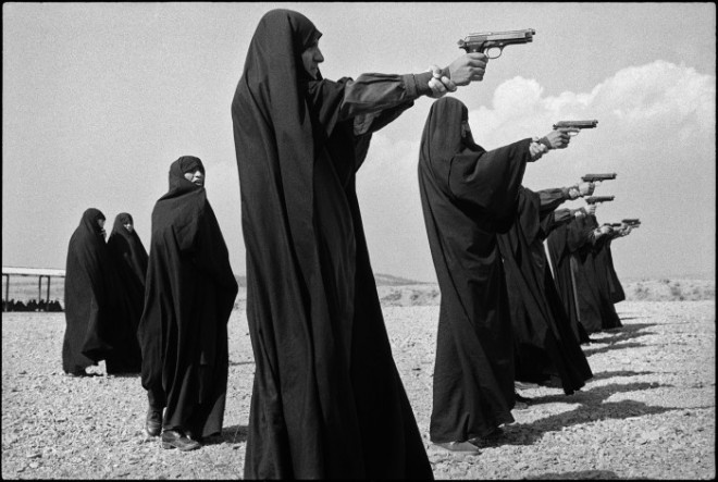
Jean Gaumy, Iran, 1986.
When you start off working the scene as a beginner, you might get too much of an adrenaline rush to stay calm and patient when shooting. But realize that with practice be time, you will be more calm and patient when working the scene– which will help you make better rational choices while shooting, and ultimately help you make better images.
8. Focus on the background
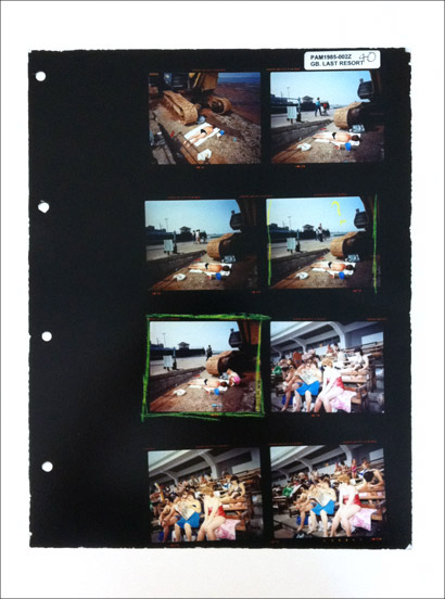
Martin Parr contact sheet from “The Last Resort“
When we are shooting on the streets, we can often focus too much on the subject and not enough on the background.
My advice is once you’ve established who your primary subject (or subjects) are– focus your eyes on the background. Try to get a clean background that doesn’t district– and adds to the scene.
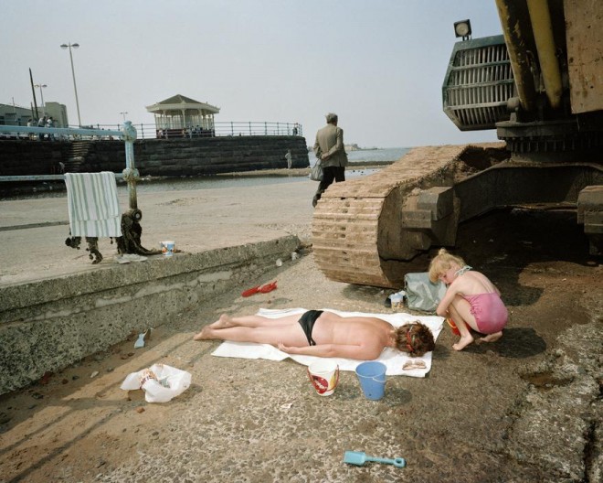
The Last Resort, Photo by Martin Parr
Try to avoid getting random heads, poles, trees, or cars in the background. When you are working the scene, move your feet to get a cleaner background. Messy backgrounds are one of the biggest killers of great potential street photographs.
Conclusion
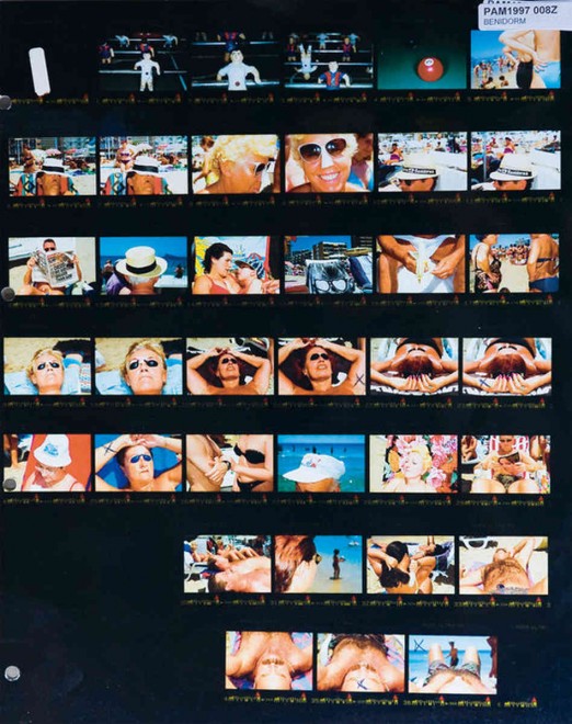
Contact Sheet by Martin Parr from Spain, 1997
To increase your odds of getting “keepers” in street photography, try practicing “working the scene” and lingering longer than necessary. Don’t keep your feet still, always be moving. But at the same time be patient.
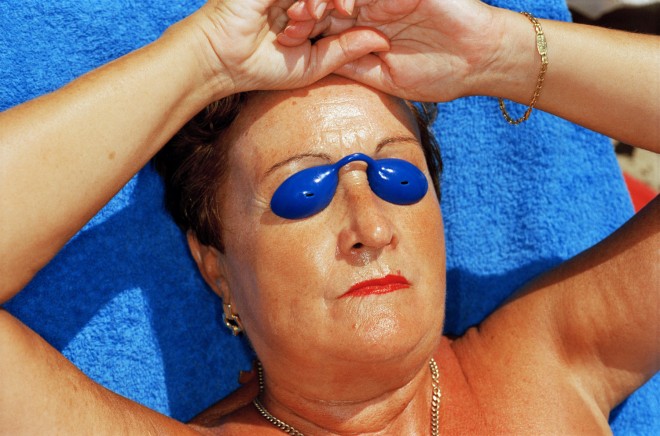
Photo by Martin Parr from his “Common Sense” book. Spain, 1997
Also know that by working the scene longer than you need to, it will be strange and awkward. But with time, patience, practice, and a smile– you will be able to overcome this.
Learn more
To learn more, I recommend picking up a copy of “Magnum contact sheets” or reading the in-depth article I wrote on it: “10 Things Street Photographers Can Learn From Magnum Contact Sheets“. Also make sure to check out the “Contact Sheets” section at the Iconic Photos Blog.
If you want to build your confidence in street photography and learn to better “work the scene”– join me at one of my upcoming street photography workshops!
__
LEGAL INFORMATION: ALL THE PHOTOGRAPHS ARE DISPLAYED WITHOUT THE INTENTION OF FINANCIAL GAIN, AS SCIENTIFIC, LITERARY AND/OR ARTISTIC CRITICISM AND/OR RESEARCH, UNDER THE TERMS OF THE CURRENT LEGISLATION CONTAINED IN INTERNATIONAL TREATIES REGARDING COPYRIGHT.
 Eric Kim (USA). Lives and works as a photographer in Berkeley, California. His main interest is street photography, to which he has devoted his artistic and educational work. He graduated in sociology from UCLA. Kim gives workshops in several parts of the world, including Canada, Holland, Vietnam, Japan and Australia, and has collaborated in a number of projects with Leica and Samsung. Hs work has been exhibited in Los Angeles and in Leica stores in Singapore, Seoul and Melbourne. and can be seen at: erickimphotography.com
Eric Kim, "Debunking the “Myth of the Decisive Moment”", Eric Kim Street Photography Blog , May 23, 2014


Contact sheet from Henri Cartier-Bresson in Seville, Spain, 1933. © Henri Cartier-Bresson / Magnum Photos
When I started off in street photography, I believed in the “myth of the decisive moment”. What do I mean by that?
Well, when I first heard of “The Decisive Moment” by Henri Cartier Bresson, I had the wrong impression that he only took one photo of a scene. I imagined Henri Cartier Bresson waltzing into a street scene, carefully aiming his Leica, and taking only one shot and creating masterpieces. I thought he was a demigod– a photographer who somehow had this magic behind his lens.
However if we look at his contact sheets, it is a different story. He (and almost all great photographers) never only take one photo of a great potential scene. Out of Henri Cartier Bresson’s contact sheets, you can see that almost all of his great images required him “working the scene”– taking multiple photos of the same scene at different angles, moments, and perspectives. He hustled hard to get the shots he wanted– and would spend considerable time with his contact sheets, determining which photos he decided were his “best”.
Close-ups of the contact sheet from Seville, by Henri Cartier-Bresson:


One mistake that I see a lot of beginner street photographers is that they only take one photo per scene. I think this is because they too believe in the “myth of the decisive moment” and partly because of the fear that they will be caught taking photographs.
The importance of studying contact sheets

Henri Cartier-Bresson looking at contacts at the New York Magnum Office. 1959. © Rene Burri / Magnum Photos
I have written about contact sheets several times before. For those of you who aren’t familiar with what a contact sheet is it is pretty much a sheet of paper which shows all the photographs a photographer shot on a roll of film. And with this sheet of paper, a photographer can use a loupe (small magnifying glass for the eye) and edit (choose) their favorite images. This was done in the days of the darkroom, and when digital didn’t exist.
Now of course, we have “Lightroom” where we can identify all of our photos of a scene digitally. Instead of having to look at tiny thumbnails, we can now see all of our “almost” photos in full resolution.
Contact sheets are the best learning tools for a photographer. You can learn from contact sheets from other photographers, and also from your own contact sheets.

Henri Cartier-Bresson. SPAIN. 1933. Valencia. Note the two versions of the photo he was considering from. This was the best.

Henri Cartier-Bresson. SPAIN. 1933. Valencia. This image wasn’t as strong as the prior.
Analyzing contact sheets from the masters who came before us is the closest thing we have to reading their minds. We can see how they “worked the scene”– and how they took photos from different perspectives, decided when to hit the shutter, and how many photos they decided to take. Some photographers are able to “nail” their photos in just 5-6 shots, while other photographers will shoot a full roll of 36 photos in just one scene.
Realize that all these master photographers were shooting on film, where it actually cost something to photograph. Now that most of us shoot digitally, there is no excuse for us to not “work the scene” and take many different photos of the same scene.
To learn more about contact sheets, check out my article: “10 Things Street Photographers Can Learn From Magnum Contact Sheets” and also pick up a copy of “Magnum Contact Sheets” on Amazon. It will be the best $100 you will ever spend for your photographic education.
How to “work the scene”
Okay, so we’ve talked about the importance of “working the scene”– and how important it is to take multiple photos of a scene (not just one photo). So how do you exactly “work the scene”?
A few things to clarify:
1. Don’t only just take one photo

Contact sheet of Elliott Erwitt, “Bulldogs”, New York, 2000. © Elliott Erwitt / Magnum Photos
Once again, it is very tempting to only the one photograph when you see a good scene. When I started off in street photography, I would be deathly afraid of offending people or being “caught in the act” of photographing strangers.
However realize that to make a great photograph, you need to work the scene. You will never know when the “best” decisive moment will occur. In a scene, there are many different great potential “decisive moments”. You generally only know which is the best “decisive moment” afterwards in the editing phase.

“Bulldogs”, New York, 2000. © Elliott Erwitt / Magnum Photos
Even Henri Cartier Bresson once said: “Sometimes you have to milk the cow a lot to get a little bit of cheese.”
2. Don’t chimp

Alain Capeilleres, 1976. © Martine Franck / Magnum Photos.
Another practical tip to better “work the scene” is to not “chimp”. What is chimping you ask? Well, it is when you look at your LCD screen after you take a photograph. Why do they call that “chimping”? Well, apparently film photographers used to make fun of digital photographers by saying they looked like a bunch of “chimps” (or monkeys) when they would crowd around their LCD screens and show off the photos they just took.

Photo by Martine Franck, Provence-Alpes-Côte d’Azur region. Town of Le Brusc. Pool designed by Alain Capeilleres, 1976. © Martine Franck / Magnum Photos
So what is so bad about “chimping” anyways? I’ve written an article on why street photographers shouldn’t chimp– but to sum up, chimping kills your flow when you’re out shooting on the streets. Rather than checking your LCD screen several times while working a scene to check for exposure, framing, and what you captured– it is better to just take a lot of photos at different angles and moments and choose the best photos later.
3. Linger

Contact sheet of Richard Kalvar, “Piazza Della Rotonda”. Rome, Italy, 1980. © Richard Kalvar / Magnum Photos
“Lingering” is one of the most difficult things about “working the scene”. Lingering is to “overstay your welcome”. It is generally rude to “linger”. Lingering is like “loitering”– you hang around longer than you should, and people look down on it.
One of the most frequently asked questions I get in my workshops is, “How long should I ‘work a scene’ and linger before I know it’s time to leave, or I got the shot?”
Well, that is the big problem. We have no idea when we either “got the shot” or we’ve hung around “long enough”.
Personally, my philosophy is to be the houseguest that overstays his or her welcome. Did you ever have a friend who asked to stay at your place for a week but ends up staying a few months? Be that guy.

“Piazza Della Rotonda”. Rome, Italy, 1980. © Richard Kalvar / Magnum Photos
The reason I advocate for “overstaying your welcome” is because it is better to linger for a longer period of time because often your best shot will be the last shot. Looking at a lot of contact sheets, especially this image by Richard Kalvar, you see that his best image was at the very end (on his 37th frame, quite lucky). If he didn’t linger around and work the scene, he would’ve never gotten his iconic shot.
Furthermore in street photography, you will only see a great potential scene once in your life. You might see similar scenes, but you will never see the same exact scene with the same exact people, with that background, that light, and that configuration.
So don’t live with regrets, linger around longer than you should– and “overshoot” a scene.
A technique I learned from my friend Charlie Kirk is if you see a great potential scene, hang around and wait a bit longer before you go in and start taking photos. For example, if you see a cool looking guy smoking– linger around him and wait for him to take a puff– then jump in and take a few shots of him inhaling his cigarette.
Lingering is quite painful to do. It is awkward, makes you feel uncomfortable, and might make your subject feel uncomfortable.
One way I get over the awkwardness of lingering and “working the scene” is by pretending I am photographing something behind them and avoiding eye contact. Because I shoot with a 35mm lens, I don’t have to point my camera directly at my subject to get them in the frame.
Another technique is to smile and interact with my subject while photographing them. For example, if I see a good scene, I might start off by shooting candidly– then if my subject makes eye contact with me, I will also make eye contact, smile, keep shooting, and even start chatting with them (hey, you’re looking good!)
4. Look for gestures

Che contact sheet. © Rene Burri / Magnum Photos
When you are “working the scene”– don’t just put your camera to rapid fire mode and start shooting aimlessly. Rather, be very conscious about when you decide to click the shutter.

Che Guevara. © Rene Burri / Magnum Photos
Generally I make the decision to click the shutter when I see hand gestures. It can be a gesture of someone covering their face, holding their hands by their sides, or pointing in a certain direction.
Another great tip is to wait for eye contact. Try experimenting taking photos without eye contact, and some photos with eye contact. You never know which photograph will be better. But there is a saying: “eyes are the windows to the soul”– which means if you get eye contact in your street photographs, they can be more intimate and emotional.
5. Keep your feet moving
If you ever watch a boxer, they rarely keep their feet still. The most important thing as a boxer is to never put your heels on the ground. The moment you stop moving is the moment you become a sitting duck– and will be a prime target to be knocked out by your opponent.
Take the same mindset as a street photographer. When working the scene, don’t just keep your feet planted on the ground. Keep your feet moving. Take photos from the left, right, take a step forward, a step backwards. Crouch down. Get different angles and perspectives.
6. Shoot both landscape and portrait photos

Contac sheet, VJ Day. Photo by Alfred Eisenstaedt
Also when working the scene, try experimenting taking your photos in both landscape (horizontal) and portrait (vertical) modes. When you are in the heat of the moment and see a great street photography scene, it is often difficult to know which is the “better” orientation of your camera for the scene.
So if you have time, try to work out both orientations of your camera– depending on what kind of image you want to create.
7. Be calm and patient

Jean Gaumy, Iran, 1986.
When you are working a scene, remember to try to stay calm and patient. We can sometimes get into a frenzy when working the scene, and trying to get “the shot”. However be calm and patient while you’re shooting– by analyzing when you need to hit the shutter, how close you need to be to your subject to frame them properly, and distracting elements in the background.

Jean Gaumy, Iran, 1986.
When you start off working the scene as a beginner, you might get too much of an adrenaline rush to stay calm and patient when shooting. But realize that with practice be time, you will be more calm and patient when working the scene– which will help you make better rational choices while shooting, and ultimately help you make better images.
8. Focus on the background

Martin Parr contact sheet from “The Last Resort“
When we are shooting on the streets, we can often focus too much on the subject and not enough on the background.
My advice is once you’ve established who your primary subject (or subjects) are– focus your eyes on the background. Try to get a clean background that doesn’t district– and adds to the scene.

The Last Resort, Photo by Martin Parr
Try to avoid getting random heads, poles, trees, or cars in the background. When you are working the scene, move your feet to get a cleaner background. Messy backgrounds are one of the biggest killers of great potential street photographs.
Conclusion

Contact Sheet by Martin Parr from Spain, 1997
To increase your odds of getting “keepers” in street photography, try practicing “working the scene” and lingering longer than necessary. Don’t keep your feet still, always be moving. But at the same time be patient.

Photo by Martin Parr from his “Common Sense” book. Spain, 1997
Also know that by working the scene longer than you need to, it will be strange and awkward. But with time, patience, practice, and a smile– you will be able to overcome this.
Learn more
To learn more, I recommend picking up a copy of “Magnum contact sheets” or reading the in-depth article I wrote on it: “10 Things Street Photographers Can Learn From Magnum Contact Sheets“. Also make sure to check out the “Contact Sheets” section at the Iconic Photos Blog.
If you want to build your confidence in street photography and learn to better “work the scene”– join me at one of my upcoming street photography workshops!
__
LEGAL INFORMATION: ALL THE PHOTOGRAPHS ARE DISPLAYED WITHOUT THE INTENTION OF FINANCIAL GAIN, AS SCIENTIFIC, LITERARY AND/OR ARTISTIC CRITICISM AND/OR RESEARCH, UNDER THE TERMS OF THE CURRENT LEGISLATION CONTAINED IN INTERNATIONAL TREATIES REGARDING COPYRIGHT.
 Eric Kim (USA). Lives and works as a photographer in Berkeley, California. His main interest is street photography, to which he has devoted his artistic and educational work. He graduated in sociology from UCLA. Kim gives workshops in several parts of the world, including Canada, Holland, Vietnam, Japan and Australia, and has collaborated in a number of projects with Leica and Samsung. Hs work has been exhibited in Los Angeles and in Leica stores in Singapore, Seoul and Melbourne. and can be seen at: erickimphotography.com
Clement Valla
!-- Parrafo de eric kim
Eric Kim, "Debunking the “Myth of the Decisive Moment”", Eric Kim Street Photography Blog , May 23, 2014
-->Clement Valla, "The Universal Texture.", Rhizome, 2012.
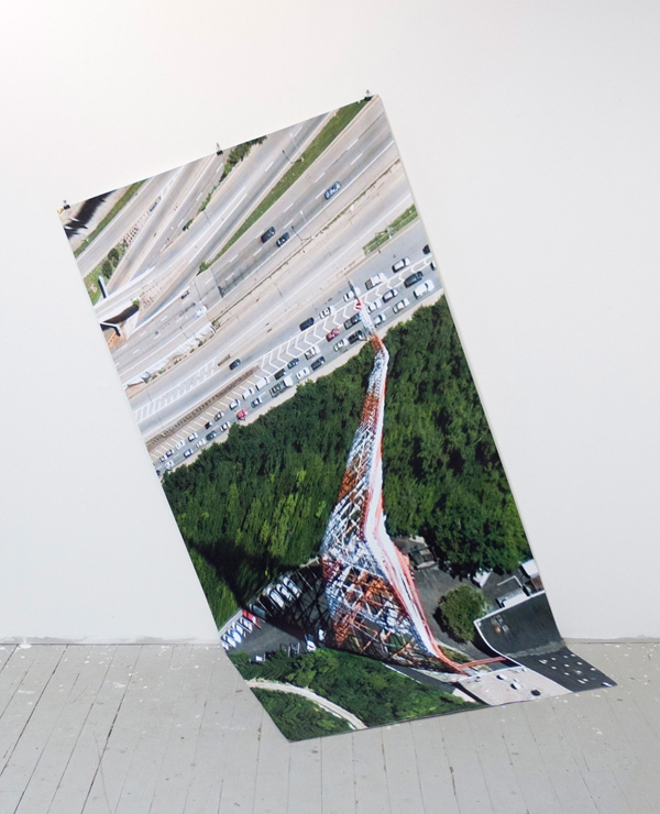
Images via Clement Valla.
These artists (...) counter the database, understood as a structure of dehumanized power, with the collection, as a form of idiosyncratic, unsystematic, and human memory. They collect what interests them, whatever they feel can and should be included in a meaning system. They describe, critique, and finally challenge the dynamics of the database, forcing it to evolve.1
I collect Google Earth images. I discovered them by accident, these particularly strange snapshots, where the illusion of a seamless and accurate representation of the Earth’s surface seems to break down. I was Google Earth-ing, when I noticed that a striking number of buildings looked like they were upside down. I could tell there were two competing visual inputs here —the 3D model that formed the surface of the earth, and the mapping of the aerial photography; they didn't match up. Depth cues in the aerial photographs, like shadows and lighting, were not aligning with the depth cues of the 3D model.
The competing visual inputs I had noticed produced some exceptional imagery, and I began to find more and start a collection. At first, I thought they were glitches, or errors in the algorithm, but looking closer, I realized the situation was actually more interesting — these images are not glitches. They are the absolute logical result of the system. They are an edge condition—an anomaly within the system, a nonstandard, an outlier, even, but not an error. These jarring moments expose how Google Earth works, focusing our attention on the software. They are seams which reveal a new model of seeing and of representing our world - as dynamic, ever-changing data from a myriad of different sources – endlessly combined, constantly updated, creating a seamless illusion.
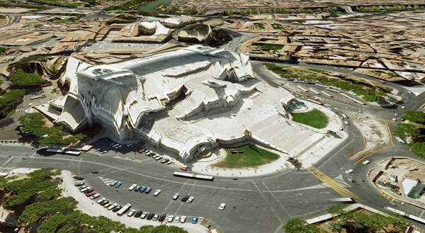 !--
!--
Contact sheet from Henri Cartier-Bresson in Seville, Spain, 1933. © Henri Cartier-Bresson / Magnum Photos-->
3D Images like those in Google Earth are generated through a process called texture mapping. Texture mapping is a technology developed by Ed Catmull in the 1970's. In 3D modeling, a texture map is a flat image that gets applied to the surface of a 3D model, like a label on a can or a bottle of soda. Textures typically represent a flat expanse with very little depth of field, meant to mimic surface properties of an object. Textures are more like a scan than a photograph. The surface represented in a texture coincides with the surface of the picture plane, unlike a photograph that represents a space beyond the picture plane. This difference might be summed up another way: we see through a photograph, we look at a texture. This is an important distinction in 3D modeling, because textures are stretched across the surface of a 3D model, in essence becoming the skin for the model.
Google Earth's textures however, are not shallow or flat. They are photographs that we look through into a space represented beyond—a space our brain interprets as having three dimensions and depth. We see space in the aerial photographs because of light and shadows and because of our prior knowledge of experienced space. When these photographs get distorted and stretched across the 3D topography of the earth, we are both looking at the distorted picture plane, and through the same picture plane at the space depicted in the texture. In other words, we are looking at two spaces simultaneously. Most of the time this doubling of spaces in Google Earth goes unnoticed, but sometimes the two spaces are so different, that things look strange, vertiginous, or plain wrong. But they’re not wrong. They reveal Google’s system used to map the earth — The Universal Texture.
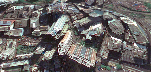 !--
!--
Contact sheet from Henri Cartier-Bresson in Seville, Spain, 1933. © Henri Cartier-Bresson / Magnum Photos-->
The Universal Texture is a Google patent for mapping textures onto a 3D model of the entire globe.2 At its core the Universal Texture is just an optimal way to generate a texture map of the earth. As its name implies, the Universal Texture promises a god-like (or drone-like) uninterrupted navigation of our planet — not a tiled series of discrete maps, but a flowing and fluid experience. This experience is so different, so much more seamless than previous technologies, that it is an achievement quite like what the escalator did to shopping:
No invention has had the importance for and impact on shopping as the escalator. As opposed to the elevator, which is limited in terms of the numbers it can transport between different floors and which through its very mechanism insists on division, the escalator accommodates and combines any flow, efficiently creates fluid transitions between one level and another, and even blurs the distinction between separate levels and individual spaces.3
In the digital media world, this fluid continuity is analogous to the infinite scroll's effect on Tumblr. In Google Earth, the Universal Texture delivers a smooth, complete and easily accessible knowledge of the planet's surface. The Universal Texture is able to take a giant photo collage made up of aerial photographs from all kinds of different sources — various companies, governments, mapping institutes — and map it onto a three-dimensional model assembled from as many distinct sources. It blends these disparate data together into a seamless space - like the escalator merges floors in a shopping mall.
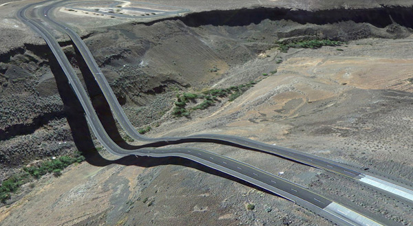 !--
!--
Contact sheet from Henri Cartier-Bresson in Seville, Spain, 1933. © Henri Cartier-Bresson / Magnum Photos-->
Our mechanical processes for creating images have habituated us into thinking in terms of snapshots - discrete segments of time and space (no matter how close together those discrete segments get, we still count in frames per second and image aspect ratios). But Google is thinking in continuity. The images produced by Google Earth are quite unlike a photograph that bears an indexical relationship to a given space at a given time. Rather, they are hybrid images, a patchwork of two-dimensional photographic data and three-dimensional topographic data extracted from a slew of sources, data-mined, pre-processed, blended and merged in real-time. Google Earth is essentially a database disguised as a photographic representation.
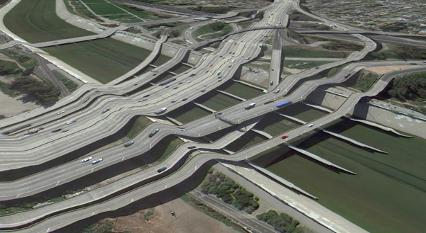 !--
!--
Contact sheet from Henri Cartier-Bresson in Seville, Spain, 1933. © Henri Cartier-Bresson / Magnum Photos-->
It is an automated, statistical, incessant, universal representation that selectively chooses its data. (For one, there is no ‘night’ in Google’s version of Earth.) The system edits a particular representation of the world. The software edits, re-assembles, processes and packages reality in order to form a very specific and useful model. These collected images feel alien, because they are clearly an incorrect representation of the earth’s surface. And it is precisely because humans did not directly create these images that they are so fascinating. They are created by an algorithm that finds nothing wrong in these moments. They are less a creation, than a kind of fact - a representation of the laws of the Universal Texture. As a collection the anomalies are a weird natural history of Google Earth’s software. They are strange new typologies, representative of a particular digital process. Typically, the illusion the Universal Texture creates makes the process itself go unnoticed, but these anomalies offer a glimpse into the data collection and assembly. They bring the diverging data sources to light. In these anomalies we understand there are competing inputs, competing data sources and discrepancy in the data. The world is not so fluid after all.
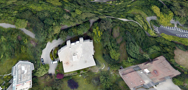 !--
!--
Contact sheet from Henri Cartier-Bresson in Seville, Spain, 1933. © Henri Cartier-Bresson / Magnum Photos-->
By capturing screenshots of these images in Google Earth, I am pausing them and pulling them out of the update cycle. I capture these images to archive them - to make sure there is a record that this image was produced by the Universal Texture at a particular time and place. As I kept looking for more anomalies, and revisiting anomalies I had already discovered, I noticed the images I had discovered were disappearing. The aerial photographs were getting updated, becoming 'flatter' – from being taken at less of an angle or having the shadows below bridges muted. Because Google Earth is constantly updating its algorithms and three-dimensional data, each specific moment could only be captured as a still image. I know Google is trying to fix some of these anomalies too – I’ve been contacted by a Google engineer who has come up with a clever fix for the problem of drooping roads and bridges. Though the change has yet to appear in the software, it’s only a matter of time.
Taking a closer look, Google’s algorithms also seem to have a way to select certain types of aerial photographs over others, so as more photographs are taken, the better ones get selected. To Google, better photographs are flatter, have fewer shadows and are taken from higher angles. Because of this progress, these strange images are being erased. I see part of my work as archiving these temporal digital typologies. I also call these images postcards to cast myself as a tourist in the temporal and virtual space - a space that exists digitally for a moment, and may perhaps never be reconstituted again by any computer.
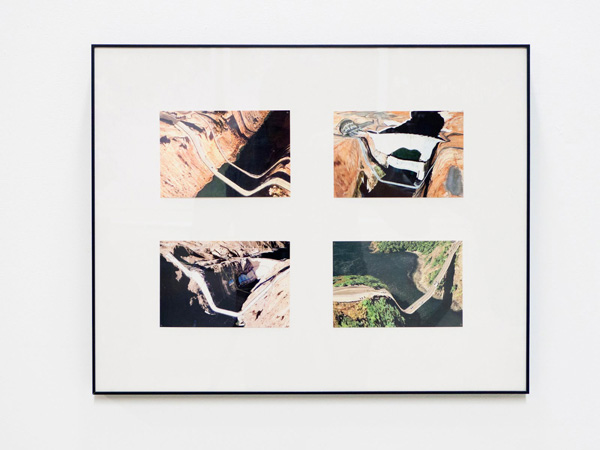 !--
!--
Contact sheet from Henri Cartier-Bresson in Seville, Spain, 1933. © Henri Cartier-Bresson / Magnum Photos-->
Nothing draws more attention to the temporality of these images than the simple observation that the clouds are disappearing from Google Earth. After all, clouds obscures the surface of the planet so photos with no clouds are privileged. The Universal Texture and its attendant database algorithms are trained on a few basic qualitative traits - no clouds, high contrast, shallow depth, daylight photos. Progress in architecture has given us total control over interior environments; climate controlled spaces smoothly connected by escalators in shopping malls, airports, hotels and casinos. Progress in the Universal Texture promises to give us a smooth and continuous 24-hour, cloudless, daylit world, increasingly free of jarring anomalies, outliers and statistical inconsistency.
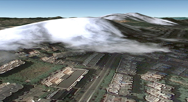 !--
!--
Contact sheet from Henri Cartier-Bresson in Seville, Spain, 1933. © Henri Cartier-Bresson / Magnum Photos-->
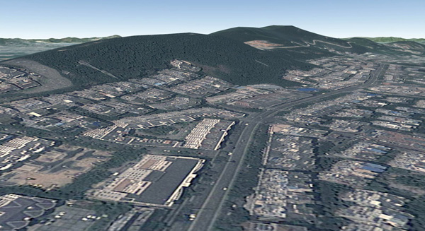 !--
!--
Contact sheet from Henri Cartier-Bresson in Seville, Spain, 1933. © Henri Cartier-Bresson / Magnum Photos-->
1. Quaranta, Domenico, “Collect the WWWorld. The Artist as Archivist in the Internet Age,” in Domenico Quaranta et al., Collect the WWWorld, exhibition catalogue, LINK Editions, September 2011.
2. "WebGL Earth Documentation - 2 Real-time Texturing Methods," WebGL Earth Documentation - 2 Real-time Texturing Methods, N.p., n.d. Web. 30 July 2012.
3. Jovanovic Weiss, Srdjan and Leong, Sze Tsung, “Escalator,” in Koolhaas et al., Harvard Design School guide to shopping, Köln, New York, Taschen, 2001.
 Clement Valla (USA, 1979). Lives and works in Brooklyn, New York. He received a BA in Architecture from Columbia University and a MFA from the Rhode Island School of Design in Digital+Media. He is currently an associate professor of Graphic Design at RISD. His work has been exhibited in several internationally places as The Indianapolis Museum of Art, Indianapolis; Museum of the Moving Image, New York; Thommassen Galleri, Gothenbur, etc. His work is available at clementvalla.com
[core_state] => 1 [core_access] => 1 [core_metadata] => {"robots":"","author":"Clement Valla","rights":"","xreference":""} [core_created_user_id] => 838 [core_created_by_alias] => [core_created_time] => 2014-06-23 17:00:00 [core_images] => {"image_intro":"images\/categories\/zonezero-3\/articles.clementvalla.valla.jpg","float_intro":"","image_intro_alt":"","image_intro_caption":"","image_fulltext":"images\/categories\/zonezero-3\/articles.clementvalla.valla.jpg","float_fulltext":"","image_fulltext_alt":"","image_fulltext_caption":""} [core_modified_time] => 2015-04-22 20:01:16 [core_language] => en-GB [core_catid] => 42 [core_publish_up] => 2014-06-23 17:00:00 [core_publish_down] => 0000-00-00 00:00:00 [content_type_title] => Article [router] => ContentHelperRoute::getArticleRoute [author] => Elisa Rugo [author_email] => elisa@zonezero.com [link] => index.php?option=com_content&view=article&id=169:the-universal-texture&catid=42&lang=en-GB [displayDate] => 2014-06-23 17:00:00 [event] => stdClass Object ( [afterDisplayTitle] => [beforeDisplayContent] => [afterDisplayContent] => ) [text] =>
!-- Parrafo de eric kim
Eric Kim, "Debunking the “Myth of the Decisive Moment”", Eric Kim Street Photography Blog , May 23, 2014
-->Clement Valla, "The Universal Texture.", Rhizome, 2012.

Images via Clement Valla.
These artists (...) counter the database, understood as a structure of dehumanized power, with the collection, as a form of idiosyncratic, unsystematic, and human memory. They collect what interests them, whatever they feel can and should be included in a meaning system. They describe, critique, and finally challenge the dynamics of the database, forcing it to evolve.1
I collect Google Earth images. I discovered them by accident, these particularly strange snapshots, where the illusion of a seamless and accurate representation of the Earth’s surface seems to break down. I was Google Earth-ing, when I noticed that a striking number of buildings looked like they were upside down. I could tell there were two competing visual inputs here —the 3D model that formed the surface of the earth, and the mapping of the aerial photography; they didn't match up. Depth cues in the aerial photographs, like shadows and lighting, were not aligning with the depth cues of the 3D model.
The competing visual inputs I had noticed produced some exceptional imagery, and I began to find more and start a collection. At first, I thought they were glitches, or errors in the algorithm, but looking closer, I realized the situation was actually more interesting — these images are not glitches. They are the absolute logical result of the system. They are an edge condition—an anomaly within the system, a nonstandard, an outlier, even, but not an error. These jarring moments expose how Google Earth works, focusing our attention on the software. They are seams which reveal a new model of seeing and of representing our world - as dynamic, ever-changing data from a myriad of different sources – endlessly combined, constantly updated, creating a seamless illusion.
 !--
!--
Contact sheet from Henri Cartier-Bresson in Seville, Spain, 1933. © Henri Cartier-Bresson / Magnum Photos-->
3D Images like those in Google Earth are generated through a process called texture mapping. Texture mapping is a technology developed by Ed Catmull in the 1970's. In 3D modeling, a texture map is a flat image that gets applied to the surface of a 3D model, like a label on a can or a bottle of soda. Textures typically represent a flat expanse with very little depth of field, meant to mimic surface properties of an object. Textures are more like a scan than a photograph. The surface represented in a texture coincides with the surface of the picture plane, unlike a photograph that represents a space beyond the picture plane. This difference might be summed up another way: we see through a photograph, we look at a texture. This is an important distinction in 3D modeling, because textures are stretched across the surface of a 3D model, in essence becoming the skin for the model.
Google Earth's textures however, are not shallow or flat. They are photographs that we look through into a space represented beyond—a space our brain interprets as having three dimensions and depth. We see space in the aerial photographs because of light and shadows and because of our prior knowledge of experienced space. When these photographs get distorted and stretched across the 3D topography of the earth, we are both looking at the distorted picture plane, and through the same picture plane at the space depicted in the texture. In other words, we are looking at two spaces simultaneously. Most of the time this doubling of spaces in Google Earth goes unnoticed, but sometimes the two spaces are so different, that things look strange, vertiginous, or plain wrong. But they’re not wrong. They reveal Google’s system used to map the earth — The Universal Texture.
 !--
!--
Contact sheet from Henri Cartier-Bresson in Seville, Spain, 1933. © Henri Cartier-Bresson / Magnum Photos-->
The Universal Texture is a Google patent for mapping textures onto a 3D model of the entire globe.2 At its core the Universal Texture is just an optimal way to generate a texture map of the earth. As its name implies, the Universal Texture promises a god-like (or drone-like) uninterrupted navigation of our planet — not a tiled series of discrete maps, but a flowing and fluid experience. This experience is so different, so much more seamless than previous technologies, that it is an achievement quite like what the escalator did to shopping:
No invention has had the importance for and impact on shopping as the escalator. As opposed to the elevator, which is limited in terms of the numbers it can transport between different floors and which through its very mechanism insists on division, the escalator accommodates and combines any flow, efficiently creates fluid transitions between one level and another, and even blurs the distinction between separate levels and individual spaces.3
In the digital media world, this fluid continuity is analogous to the infinite scroll's effect on Tumblr. In Google Earth, the Universal Texture delivers a smooth, complete and easily accessible knowledge of the planet's surface. The Universal Texture is able to take a giant photo collage made up of aerial photographs from all kinds of different sources — various companies, governments, mapping institutes — and map it onto a three-dimensional model assembled from as many distinct sources. It blends these disparate data together into a seamless space - like the escalator merges floors in a shopping mall.
 !--
!--
Contact sheet from Henri Cartier-Bresson in Seville, Spain, 1933. © Henri Cartier-Bresson / Magnum Photos-->
Our mechanical processes for creating images have habituated us into thinking in terms of snapshots - discrete segments of time and space (no matter how close together those discrete segments get, we still count in frames per second and image aspect ratios). But Google is thinking in continuity. The images produced by Google Earth are quite unlike a photograph that bears an indexical relationship to a given space at a given time. Rather, they are hybrid images, a patchwork of two-dimensional photographic data and three-dimensional topographic data extracted from a slew of sources, data-mined, pre-processed, blended and merged in real-time. Google Earth is essentially a database disguised as a photographic representation.
 !--
!--
Contact sheet from Henri Cartier-Bresson in Seville, Spain, 1933. © Henri Cartier-Bresson / Magnum Photos-->
It is an automated, statistical, incessant, universal representation that selectively chooses its data. (For one, there is no ‘night’ in Google’s version of Earth.) The system edits a particular representation of the world. The software edits, re-assembles, processes and packages reality in order to form a very specific and useful model. These collected images feel alien, because they are clearly an incorrect representation of the earth’s surface. And it is precisely because humans did not directly create these images that they are so fascinating. They are created by an algorithm that finds nothing wrong in these moments. They are less a creation, than a kind of fact - a representation of the laws of the Universal Texture. As a collection the anomalies are a weird natural history of Google Earth’s software. They are strange new typologies, representative of a particular digital process. Typically, the illusion the Universal Texture creates makes the process itself go unnoticed, but these anomalies offer a glimpse into the data collection and assembly. They bring the diverging data sources to light. In these anomalies we understand there are competing inputs, competing data sources and discrepancy in the data. The world is not so fluid after all.
 !--
!--
Contact sheet from Henri Cartier-Bresson in Seville, Spain, 1933. © Henri Cartier-Bresson / Magnum Photos-->
By capturing screenshots of these images in Google Earth, I am pausing them and pulling them out of the update cycle. I capture these images to archive them - to make sure there is a record that this image was produced by the Universal Texture at a particular time and place. As I kept looking for more anomalies, and revisiting anomalies I had already discovered, I noticed the images I had discovered were disappearing. The aerial photographs were getting updated, becoming 'flatter' – from being taken at less of an angle or having the shadows below bridges muted. Because Google Earth is constantly updating its algorithms and three-dimensional data, each specific moment could only be captured as a still image. I know Google is trying to fix some of these anomalies too – I’ve been contacted by a Google engineer who has come up with a clever fix for the problem of drooping roads and bridges. Though the change has yet to appear in the software, it’s only a matter of time.
Taking a closer look, Google’s algorithms also seem to have a way to select certain types of aerial photographs over others, so as more photographs are taken, the better ones get selected. To Google, better photographs are flatter, have fewer shadows and are taken from higher angles. Because of this progress, these strange images are being erased. I see part of my work as archiving these temporal digital typologies. I also call these images postcards to cast myself as a tourist in the temporal and virtual space - a space that exists digitally for a moment, and may perhaps never be reconstituted again by any computer.
 !--
!--
Contact sheet from Henri Cartier-Bresson in Seville, Spain, 1933. © Henri Cartier-Bresson / Magnum Photos-->
Nothing draws more attention to the temporality of these images than the simple observation that the clouds are disappearing from Google Earth. After all, clouds obscures the surface of the planet so photos with no clouds are privileged. The Universal Texture and its attendant database algorithms are trained on a few basic qualitative traits - no clouds, high contrast, shallow depth, daylight photos. Progress in architecture has given us total control over interior environments; climate controlled spaces smoothly connected by escalators in shopping malls, airports, hotels and casinos. Progress in the Universal Texture promises to give us a smooth and continuous 24-hour, cloudless, daylit world, increasingly free of jarring anomalies, outliers and statistical inconsistency.
 !--
!--
Contact sheet from Henri Cartier-Bresson in Seville, Spain, 1933. © Henri Cartier-Bresson / Magnum Photos-->
 !--
!--
Contact sheet from Henri Cartier-Bresson in Seville, Spain, 1933. © Henri Cartier-Bresson / Magnum Photos-->
1. Quaranta, Domenico, “Collect the WWWorld. The Artist as Archivist in the Internet Age,” in Domenico Quaranta et al., Collect the WWWorld, exhibition catalogue, LINK Editions, September 2011.
2. "WebGL Earth Documentation - 2 Real-time Texturing Methods," WebGL Earth Documentation - 2 Real-time Texturing Methods, N.p., n.d. Web. 30 July 2012.
3. Jovanovic Weiss, Srdjan and Leong, Sze Tsung, “Escalator,” in Koolhaas et al., Harvard Design School guide to shopping, Köln, New York, Taschen, 2001.
 Clement Valla (USA, 1979). Lives and works in Brooklyn, New York. He received a BA in Architecture from Columbia University and a MFA from the Rhode Island School of Design in Digital+Media. He is currently an associate professor of Graphic Design at RISD. His work has been exhibited in several internationally places as The Indianapolis Museum of Art, Indianapolis; Museum of the Moving Image, New York; Thommassen Galleri, Gothenbur, etc. His work is available at clementvalla.com
[id] => 169 [language] => en-GB [catid] => 42 [jcfields] => Array ( ) ) 1
ZoneZero
Considered a visual artist, interactive narrator and Internet anthropologist, Harris is interested in the fragments and feelings of intimate stories, and our need to express ourselves. He converses with the viewer through images and technology, interconnected them to his own artistic universe.
In his essay Navigating Stuckness, which consists of texts and illustrations, Harris shares an autobiographical journey, describing the successive stages of his development as a creator and how he has forced himself to surpass and rediscover himself. ZoneZero has chosen two projects from these various stages, to present a sample of the enormous variety and diversity of his platforms of expression, as a glimpse of his versatile artwork.
The first is Today, photographs documenting the 440 days that followed Harris’s 30th birthday, defining a self-portrait of his everyday life and transforming this process into a ritual. In the second, Balloons of Buthan, he presents portraits of happiness in the last Himalayan kingdom, Bhutan. He uses photographs and audio testimonials to address universal concerns, and records action through an interactive platform in which we can approach each of the 117 persons he met.
These are only two examples, showing two principal lines of Harris’s artistic activity. One of these is realizing that in order to approach other people and depend on them, we must pause to know and speak about ourselves. The other line is interpreting how we can converge with technology as the best means of telling stories, thus creating platforms that give order to human chaos in our globalized, Internet-centered world.
Harris is perhaps one of the most sensitive artists present online, whose projects can inspire us to continue our own pursuit of visual communication. The ZoneZero team therefore presents an interview with him, to provide an insight into the processes involved in his work.
 Jonathan Harris (USA, 1979). Lives and works in New York, though he undertakes some of his projects in others parts of the world. Balloons of Buthan, for example, was produced in Buthan, Himalaya. An artist and computer scientist, his work explores the relationship between humans and technology. He graduated in Computer Science and Photography from Princeton University. His artwork has been exhibited throughout the world and has earned several prizes and awards. It can be viewed at: Number27
Regarding the development of your projects, could you tell us what's the place of the concept and what role does your selected media play?
For me, projects tend to start with a concept — usually something simple and communicable in a single sentence (e.g. “A search engine for feelings” (We Feel Fine), “A public library of human experience” (Cowbird), “An expression of single moments in time” (10x10). From there, I spend a lot of time developing the idea on paper (in my sketchbook). This process is iterative, and can take a long time. I’ll usually try a lot of different angles and approaches, and many of them won’t feel right, so I’ll keep trying different things, all the while keeping in mind that single-sentence description, which is like the soul of the idea, and that soul should never change. At some point, I’ll decide on an angle (e.g. search for the phrase “I feel”; constrain stories to text and a single image; scrape news websites every hour for 100 words and pictures; etc.), and will start collecting data. Then, there's the process of developing a relationship with that data, which is almost like learning the ways of a lover — to try to understand its secrets (i.e. what about it is beautiful and interesting). Once you learn its secrets, then you can design interfaces that reveal those secrets to others. That is what makes something feel poetic, and what makes it come alive.
On your most recent work, what are the topics or concerns that move you to start and develop a new project?
Currently, I’m interested in the evolution of the human species into a single meta-organism, in which we all take part, like cells in a body. I’m interested in the nature of that meta-organism — its emotions, its thoughts, its desires, its choices.
With the constant changes on technology and projects that rely so much on it, do you worry about obsolescence? How do you deal with that risk?
Working with technology, obsolescence is unavoidable. Already, some of my earlier projects are difficult or impossible to see — most browsers no longer support Java applets by default, so to view We Feel Fine, visitors must download and install a plugin; the company whose news API powered Universe was acquired and no longer exists, so that project is sadly offline. Nowadays, I try to use open source technologies (HTML5, Javascript, WebGL, etc.), which are less likely to become obsolete than proprietary technologies like Java and Flash.
On an aesthetic level, obsolescence is also a danger, but this kind of obsolescence is related to the homogenizing effect of popular tools. For instance, when many people use a tool like Adobe Illustrator, Adobe Flash, or even a service like Instagram, the shortcuts enabled by the tool will, over time, have a homogenizing effect on the projects that people use the tool to create. Because of this, many digital projects quickly look dated — they are timely, but not timeless. To avoid this, I try to design all my interfaces from scratch, not relying on shortcuts enabled by tools, but generated programmatically by code I write myself. So, for example, the typography in The Whale Hunt is custom-designed to be bisected by whaling harpoons. In Universe, all the typography is formed by star constellations. When you write stuff from scratch (using open source tools), you have a better chance at avoiding obsolescence.
You can learn more about Harris's concerns and obsessions by visiting number27.org

Considered a visual artist, interactive narrator and Internet anthropologist, Harris is interested in the fragments and feelings of intimate stories, and our need to express ourselves. He converses with the viewer through images and technology, interconnected them to his own artistic universe.
In his essay Navigating Stuckness, which consists of texts and illustrations, Harris shares an autobiographical journey, describing the successive stages of his development as a creator and how he has forced himself to surpass and rediscover himself. ZoneZero has chosen two projects from these various stages, to present a sample of the enormous variety and diversity of his platforms of expression, as a glimpse of his versatile artwork.
The first is Today, photographs documenting the 440 days that followed Harris’s 30th birthday, defining a self-portrait of his everyday life and transforming this process into a ritual. In the second, Balloons of Buthan, he presents portraits of happiness in the last Himalayan kingdom, Bhutan. He uses photographs and audio testimonials to address universal concerns, and records action through an interactive platform in which we can approach each of the 117 persons he met.
These are only two examples, showing two principal lines of Harris’s artistic activity. One of these is realizing that in order to approach other people and depend on them, we must pause to know and speak about ourselves. The other line is interpreting how we can converge with technology as the best means of telling stories, thus creating platforms that give order to human chaos in our globalized, Internet-centered world.
Harris is perhaps one of the most sensitive artists present online, whose projects can inspire us to continue our own pursuit of visual communication. The ZoneZero team therefore presents an interview with him, to provide an insight into the processes involved in his work.
 Jonathan Harris (USA, 1979). Lives and works in New York, though he undertakes some of his projects in others parts of the world. Balloons of Buthan, for example, was produced in Buthan, Himalaya. An artist and computer scientist, his work explores the relationship between humans and technology. He graduated in Computer Science and Photography from Princeton University. His artwork has been exhibited throughout the world and has earned several prizes and awards. It can be viewed at: Number27
Regarding the development of your projects, could you tell us what's the place of the concept and what role does your selected media play?
For me, projects tend to start with a concept — usually something simple and communicable in a single sentence (e.g. “A search engine for feelings” (We Feel Fine), “A public library of human experience” (Cowbird), “An expression of single moments in time” (10x10). From there, I spend a lot of time developing the idea on paper (in my sketchbook). This process is iterative, and can take a long time. I’ll usually try a lot of different angles and approaches, and many of them won’t feel right, so I’ll keep trying different things, all the while keeping in mind that single-sentence description, which is like the soul of the idea, and that soul should never change. At some point, I’ll decide on an angle (e.g. search for the phrase “I feel”; constrain stories to text and a single image; scrape news websites every hour for 100 words and pictures; etc.), and will start collecting data. Then, there's the process of developing a relationship with that data, which is almost like learning the ways of a lover — to try to understand its secrets (i.e. what about it is beautiful and interesting). Once you learn its secrets, then you can design interfaces that reveal those secrets to others. That is what makes something feel poetic, and what makes it come alive.
On your most recent work, what are the topics or concerns that move you to start and develop a new project?
Currently, I’m interested in the evolution of the human species into a single meta-organism, in which we all take part, like cells in a body. I’m interested in the nature of that meta-organism — its emotions, its thoughts, its desires, its choices.
With the constant changes on technology and projects that rely so much on it, do you worry about obsolescence? How do you deal with that risk?
Working with technology, obsolescence is unavoidable. Already, some of my earlier projects are difficult or impossible to see — most browsers no longer support Java applets by default, so to view We Feel Fine, visitors must download and install a plugin; the company whose news API powered Universe was acquired and no longer exists, so that project is sadly offline. Nowadays, I try to use open source technologies (HTML5, Javascript, WebGL, etc.), which are less likely to become obsolete than proprietary technologies like Java and Flash.
On an aesthetic level, obsolescence is also a danger, but this kind of obsolescence is related to the homogenizing effect of popular tools. For instance, when many people use a tool like Adobe Illustrator, Adobe Flash, or even a service like Instagram, the shortcuts enabled by the tool will, over time, have a homogenizing effect on the projects that people use the tool to create. Because of this, many digital projects quickly look dated — they are timely, but not timeless. To avoid this, I try to design all my interfaces from scratch, not relying on shortcuts enabled by tools, but generated programmatically by code I write myself. So, for example, the typography in The Whale Hunt is custom-designed to be bisected by whaling harpoons. In Universe, all the typography is formed by star constellations. When you write stuff from scratch (using open source tools), you have a better chance at avoiding obsolescence.
You can learn more about Harris's concerns and obsessions by visiting number27.org
Page 1 of 2
Page 1 of 2

